
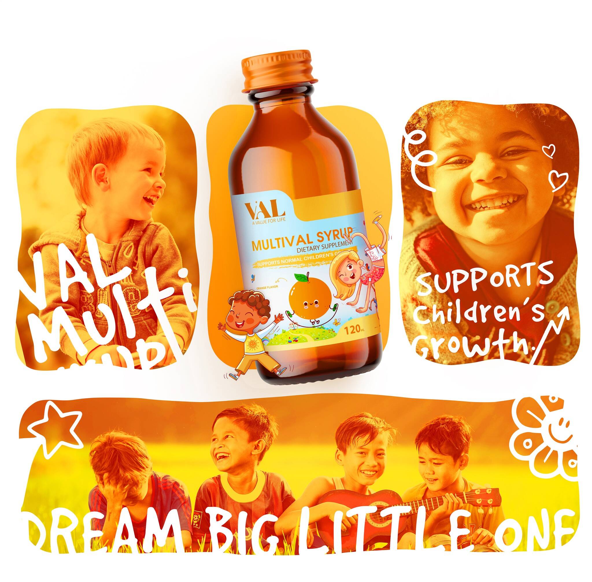
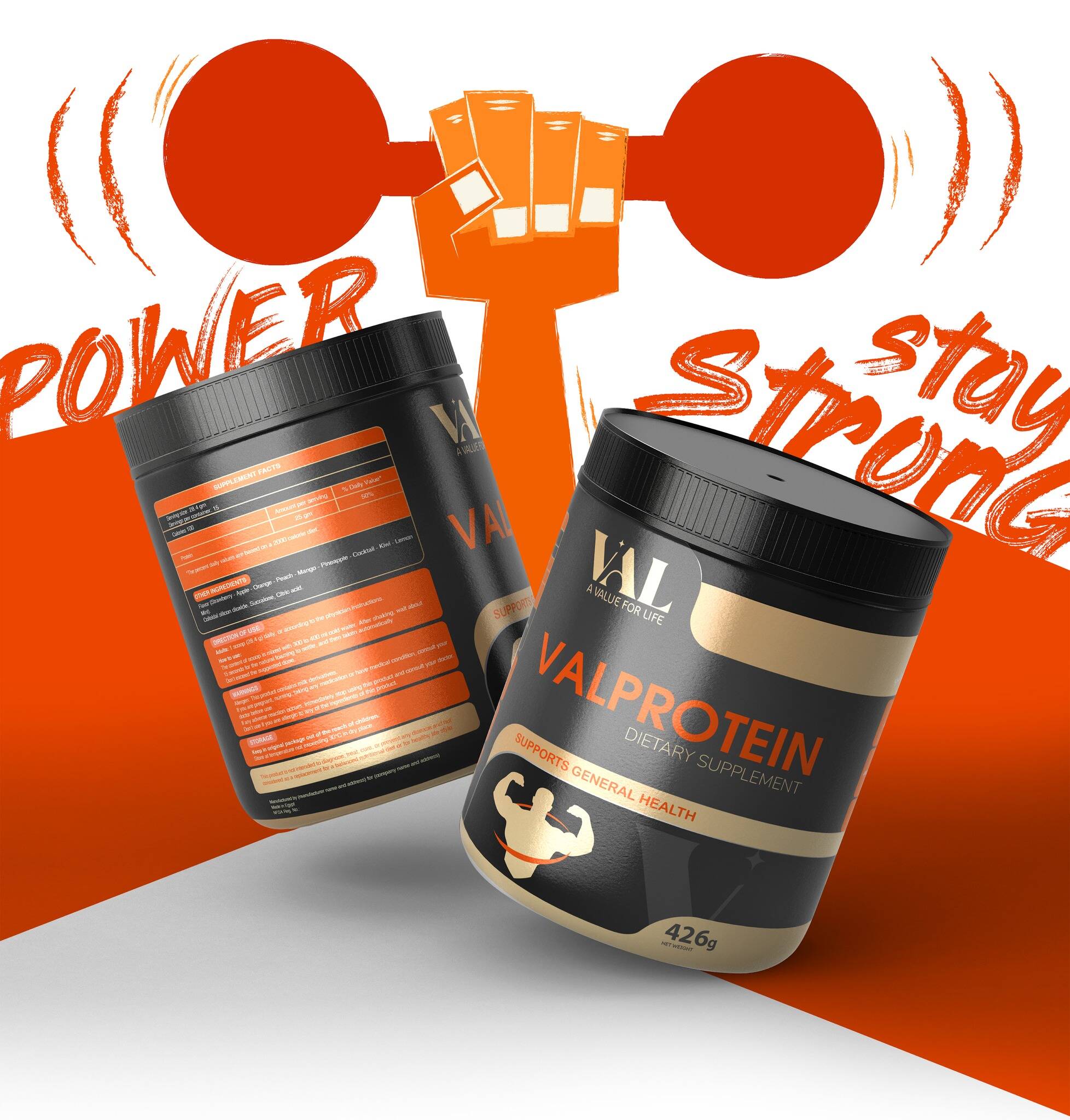
Description
What if strength came in color-coded doses?
Marklinica partnered with VAL to design a full-spectrum packaging experience for its supplements engineered to deliver energy, identity, and instant recognition.
This wasn’t about pills.
It was about building a visual language of performance.
Each product served a purpose.
Our role was to give that purpose a voice.
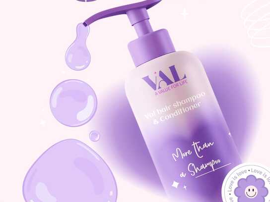
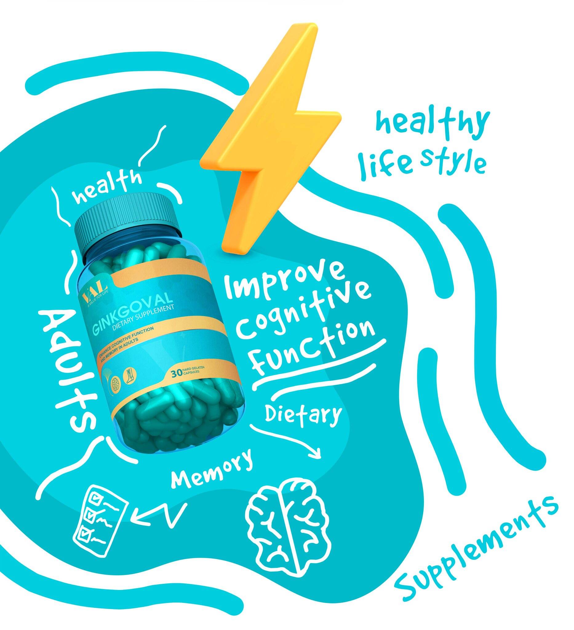
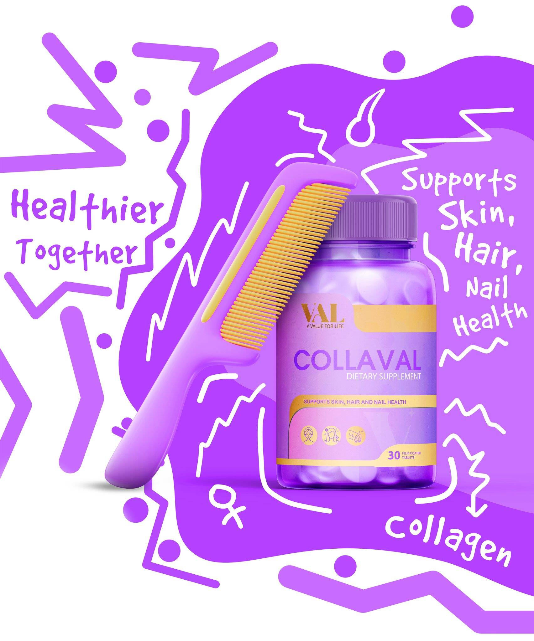
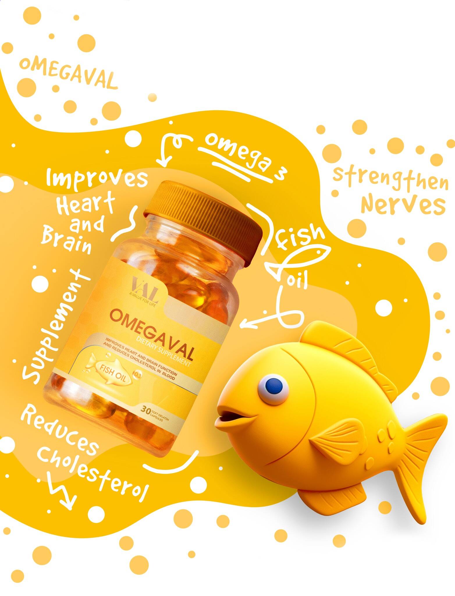
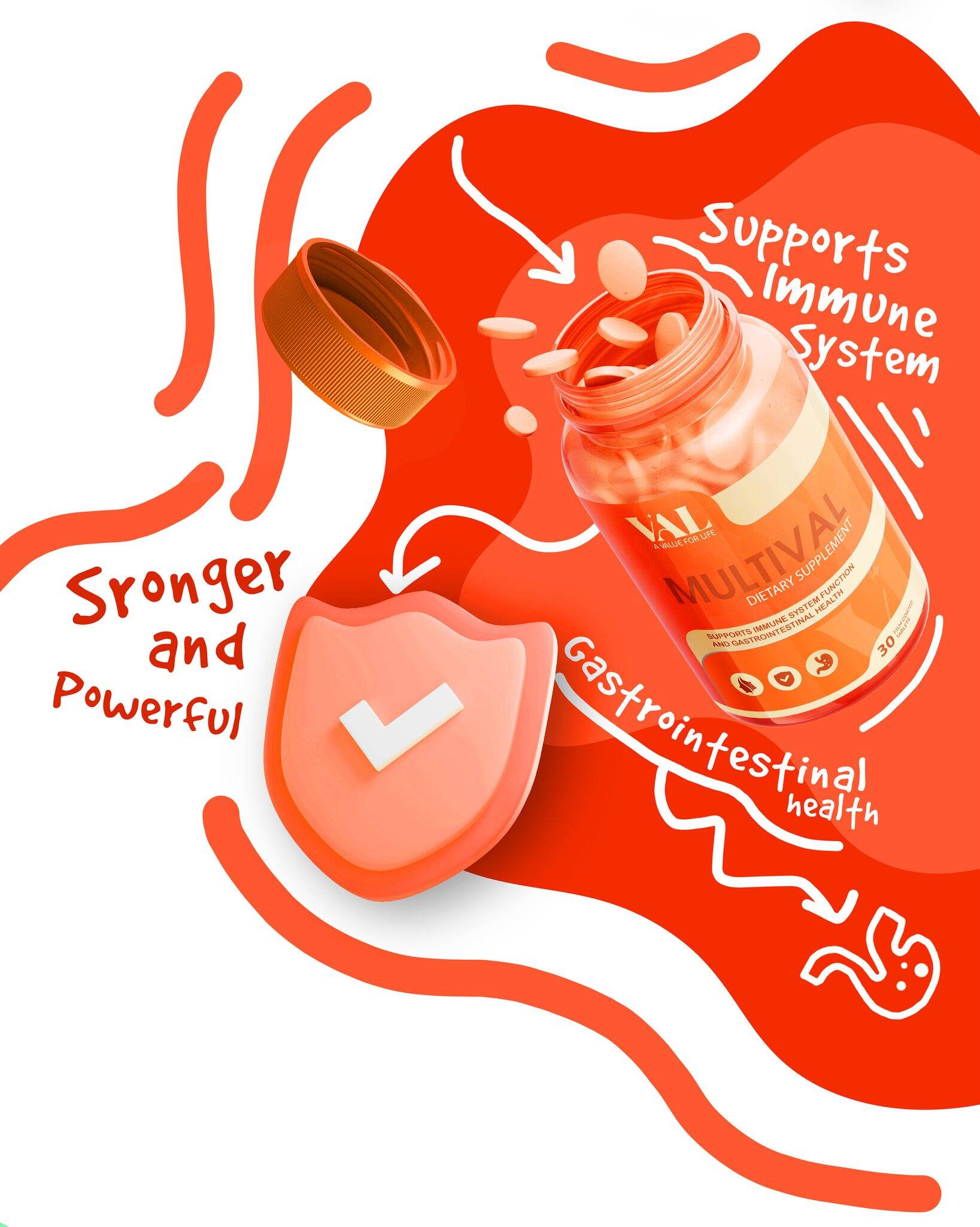
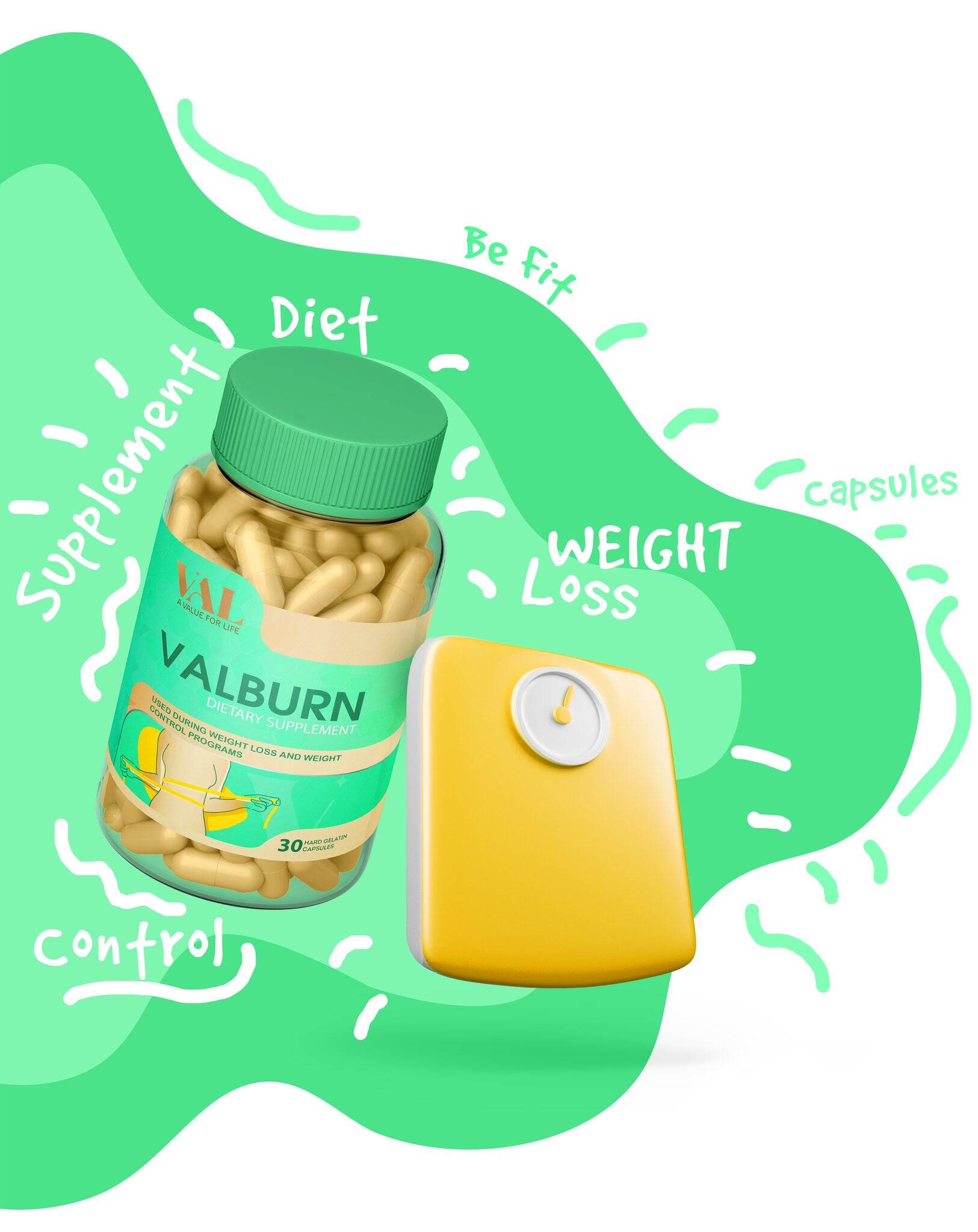
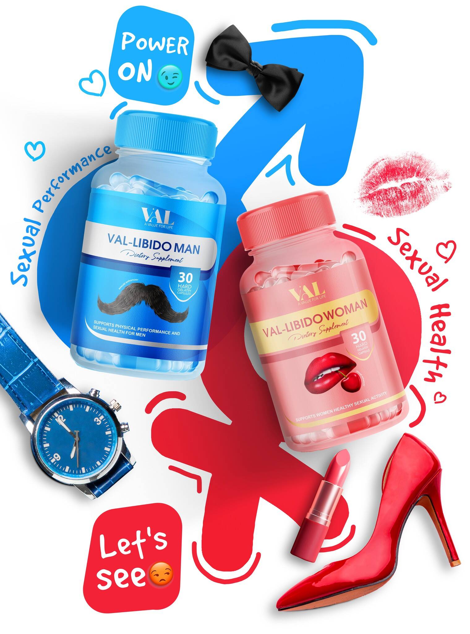
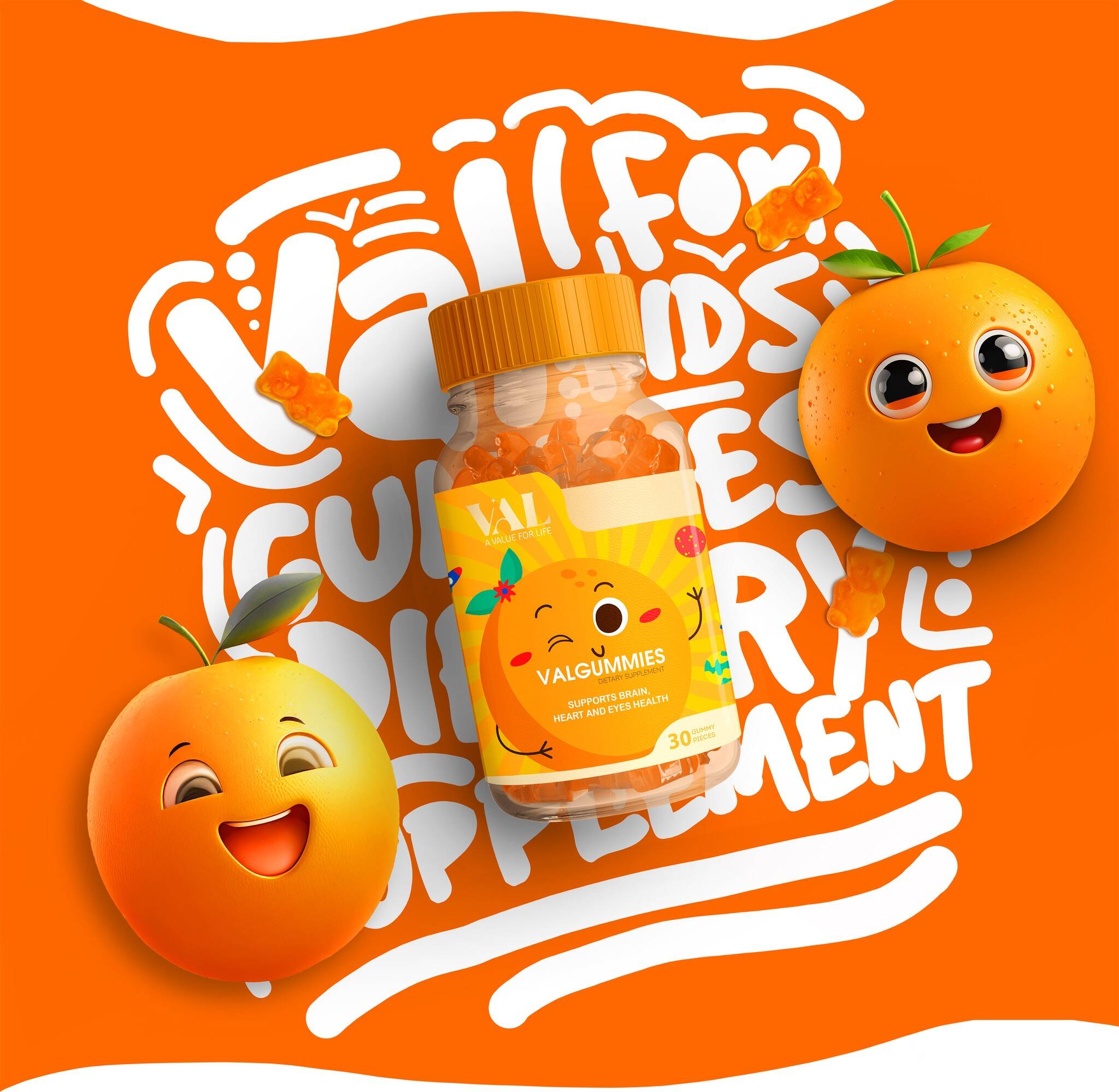
Gradient pastels signal calm. Saturated oranges drive energy. Deep teals sharpen focus. Typography holds its stance. Icons communicate clearly, never loudly.
Art direction captured movement itself:
Containers framed like tools in action. Shadows defined, backgrounds dynamic. In VAL’s world, packaging doesn’t sit still it moves, performs, and belongs to the rhythm of the body.
From workout shakes to brain-boost capsules, from gummies to sports packs every touchpoint was designed to reflect motion, intention, and modern vitality.
This professional campaign titled ' This Isn’t Packaging. It’s a Dose of Val Logic.' was published in Canada and United States in June, 2023. It was created for the brand: VAL LLC, by ad agency: Marklinica. This Content, Design, and Print media campaign is related to the Food and Health industries and contains 10 media assets. It was submitted 7 months ago by CEO : Rana Mohsen of Marklinica Agency.
Credits
Art Director: Rana Mohsen
Brand Designer: Sara Anani
Agency: Marklinica