Before
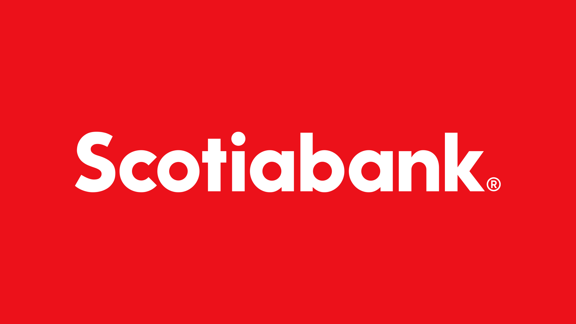
Logo
Concept
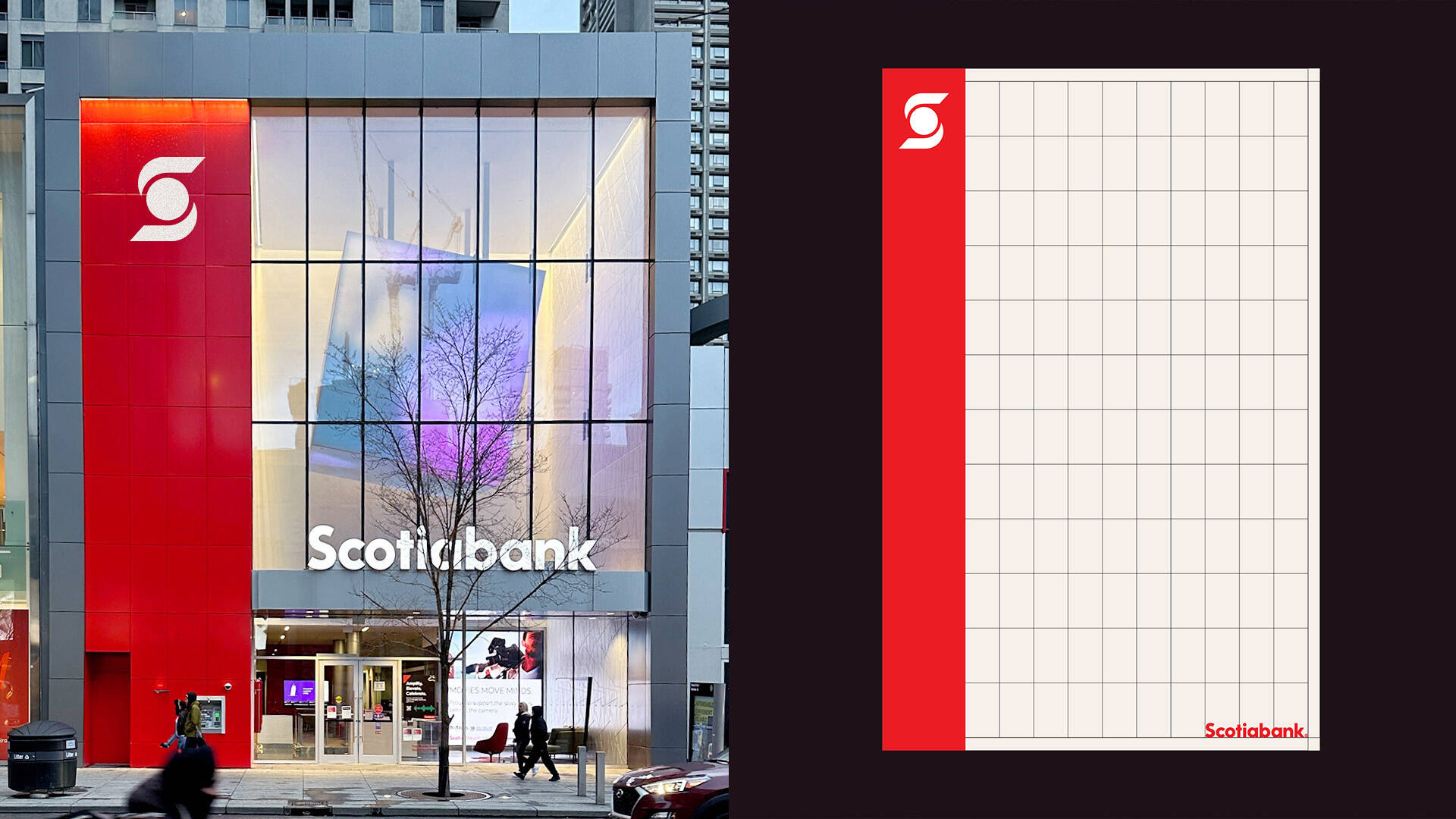
Artful Grid
System
Strategy
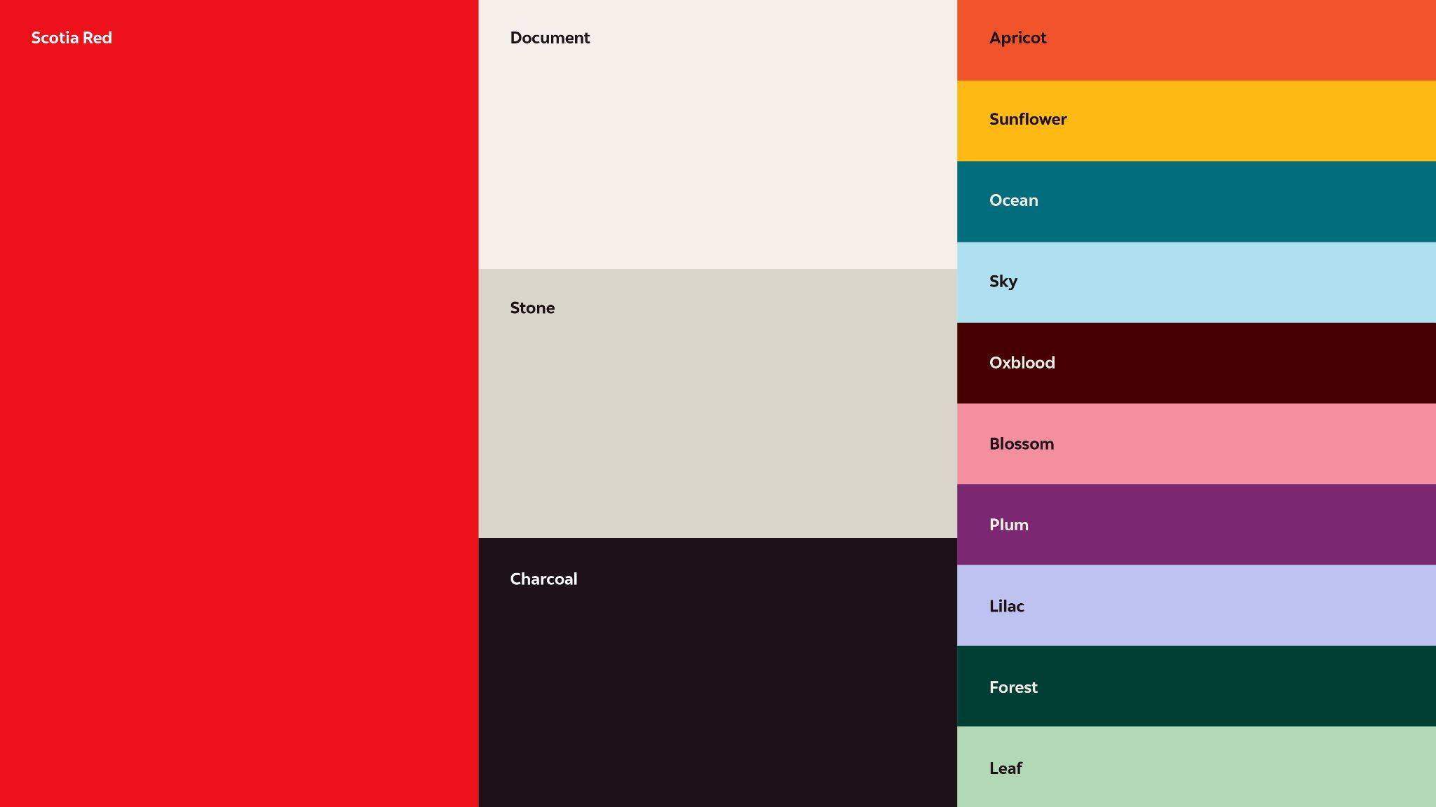
Core Colours
Secondary Colours
Full Colour
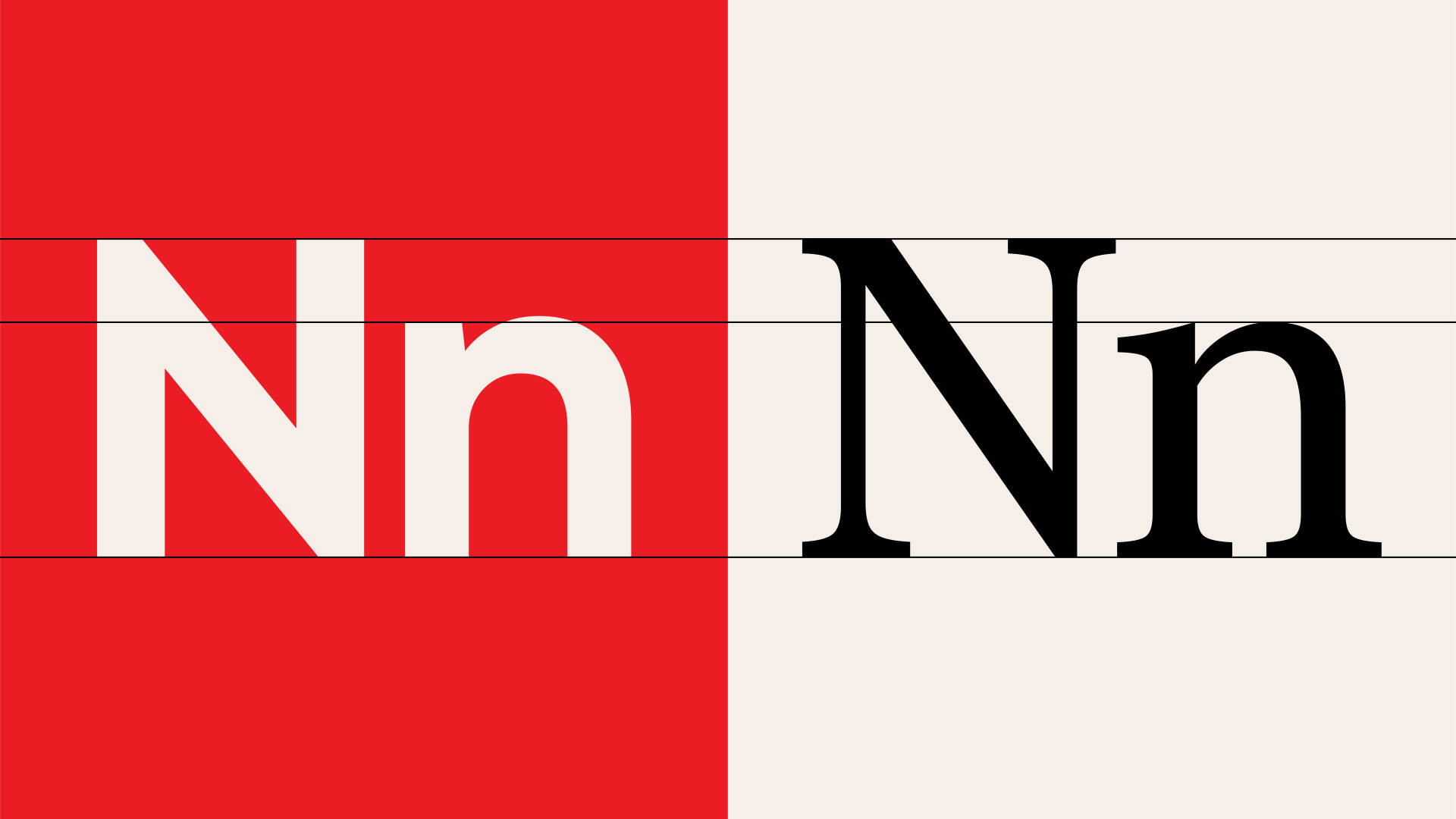
Type
Type
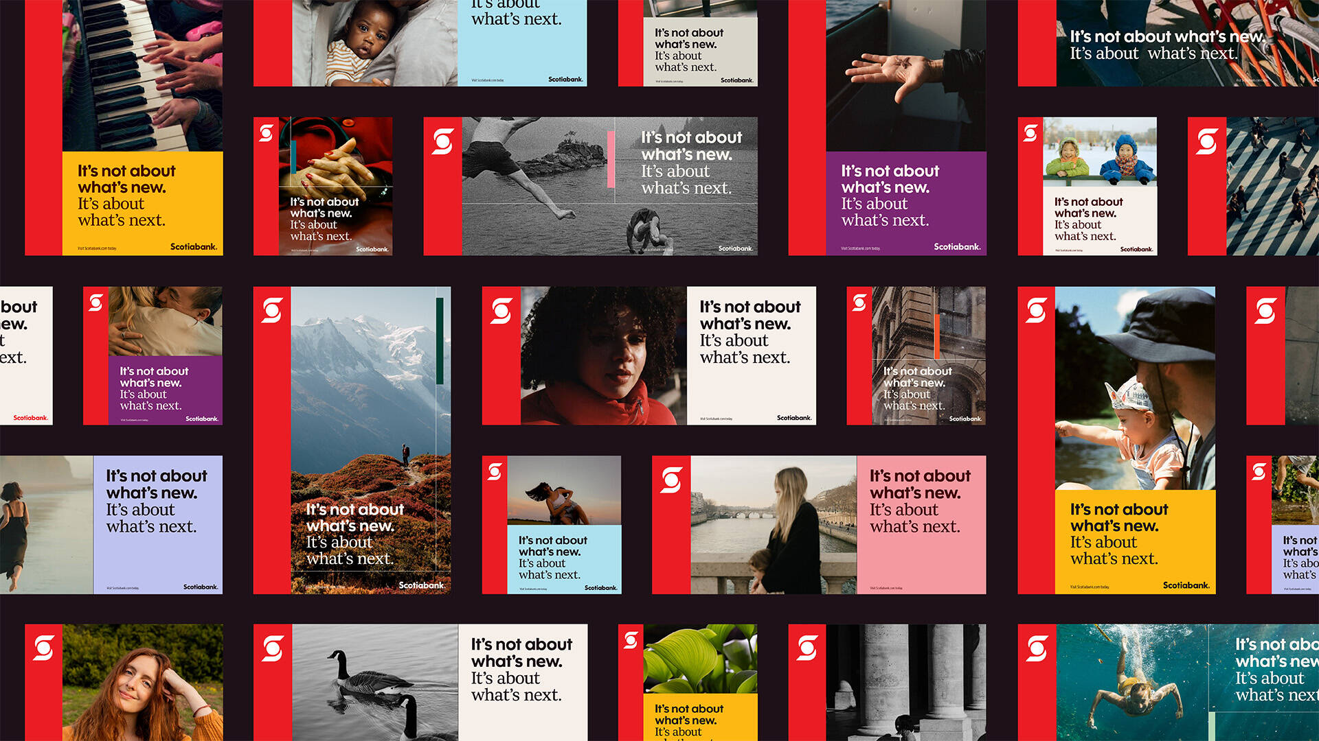
Photography Pillars
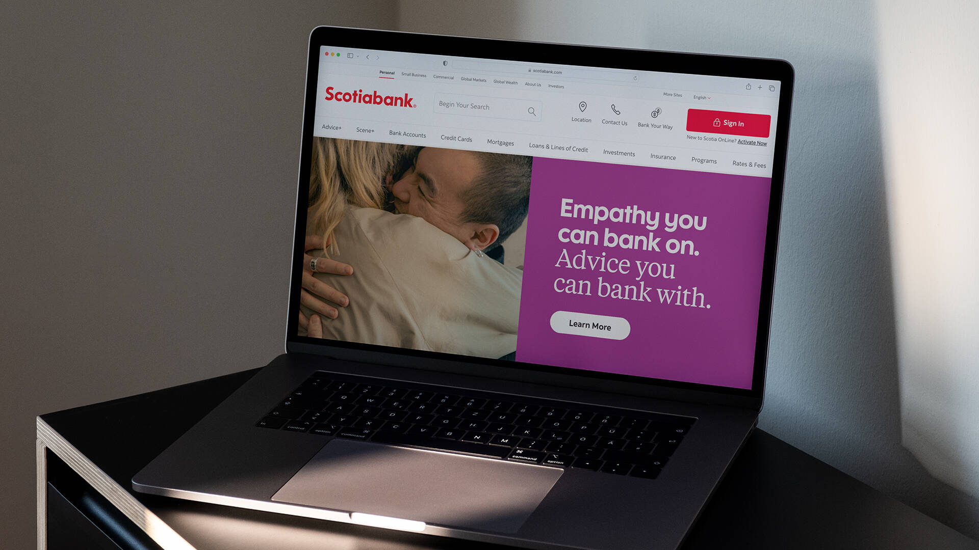
Banner
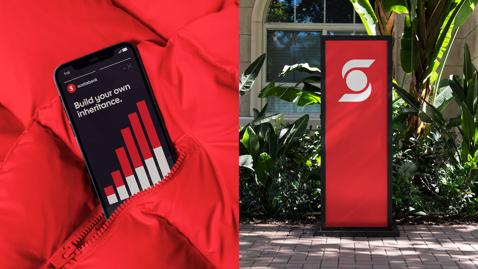
Phone
Social
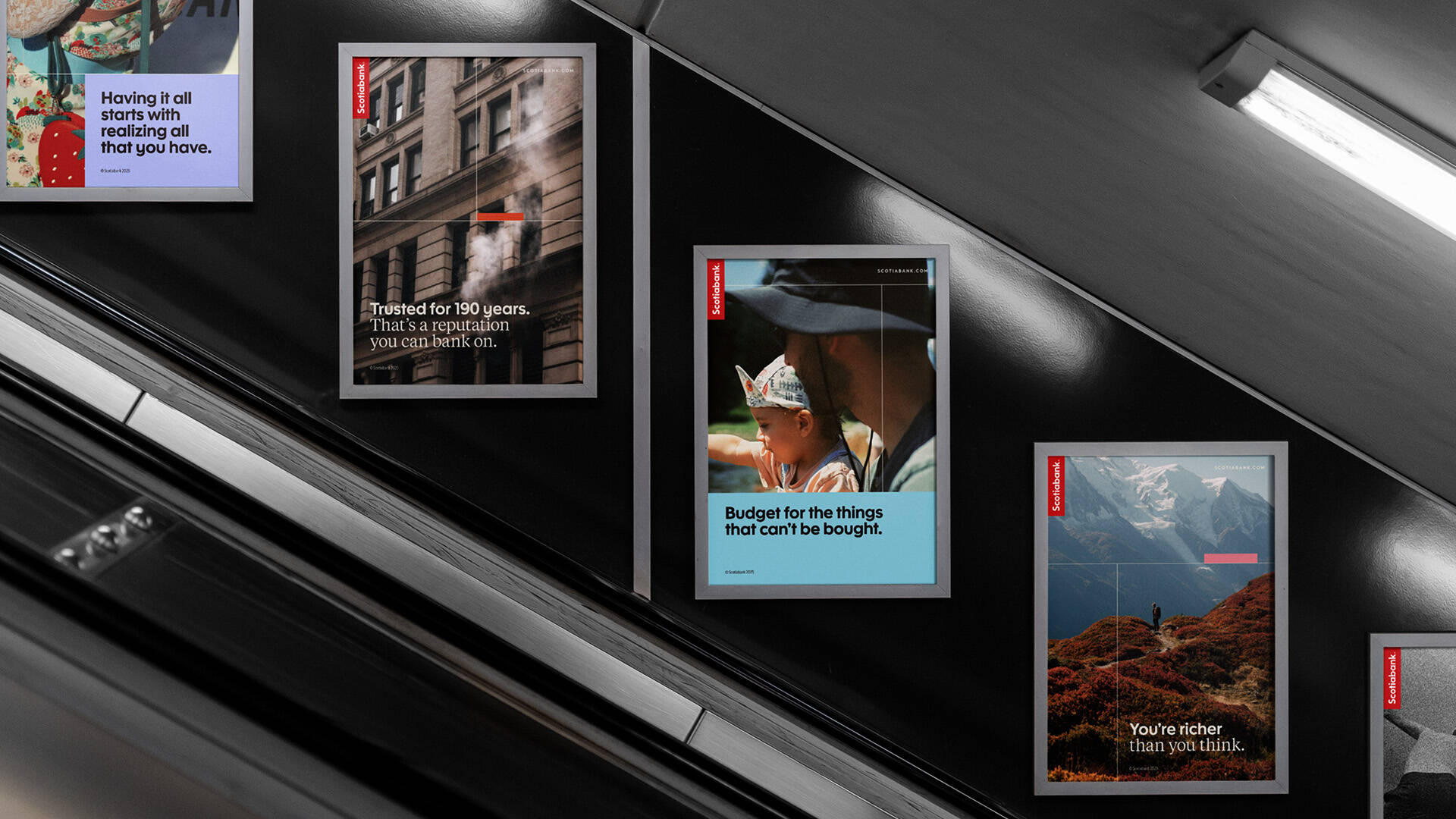
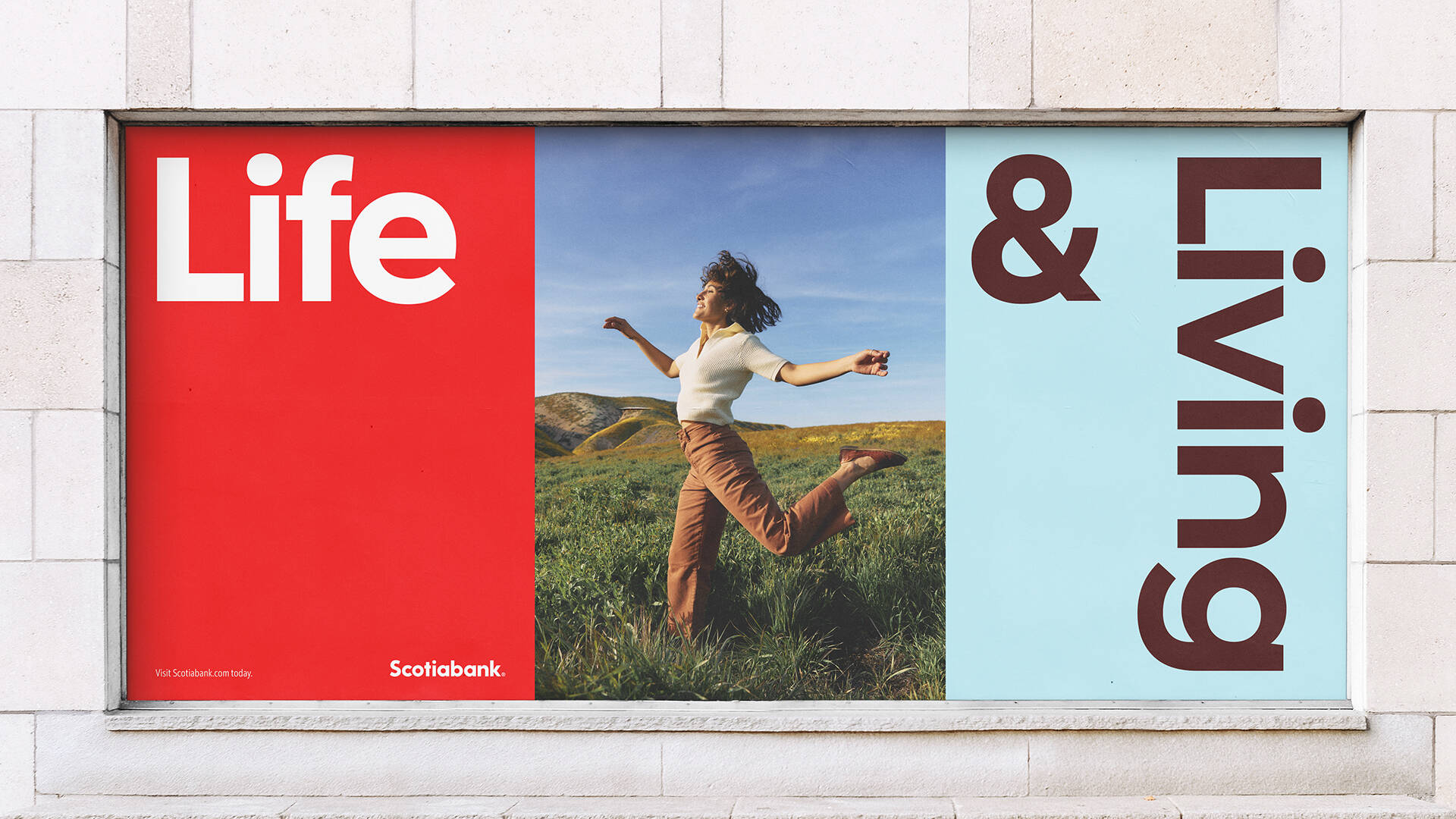
Posters
Logo animation
Description
Scotiabank needed a rebrand that unified their global identity and appealed to a more affluent clientele. We started by establishing consistent design layouts, drawing inspiration from their worldwide branch architecture. To elevate their overall tone, we crafted an elegant bespoke serif typeface, developed a sophisticated new approach to imagery, and refined their colour palette, thoughtfully referencing their heritage. Proving that a consistent global rebrand can revitalize even a 193-year-old institution.
This professional campaign titled 'Scotiabank Rebrand' was published on January 19, 2026. It was created for the brand: Scotiabank, by ad agency: Rethink. This 360° and Design media campaign contains 17 media assets. It was submitted 6 months ago by Associate Creative Director: Zoë Boudreau of Rethink.
Credits
Lead Designers: Zoë Boudreau, Thomas Hadfield
Creative Direction: Hans Thiessen, Rich Greco, Berkeley Poole
Associate Creative Director: Mark Mabey
Designers: Erin Maguire, Nathan Leung
Copywriter: Brendan Scullion, Mnrupe Virk, Jenai Kershaw
Scotia Serif Typeface Design: Dalton Maag
Motion Design: Jesse Shaw
Client: Scotiabank, Laura Curtis Ferrera, John Rocco, Dave Laing, Katie O'Dodonovan, John Tisdale, Lighthouse Team
Account Director: Catherine Demmer
Accounts: Jules Syvestre, Alex Rousom, Sandra Stainton
Group Strategy Director: Crystal Sales
Strategy Director: Daavi Wong Wolfson
Group Business Lead: Caitlin Bourada
Integrated Producer: Jenna Fullerton