
Description
Overview
Metis is VitaDairy's milk brand for pre-teens, reimagining a generation that has outgrown the soft pastels of childhood but isn't ready for anything that takes itself too seriously. Featuring fruit and barley milk with chewy jelly, it delivers essential vitamins for growth, but what it really delivers is permission to be a little bit ridiculous.
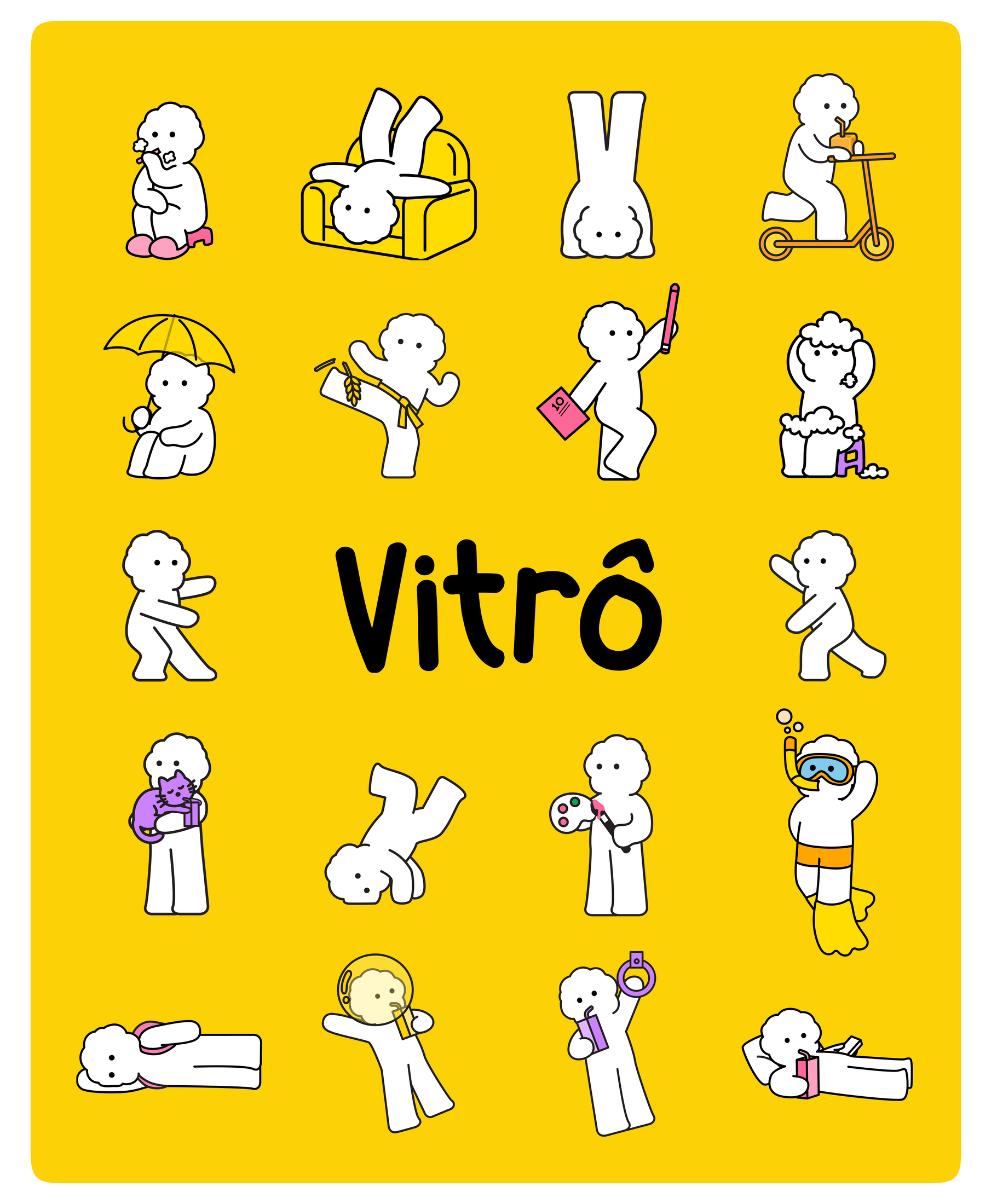
At its center is Vitrô, the official mascot of Metis, and a certified Gen Alpha. Carefree, optimistic, and possessed of the energy that makes everything it touches feel lighter. Vitrô doesn't just appear on the carton. It lives in it, through it, and increasingly beyond it.
Website: sieumetis.vn
Scope Of Work
Brand Strategy & Insight, Brand Experience, Brand Governance
Brand Identity: Naming, Brand Design System, Character Design, Motion & Photography, Digital Experience, Promotion Design, Custom Typeface, Guidelines
Packaging: Master Design, Matrix Development, Packaging Design
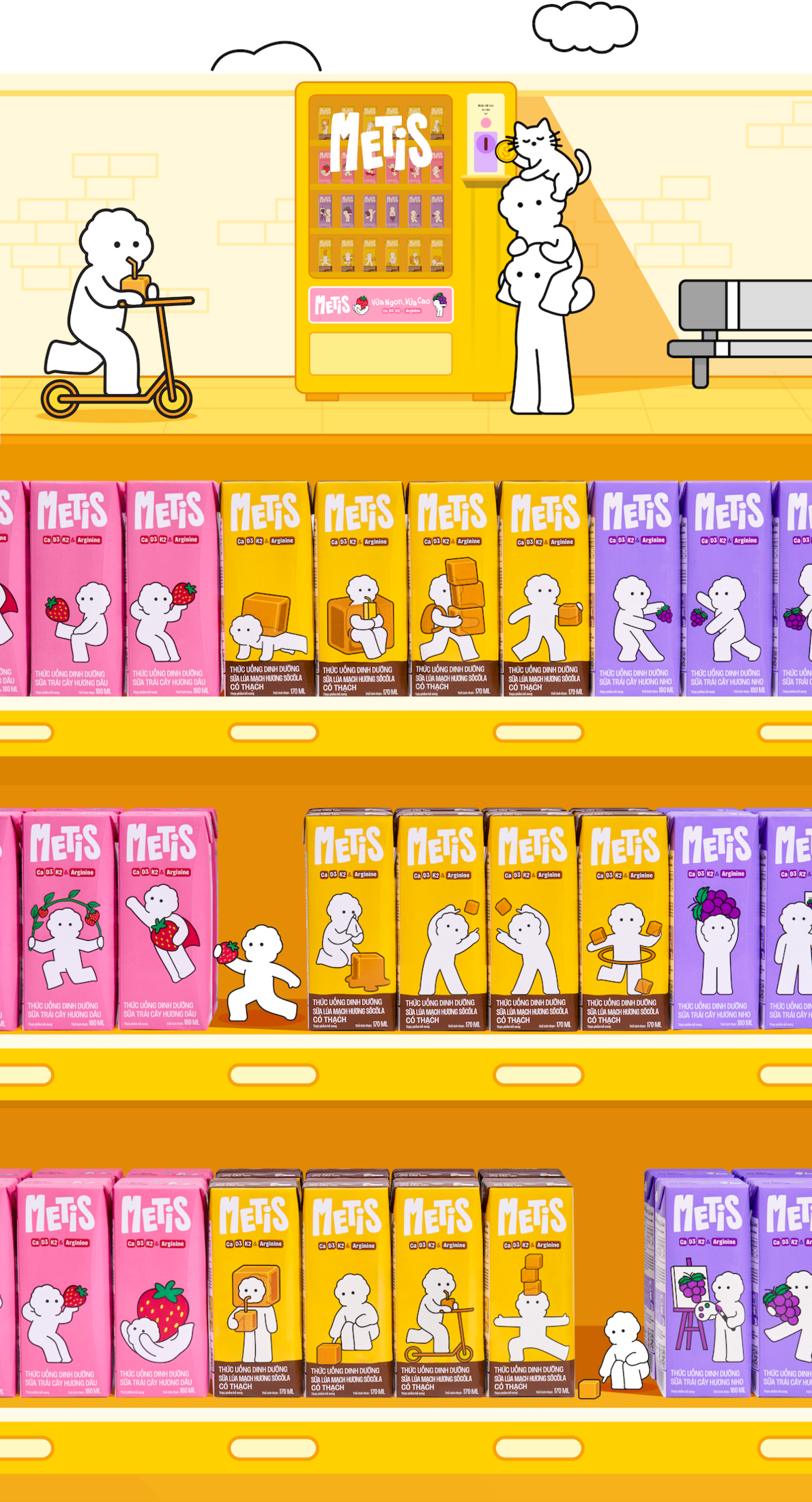
Step into a world where milk is no longer just a product, but a playground of small visual moments. Metis is built as a series of bite-sized scenes: simple, playful, and slightly unexpected, where characters, colors, and compositions come together to create a living, moving system. Each surface becomes a frame, each frame a story, unfolding through rotation, interaction, and curiosity.
The visual language draws from the way Gen Alpha consumes content today: fast, fragmented, and driven by micro-experiences. Rather than relying on one big narrative, Metis creates a collection of small worlds: a playful sequence on the side panel, a playful character out-of-box, a color system that shifts across variants. Together, these elements form a design system that feels light, dynamic, and endlessly explorable.
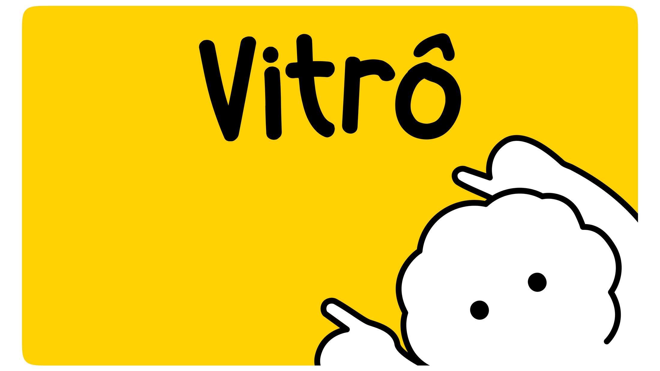
Vitrô
Vitrô is not a mascot designed to sell milk. It is a presence built to be liked.
As a character born to represent the next generation, its creation began the same way, built by AI. Early sketches were generated rather than drawn, using AI as the first gesture in the design process. Not as a shortcut, but as a deliberate reflection: a character made for a generation shaped by AI, built through one too.
From those initial outputs, the team took over: refining, pushing, giving Vitrô the personality that no prompt could fully specify. The result is a character that feels both inevitable and handmade, as if it had always existed somewhere and just needed to be found.
Defined by a carefree, optimistic, and friendly personality, Vitrô represents a generation embracing life with a sense of humour and curiosity. Its tẻn tẻn personality adds a layer of charm, making the character feel approachable and naturally relatable. Through small moments, Vitrô becomes a presence that radiates joy, spreads good vibes, and connects naturally with its audience.
Logo
The Metis logo translates product form into brand language, expressing height, strength, and the vibrant spirit of Gen Alpha. Its structure carries a subtle sense of forward movement, reflecting a generation that is always growing and leaning into what’s next.
The letter “M” becomes the defining gesture. Its extended leg echoes a running stride, introducing a quiet sense of motion into the composition. When brought together, the wordmark feels confident yet lively at once. A form shaped by energy, not just geometry.
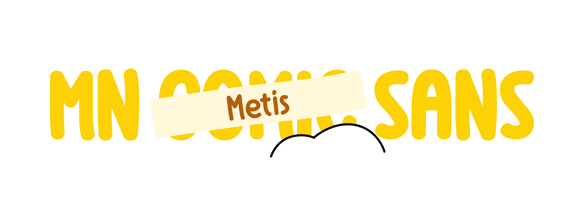
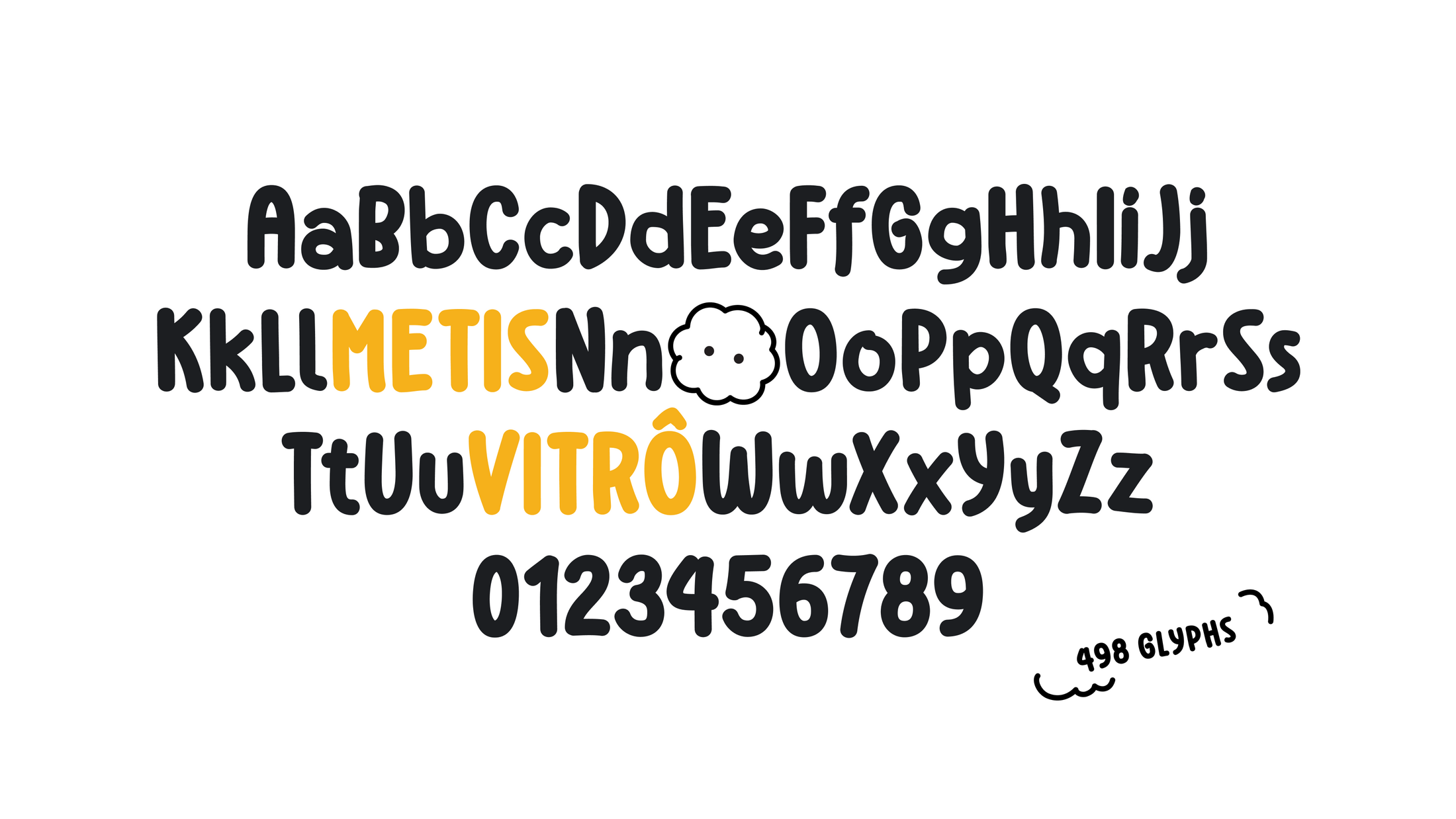
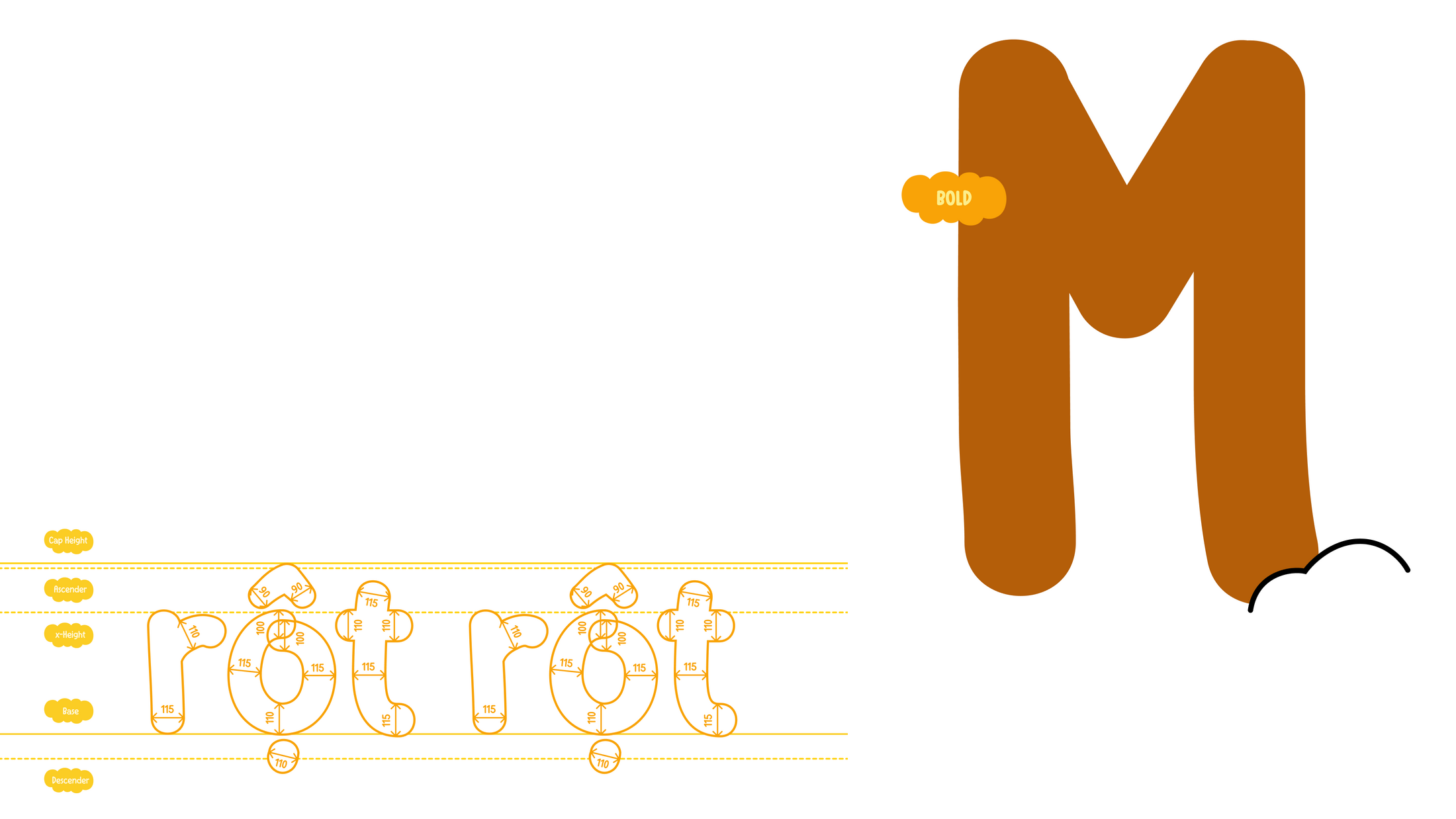
Typeface
MN Metis Sans (not Comic Sans) is a custom handwritten-style sans serif drawn from the logic of Gen Alpha's visual language: spontaneous, imperfect, alive. Its letterforms are loose and rounded, its terminals soft, its overall character closer to a doodle than a typeface — in the best possible sense.
Built with soft, chunky shapes and minimal contrast, it echoes the naive hand of Vitrô. Three weights. Full Vietnamese diacritic support. Even the .notdef glyph is Vitrô's head, rendered in the typeface's own proportions, as if the character had always lived inside the letters.
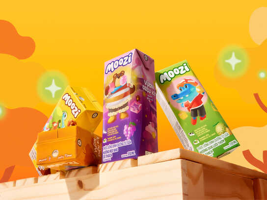
Packaging
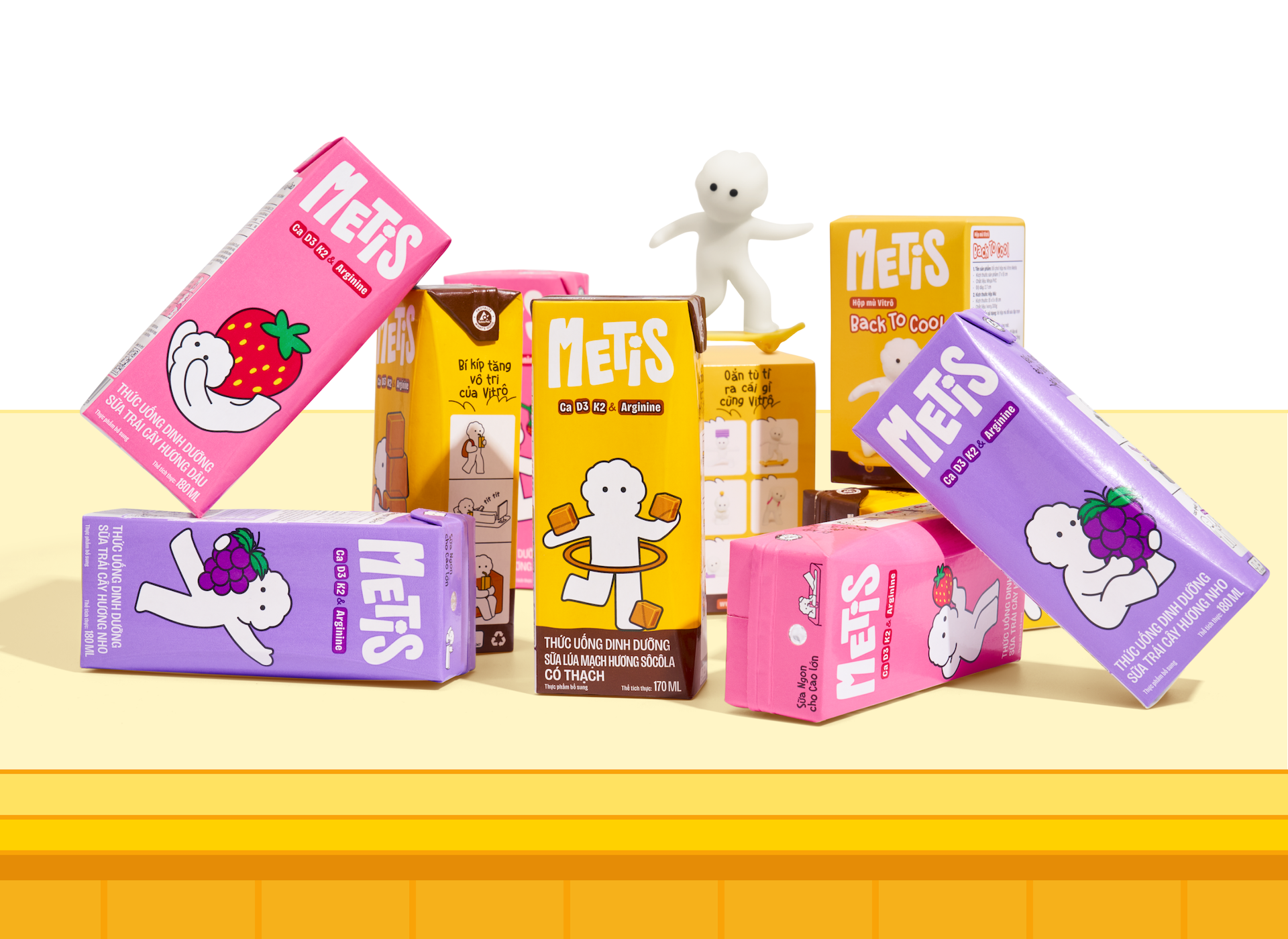
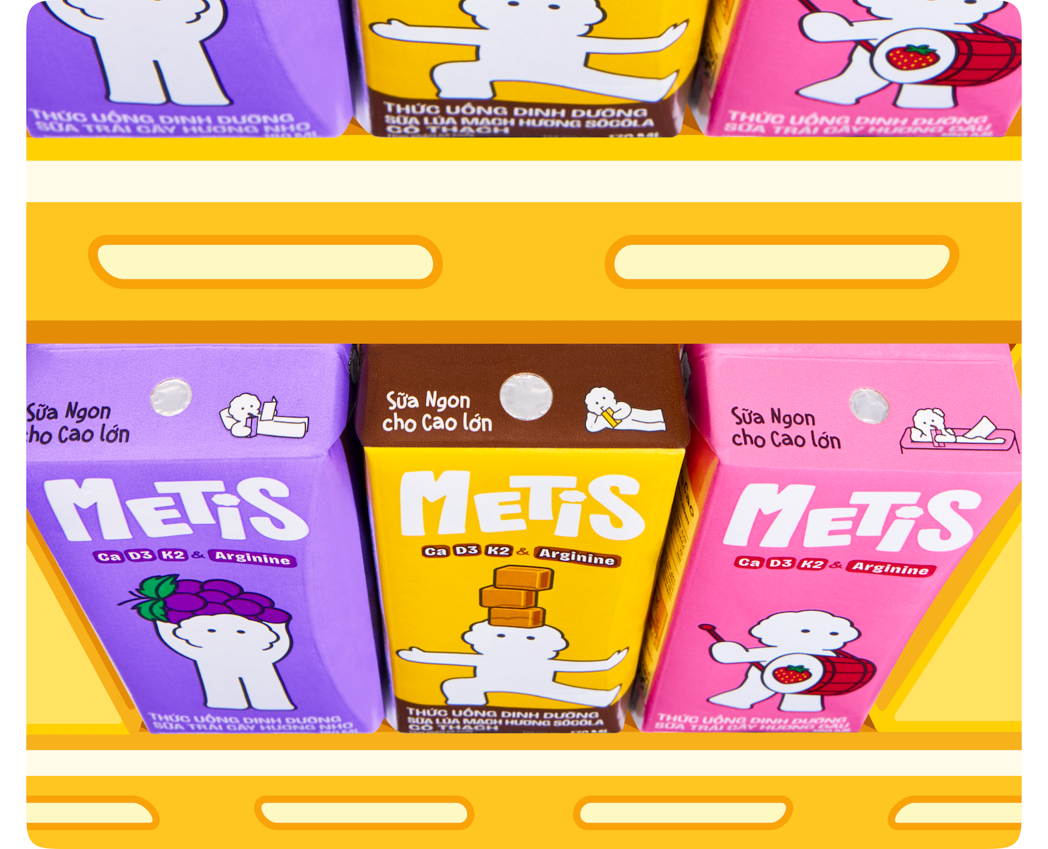
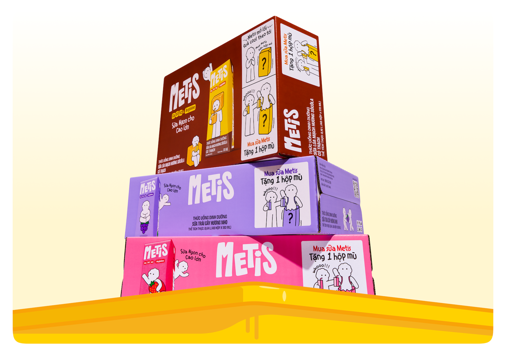
In a category where most products try to look trustworthy, Metis chooses to be irresistible. The packaging is bold, character-led, and designed to stand out instantly on shelf. Each product becomes more than a drink, it’s a canvas for creativity.
Beyond the front-facing design, every surface of the pack becomes a playground for storytelling. The side panel transforms into a three-frame narrative: a visual sequence that follows Vitrô through playful, everyday moments. While subtly reinforcing height growth, these stories shift the focus from function to feeling, creating a distinct brand signature within the category.
Each pack introduces a different Vitrô variation, paired with its own scenario. No two boxes feel the same, encouraging curiosity, collection, and repeat engagement. By turning utility into narrative, Metis transforms a simple milk box into a moment of surprise beyond the first sip.
Brand System
A system that stays consistent, but never stays still.
Metis is designed as a system that can play anywhere. From packaging to social content, from in-store displays to small brand moments, everything feels connected through a shared sense of controlled unpredictability. The visual language is flexible enough to adapt, but consistent enough to stay recognizable. It doesn’t just scale across platforms, it keeps evolving, just like the audience it’s made for.
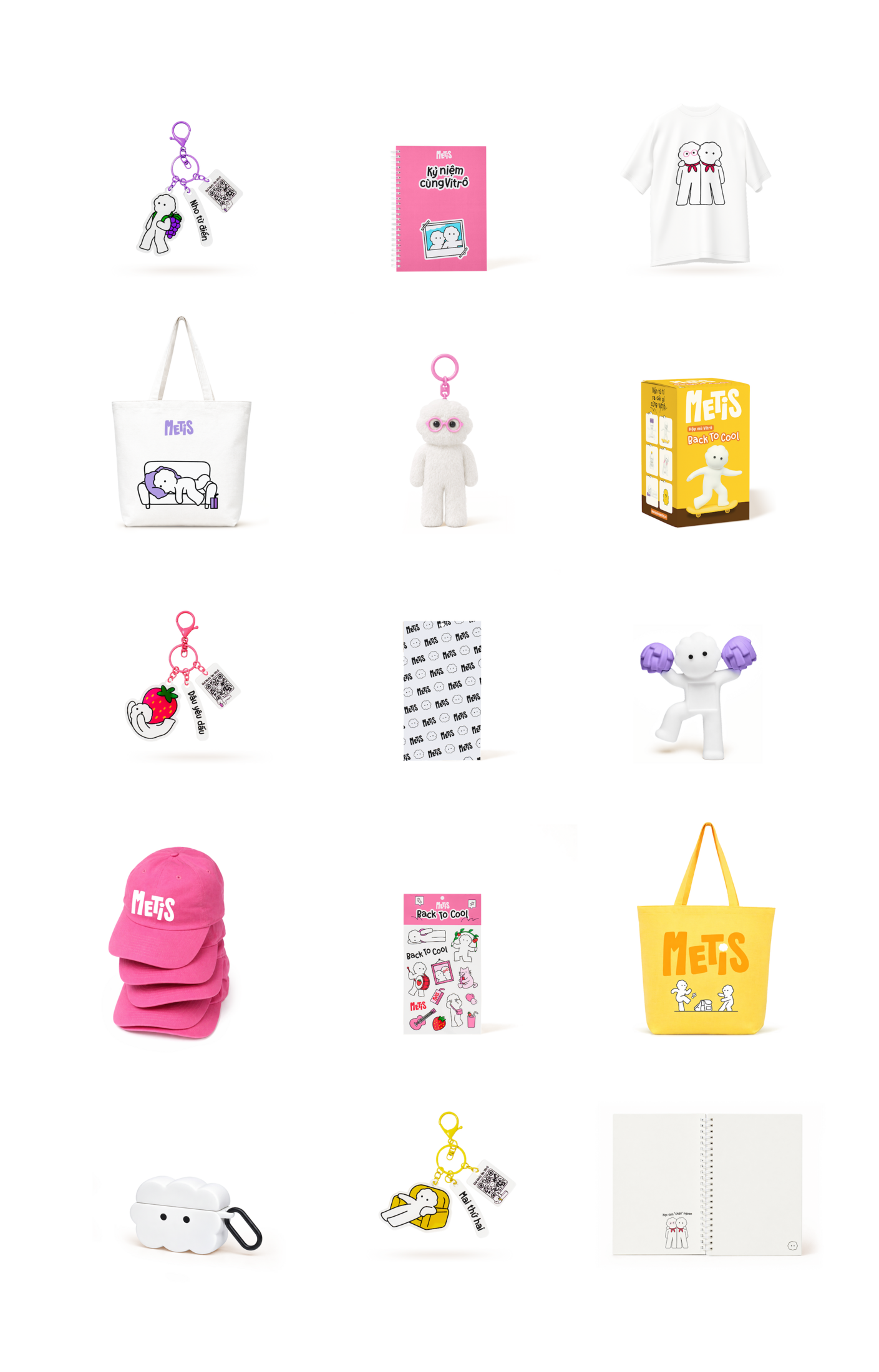
Merchandise
Welcome to the Vitrôverse, where Vitrô lives rent-free in your life
The experience doesn't stop at the product. Vitrô extends into blind boxes, collectible merchandise and sticker sets on social platforms, brand touchpoints that don't feel like brand extensions because they don't behave like brand extensions. They behave like things a kid would actually want. Because at its core, Metis was never just about selling milk. It was about creating a carefree companion that lives within the small, repeated moments of daily life.
This professional campaign titled 'Metis' was published in Vietnam in April, 2026. It was created for the brands: Metis and Vitadairy, by ad agency: M — N Associates. This Design, Integrated, and Print media campaign is related to the Drinks (Non Alcoholic) and Food industries and contains 29 media assets. It was submitted about 2 months ago.
Credits
Client: Vitadairy
Brand: Metis
Branding Firm: M — N Associates
Executive Creative Director: Duy — N
Design Director: Vy Lê
Project Manager: M — Lan
Brand Strategist: Ly Nguyễn, Vy Nguyễn
Designer: Bảo Trương, Anh Nguyễn, Văn-Tú Nguyễn, Phương-Anh Nguyễn, Giang Nguyễn, Thái-Tú Nguyễn, Amanda Moeller, Khánh Trần
Digital Designer: Phương Lưu
Copywriter: Ly Nguyễn, Vy Nguyễn, Tân Nguyễn
Junior Project Manager: Ly Nguyễn, Ngân Nguyễn, Vy Nguyễn, Tân Nguyễn
Printing Producer: Thảo Nguyễn, Vy Lê
Typography under Type Associates
Type Concept: Duy — N
Type Designer: Bảo Trương, Phương-Anh Nguyễn
Website Development: Blank Co.
Character Modeling: Huy Lê
3D Animation: GudLag Studio
Portfolio Photography: Wing Chan, Bite Studio
Mascot Photography: Lâm Uy Huỳnh
Portfolio Producer: Vy Lê, Bảo Trương, Phương-Anh Nguyễn