Description
BRAND STORY
CHONCHOS was born from the vibrant food culture of Colombia’s streets, where food is more than simply a way to satisfy hunger—it is a catalyst for bringing people together through joyful, energetic moments.
With Salchipapa at the heart of the brand, CHONCHOS embraces a bold, contemporary, and distinctly urban spirit, turning every serving into a complete experience through rich flavors, quality ingredients, and thoughtful service.
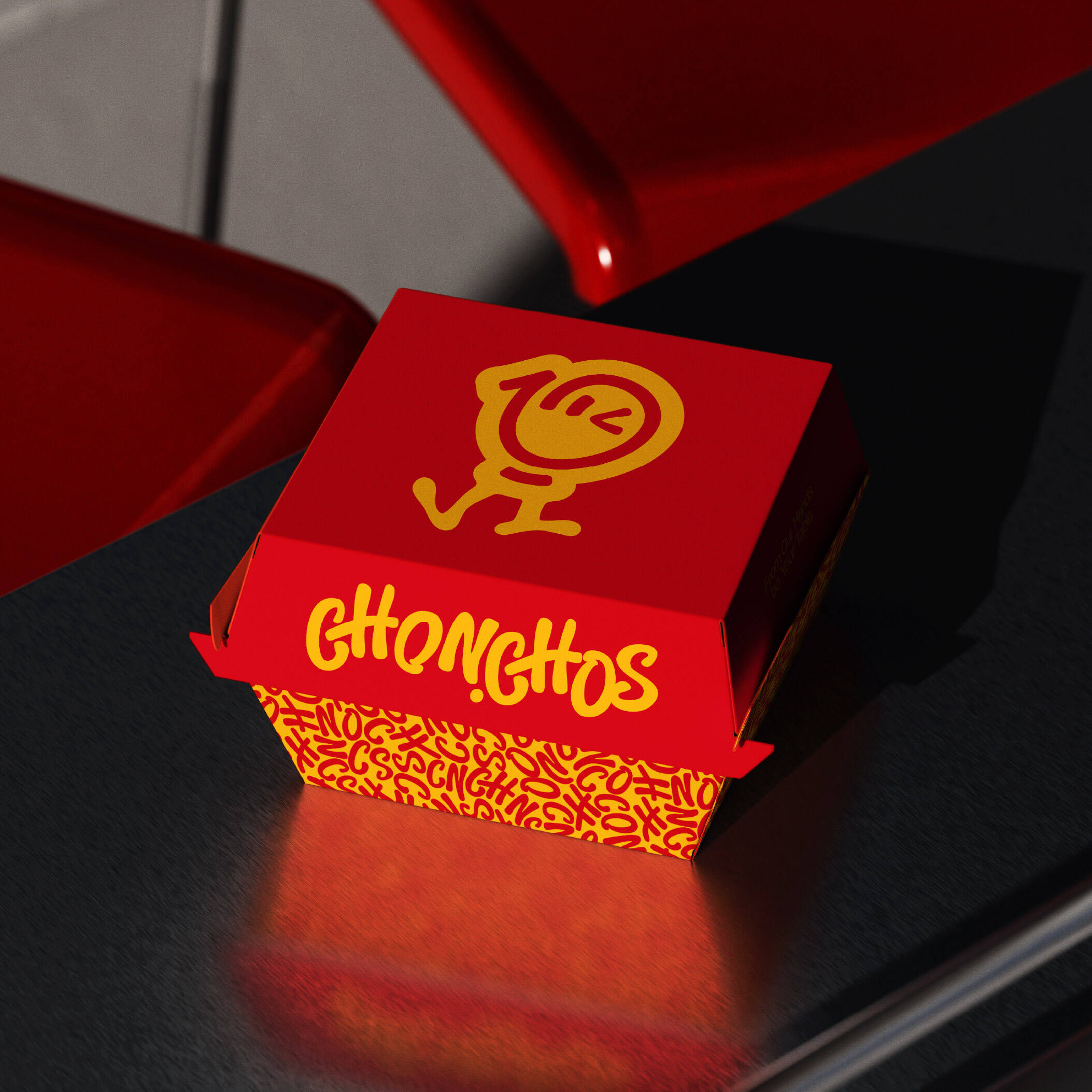
The brand mascot is derived from a stylized pair of hands, symbolizing the care and dedication invested in every stage of preparation, as well as the attention given to every dish before it reaches the customer. More than a visual identifier, the mascot represents CHONCHOS’ commitment to quality, reliability, and the joy the brand aims to deliver with every serving.
The visual identity uses red as the primary color, designed to stimulate appetite while expressing the brand’s energy and bold personality. Yellow serves as an accent color, evoking the golden crispness of French fries—the signature component of Salchipapa—while bringing a sense of freshness, optimism, and excitement.
The logotype is designed using a custom sans-serif typeface with soft, fluid, and expressive forms while maintaining strong legibility. The rhythm of the letterforms creates a sense of continuous movement, reflecting the vibrancy of street food culture and the energetic lifestyle of today’s younger generation.
For CHONCHOS, every dish is more than a quick meal—it is a moment to enjoy, connect, and share positive energy. The brand aspires to become a symbol of modern street food culture: bold in flavor, playful in spirit, full of personality, and always leaving customers wanting to come back.
LOGO CONCEPT
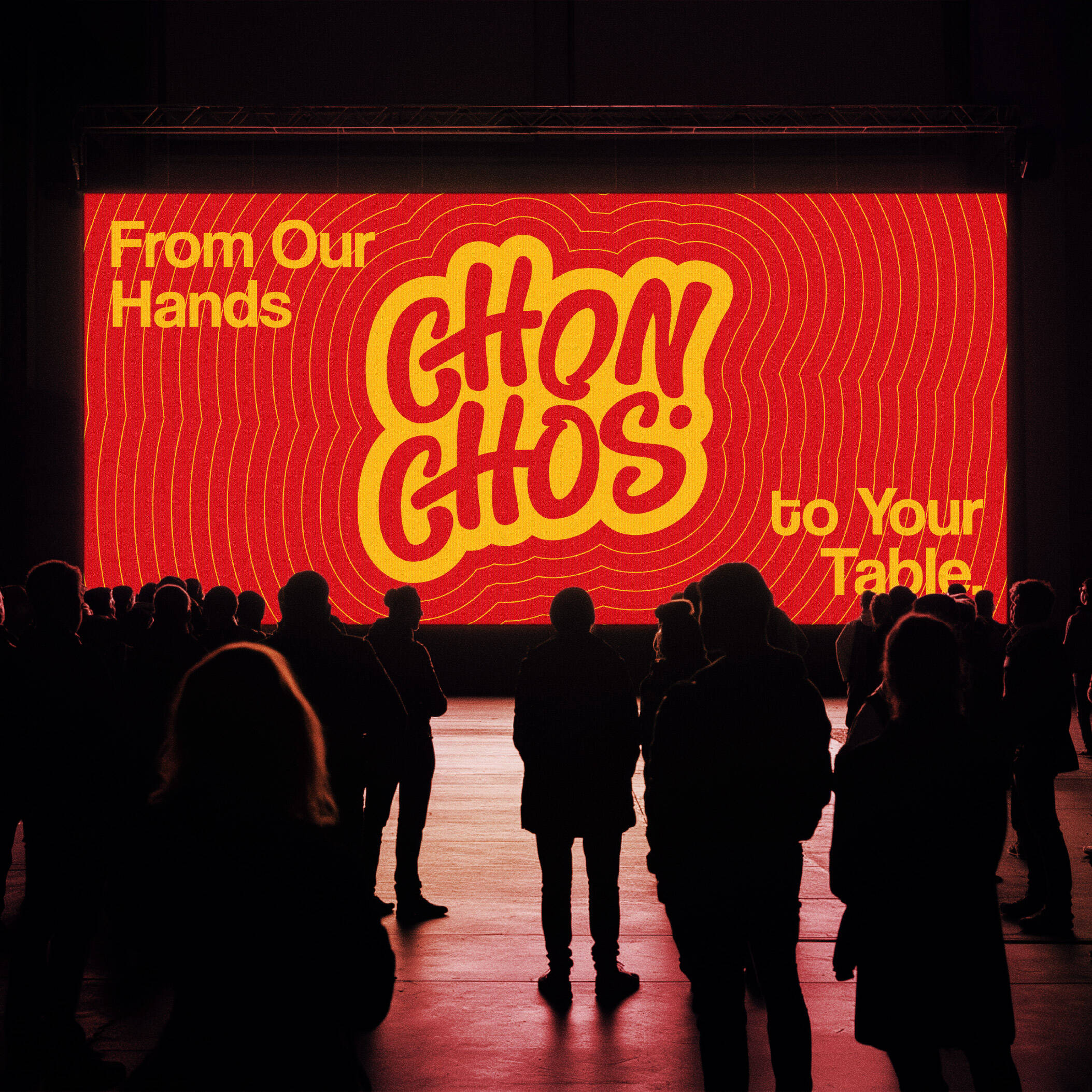
The CHONCHOS logo combines custom typography with a simplified mascot, creating a youthful, energetic identity designed to scale across multiple brand touchpoints.
The logotype uses a customized sans-serif typeface inspired by hand lettering, featuring fluid and expressive strokes while maintaining legibility across different sizes. Its letterforms convey a sense of continuous movement, reflecting the brand’s free-spirited, contemporary, and distinctly street-oriented character.
The symbol is developed from a stylized pair of hands, representing the care invested in every stage of preparation and CHONCHOS’ commitment to delivering quality food directly to customers.
The form is further simplified into a playful mascot with a friendly expression, making the brand more approachable, memorable, and adaptable across packaging, social media, and communication materials.
The combination of bold typography and a distinctive mascot creates an identity that is both recognizable and versatile, accurately reflecting the spirit of CHONCHOS: energetic, flavorful, playful, and modern.
The symbol begins with the idea of a pair of stylized hands and is then simplified into a mascot that embodies a playful and energetic spirit. It represents the care given to every product, the dedication behind its preparation, and CHONCHOS’ commitment to delivering quality food to every customer.
COLOR PALETTE
CHONCHOS uses a color system consisting of one primary color, one secondary color, and two supporting colors, creating a bold and energetic brand presence while maintaining flexibility across different applications.
The combination of hot red, vibrant yellow, and two shades of blue creates a balance between emotional impact, brand recognition, and functional versatility, reflecting the youthful, contemporary, and distinctly urban character of the brand.
The CHONCHOS color palette is built around a balance of emotion and function. The two warm tones—red and yellow—stimulate appetite while conveying energy and enjoyment. The two blue tones introduce depth, trust, and a sense of contemporary urban culture.
Together, these colors capture the personality of CHONCHOS: a youthful street food brand that is bold, flavorful, energetic, yet professional and trustworthy.
The color system not only helps CHONCHOS stand out in a competitive market but also provides flexibility across packaging, uniforms, signage, social media, and digital platforms.
SUPPORTING COLORS
Urban Blue
Urban Blue is introduced to balance the warm tones within the palette while representing trust, professionalism, and brand consistency.
The color also evokes the character of the modern city, supporting CHONCHOS’ positioning as a dynamic street food brand created for a younger generation.
In practical applications, Urban Blue can be used across communication materials, illustrations, digital media, and background elements to add depth and dimension to the visual identity.
Deep Navy
Deep Navy serves as the second supporting color, providing contrast and visual depth throughout the design system.
Its darker tone helps balance the more vibrant colors while improving legibility on light backgrounds and across digital applications.
Deep Navy also represents the stability, quality, and reliability that CHONCHOS promises through every product.
It is particularly suitable for typography, icons, patterns, and interface elements that require visual emphasis without compromising the brand’s youthful character.
TYPOGRAPHY
The typography is developed in a custom sans-serif hand-lettering style, featuring bold, rounded letterforms with a natural sense of movement.
This typographic approach allows the brand to:
Remain highly legible across different sizes
Feel approachable and friendly
Express a free-spirited, youthful character rather than a rigid or corporate tone
Create differentiation from fast-food brands that rely heavily on conventional geometric typography
The continuous curves and strong visual rhythm also evoke the movement of sauces, toppings, and the generous fullness of the food itself, adding an appetizing quality to the overall visual language.
VISUAL IDENTITY SYSTEM
The CHONCHOS visual identity system is designed to create a consistent brand experience across every touchpoint, from digital platforms to physical stores and POSM materials.
Inspired by the rhythm of urban life and Colombian street food culture, the visual system combines dynamic graphic elements, expressive typography, and a distinctive mascot to create an identity that feels youthful, bold, and memorable.
Each component is designed to work flexibly, allowing the brand to maintain consistency while adapting seamlessly across different sizes, formats, and materials.
Through the combination of strong color contrast, dynamic patterns, and contemporary layouts, CHONCHOS communicates a clear Bold – Fun – Urban personality, creating an energetic and appetite-stimulating experience from the very first glance.
GRAPHIC ELEMENTS
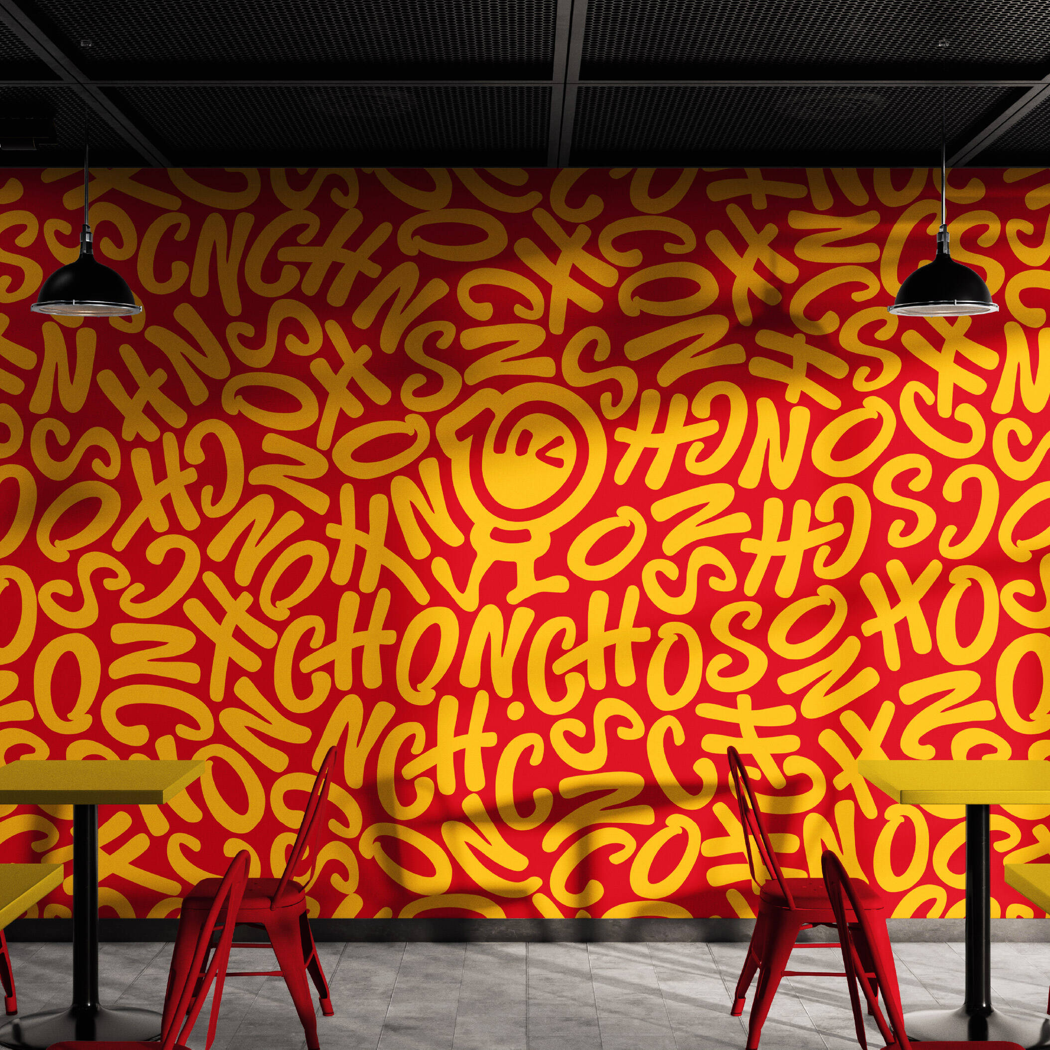
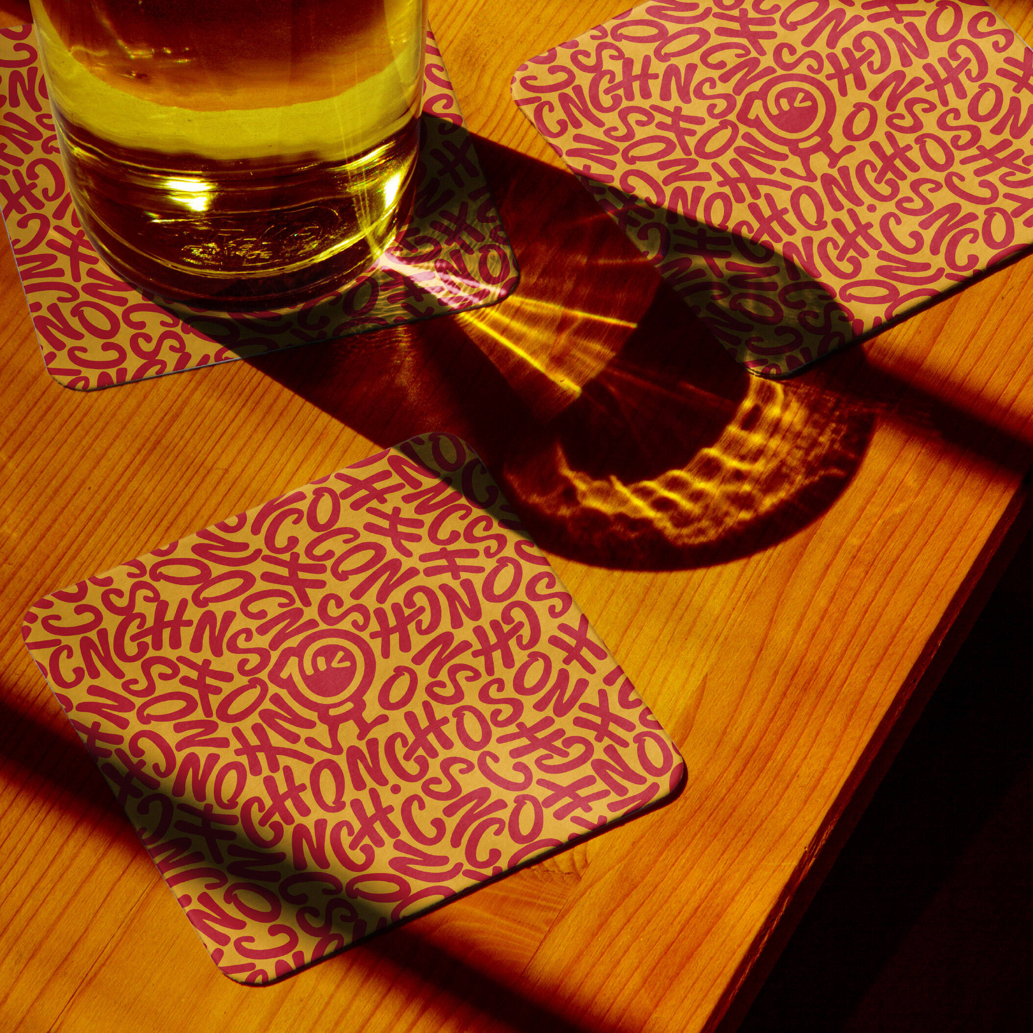
The CHONCHOS graphic system is derived directly from the brand’s core identity elements, including the logotype, mascot, and signature linework.
These forms are restructured into flexible patterns and graphic components, creating a unified visual language across the entire identity system.
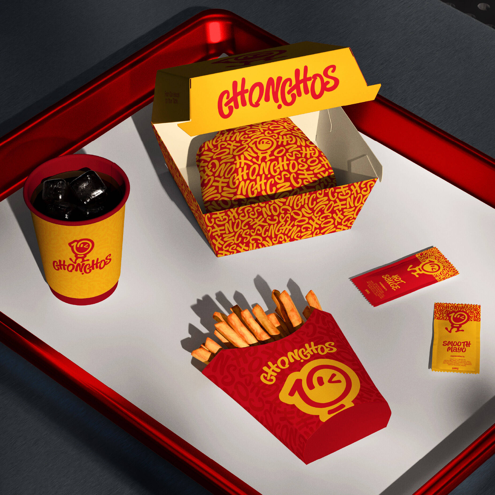
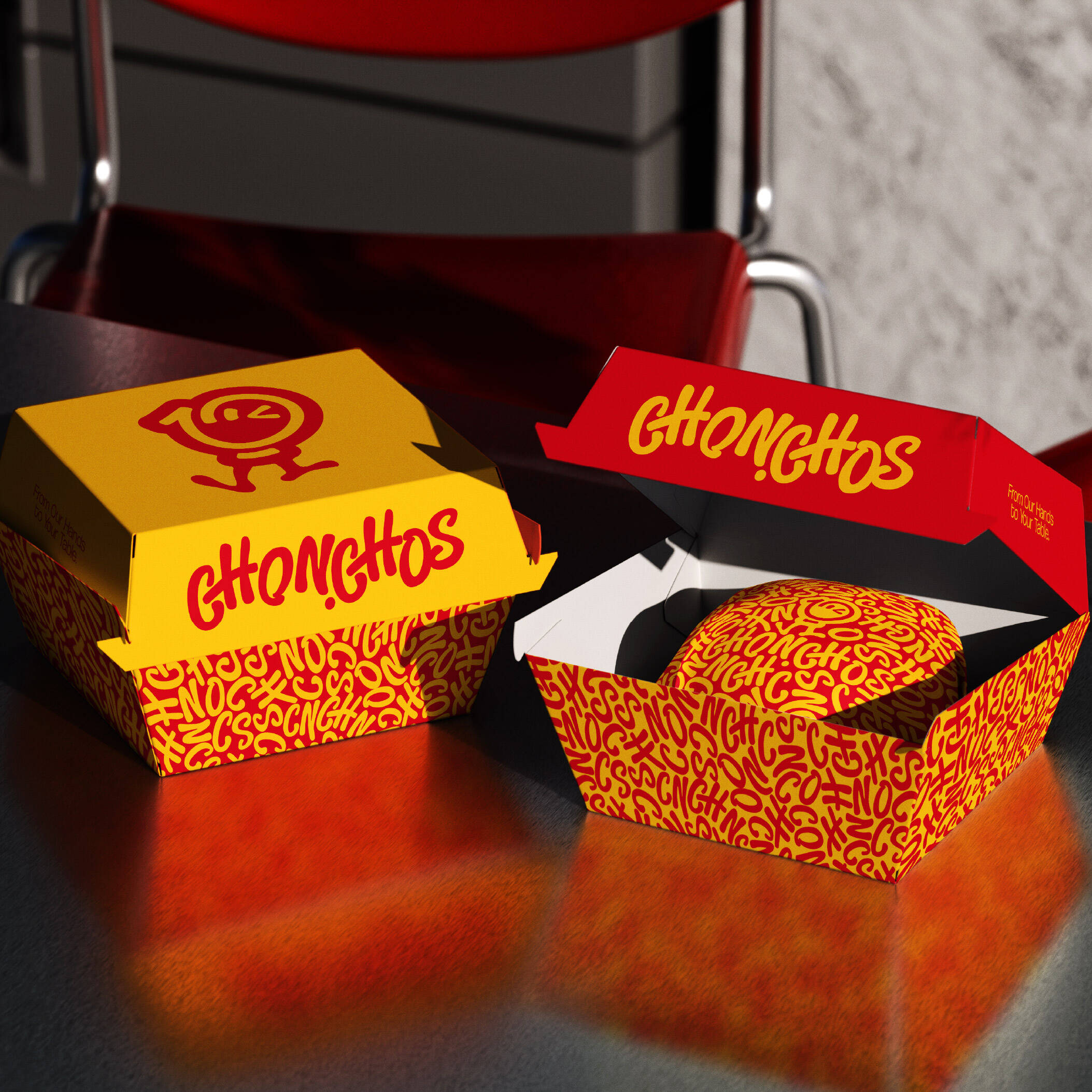
The patterns are created by repeating elements from the typography and mascot in spontaneous, dynamic compositions, capturing the constant movement and energy of street food culture.
This approach allows the brand to maintain a youthful, playful, and highly distinctive character without relying excessively on food photography or literal food imagery.
DIGITAL & POSM APPLICATION
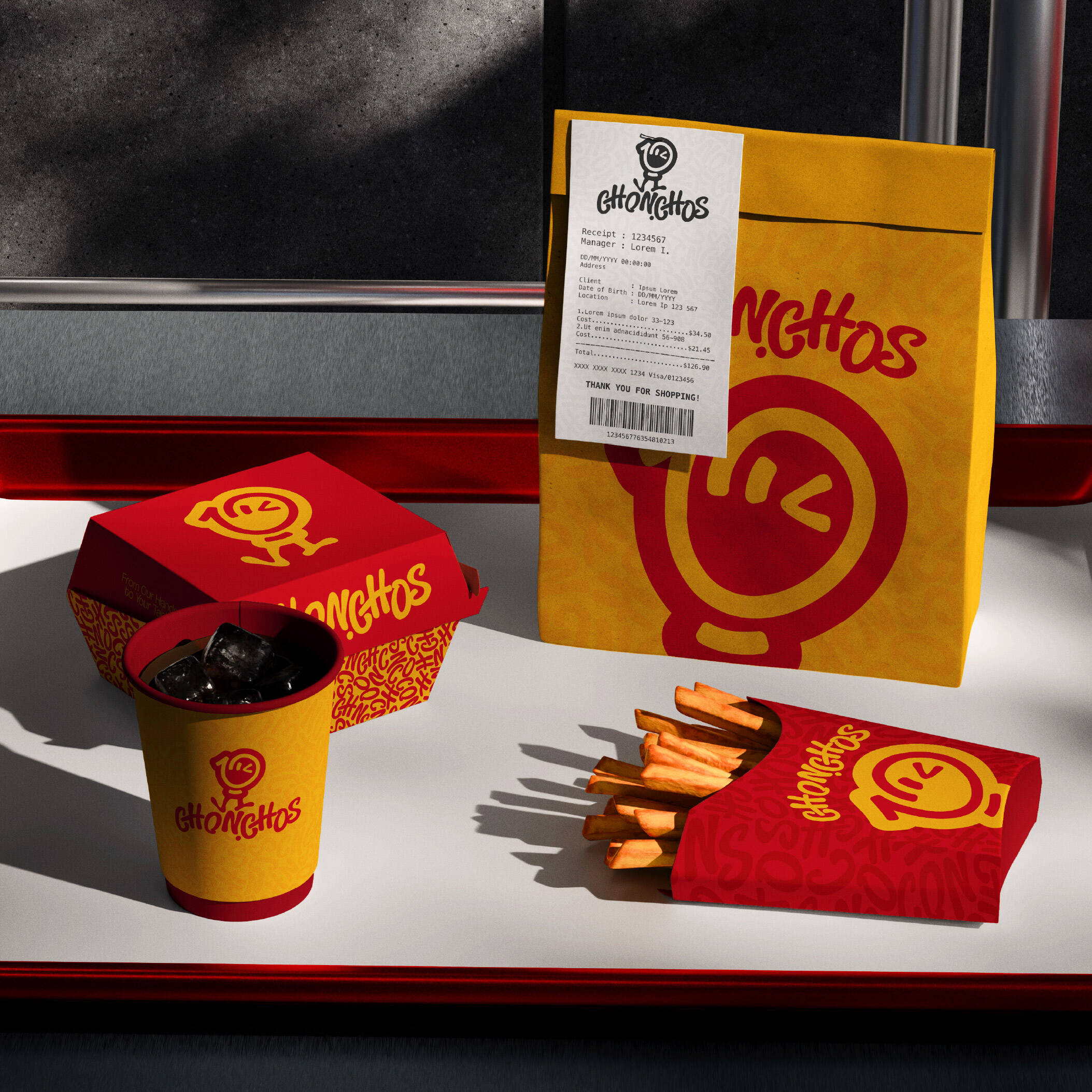
The identity system is designed with a strong focus on practical application, ensuring consistent implementation across both digital platforms and physical point-of-sale materials.
From social media posts, profile imagery, advertising banners, signage, business cards, posters, and menus to packaging and POSM, every application follows the same visual language—defined by vibrant colors, expressive typography, and the mascot as a key recognition element.
This consistency not only strengthens brand recall, but also creates a cohesive experience for customers across every interaction with CHONCHOS.
BRAND EXPERIENCE
CHONCHOS is not simply about creating a logo; it is about building a complete brand identity system capable of delivering a memorable brand experience.
The combination of vibrant colors, energetic typography, a friendly mascot, and flexible graphic patterns allows CHONCHOS to stand out within the highly competitive fast-food landscape.
Whether appearing on a smartphone screen, food delivery app, storefront signage, or takeaway packaging, CHONCHOS retains its distinctive personality while consistently communicating the essence of the brand:
Bold in flavor. Modern in spirit. Full of energy.
This professional campaign titled 'CHONCHOS' was published in Vietnam in August, 2026. It was created for the brand: CHONCHOS, by ad agency: COCKAgency. This Design medium campaign is related to the Food industry and contains 8 media assets. It was submitted about 1 month ago by Creative Director/Branding: Marvis Nguyen.
Credits
Advertising Agency: Vietnam
Art Director: Marvis Nguyen
Copywriter: Marvis Nguyen