

Description
Plural offers short courses in architecture and interior design. It's an open space for teachers from different areas and specialties share their knowledge. By putting talents together, Plural offers an original suite of themes and approaches, resulting in transformative experiences.
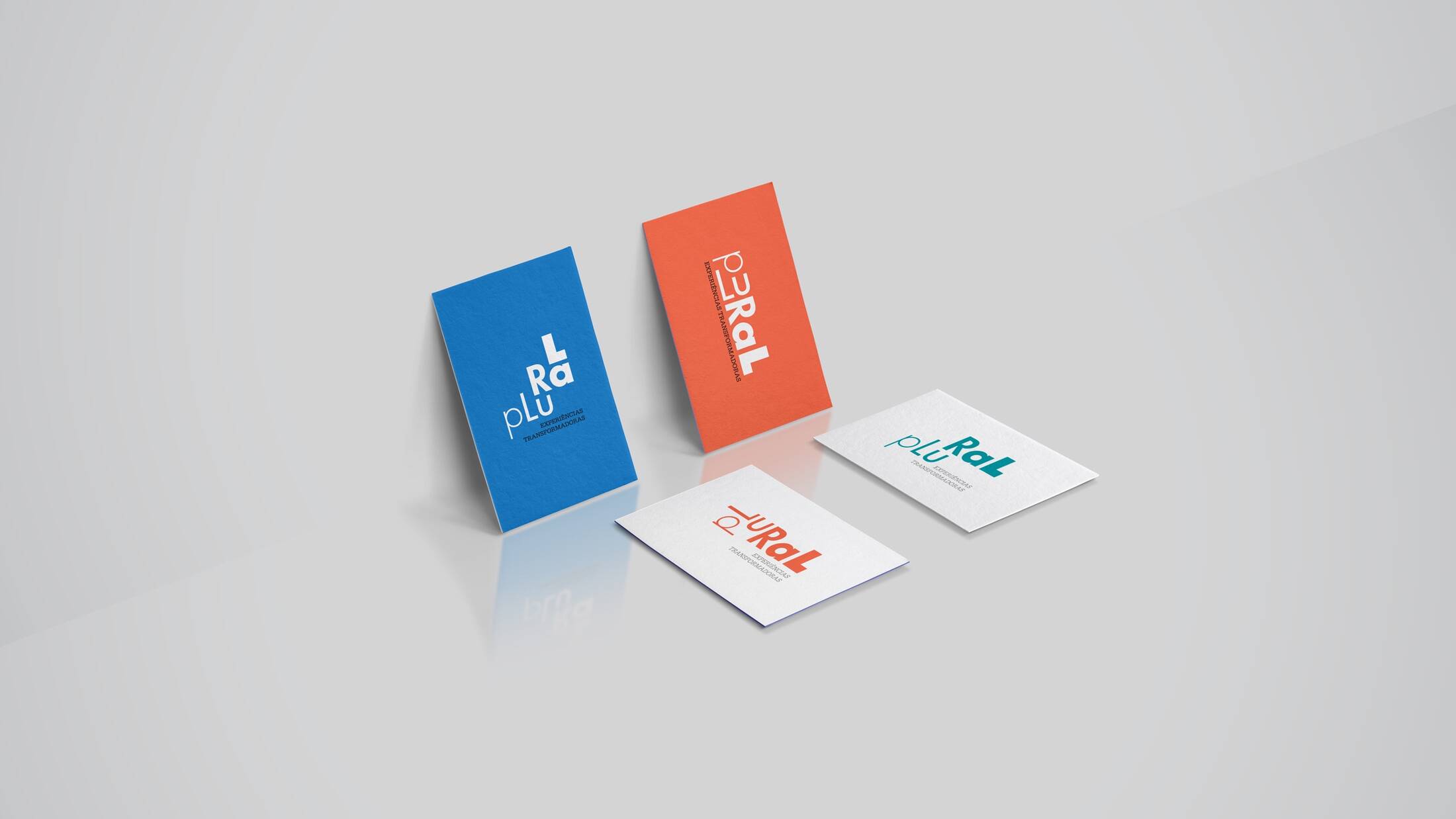
The visual identity is based on three concepts: personal transformation, multiplicity and complementarity. It assembles diverse typographic elements, that together, form a unit. This unity is portrayed on a crescendo, becoming bigger and better with each added element (since each letter is bolder than the previous one). This variation evokes visual movement, and alludes to the student's transformation through the Plural experience.
The result is a dynamic, vivid and highly adaptable brand. The visual signature can be applied in numerous formal and chromatic versions without losing its identity - on the contrary, the more diverse the application, the stronger the brand's meaning becomes.
This professional campaign titled 'Branding Project' was published in Brazil in January, 2019. It was created for the brand: Plural School, by ad agency: Tête-à-Tête. This Design medium campaign is related to the Education industry and contains 7 media assets. It was submitted almost 7 years ago.
Credits
Advertising Agency: Tête-à-Tête, Cascavel-PR, Brazil
Creative Director: Laila Rotter Schmidt Smolarek
Assistant Graphic Designer: Felipe Valenciano Cruz


