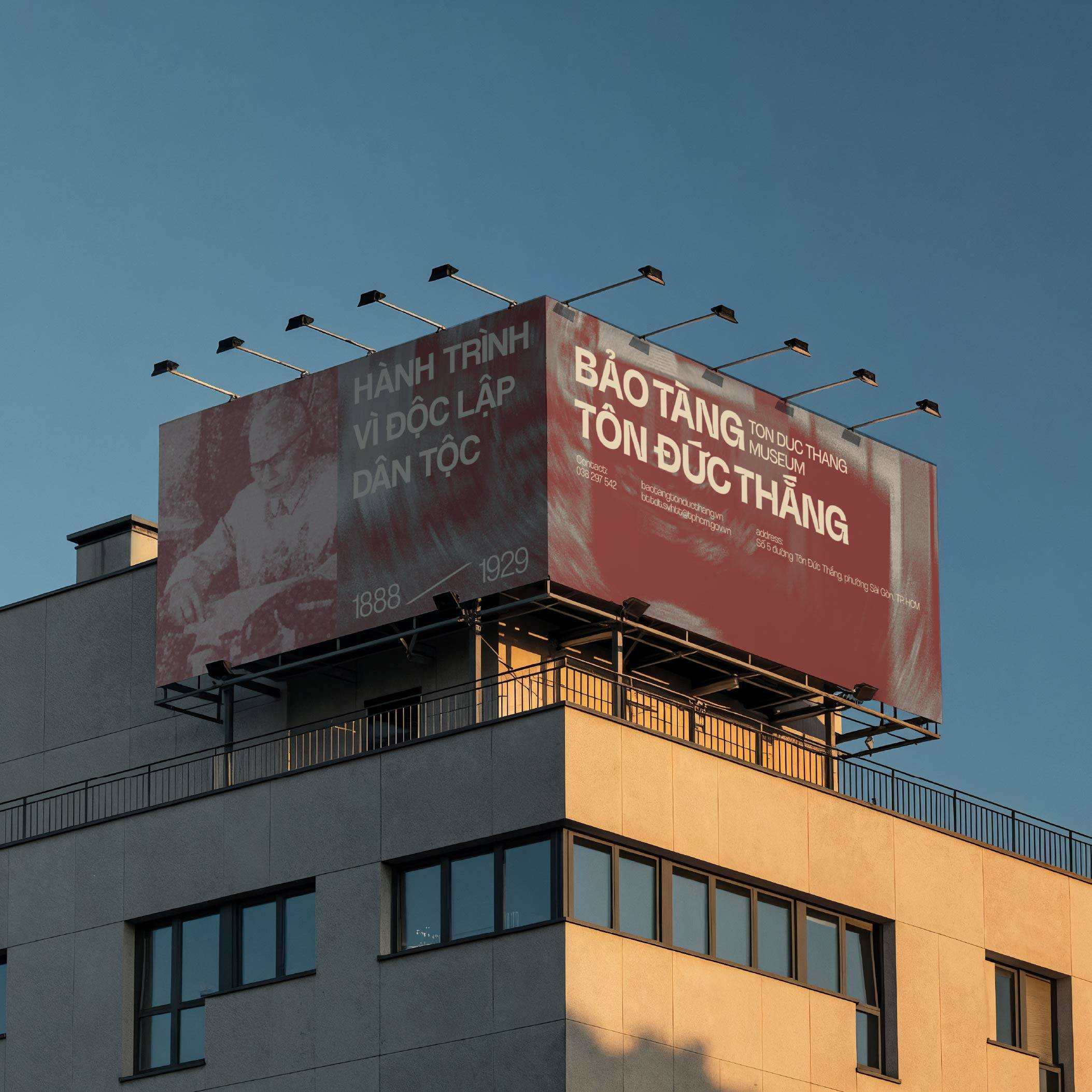
Description
ABOUT PROJECT | GIỚI THIỆU DỰ ÁN
FROM ONE HUMAN BEING – TO A LEGACY OF VALUES
The Ton Duc Thang Museum was established in 1988 to commemorate the 100th birth anniversary of President Ton Duc Thang (1888–1988). Its mission is to systematically preserve and present the life and legacy of President Ton Duc Thang, while contributing to the education of historical traditions, the cultivation of ideals, and the transmission of enduring values to the community and younger generations.
Yet the story of Ton Duc Thang is not simply the story of a national leader. At its heart, it is the story of a man whose journey began with labor.
Beginning as a worker, Ton Duc Thang became closely associated with the labor movement and activities at Ba Son. His journey continued through years of struggle, imprisonment in Con Dao, revolutionary activities, and his contribution to building and strengthening national solidarity.
The Museum’s current exhibition system reflects this journey through five chapters of his life: His Early Years; From Worker to Leader of the Saigon Labor Movement; 15 Years of Imprisonment in Con Dao; A Pillar of National Solidarity; and President of the State. Throughout these chapters, Ton Duc Thang is remembered for qualities such as loyalty, dedication, resilience, humility, and simplicity.
Therefore, the value preserved by the Museum lies not only in its artifacts or historical milestones.
It is the value of humanity.
The dignity of labor.
The resilience to overcome adversity.
The spirit of solidarity between people.
And above all, the commitment to serving the community and the nation.
The Museum does not simply preserve a life.
It preserves the values shaped by that life.
And when these values are retold to generations today, history no longer remains confined to the past. It becomes a living continuum: Formed – Preserved – Connected – Continued.
LOGO CONCEPT
TĐT – A MARK LEFT BY THE WORKER
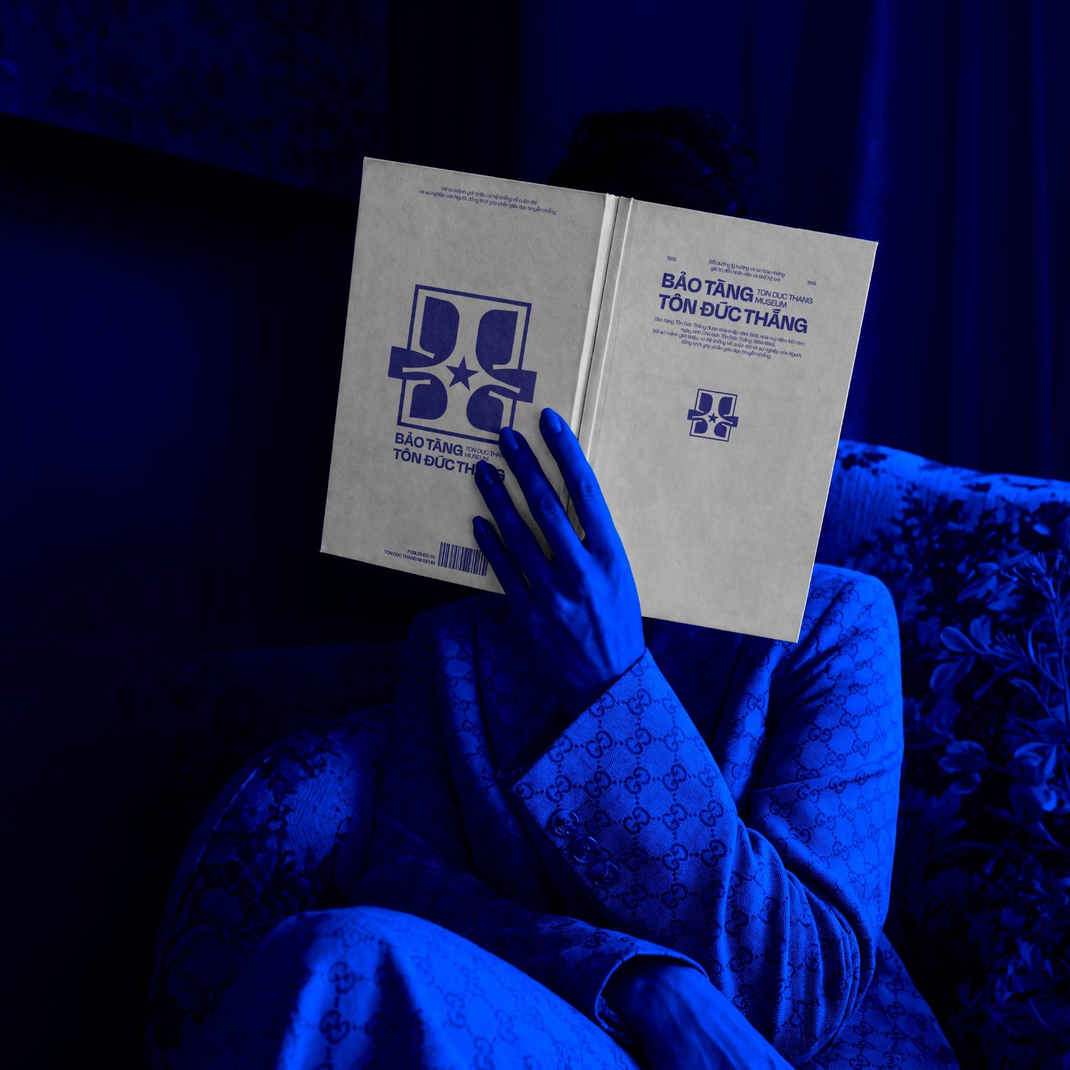
The symbol is developed from the three characters T – Đ – T, the initials of President Ton Duc Thang, restructured into a unified visual form. A strong geometric language is combined with open, dynamic lines to evoke the imagery of labor environments, industrial structures, and interconnected flows.
T recalls the image of Ton Duc Thang as a worker at Ba Son, where he once worked and became involved in the labor movement. The bold strokes within the letterform are inspired by the spirit of the workshop, industrial tools, steel structures, and shipyard spaces — all closely associated with an important chapter of his life.
Đ occupies the center of the symbol. Beyond representing the initial of “Đức,” it is expanded conceptually into Đoàn kết — Solidarity, one of the defining values throughout Ton Duc Thang’s life and legacy. The intersection of geometric forms creates a central point of connection, evoking the spirit of the labor union and the solidarity of workers. The Museum’s current exhibition also dedicates a chapter to his role as a nucleus of national solidarity.
The horizontal stroke running through the entire symbol is perceived as a connecting flow, while also evoking the river, harbor, and Saigon landscape — the setting where the labor movement of the early twentieth century was closely connected to Ba Son and the Saigon Commercial Port.
The star at the center serves as the focal point of the entire structure, representing ideals, the nation, and the values to which Ton Duc Thang devoted his life.
The enclosing frame represents the Museum — a place where artifacts, archival materials, and historical memories are preserved. As the lines extend beyond the frame, the symbol also expresses the idea of bringing these values beyond the exhibition space, allowing them to continue connecting with the community and younger generations. This direction aligns with the Museum’s aim to modernize its communication, enhance visitor experience, and strengthen the connection between heritage and the public.
The symbol is therefore more than simply the letters TĐT. It becomes a visual storytelling system: From the worker – to solidarity - From history – to memory - From memory – to continuity.
The Ton Duc Thang Museum logo transforms the three characters T–Đ–T into a unified geometric structure, where the blue forms not only define the letterforms but also evoke layers of memory associated with the life and legacy of President Ton Duc Thang. The square serves as a frame that preserves and contains history, while the horizontal line extending through the frame represents a continuous flow — connecting people, labor, and generations to come.
The strong, solid structure of the letterforms recalls the image of the worker, Ba Son Shipyard, and the spirit of labor— an important part of Ton Duc Thang’s journey. At the center, the star becomes a point of convergence, symbolizing the imprint he left and the values preserved through time. Together, the elements create more than a visual representation of the name Ton Duc Thang. They form an expandable visual system that traces a broader narrative: From the worker – to Ba Son – to Saigon – to the Museum – and onward to future generations.
The mark becomes more than a monogram; it becomes a visual structure of memory, labor, and continuity — connecting the history preserved within the Museum to the generations that carry its values forward.
HỆ THỐNG MÀU SẮC | COLOR SYSTEM
Based on the color direction previously communicated by the Ton Duc Thang Museum in its identity development materials, the three colors can be named in a concise, systematic way that directly connects to the Museum’s narrative.
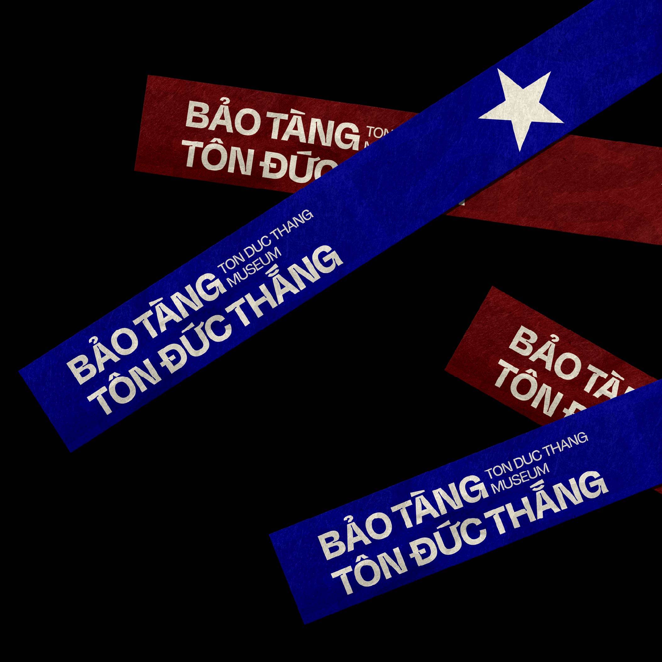
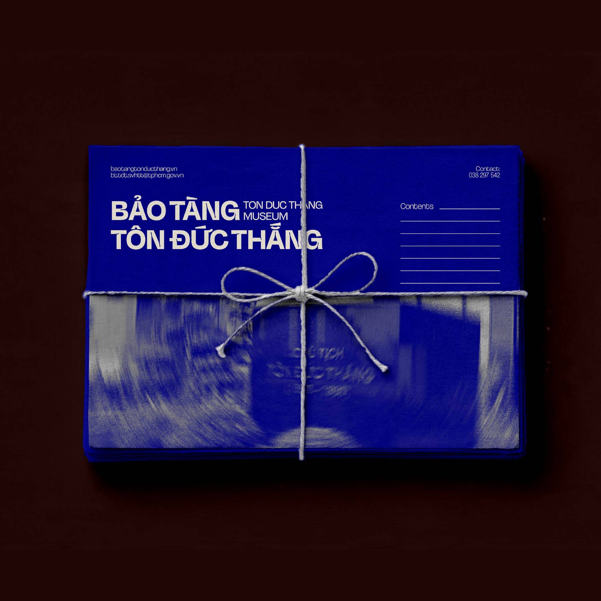
The Museum defines red as representing ideals and dedication, blue as representing the working class and the enduring spirit of labor, and yellow as representing national tradition and historical values.
WORKER BLUE — HEX #181893
The Worker Blue
Evoking the image of the worker, labor, and Ba Son — where Ton Duc Thang once worked and became involved in the labor movement. The name also directly reflects the Museum’s stated color direction: blue represents the working class and the enduring spirit of labor.
DEDICATION RED — HEX #7E2729
The Dedication Red
Expressing the spirit of dedication, ideals, and action, while providing a strong visual accent across the identity system. The name directly reflects the Museum’s interpretation of red as representing “revolutionary ideals and the spirit of dedication.”
HERITAGE IVORY — HEX #F4EFDF
The Heritage Ivory
Ivory serves as the foundational tone of the system, evoking a sense of quietness, preservation, and the passage of time— qualities that reflect the Museum’s role as a space for preserving and transmitting historical values.
TYPEFACE
The typeface is a custom display typeface designed exclusively for the Tôn Đức Thắng Museum, developed from the same geometric language as the logo. Rather than simply adapting an existing font, each letter is constructed as part of a unified visual system — carrying the same solid forms, straight lines, proportions, and modular structure found in the T–Đ–T symbol.
The letterforms are built with a balance between strength and simplicity, reflecting the visual character of the logo while creating a distinctive typographic voice for the museum. Repeated geometric elements establish a consistent rhythm across the alphabet, allowing the typeface to feel like an extension of the identity rather than a separate graphic element.
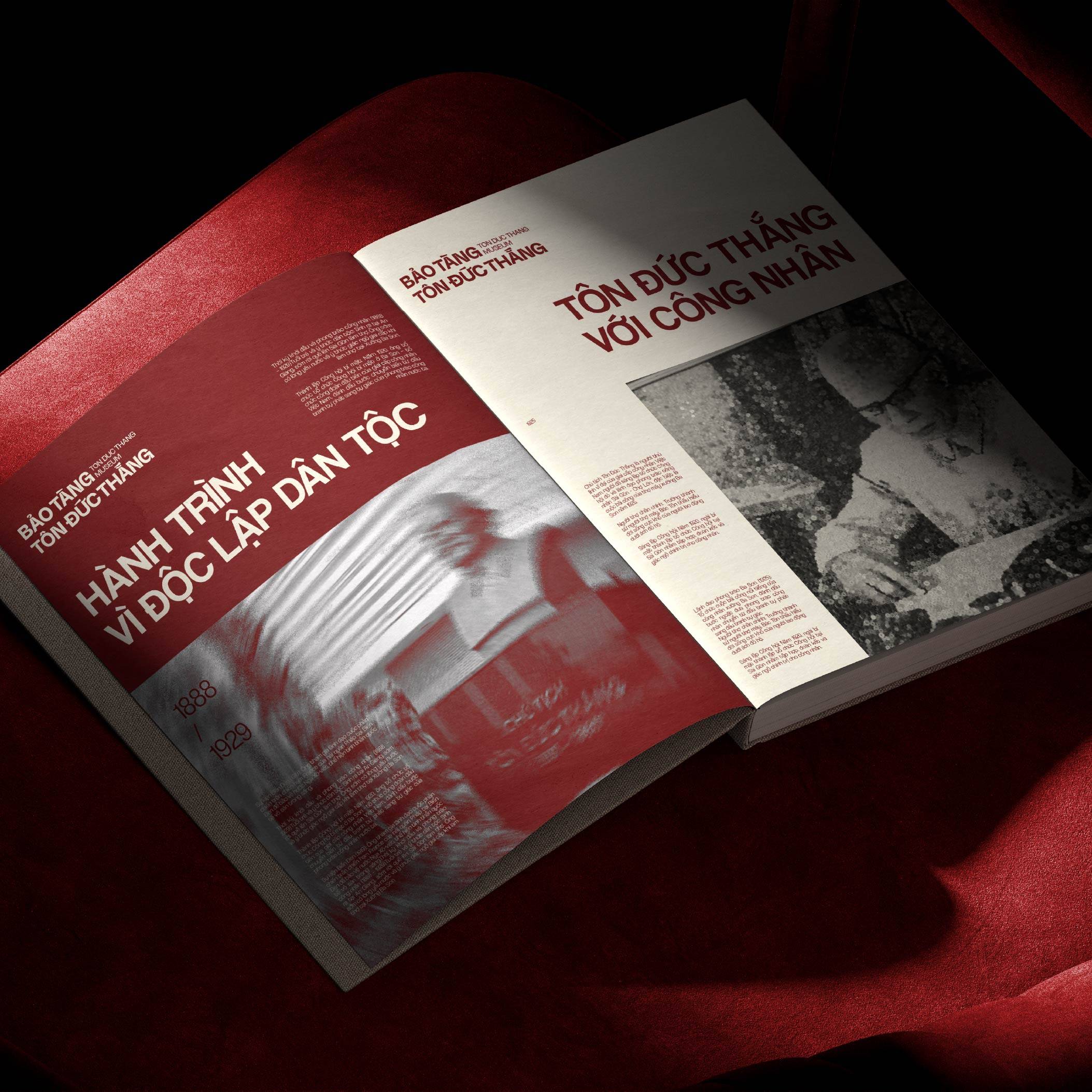
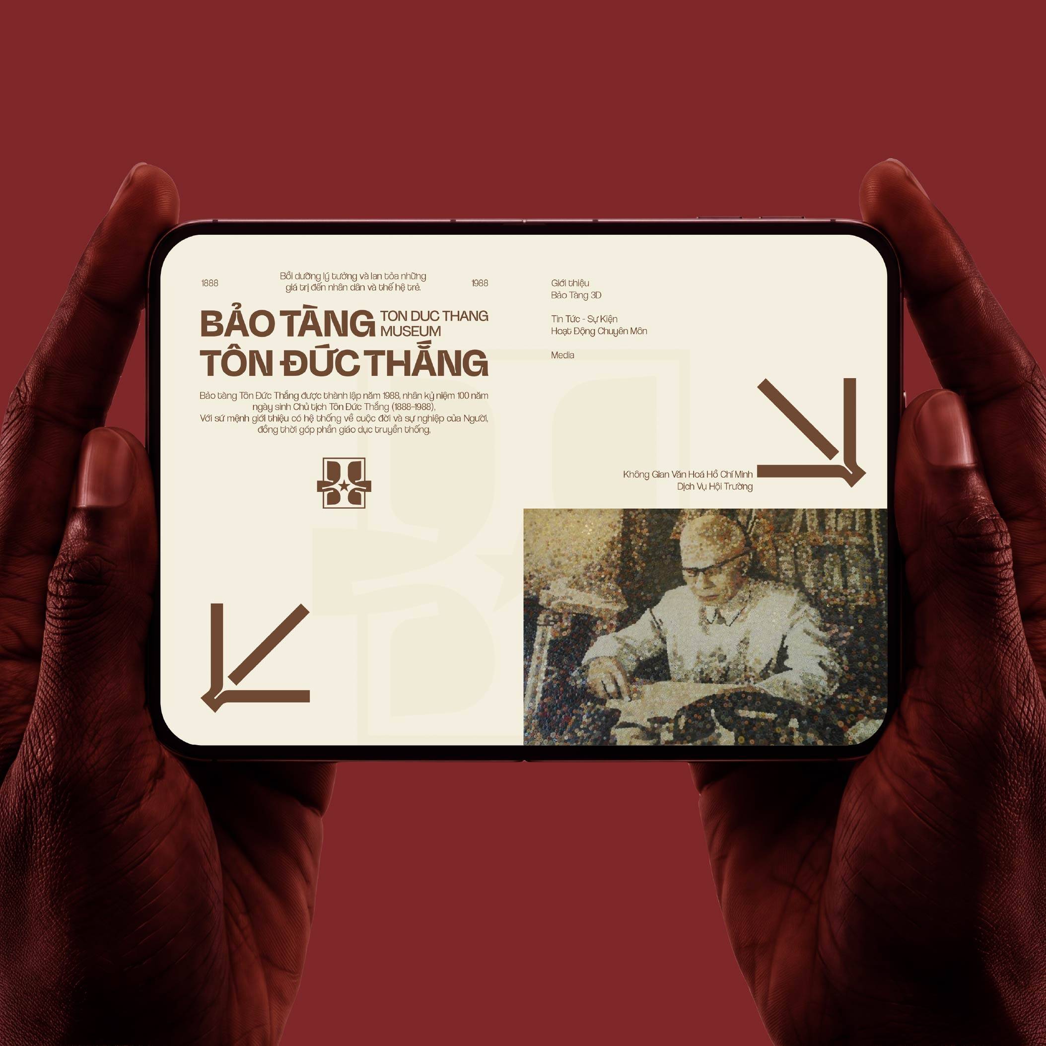
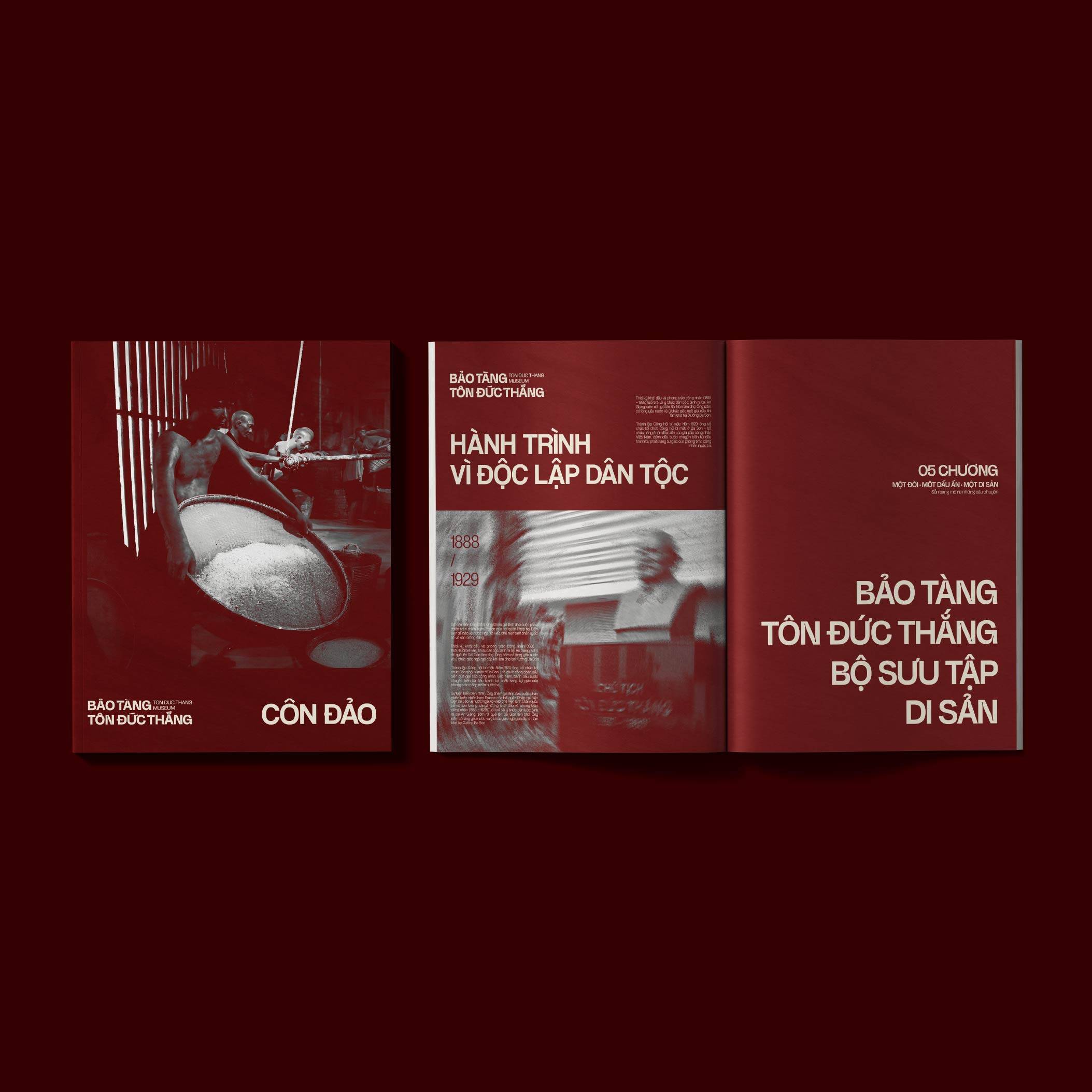
Together, the custom logo type and display typeface form a unified visual language — transforming the structure of T–Đ–T into typography that is recognizable, contemporary, and adaptable across the museum’s signage, exhibition titles, publications, communication materials, and digital applications.
GRID SYSTEM | HỆ THỐNG LƯỚI ĐIỆN
20 × 8 — A Grid Built from Memory
The grid system of the Ton Duc Thang Museum is developed from a 20 × 8 structure, inspired by the August 20 birth date of President Ton Duc Thang. This number is transformed into a modular grid that provides a unified foundation for organizing imagery, typography, and content throughout the entire identity system.
The 20 columns and 8 rows create a flexible framework that can accommodate everything from simple layouts to complex information structures. Modules can be combined, expanded, or cropped to adapt to a wide range of formats — from books, catalogues, posters, and brochures to digital applications and exhibition spaces.
The grid system not only establishes order and consistency, but also becomes a layer of meaning embedded within the identity: a date from history is transformed into a structure for telling history.
MEMORY — STRUCTURE — EXPERIENCE
DISCIPLINE
The grid establishes a unified structure that organizes imagery, typography, and information with clarity — reflecting the Museum’s role in preserving and communicating historical records.
FLEXIBILITY
Built upon the same 20 × 8 system, modules can be combined or subdivided to create a variety of layouts while maintaining a consistent visual language.
CONTINUITY
Each module functions as an independent unit, yet when brought together, they form a complete whole — much like the way documents, stories, and memories are connected to form an ongoing historical narrative.
VISUAL IDENTITY SYSTEM | HỆ THỐNG NHẬN DIỆN THỊ GIÁC
From Symbol to Identity System
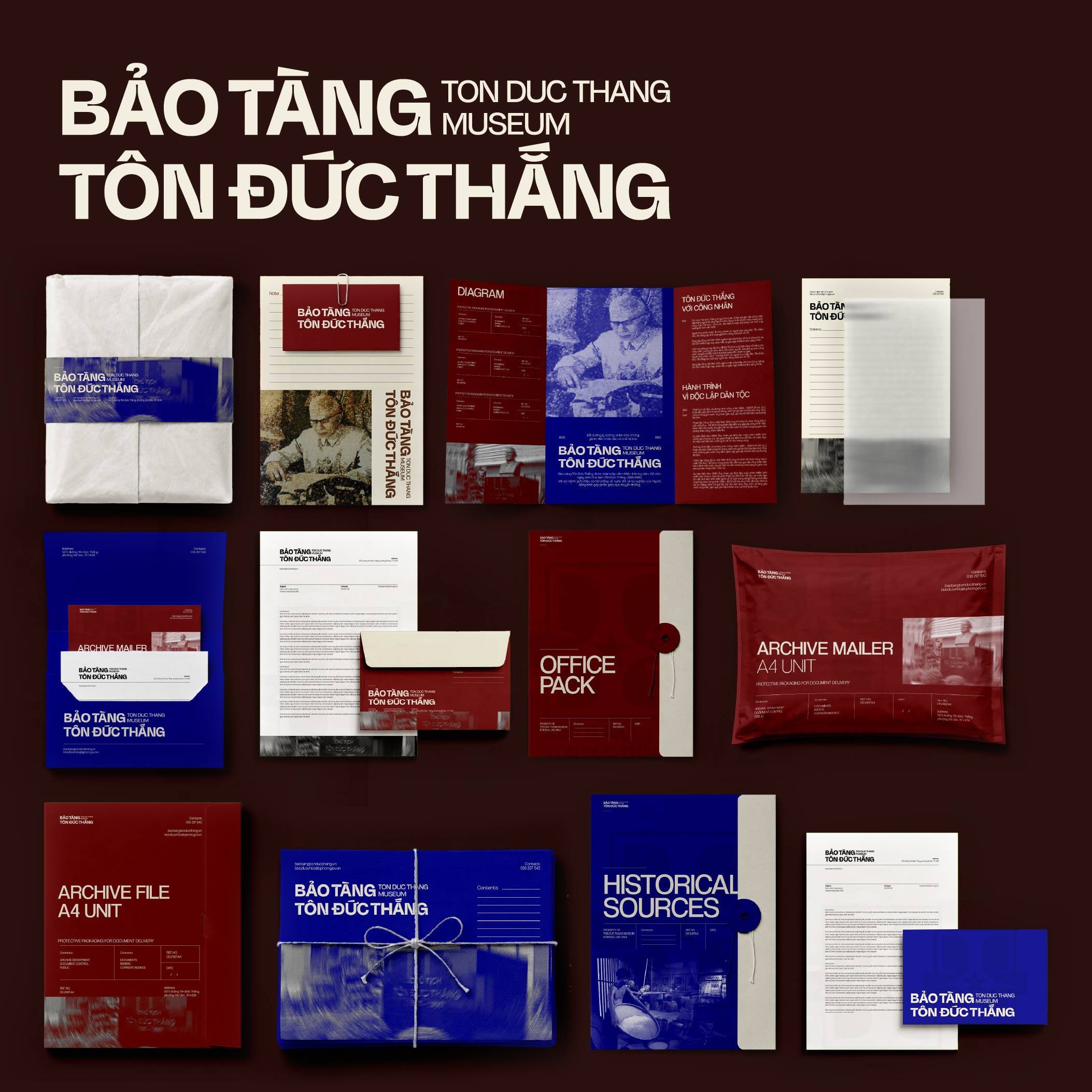
The visual identity system of the Ton Duc Thang Museum is developed directly from the geometric structure of the T–Đ–T symbol, transforming the logo’s geometric forms, horizontal lines, and square frame into a cohesive graphic language across the Museum’s various touchpoints.
Rather than creating a separate pattern, the system draws directly from the DNA of the logo. Geometric elements can be separated, extended, enlarged, or cropped to create different levels of visual expression — from subtle details on stationery to large-scale compositions across posters, publications, digital applications, and exhibition spaces.
This visual language also reflects the layers of meaning embedded in the story of Ton Duc Thang: the worker – Ba Son – labor – connection – preservation – continuity. Horizontal lines can evolve into continuous flows, evoking the harbor, the waterways of Saigon, and the idea of connection. Meanwhile, square structures and solid geometric forms create associations with architecture, workshops, industrial structures, and spaces that preserve collective memory.
LOGO — MODULE — PATTERN — COMPOSITION — EXPERIENCE
The system is built upon three core principles:
CONSISTENCY
Every pattern and composition is developed from existing structures within the T–Đ–T logo. Proportions, lines, and geometric forms remain consistent, ensuring that each application — despite its variations — maintains a recognizable connection to the Museum’s visual identity.
FLEXIBILITY
Logo-derived modules can be separated, combined, enlarged, reduced, or cropped, allowing for a wide range of compositional possibilities. This enables the system to adapt seamlessly across stationery, documents, posters, exhibitions, physical spaces, and digital platforms.
CONTINUITY
Geometric forms and horizontal lines are developed as continuous visual movements, representing the journey from worker to legacy, from past to present, and from the Museum to future generations.The logo is therefore not simply a static mark. It becomes a dynamic visual system capable of continuing and expanding the story of the Ton Duc Thang Museum across every touchpoint.
GRAPHIC ELEMENTS | YẾU TỐ THỊ GIÁC
The graphic system of the Ton Duc Thang Museum is developed directly from the brand’s core identity elements, including Type, Symbol, and distinctive linework. These visual forms are restructured into flexible patterns and graphic components, creating a cohesive visual language that extends consistently throughout the entire identity system.
This professional campaign titled 'Bảo Tàng Tôn Đức Thắng | Branding' was published in Vietnam in November, 2026. It was created for the brand: Bảo Tàng Tôn Đức Thắng, by ad agency: COCKAgency. This Design medium campaign is related to the Retail Services industry and contains 8 media assets. It was submitted 1 day ago by Creative Director/Branding: Marvis Nguyen.
Credits
Advertising Agency (School): COCKAgency
Production Company: VietNam
Art Director: Marvis Nguyen
Copywriter: Marvis Nguyen