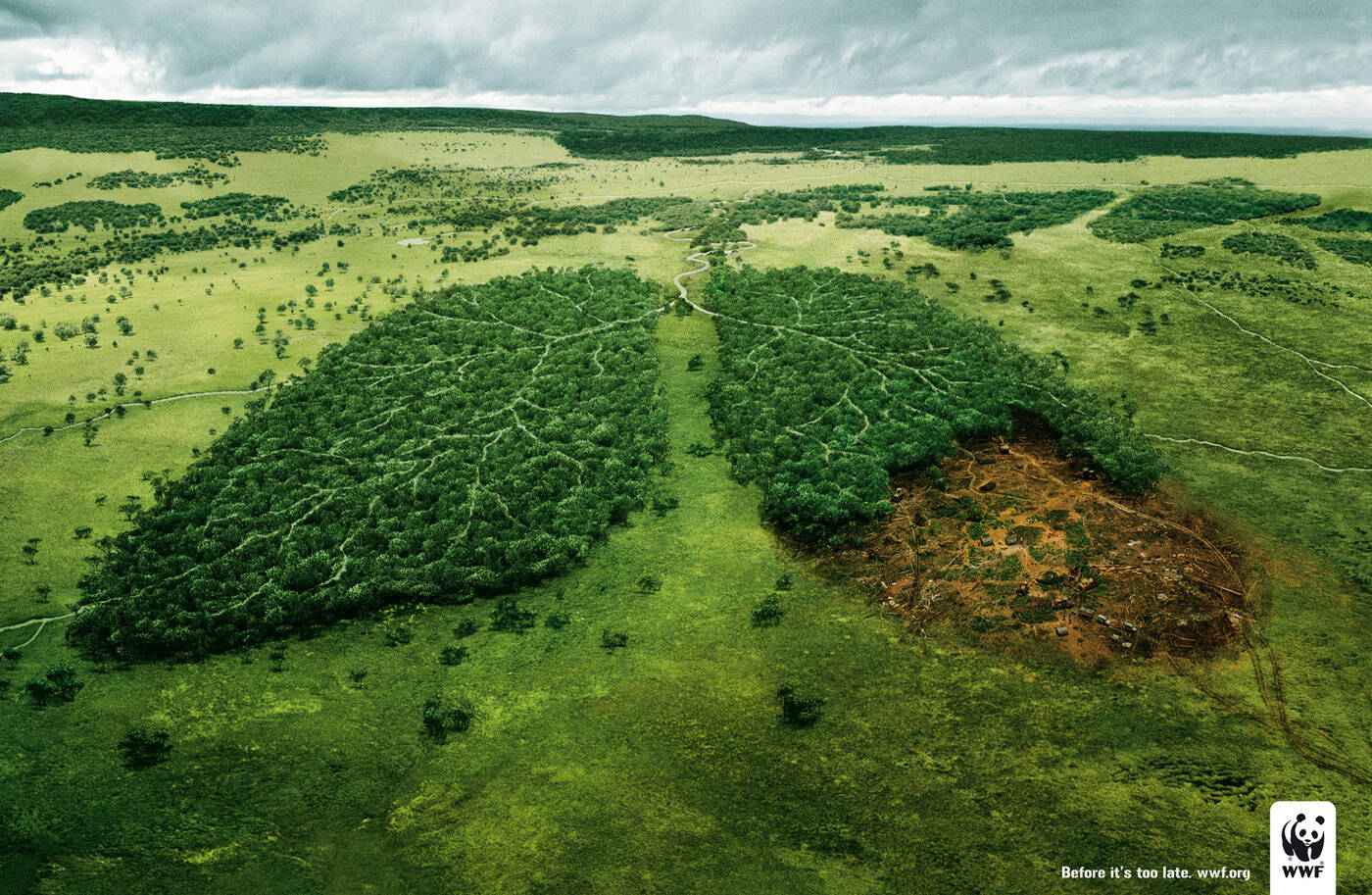
Description
Print advertisement created by TBWA, France for WWF, within the category: Public Interest, NGO.
Before it's too late.
Executive Creative Director / Creative Director: Erik Vervroegen
Copywriter: Nicolas Roncerel
Art Directors: Caroline Khelif, Leopold Billard, Julien Conter
Account Supervisor: Laurent Lilti
Highest Rated
Heck, why not skip the whole ad and save some trees!!!!
(haha, more points......)
My first thought at this is to say that students can't do tabasco sauce or condom ads, so can we give this client a break? But, this is a really beautiful execution. Nice job.
--
brandon

Great! but terrible and very ordinary tagline.
Skip the strapline. The visual is self-explanatory. The WWF logo does the ncessary pay-off work.
Maybe it's already too late. (Good Art Direction tho)
http://adsoftheworld.com/media/tv/public_awareness_global_warming
Perfectly executed. But the idea is definitely first thoght. And the tagline is really weak.
I'd expect more from these creatives.

it was even done in greece before for the fires in athens 2 yrs ago...
but yes the artwork is nice.


Similar ad ???? What kind of beer you drink????

share your drugs!

Done done done.
Look link "Brasília Shopping". Google it.
Nice, but the devastation is harder than this.

I made these ads with a similar concept/tagline a year ago - check them out http://www.youtube.com/watch?v=8mexqOWZxPs

What is it with you lot....the minute a good Ad appears you all rush to say "it's been done" , "it's a first idea" blah blah blah,
So what the message works for this campaign because like the one that it's apparently copied the idea is generic so it can be used!
It's also beautifully done, it's strong and clear....and you don't need to put a great Tagline with it because what needs to be said is shown!!!!
I agree with you on a certain level. I'm also tired of hearing those "catch phrases" on this site! I wish people would come up with some constructive criticism. That being said, I love the ad, but feel that it might be lost on a percentage of the public who are not familiar with the World Wildlife Foundation... When I first looked, I thought it was an anti-smoking campaign or for lung cancer. Even considering that I have donated to WWF for the last few years. Just my first reaction though. Still some amazing art!

Those bums like to puff their chest, because they will never amount to anything more than a designer for their local city paper.
If the people who did all of the talking were in a creative meeting with a copywriter or as a group with the client(s) and they were asked to give their idea, they would probably claim anxiety disorder and ask to be excused to go home.
If these loudmouths were given two photos to color correct and extract from the background, they would probably resort to a tutorial site and constantly ask the creative director if they were doing it right.
If these nobodies were asked to work more than eight hours to finish a campaign, they would probably break down in tears and ask for their mommy.
If these wannabe-creatives were given a job to have done with a tight deadline, you would probably hear the next morning that they took their own...ahh, what the heck. You all get where I am going.
I agree with you about the bums and about the ad itself. :)
I agree with you
what an excitement.
actually most like your work here... it is not blasphemic, if some don't regard it as perfect.

wwf ads coming out? it must be time for Cannes

I thought Erik Vervroegen left TBWA Paris one year back. When did he join back?
"Released: April 2008"
I thought guests happened to make smart comments...
Tagline is weak but the art is pretty good actually.
CG

oh ... not bad... !!

i feel like i've seen this idea (especially lately) a lot. and ads for thei client NEVER tell me anything new. done expressly for the purpose of awards shows.
I like it a lot, i luv it, but I agree, you can lose the tagline. Congrats!

Part of the problem here is that all the commentary here is actually first level...possibly along with the idea shown in the ad itself. I find it amazing how the only solution that people all too often have with ads like this is, "please, no more WWF ads!" or "no more condom ads!" or whatever. How about a constructive, strategic comment like, "the problem with this ad and ads like this is that it shows nothing new about the idea of the loss of trees and greenspace, and therefore nothing new and intriguing about what the client has to say to the world."
In a nutshell, this ad works in the same way as a manic street preacher showing up on the same street corner, uttering the same ramblings over and over again. Or the telemarketer calling the same potential customer with the exact same annoying sales statement at the exact same time on the exact same day of each week.
The problem with this ad isn't with the client, it's with the idea.
Great idea. Great visual... I think the copy is strong enough.
I think there's no need for the copy. The visual is strong and clear enough. Good concept.

Things that looks like other things. C'mon, this is very old. Forget about the agency, and consider just the idea: it's an old idea and execution.

I like it. After reading the comments.. yeah, maybe it's something that looks like something else.. maybe it's an ad that's saying the same thing it has before.. maybe a bit alarmist.. but, metaphor, truth, and urgency, they all have their place.
I love the environment, but this doesn't make me want to go tie myself to a tree. Like smoking ads, if you want to cause change, you need something drastic, something face-slapping, like a bloodied panda bear in the crosshairs of a poacher's rifle because he doesn't have anywhere to hide anymore.. this doesn't stab me in the heart. But I think it looks cool. And WWF probably liked it. So that's good.
I don't want to be negative, but with condoms ads and this one, TBWA Paris is far to be at his best this week...
Just an opinion. I mean, what might have been good coming out from many agencies just doesn't fit to TBWA.
Wake up guys !
before it's too late

정말 마음이 많이 아파요. 어떻게 저렇게 아름다운 자연을 훼손시킬수 있는지..
또한번 많이 느끼고 갑니다.

If this ad won any international award, there's only one explanation: lobby.
I expect more from tbwa paris.
Just a regular idea, well photographed
Agreed. No need for the copy. And even less for the visual.
Heck, why not skip the whole ad and save some trees!!!!
(haha, more points......)
reminds me of this nice outdoor from Saatchi Paris :
http://lalbumnpo.files.wordpress.com/2007/05/wwfpapersave.jpg

Great campagnable idea.
No need for copy.

obvious and weak
very nice!great!

sorry but its a cartoon idea and first thought also sorry for tbwa paris.
you have to much much much ideas with your big big big budget!!!

sorry but its a cartoon idea, i expect better from tbwa paris. sorry guys but use your big big big budget for much brilliant ideas!!!

What are the dimensions of this poster ?
This is probably one of the best print ads I've ever seen. Beautiful Artwork!