Description
OVERVIEW
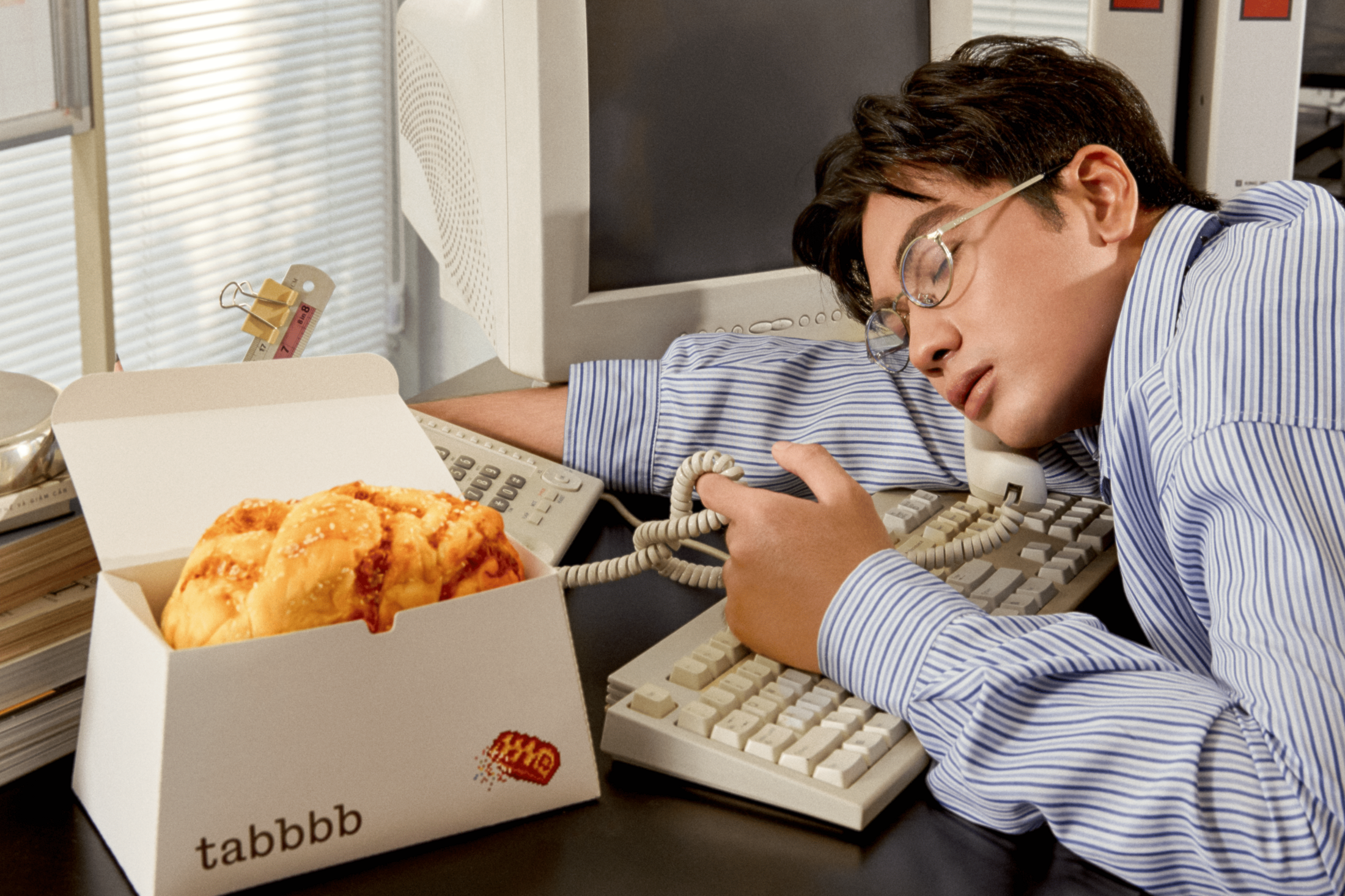
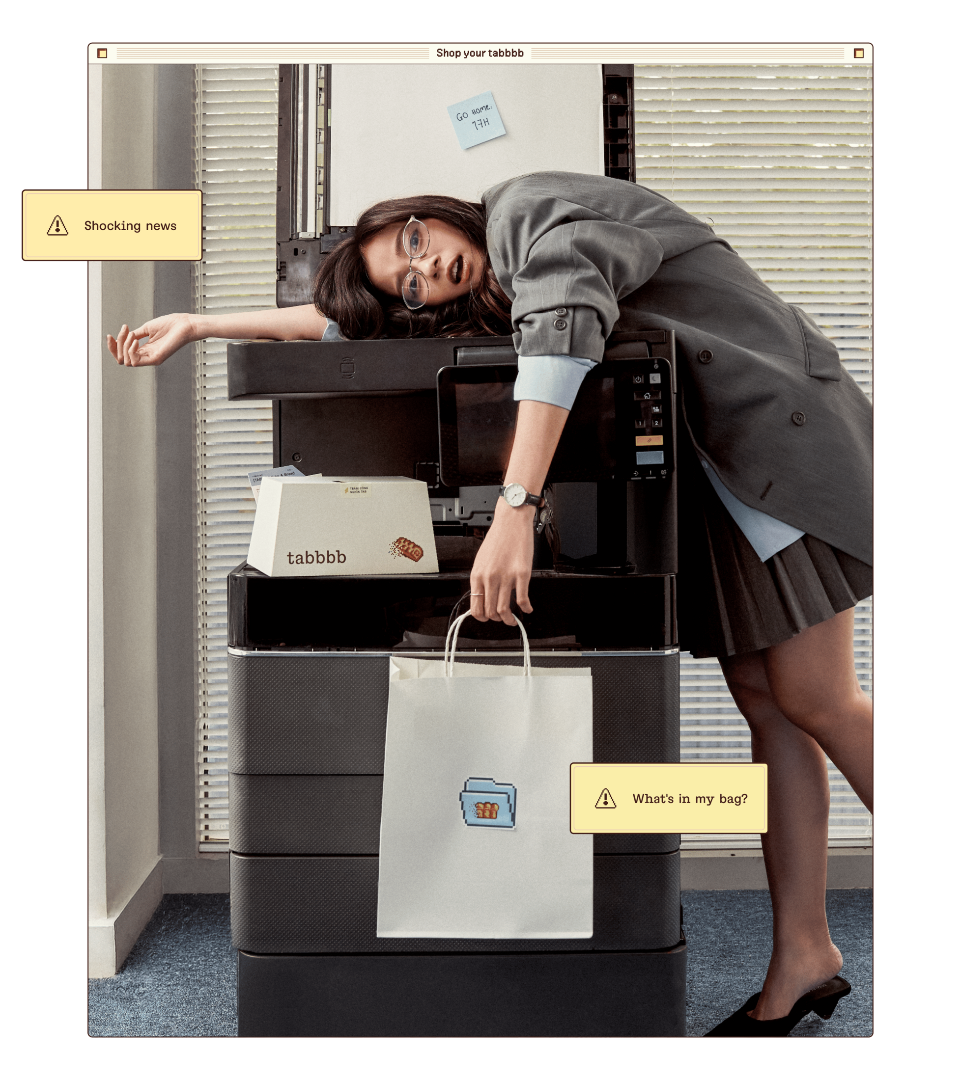
We all know the mid-workday slump: every email feels urgent, the clock barely moves and the to-do list refuses to shrink. TABBBB, an online bake shop and creative venture by M — N Associates, gives office workers a delicious reason to pause. The idea is simple: Take A Bread. A little wordplay on taking a break, built around the browser tabs and Tab key that fill our working days.
Made for Vietnamese offices, where midday breaks already bring naps, chats and snacks, TABBBB turns multi-flavour brioche into a small act of everyday escapism. The brand brings the familiar language of work into a warmer world of bread, butter and better breaks.
SCOPE OF WORK
Brand Strategy
Brand Identity: Naming, Brand Design System, Collaterals & Packaging, Motion & Photography, Digital Experience, Promotion Design, Custom Typeface, Guidelines
Website: https://tabbbb.com
NAMING & LOGO
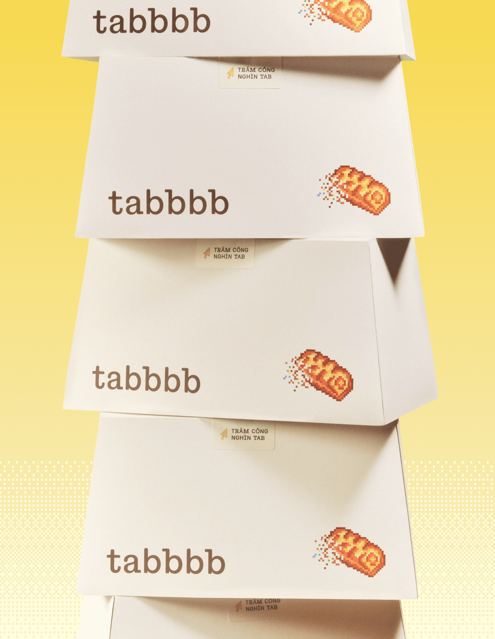
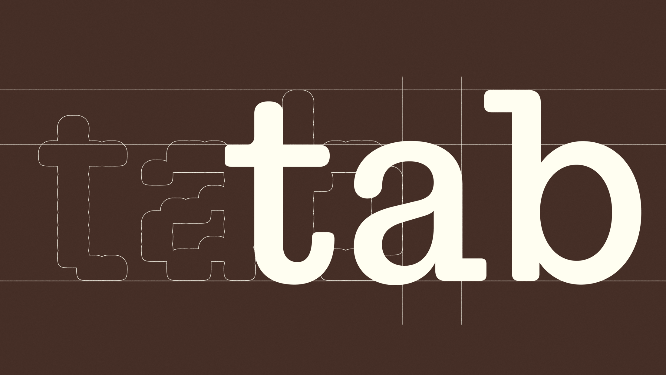
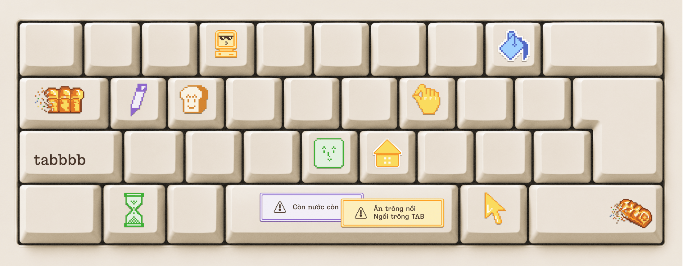
If a browser tab is where you go to get things done, TABBBB is the one you open when you’re done getting things done. The name turns stressful URL tabs into edible IRL tabs, with extra B’s for more bread, more butter and a better break. The logo is typed out as a document file, giving this invitation to pause an appropriately office-like form. Even the Tab key is on our side: one press creates a little more space.
PACKAGING DESIGN
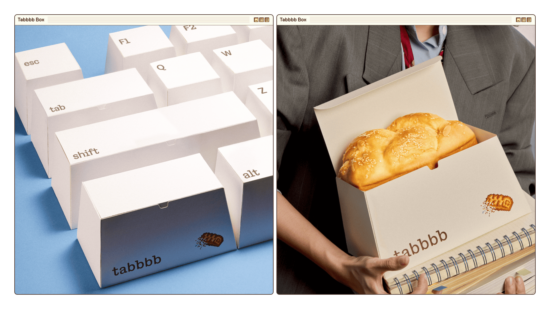
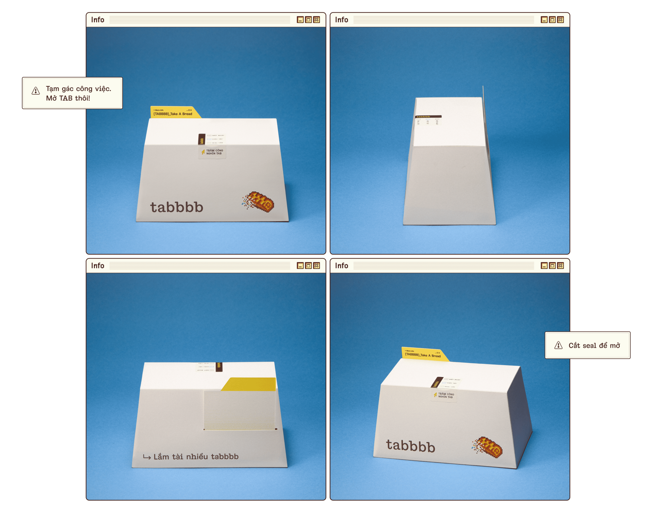
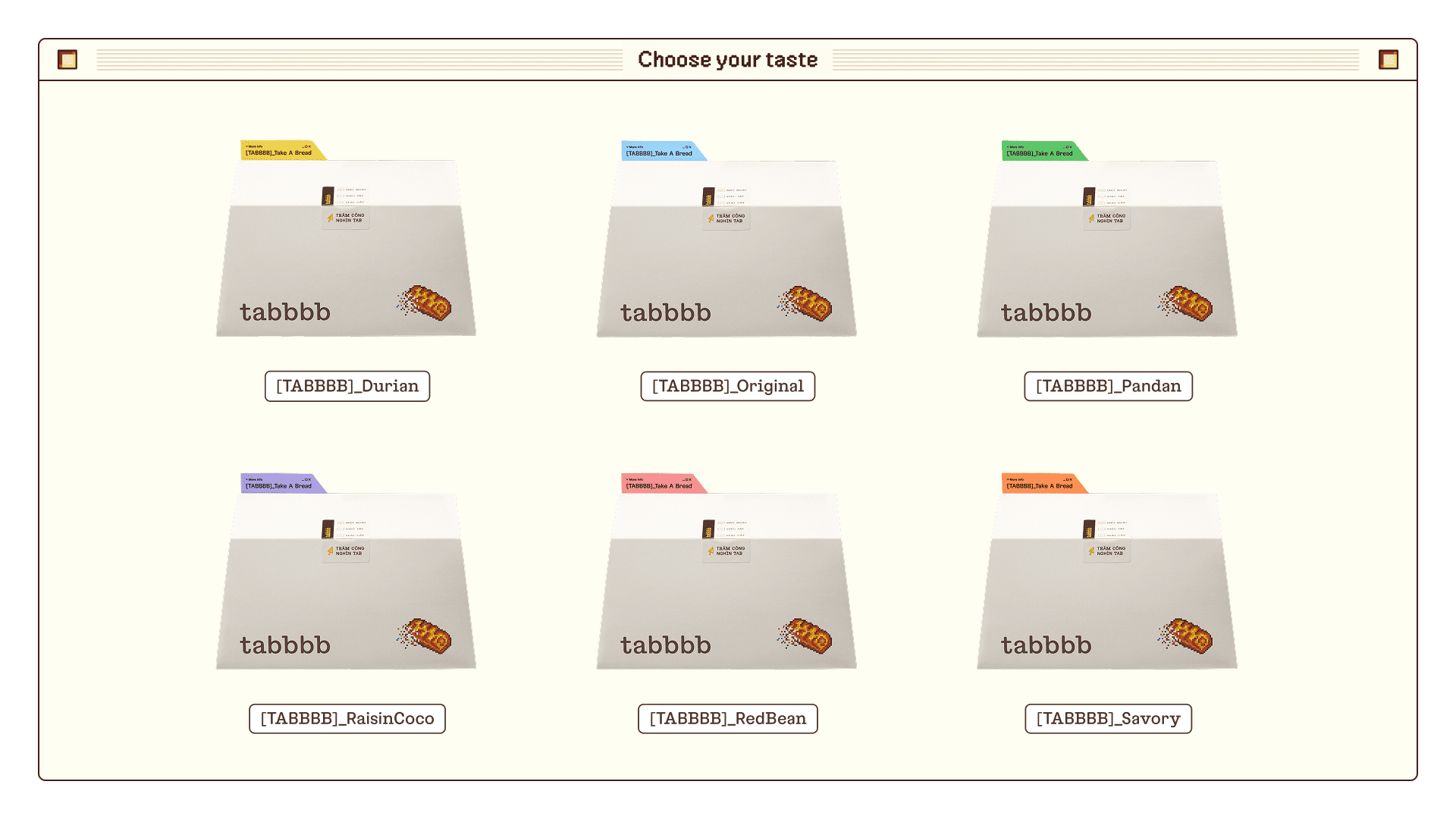
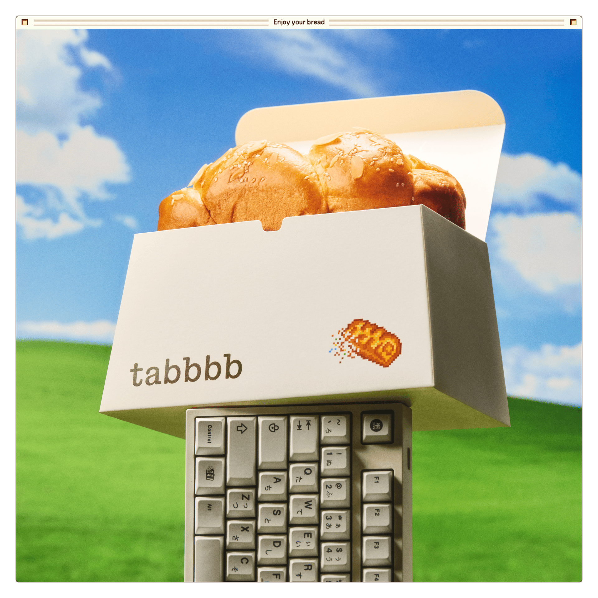
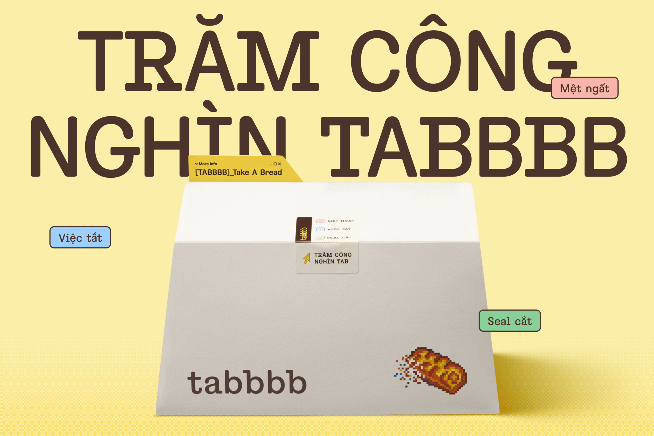
The trapezoidal shape of a Tab keycap becomes a functional bakery box, bringing a familiar desk object into the snack break. A coloured tab on top borrows from the browser tabs that crowd our screens, but serves a simpler purpose: helping everyone find their favourite flavour. Your only task is to press open the keycap-inspired packaging and claim a soft brioche reward.
COLOR PALETTE
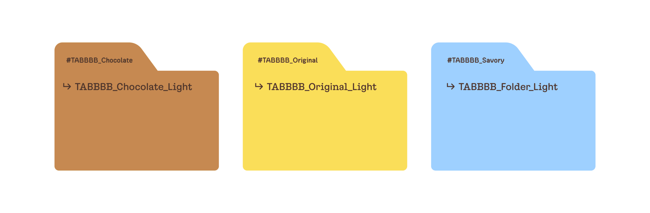
Brown, yellow and blue take their cues from digital folders, with brighter, more saturated tones giving these everyday screen colours a playful lift. The secondary palette extends across six flavours: Original, Durian, Pandan, Raisin Coco, Red Bean and Savory. Each receives its own colour tab, making selection quick and intuitive. More colour, more flavour, less guesswork.
TYPOGRAPHY
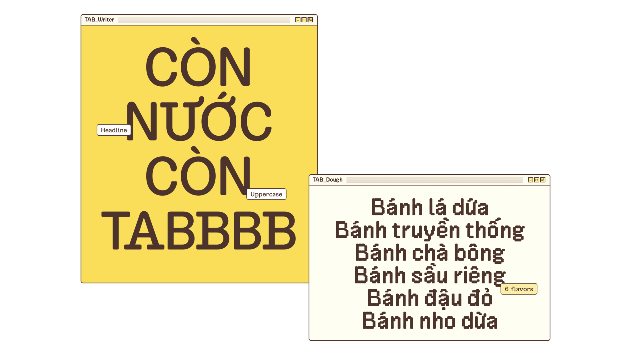
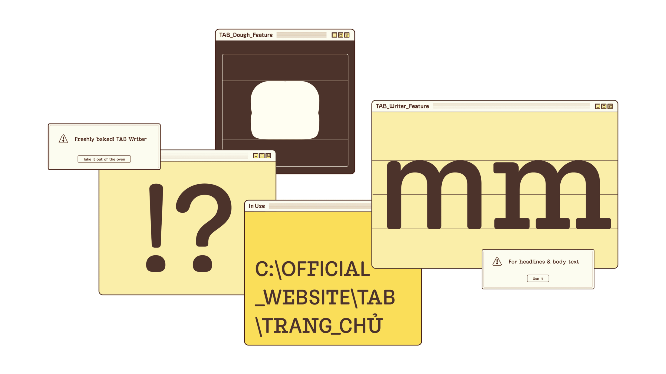
Two custom typefaces balance the digital and the doughy. TAB Dough brings a pixel-inspired character to large headlines, loosening the formality of office life. TAB Display keeps body copy clear with semi-monospaced letters, rounded corners and a soft, dough-like dot. Contextual alternates add small surprises within words, giving the identity room to play even in its finer details.
WEBSITE
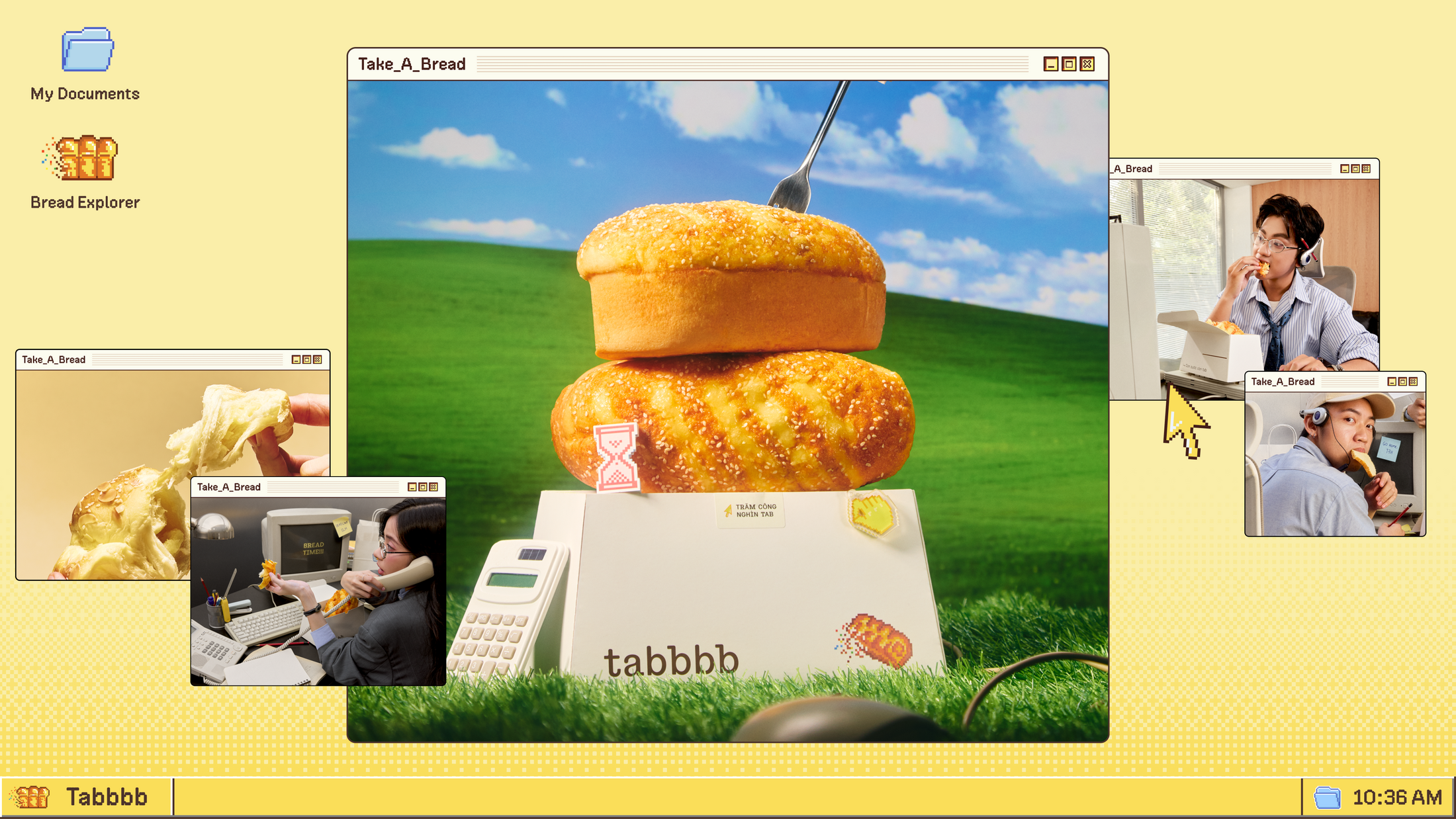
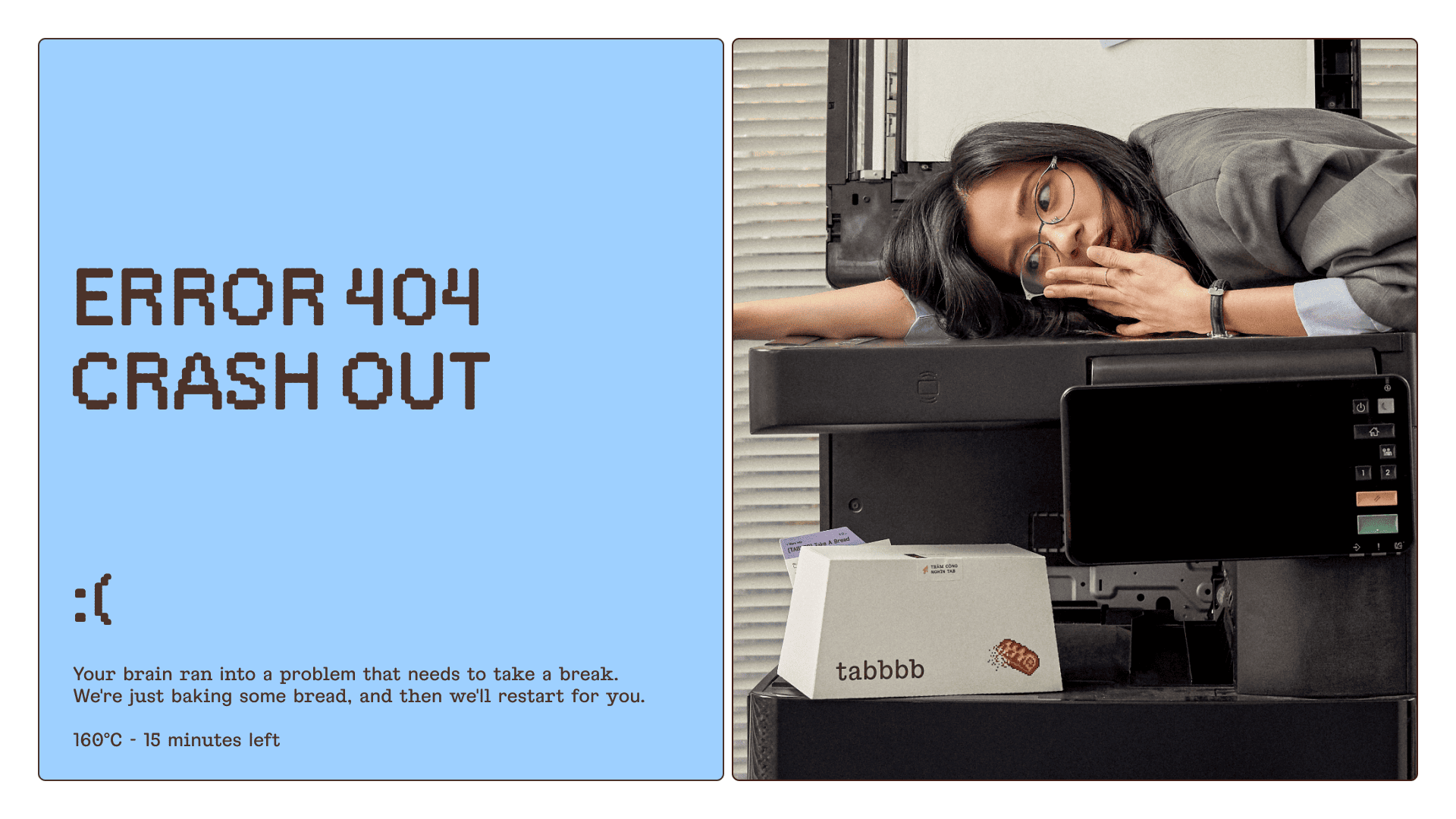
TABBBB’s website brings pixel graphics, punchy copy and food photography into a digital workspace of opening windows. Familiar interface cues make the experience easy to explore while turning a bread order into a cheeky workday diversion. Fresh brioche meets the everyday keyboard, giving office workers one more tab worth opening.
SOCIAL MEDIA EXPERIENCE
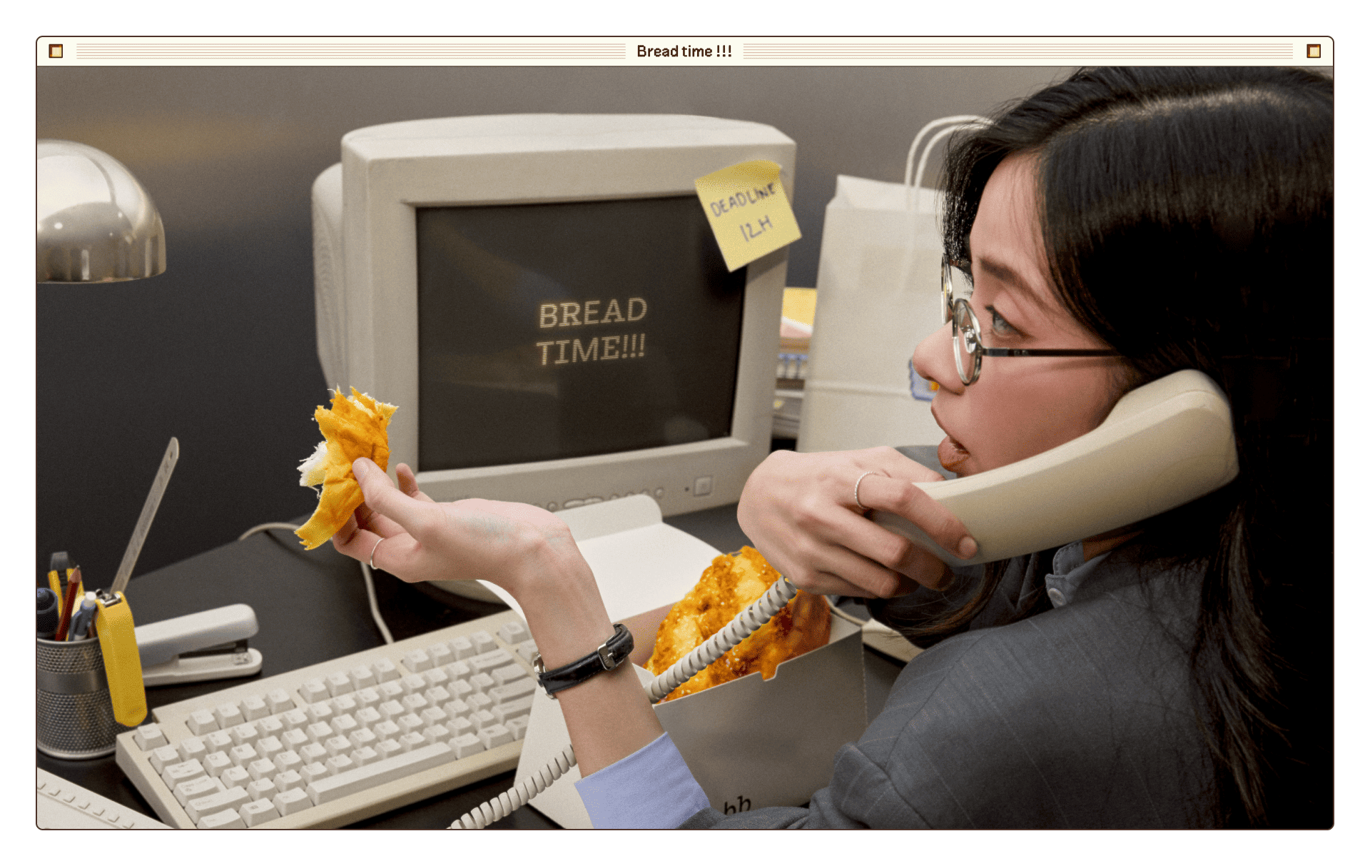
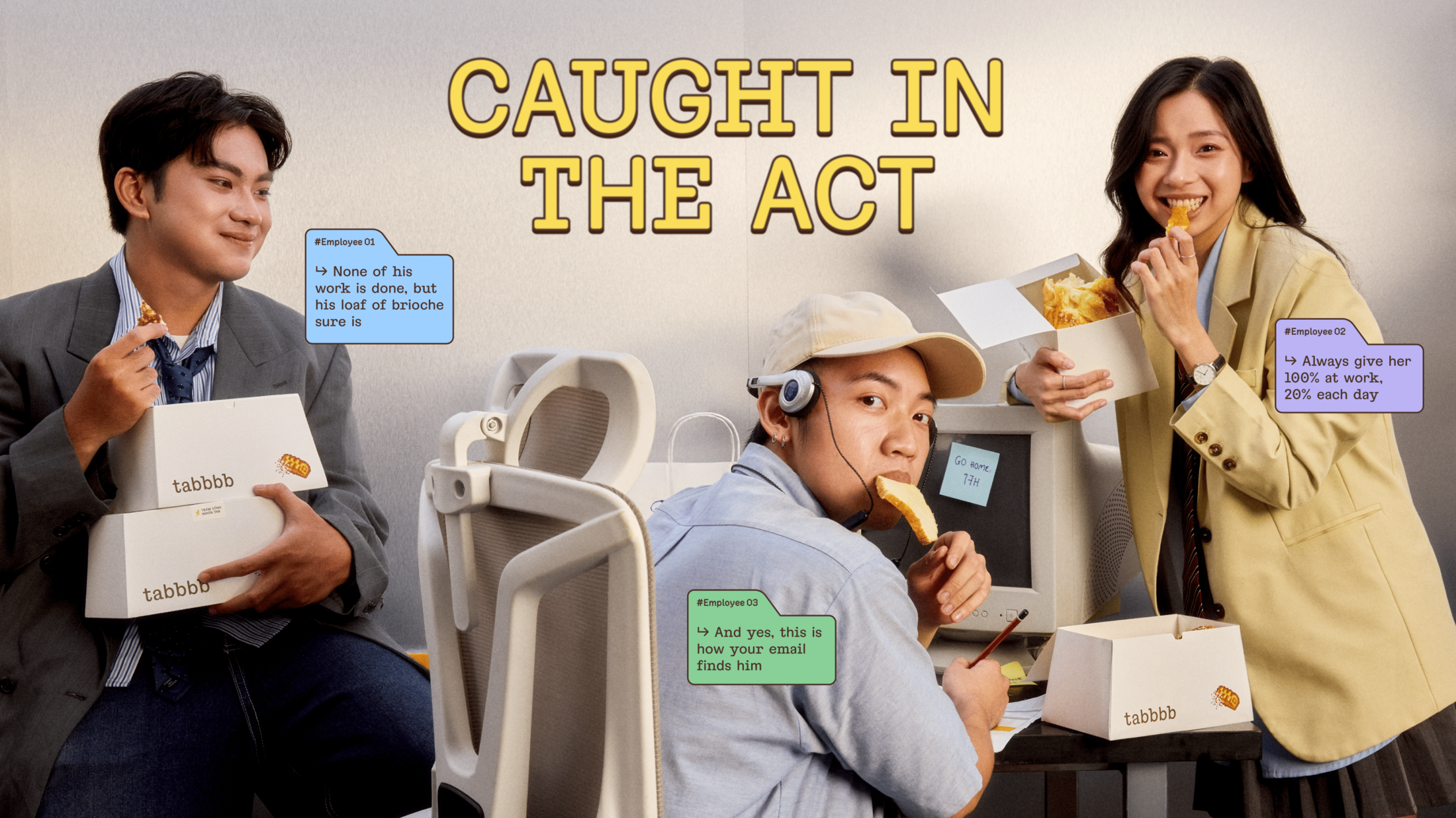
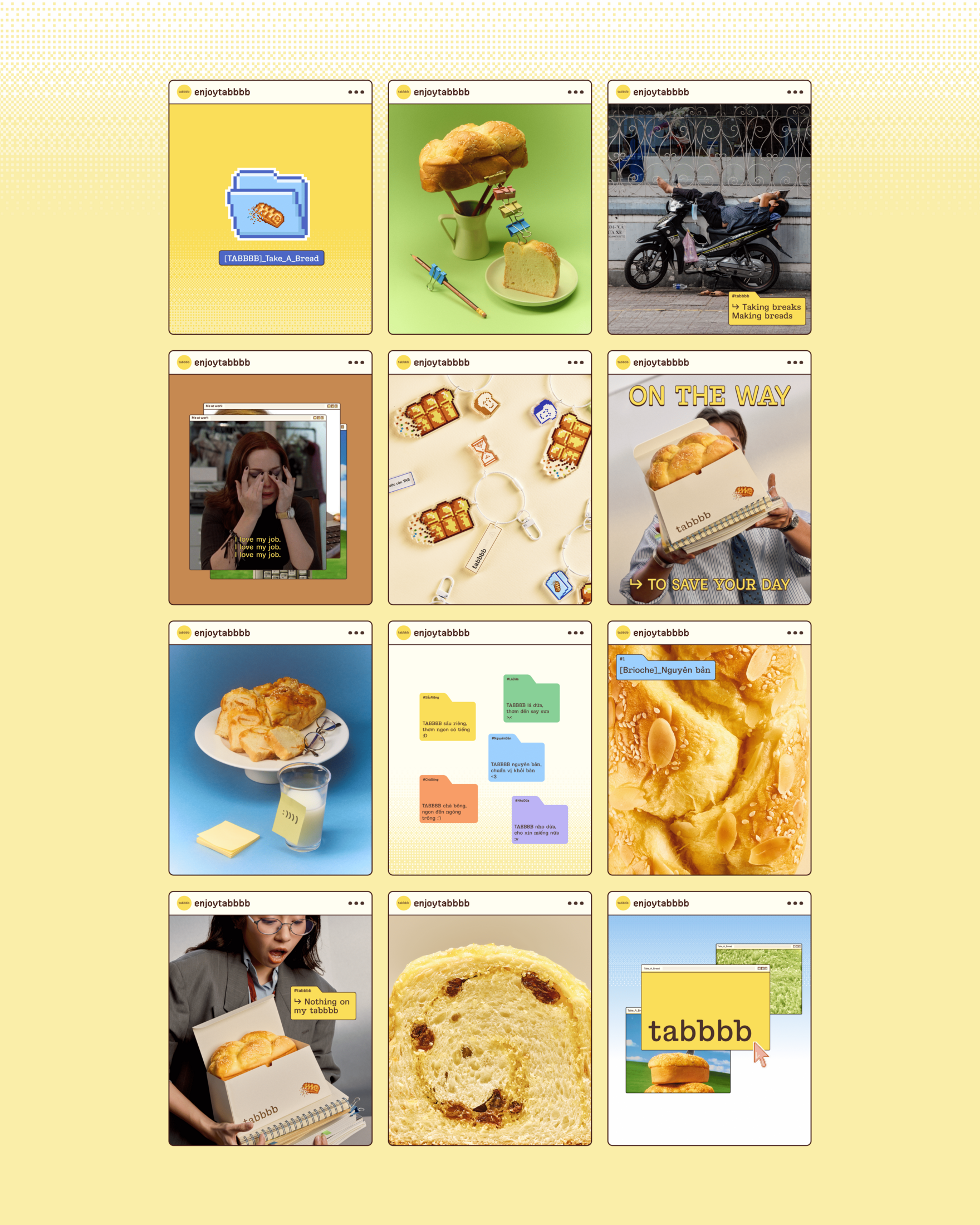
On social media, TABBBB celebrates the little breaks that make long workdays lighter. Photography, typography, graphics and humour turn shared office frustrations into relatable stories for fellow tab-hoppers. The feed offers gentle reminders to pause, stretch, snack and laugh off a little stress, bringing the brand’s invitation to take a break into everyday scrolling.
MERCHANDISE
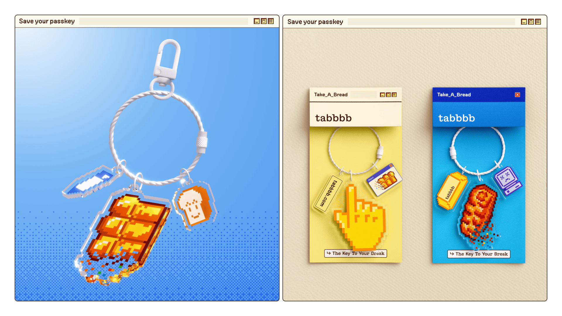
The break continues beyond the box. A keyring with playful charms travels between meetings, coffee runs and snack breaks, clipped to bags, keys or office lanyards. Stickers included with every order bring a little personality to laptops and desks. Together, these small objects keep TABBBB close at hand, reminding people to close a few tabs, stretch their shoulders and Take A Bread.
This professional campaign titled 'Take A Bread: A Better Break for the Workday' was published in Vietnam in November, 2026. It was created for the brand: TABBBB, by ad agency: M — N Associates. This Design, Digital, and Integrated media campaign is related to the Food industry and contains 37 media assets. It was submitted 1 day ago.
Credits
Creative Venture by M — N Associates
Brand: TABBBB - Take A Bread
Branding Firm: M — N Associates
Executive Creative Director: Duy — N
Lead Project Manager: M — Lan
Associate Creative Director: Bảo Trương
Graphic Designer: Thái-Tú Nguyễn, Uyển-Nhi Nguyễn, Hà-Chi Lê, Phương-Anh Nguyễn
Motion Designer: Phương-Anh Nguyễn, Đức-Thuận Lê
Digital Designer: Hà-Chi Lê, Phương Lưu
Website Manager: Tân Nguyễn
Strategist: Thảo-Vy Nguyễn
Copywriter: Thảo-Vy Nguyễn, Hồng-Hạnh Nguyễn, Hải-Linh Trần
Project Manager: Vy Lê, Ngân Nguyễn, Hồng-Chi Phan
Printing Producer: Ngân Nguyễn, Thanh-Vy Lê
Typography under Type Associates
Type Concept: Bảo Trương
Type Designer: Dương Trần, Bảo Trương
Portfolio & Product Photographer: Marcel Vũ
Product Stylist: Xuân Đức
Model: Huy-An Vũ, Mai Chi
Portfolio Producer: Bảo Trương, Thái-Tú Nguyễn, Uyển-Nhi Nguyễn, Phương-Anh Nguyễn, Thảo-Vy Nguyễn