Description
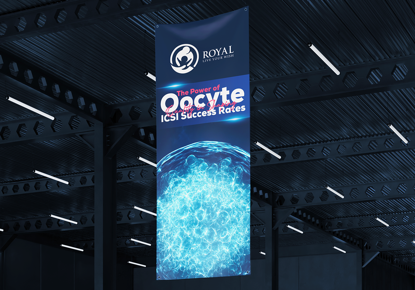
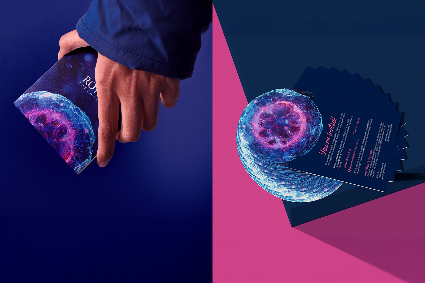
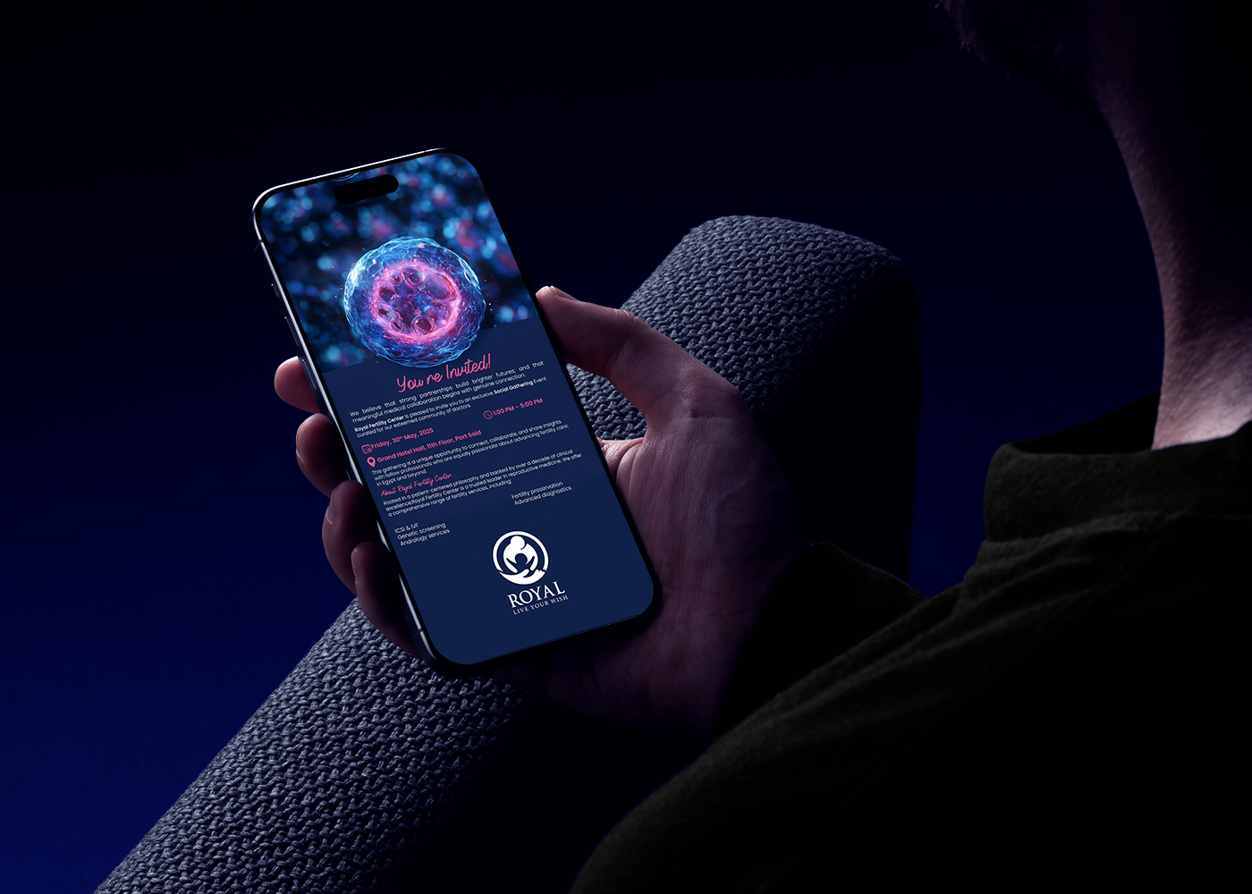
Royal Fertility Center introduced a refreshed visual identity for its IVF conference series to establish a clearer academic presence. Created by Marklinica, the new system moves away from familiar medical clichés, instead building the identity from the actual logic of reproductive science.
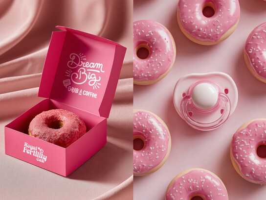
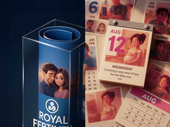
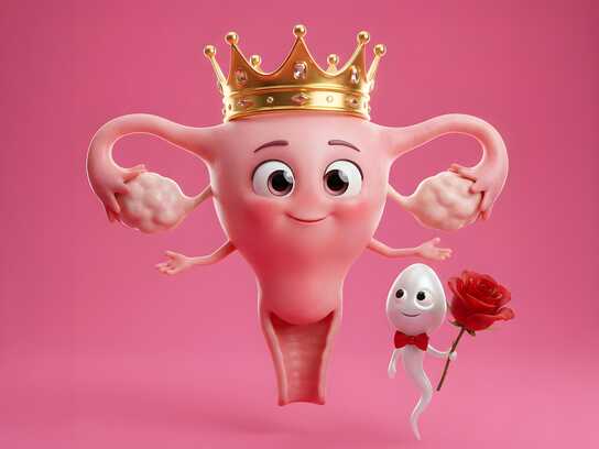
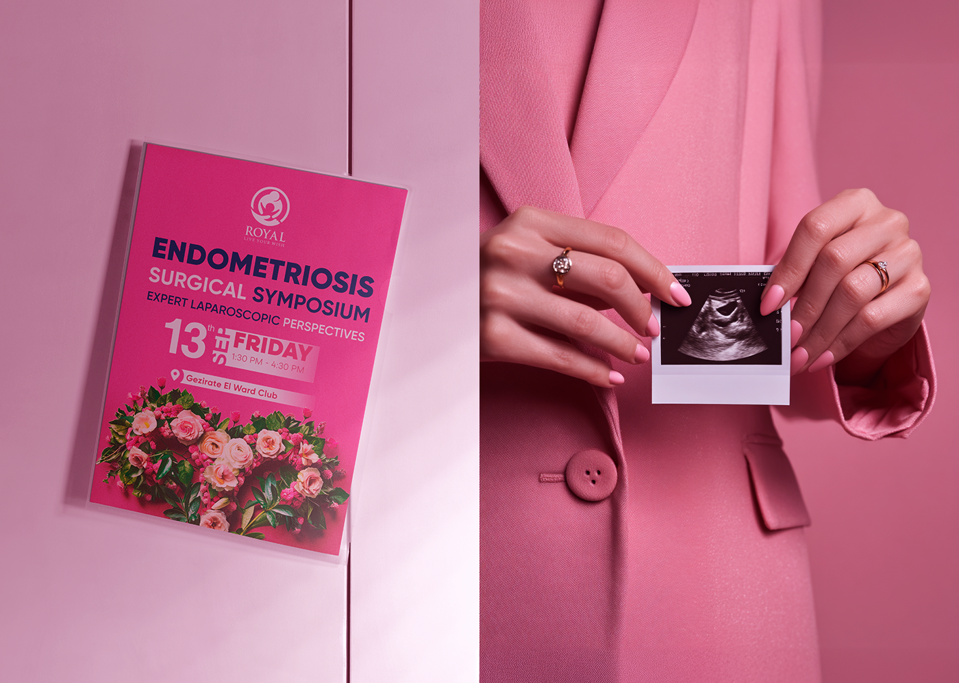
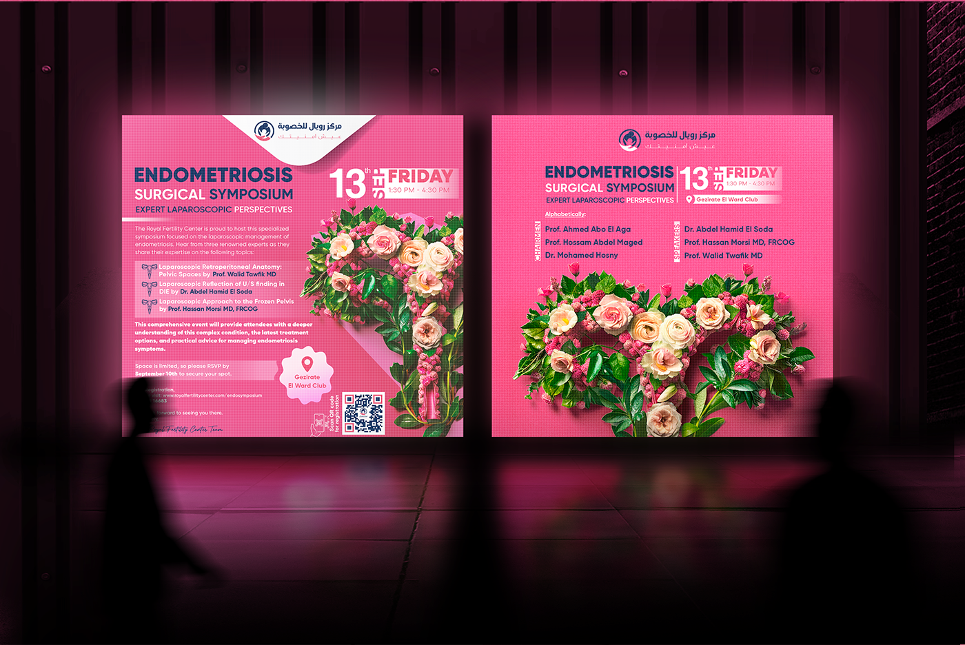
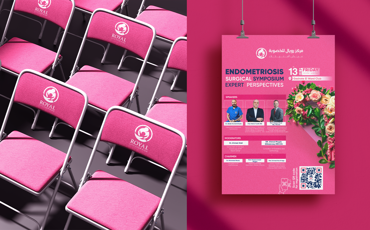
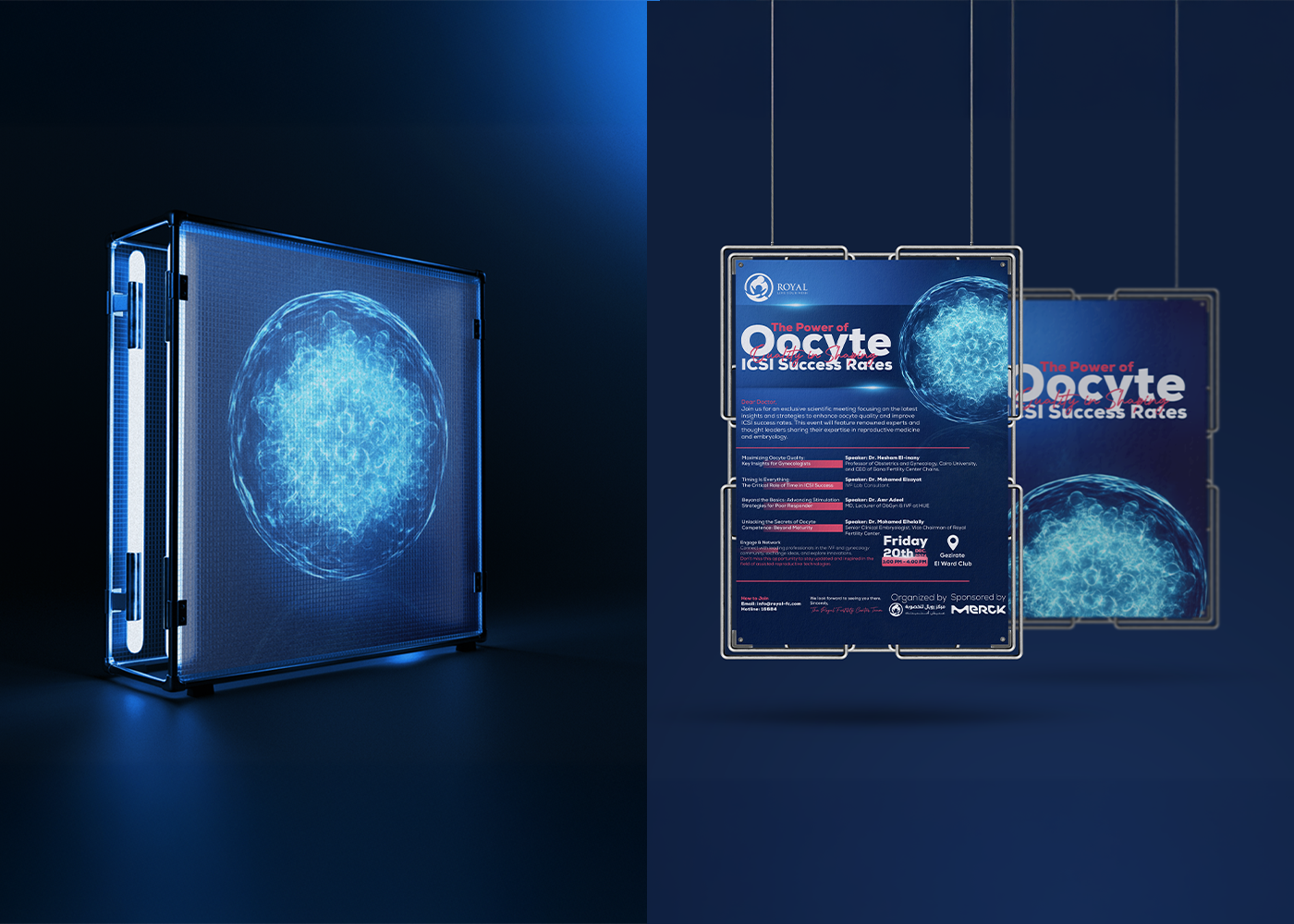
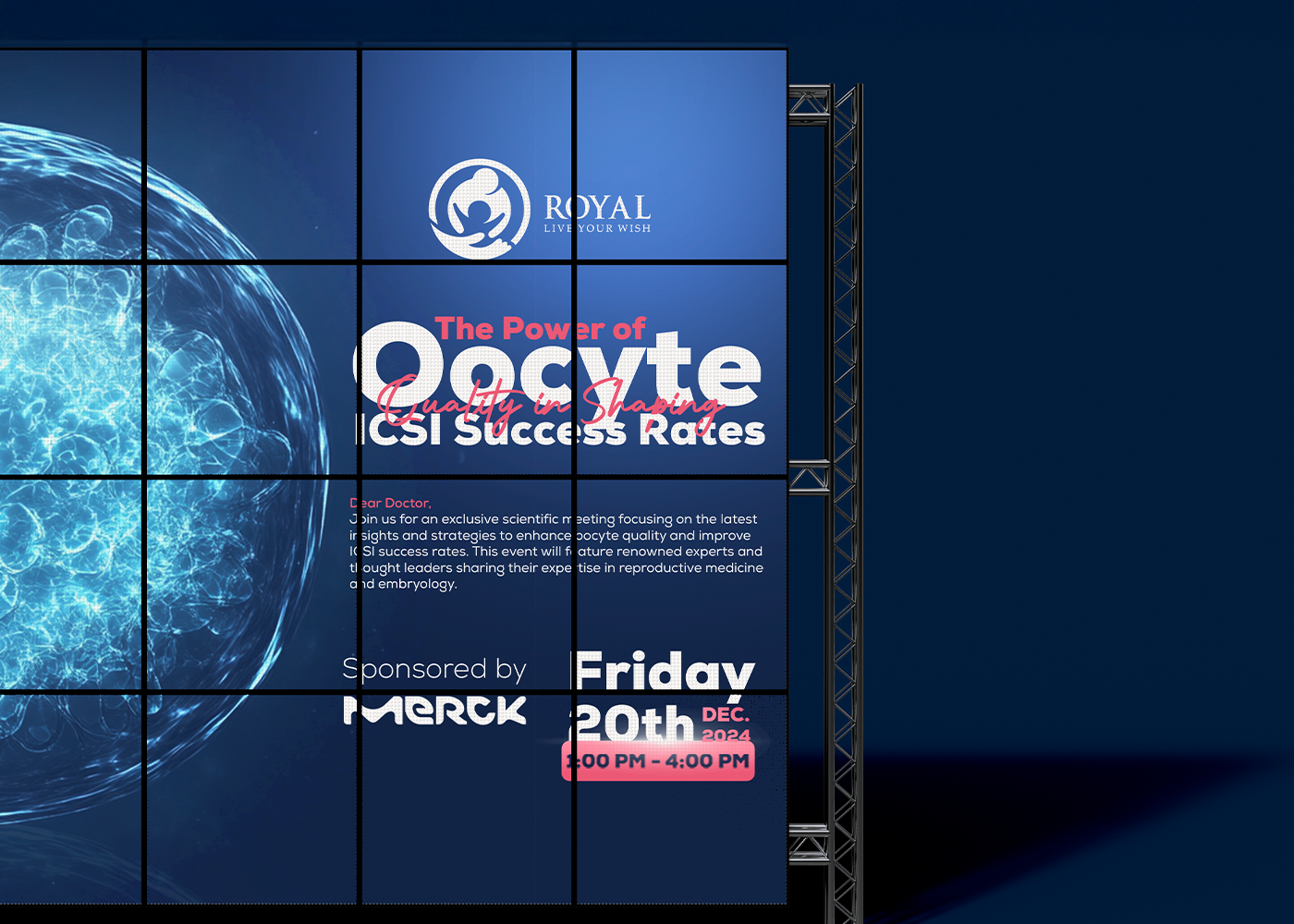
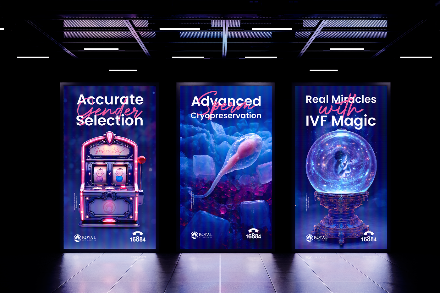
The design draws on the precision found in embryology labs and the order behind procedural workflows. The visual language utilizes measured alignment, controlled spacing, and geometric structures that loosely echo the stages of cell development. Colors were engineered to feel professional and steady, supporting the seriousness of the content while maintaining a contemporary look.
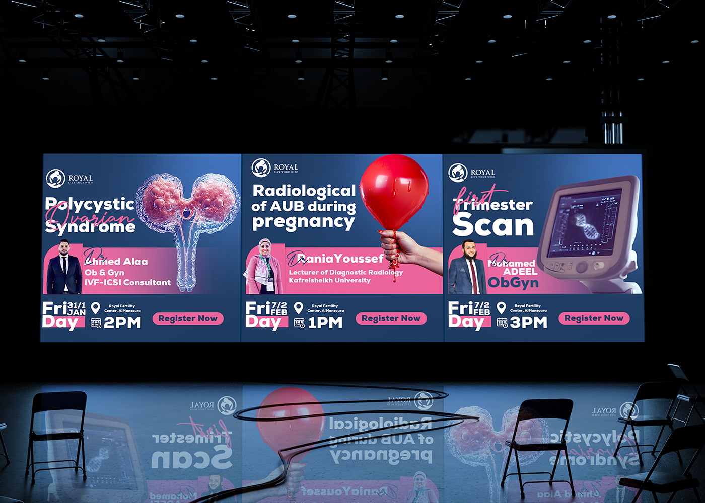
Marklinica’s creative approach was driven by a key insight: The design had to match the mindset of the attendees. IVF specialists rely on information that is structured, exact, and reliable. By mirroring this mental model, the visuals allow presenters to communicate complex data without distraction, creating an environment that feels organized and trustworthy.
Extended across all touchpoints, from digital announcements to on-ground signage, the identity is built to scale. Through this flexible system, Marklinica ensures the conference adapts to future workshops and regional collaborations, giving the Royal Fertility Center a distinct, authoritative signature within the medical events landscape.
This professional campaign titled 'Not just an Identity. It’s a Royal Code for Conferences.' was published in Egypt in May, 2025. It was created for the brand: Royal Fertility Center, by ad agency: Marklinica. This 360°, Content, and Design media campaign is related to the Health industry and contains 10 media assets. It was submitted 7 months ago by CEO : Rana Mohsen of Marklinica Agency.
Credits
Art Director: Rana Mohsen
Brand Designer: Rowan Hamada
Brand House: Marklinica