


Description
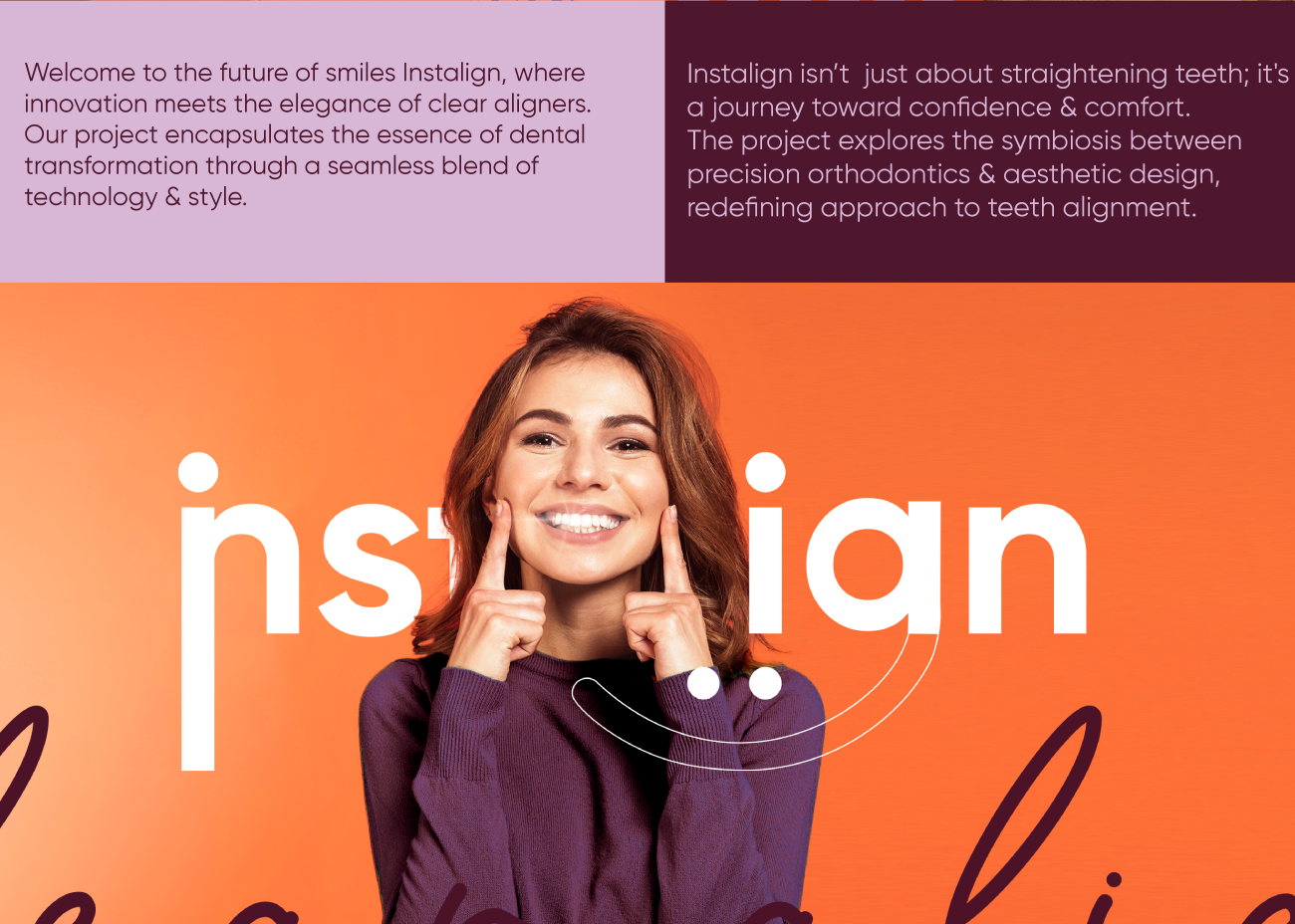
Instalign entered the market with a simple ambition: make orthodontic treatment feel modern, precise, and aesthetically confident. Marklinica developed a full brand identity for the clear aligner brand, building a visual system that reflects the product’s core promise, defining an alignment that feels effortless and looks refined.
From the beginning, the challenge was to give Instalign a presence that matches the quality of the product itself. Clear aligners are invisible, technical, and design-driven, so the brand needed a language that carries the same qualities, including clean geometry, calm precision, and an immediate sense of trust.
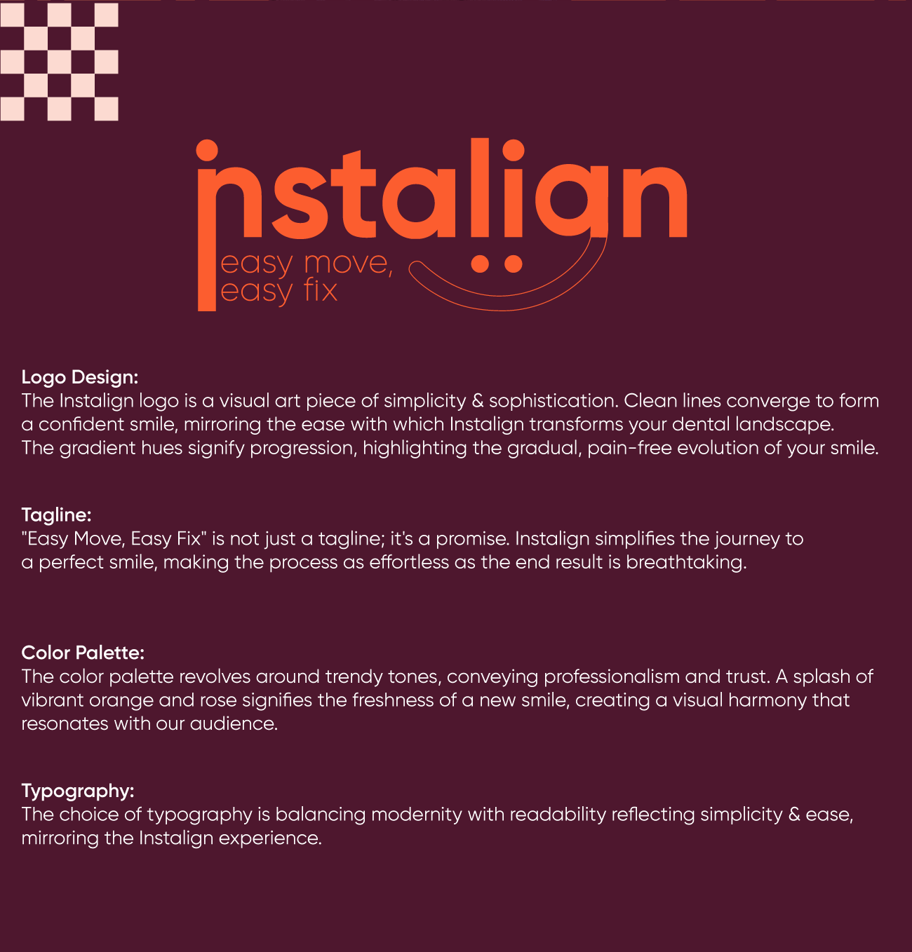
The visual foundation is built around structure and clarity. The logo uses balanced forms that echo the gentle curvature of dental arches. The typography behaves with the same discipline seen in orthodontic planning. Colors were selected to feel clinical yet contemporary, avoiding the cold sterility of medical branding while maintaining a professional tone.
Marklinica extended the system far beyond the logo. Packaging became a major touchpoint, designed to feel premium and functionally organized. The structure of each box mirrors the treatment experience, making it simple, ordered, and easy to understand. Clear white spaces, structured layouts, and subtle detailing give the product an elevated feel, positioning Instalign as a modern choice within a competitive market. The identity also adapts seamlessly across digital platforms, educational materials, and in-clinic communication, allowing orthodontists and patients to interact with the brand in a consistent, reassuring way.
The Instalign system was built to feel transparent in the same way the product is. Every line, shape, and proportion is intentional. Nothing is loud, nothing is decorative, and nothing distracts from the core value of the treatment, which is precision. This restraint is what gives the brand its strength. It communicates confidence without force, and sophistication without complication.
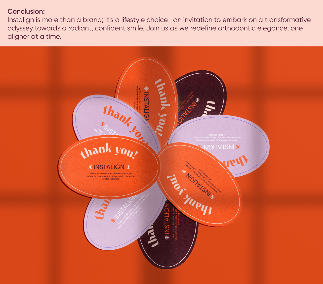
As the clear aligner category continues to grow, Instalign now has a visual identity capable of standing beside global competitors. The brand feels clean, credible, and engineered, creating a system that supports the patient journey and reflects the level of care behind the treatment. Marklinica’s work gives Instalign a visual signature that can expand into new markets, new products, and future touchpoints without losing its foundation.
This identity doesn’t try to reinvent the category. It simply gives it the clarity it always needed. Instalign now carries a brand presence that matches its product, appearing precise, minimal, and made to fit effortlessly into people’s lives.
This professional campaign titled 'The Invisible Side of Dental Confidence.' was published in Egypt in April, 2023. It was created for the brand: Instalign Clear Aligners, by ad agency: Marklinica. This Design, Digital, and Print media campaign is related to the Health industry and contains 7 media assets. It was submitted 7 months ago by CEO : Rana Mohsen of Marklinica Agency.
Credits
Art Director: Rana Mohsen
Design House: Marklinica