Description
Overview
LÔCÔ Art Market is more than an art fair. It’s a cultural gathering where independent artists, local brands, and creative communities meet to exchange ideas, showcase work, and celebrate the energy of creating. Taking place in Ho Chi Minh City, Vietnam, each season centers on a new theme that shapes the atmosphere and visual language, while keeping LÔCÔ’s purpose consistent: to bridge local creators and local audiences through an experience that feels open, lively, and welcoming.
The Summer 2026 edition marked the first time LÔCÔ Art Market launched a collaborative platform. Rather than operating as a standalone event, it was envisioned as a shared, community-built experience where different voices could help shape what the platform could become. M — N Associates joined as the visual identity partner, developing a full-scope branding campaign that elevates the experience beyond a seasonal event. Our shared ambition is to build a cultural platform where design, art, local brands, and young creatives can come together as one community.
Website: @locoartmarket
Scope Of Work
Brand Strategy
Brand Concept
Brand Identity: Brand Design System, Motion & Photography Direction, Event Visual, Social Media System, Collaterals
Concept
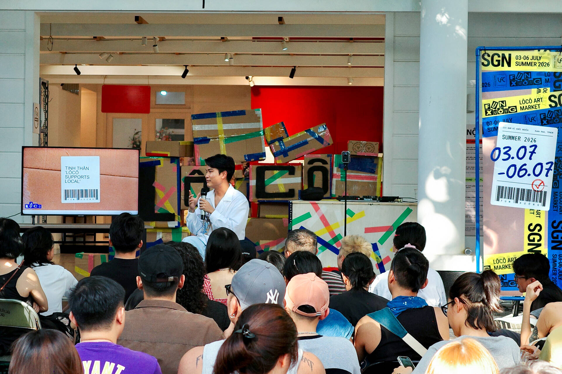
The concept needed to embody the spirit of this collaboration, so we looked for a place where individuals, people, and processes come together to create something complete. After exploring many creative directions, the factory emerged as the strongest metaphor with a production line where every creation is assembled, refined, and ultimately ready to meet its audience. At the heart of this concept is a ready-to-ship package: complete, yet bearing the marks of tape, labels, and handling. This imperfect perfection reflects the journey of every creative work, as LÔCÔ Art Market becomes the final touchpoint where local artists and brands, including M — N Associates, present their creations to the community.
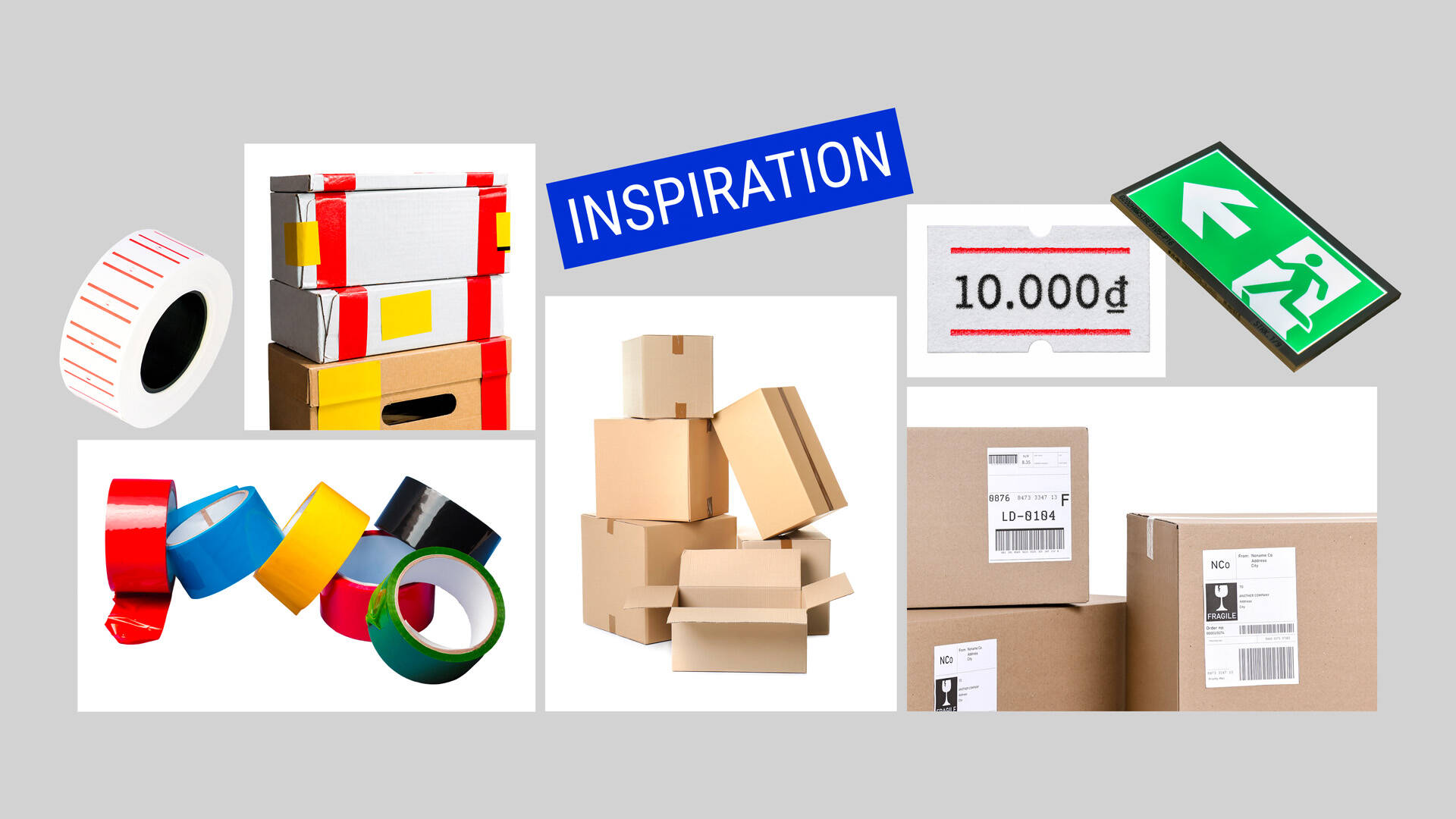
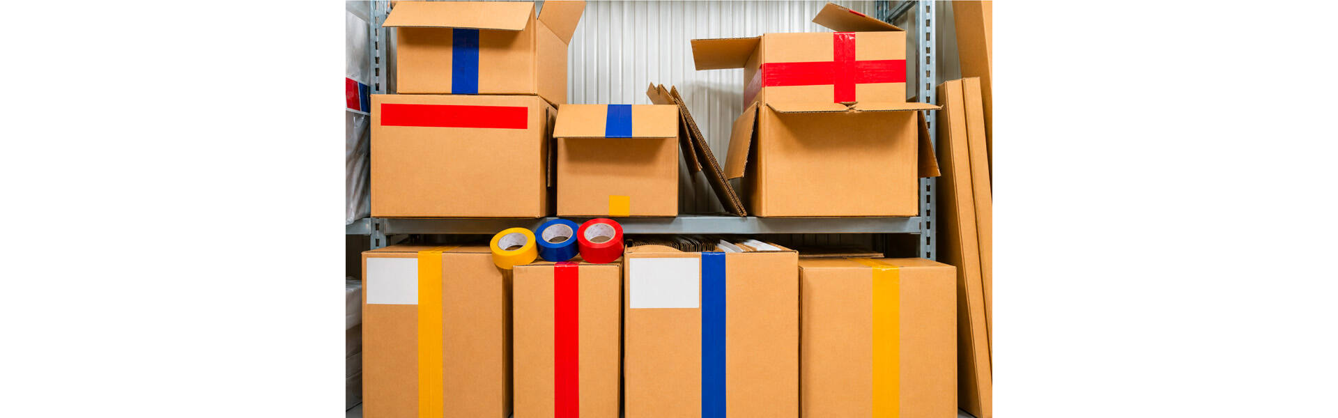
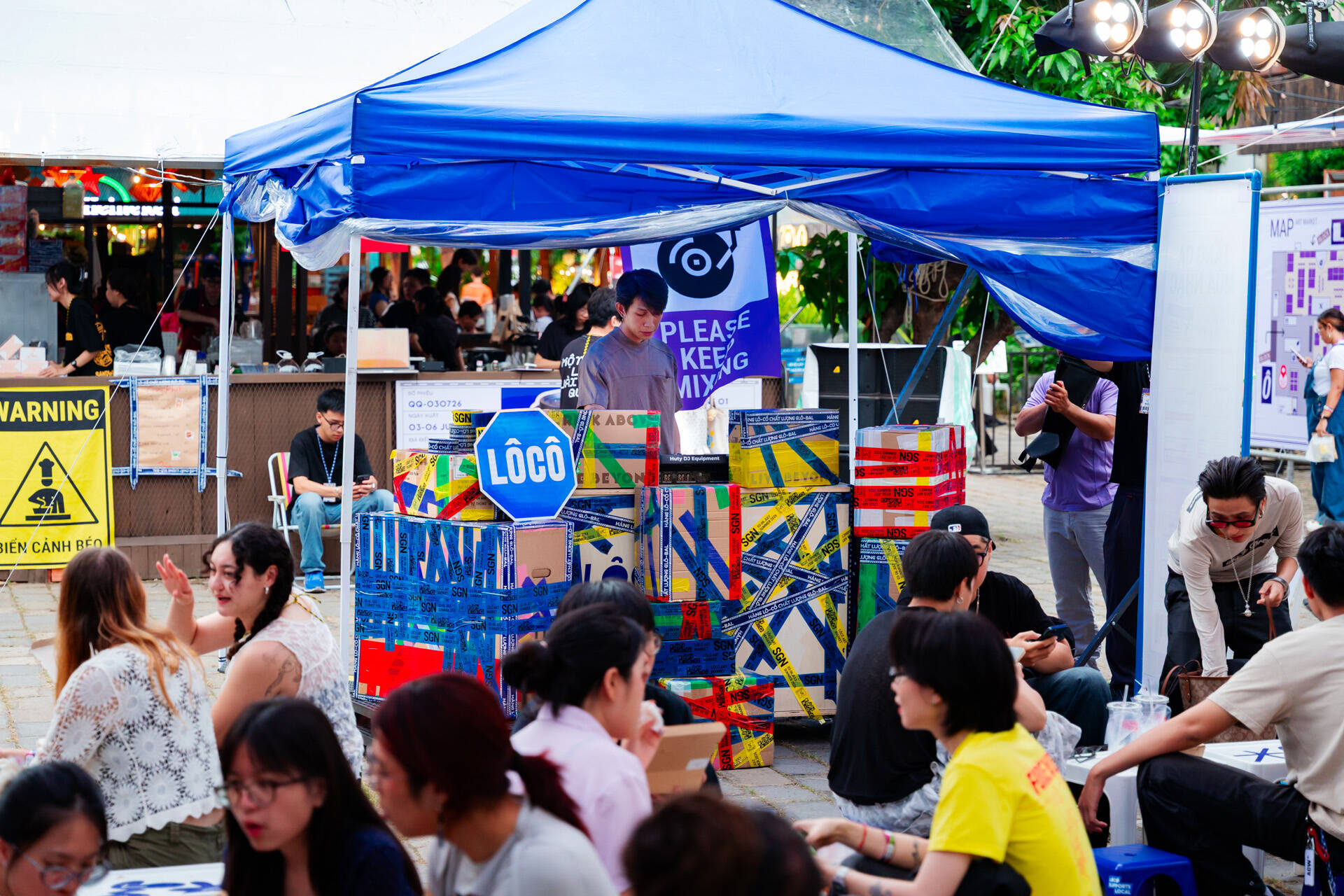
The system takes cues from every corner of a working factory: rows of stacked cartons, strips of packing tape, glowing signage, and layered shipping labels. All come together to create an environment of repetition, irregularity and speed, where movement never truly stops. These lively elements ideally reflect the bustling energy of an art market, reflecting how creativity is constantly in the making and every work finds its way from artists to audience. Treating the event as a reimagined factory also opened up a rich creative framework, laying the foundation for playful copywriting, immersive spatial applications, and social content to encourage interaction, conversation, and social sharing.
LOGO
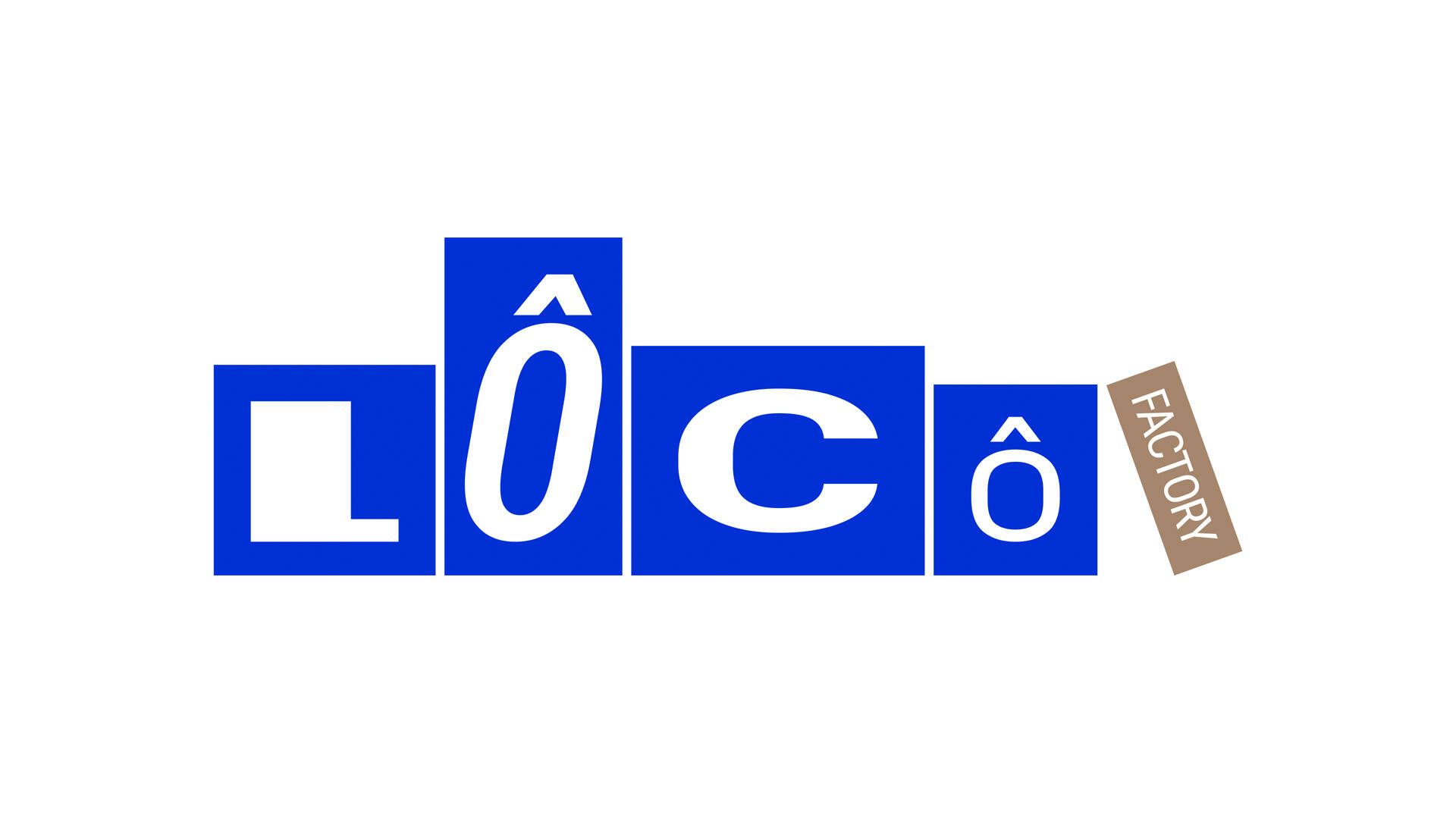
The logo treatment draws inspiration from stacked carton boxes, with letterforms that tilt, overlap and shift in scale to echo the organized chaos of human-run factories. Each character acts as a distinct product unit, varying in size, height, and proportion. Together, they form a rhythmic visual language to represent the overall concept, while remaining static. Order within disorder, logic within irregularity — the everyday rhythm of work is reimagined as a bold typographic logo that feels both functional and alive.
TYPOGRAPHY
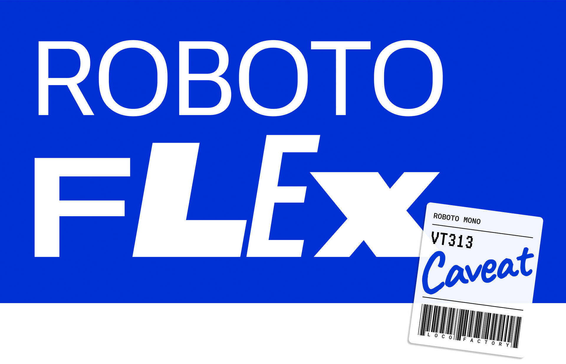
The typography system is what brings logic to the chaos. It acts as a “grid” that holds the identity together while the rest embrace irregularity, overlap, and movement. At its core are two monospaced typefaces, Roboto Mono and VT323, chosen for their consistent character widths. Roboto Mono is also adapted with multiple widths, heights, weights, and slants for important titles. A handwritten style (Caveat) is introduced as a “human mark.” It appears only in selected large headlines or emphasis moments, like a quick note on a shipping label to bring authenticity and personality without competing with the monospaced structure.
INTERACTIVE TYPE TOOL
We created an internal Glyph Box Generator, allowing both teams to quickly generate consistent glyph compositions while preserving the identity's playful sense of chaos within a structured system.
SCALING BOXES &TAPE FROM SCREEN TO SPACE
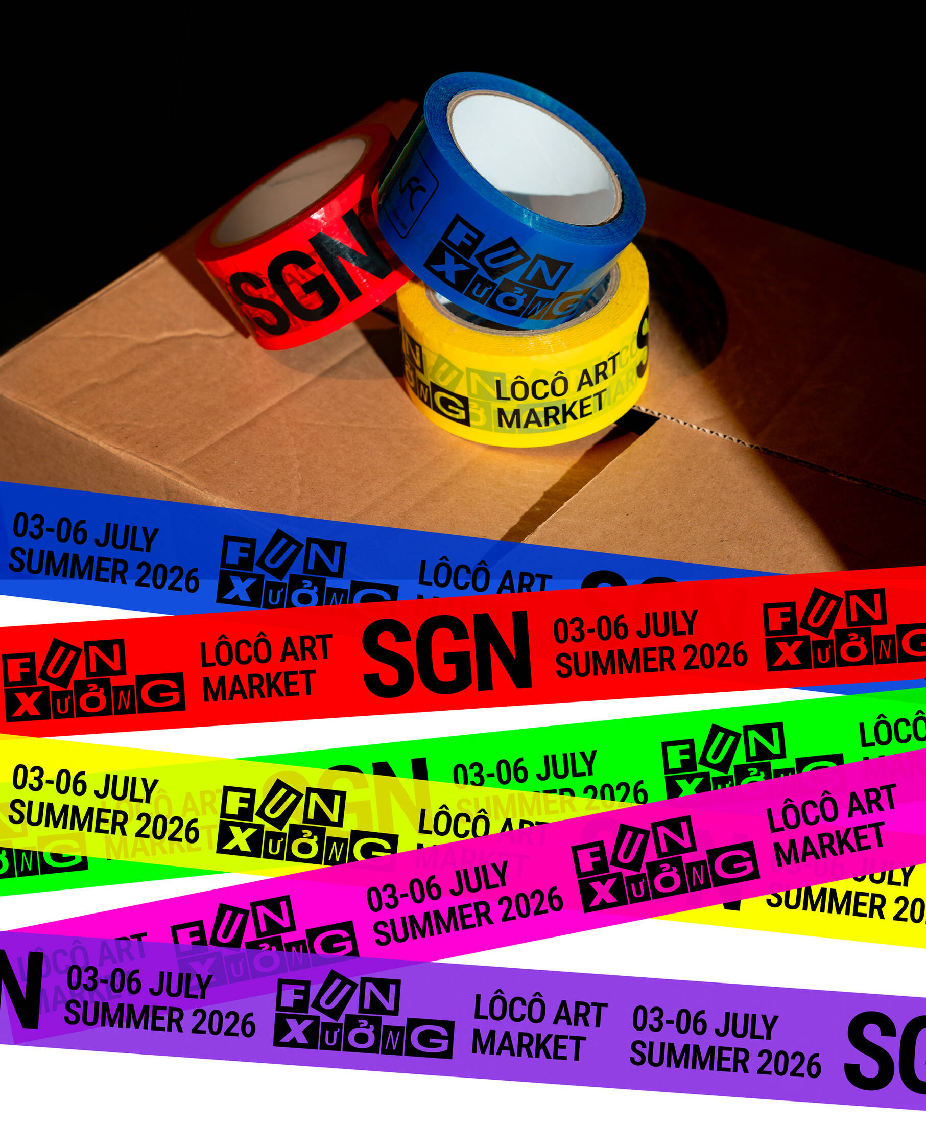
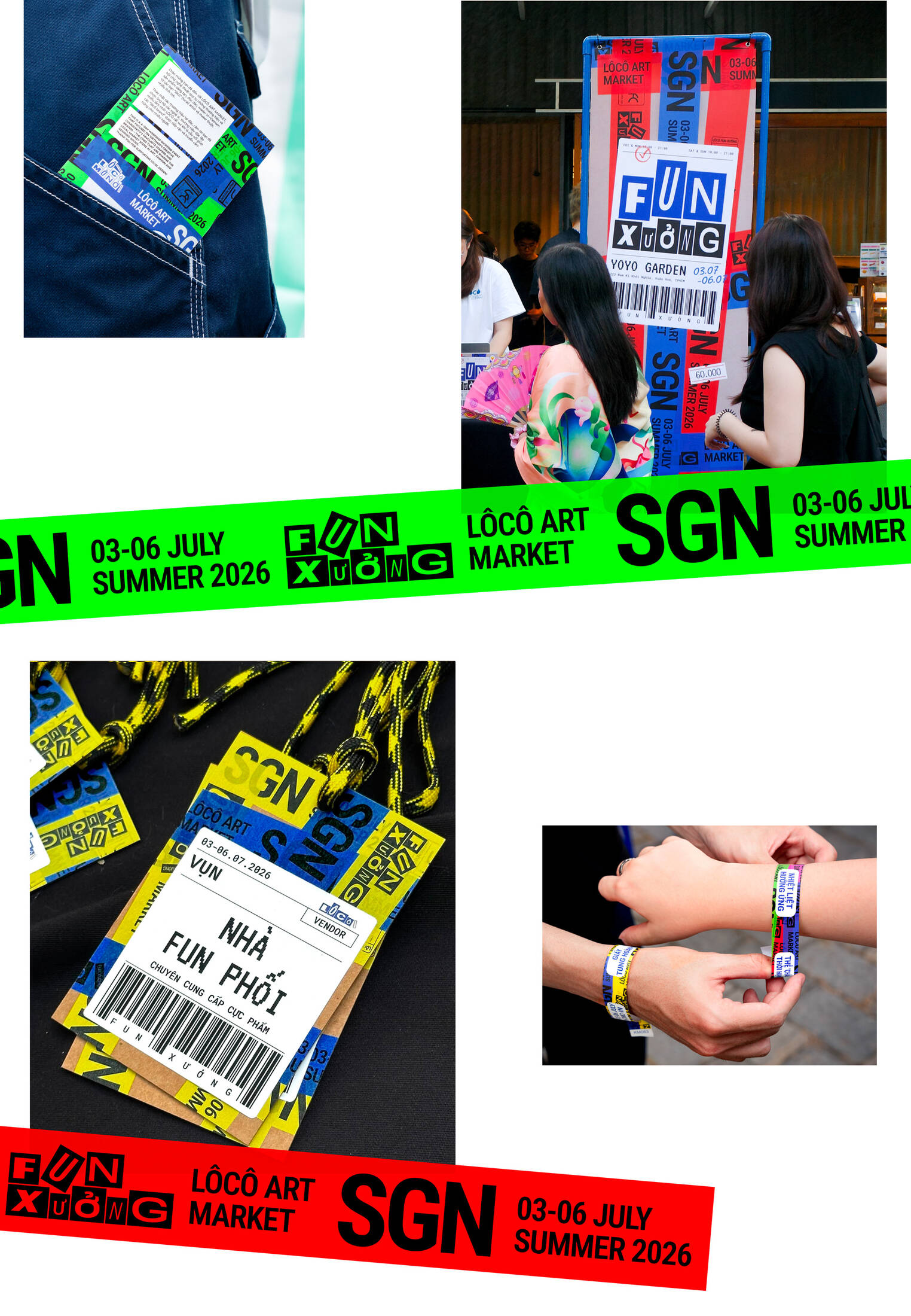
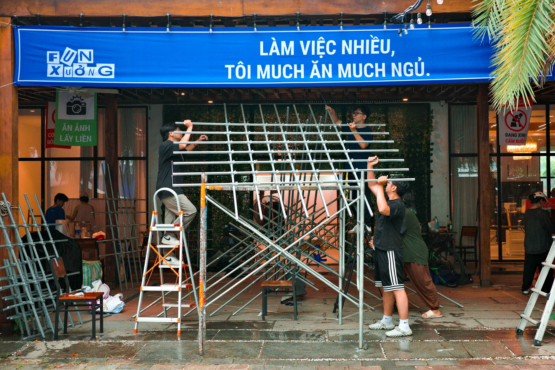
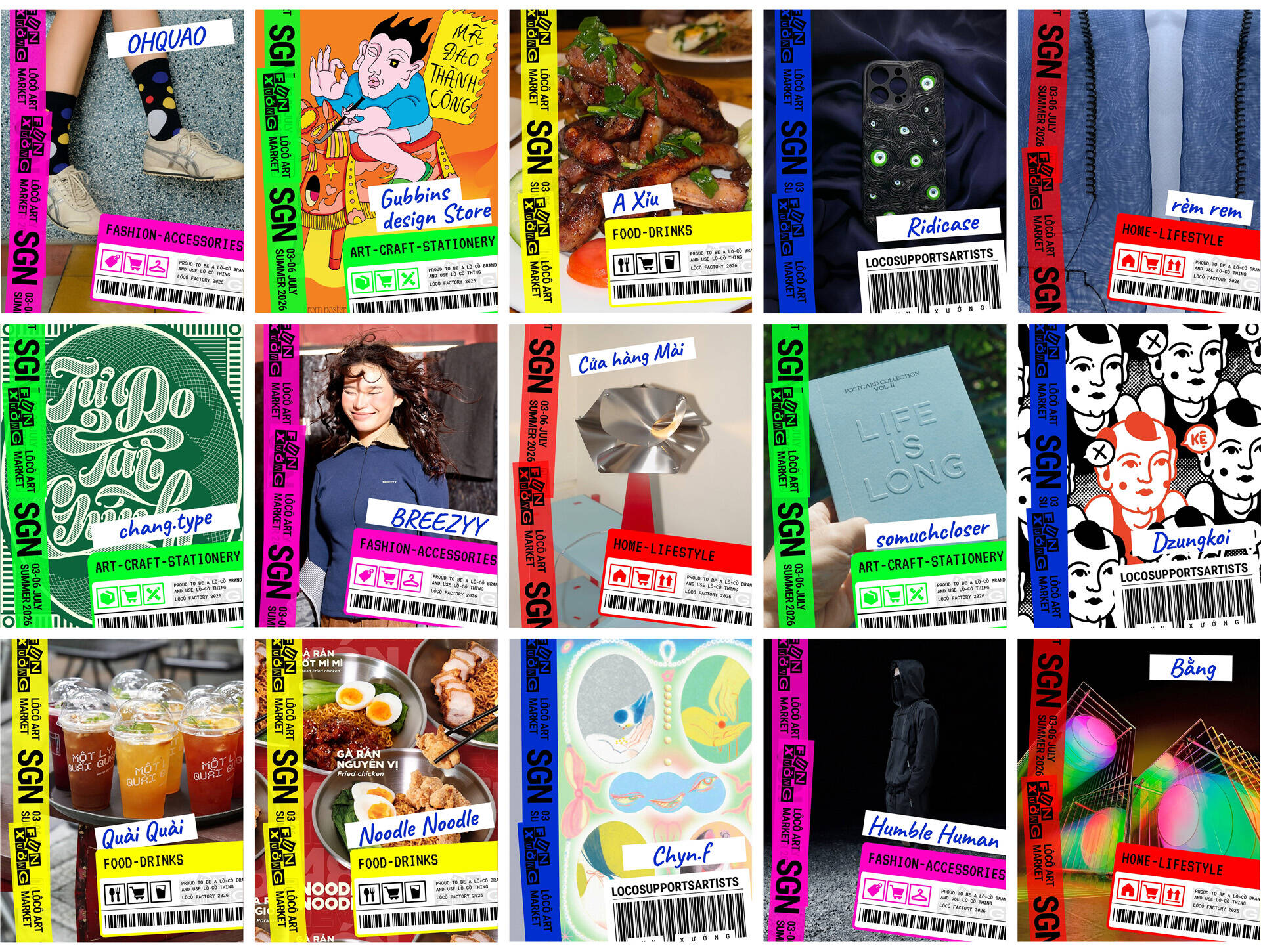
Ready-to-ship packages sit at the core of this identity, serving as the canvas for the entire system. The grooved cardboard, packing tapes, shipping labels, markings, and handwritten details are deconstructed into a modular set of graphic elements that can be recomposed across every application. While the neutral color and raw texture of carton boxes create a quiet canvas, packing tape does the exact opposite as it is rarely designed to be beautiful, it is designed to be seen. Borrowing from this functional logic, the identity adopts a palette of high-visibility colors commonly associated with logistics, safety, and transportation. This treatment translates the tactile language of physical packaging into a cohesive visual system that scales seamlessly across both digital and physical touchpoints. It blurs the line between real-life objects and graphic design, making the digital experience feel tangible and the physical experience unmistakably branded.
LABEL & ICON ELEMENTS
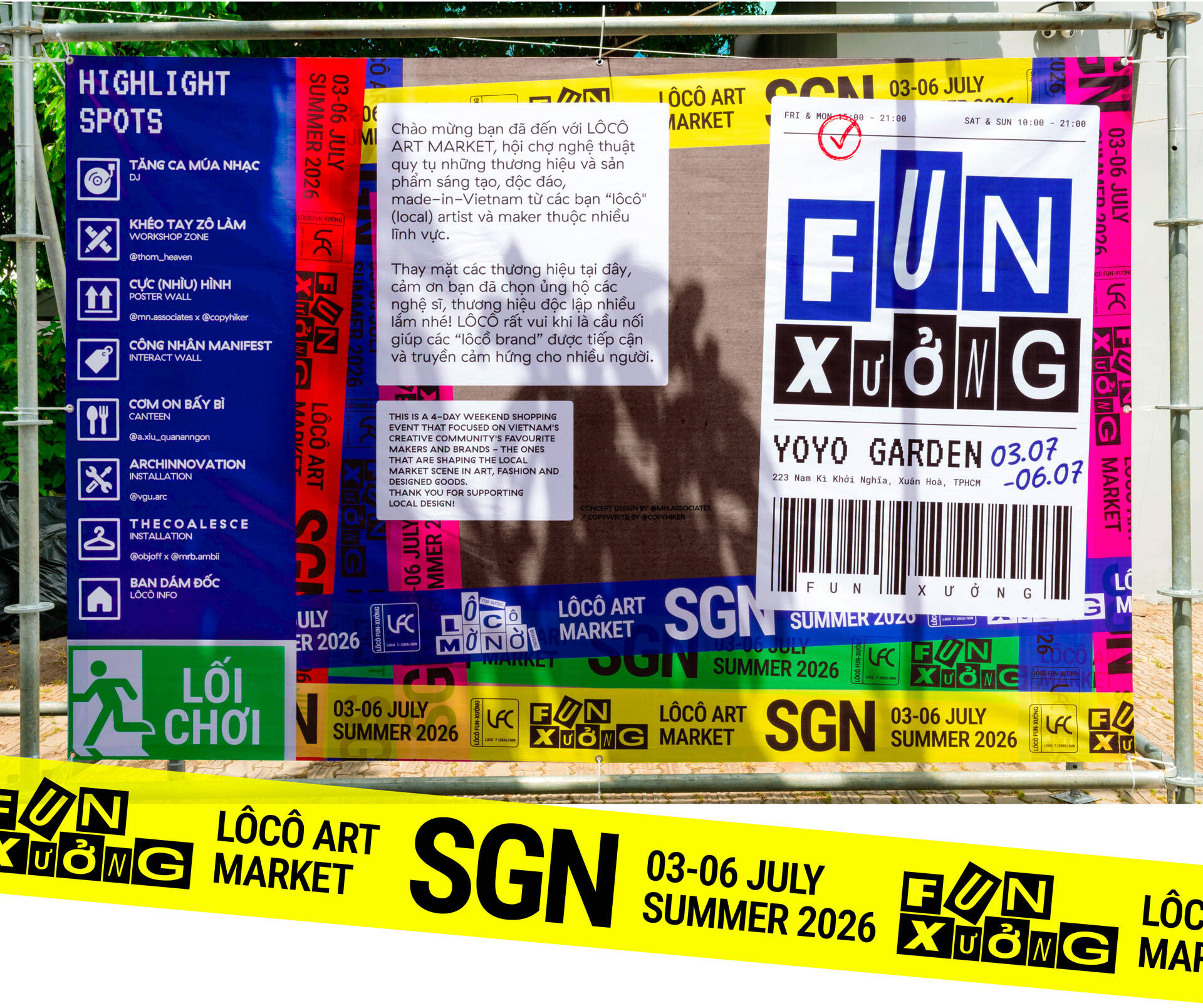
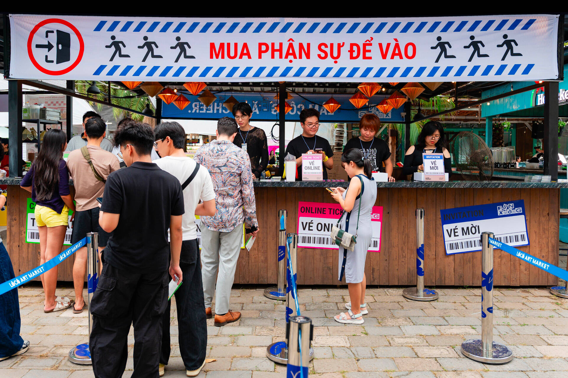
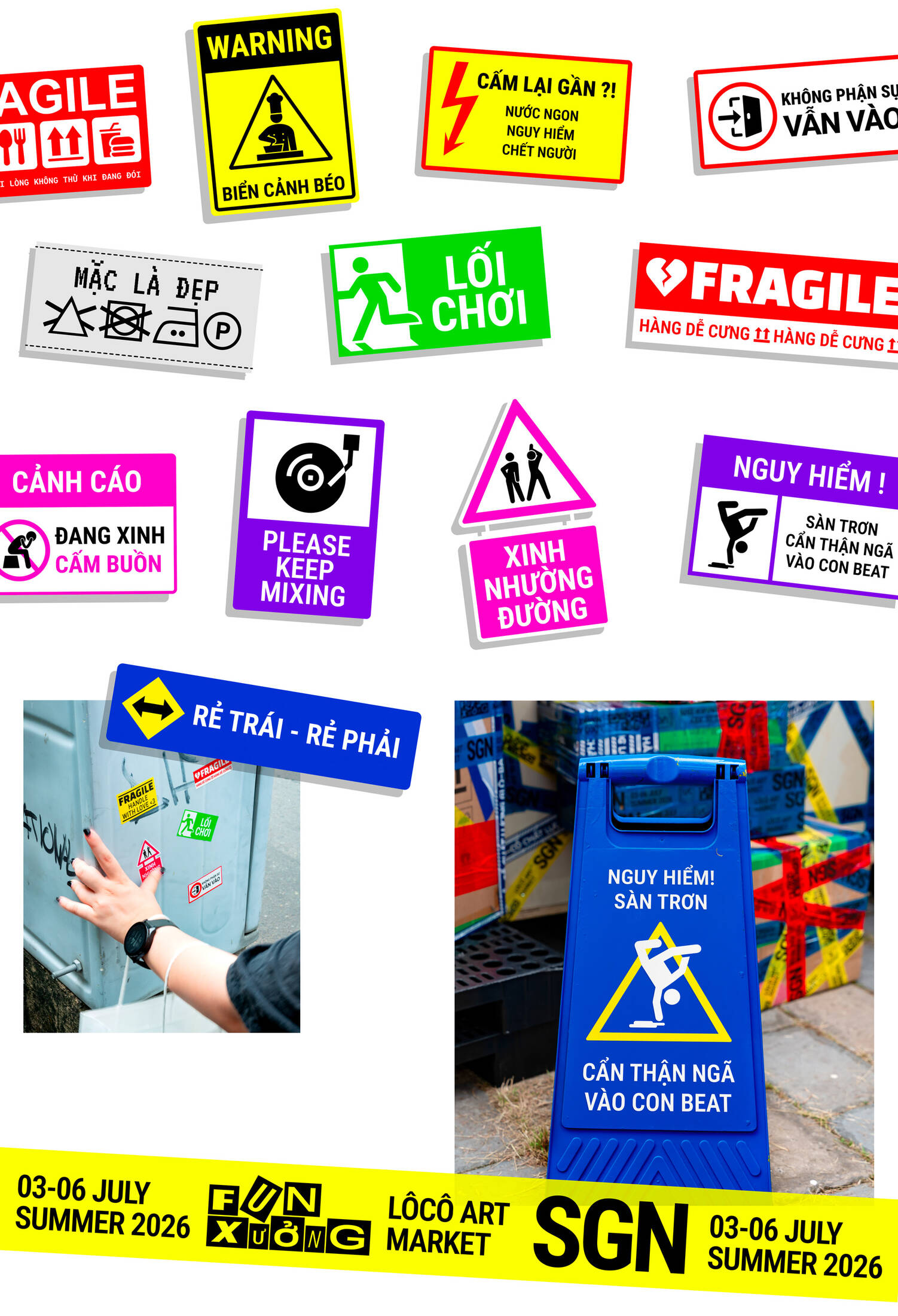
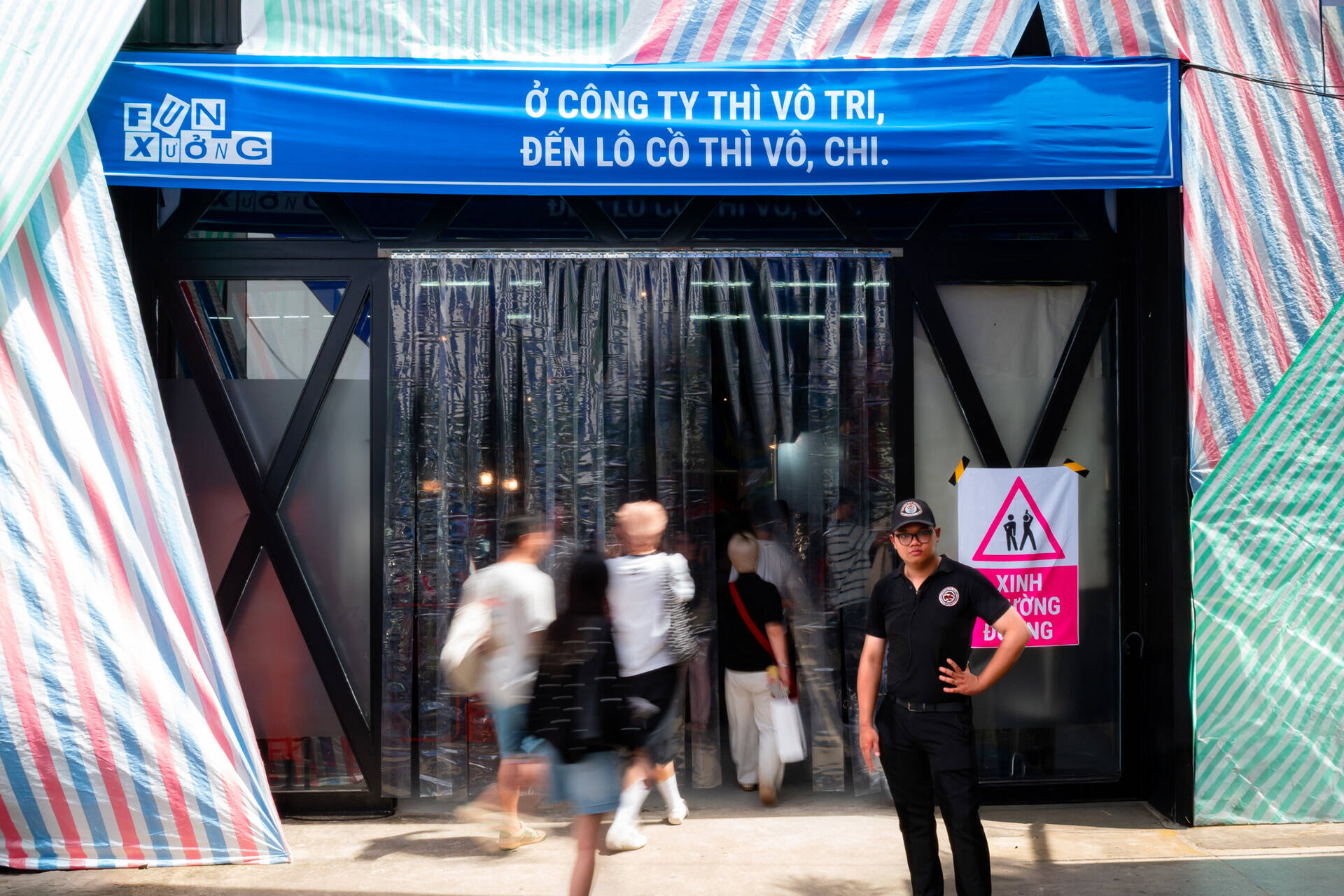
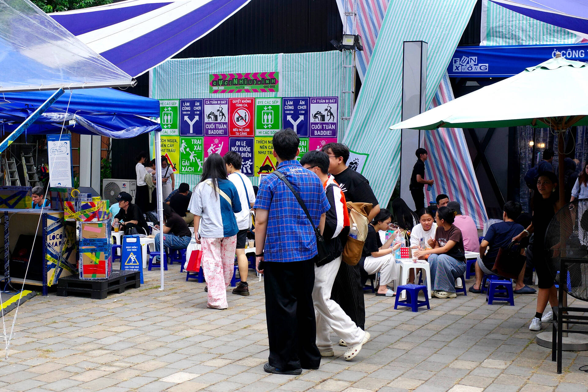
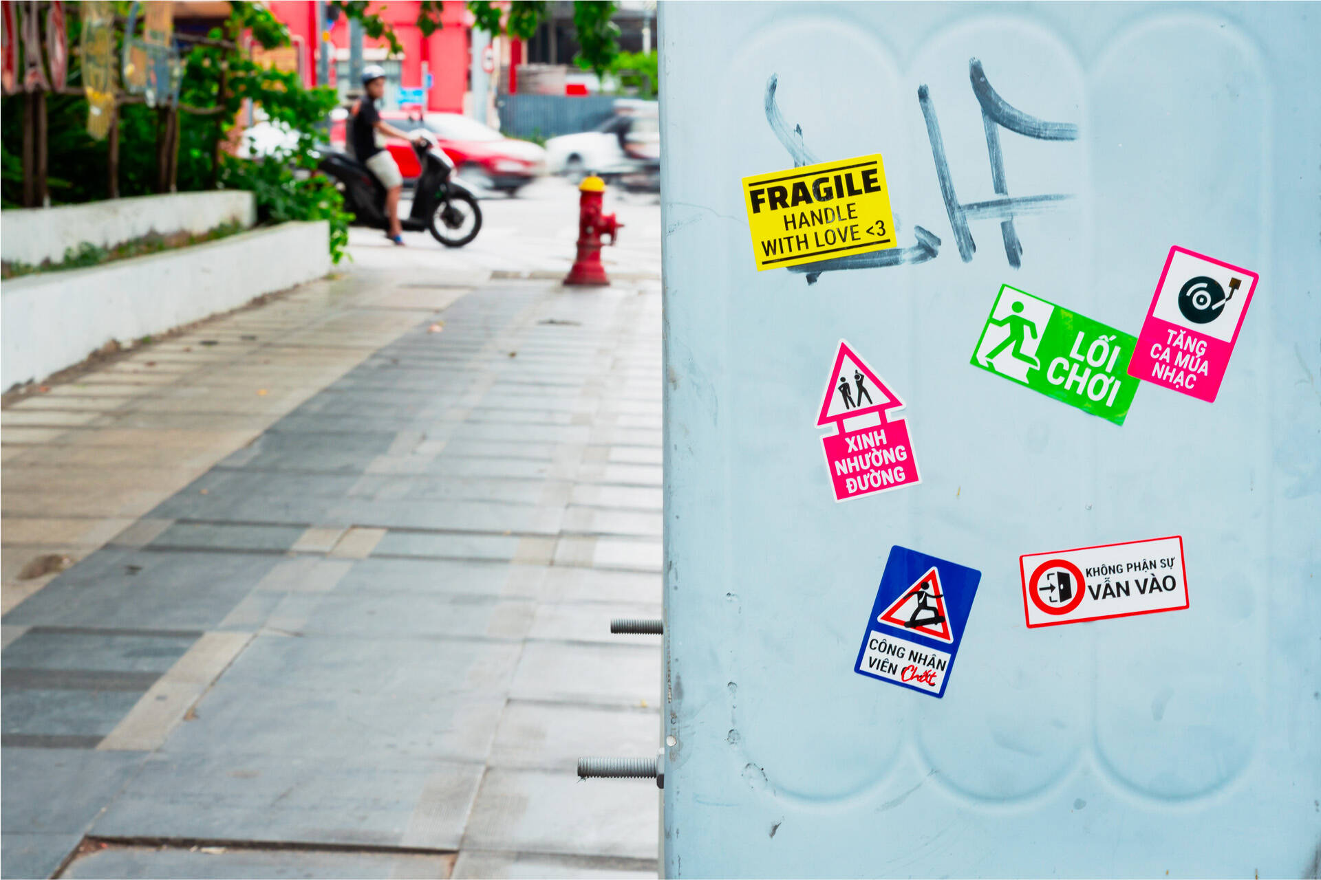
A collection of labels, stickers, and industrial signage extends the identity into a richer environmental graphic system. These formats allow the system to adapt across touchpoints, from entrance markers, event backdrops and banners to category tags, booth signs and pop-up notices. Rather than serving as purely decorative elements, each label plays a functional role by pairing with witty copywriting and localized humor within the factory theme. These typographic posters become memorable branded moments: surprising, entertaining, and worth capturing for social media.
ON-EVENT
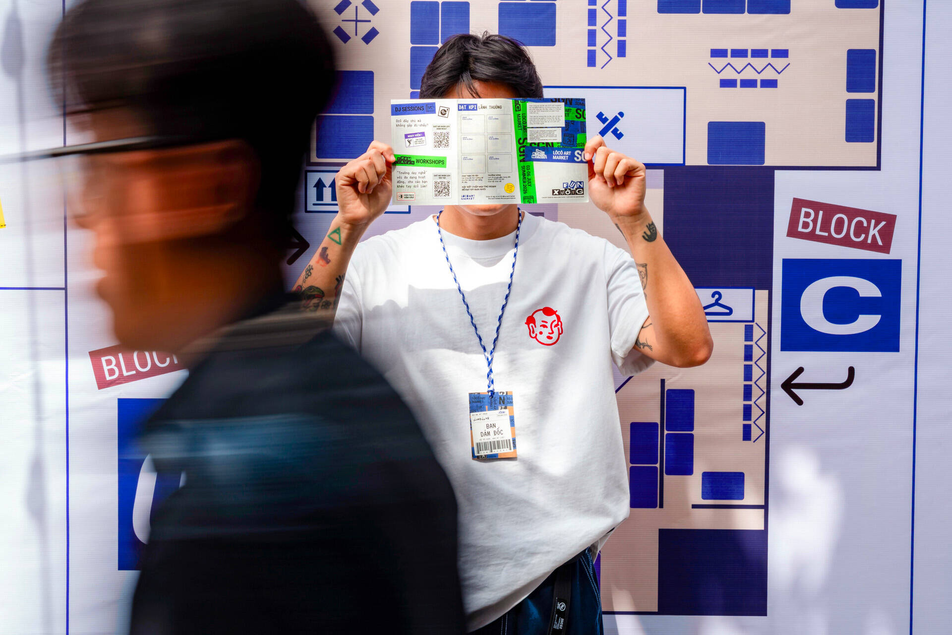
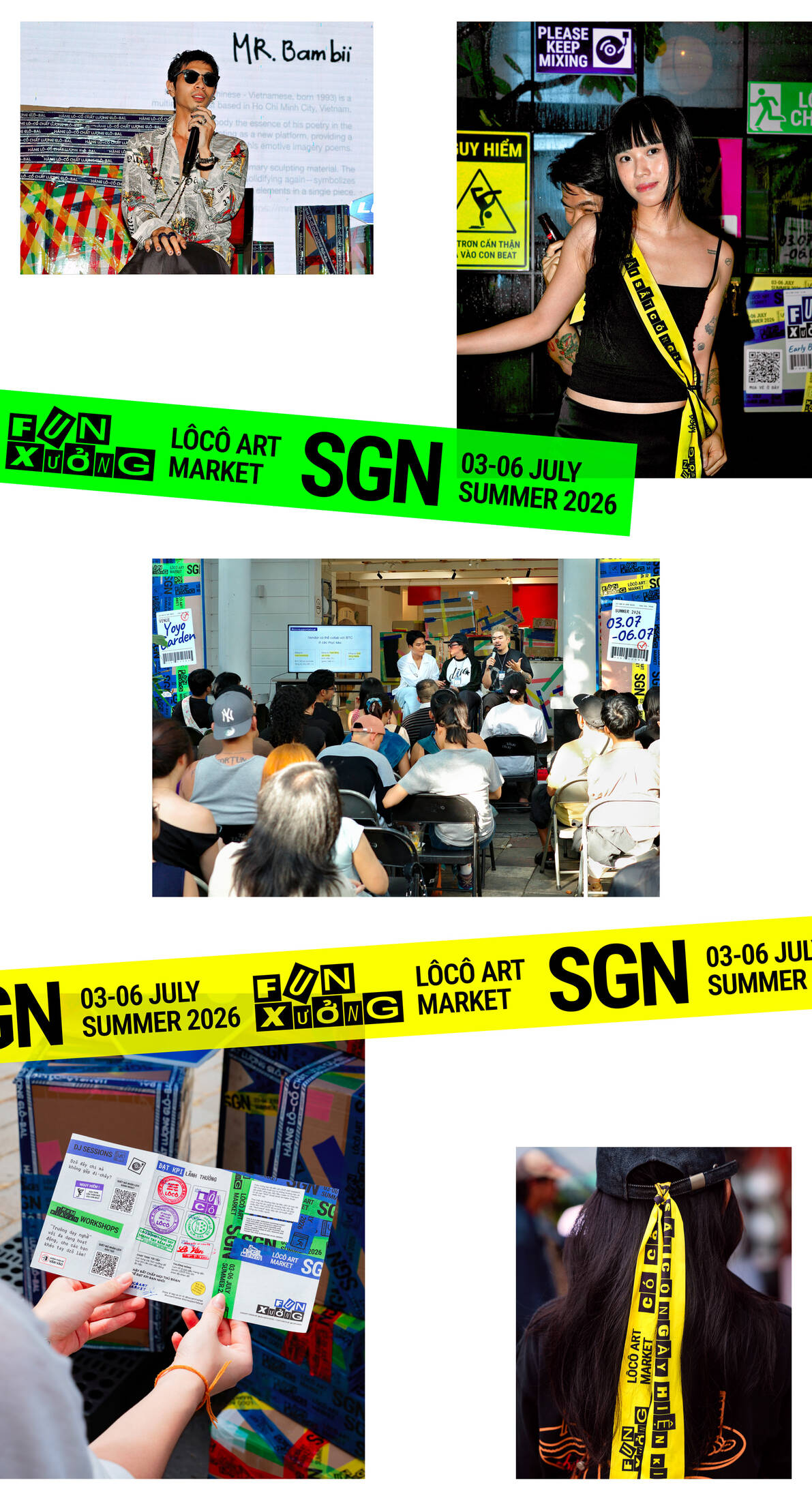
The identity came to life across every touchpoint during the event, becoming inseparable from the energy of both the artists and the audience. Most importantly, it didn’t just look good, it worked. It helped guests navigate the space, encouraged them to take photos, and overall created a shared atmosphere that made the event feel intentional, immersive and culturally aligned with the community it was built for.
This professional campaign titled 'M — N Associates Unboxes Local Culture Through "Fun-Xưởng"' was published in Vietnam in August, 2026. It was created for the brand: LÔCÔ Art Market, by ad agency: M — N Associates. This Design, Experiential, and Integrated media campaign is related to the Hospitality, Tourism, Other, and Travel and Tourism industries and contains 33 media assets. It was submitted about 2 months ago.
Credits
Collaboration Partner: LÔCÔ Art Market
Brand: LÔCÔ Art Market
Branding Firm: M — N Associates
Executive Creative Director: Duy — N
Designer: Bảo Trương, Nhi Bùi, Phương-Anh Nguyễn
Social Media Content: Thảo-Vy Nguyễn
Project Manager: Hồng-Chi Phan
Copywriter: NoEyeDeer x SAC
Social Media Designer: Phát Lê
Event Decorator: evergreen
Production Manager: Hậu Tăng, Nhi Nguyễn
Photographer: Nhân Lê
Portfolio Producer: Bảo Trương, Nhi Bùi, Phương-Anh Nguyễn, Thảo-Vy Nguyễn, Tân Nguyễn