

Description
OVERVIEW
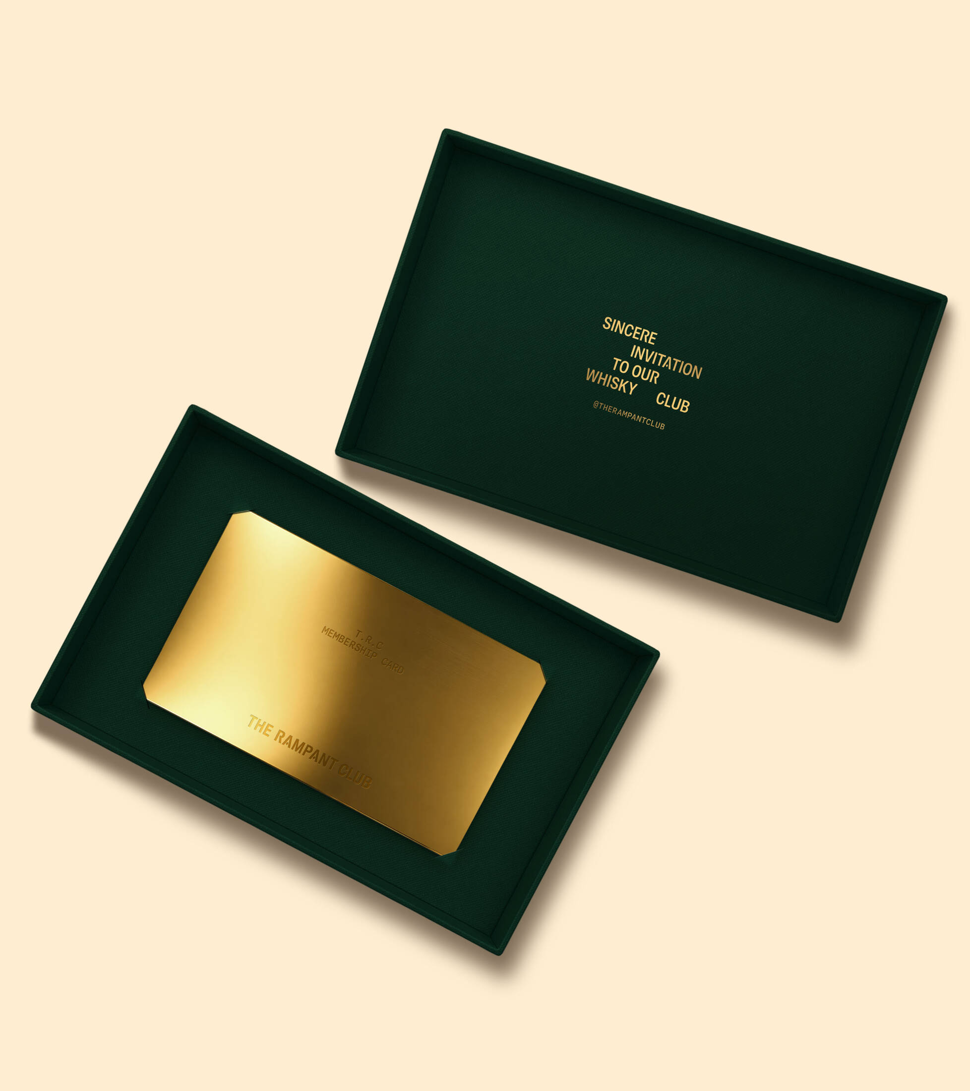
Born from a Scottish whisky house, The Rampant Club is a private members' society for those devoted to whisky and everything worth gathering around it. Located in the heart of Ho Chi Minh City, the club is shaped by the philosophy of Scottish heritage meets Vietnamese soul, reinterpreting the customs of Scotland's whisky traditions through the convivial rhythm of contemporary Vietnam.
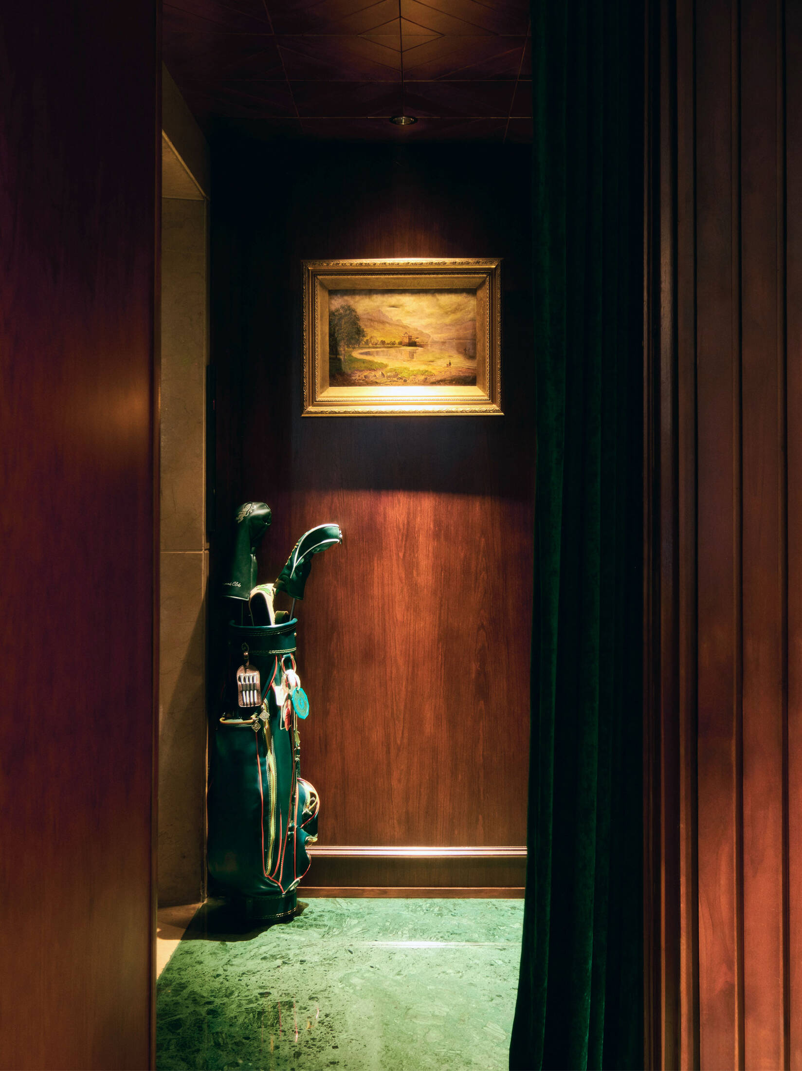
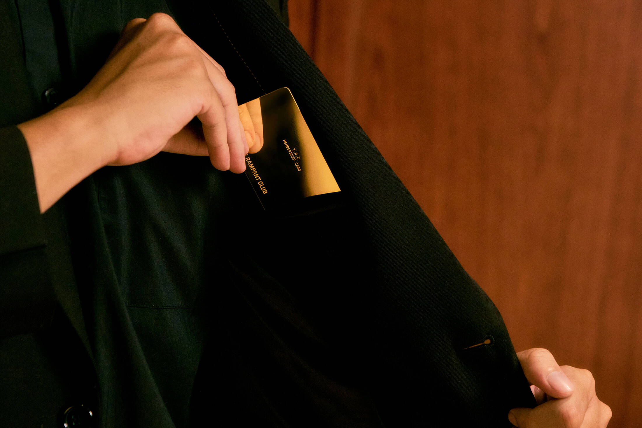
Membership is by referral only, granting access to a five-floor clubhouse which is sustained not by profit motives, but by a community of kindred spirits. Here, there are no menus to dictate the evening, no clocks to bring it to an end and no permission required to linger a little longer. The Rampant Club embodies the belief that whisky is best enjoyed not in isolation, but as a catalyst for conversation, discovery and meaningful companionship.
Scope Of Work
Brand Concept & Naming
Brand Identity: Brand Design System, Custom Typography, Digital Experience, Photography Direction, Applications, Guidelines
Concept
A club that values community over status is not for everyone. It is for those who understand why this kind of access is rare, those who are committed to making whisky socially alive, and those who belong to a generation of curious drinkers and creative minds.
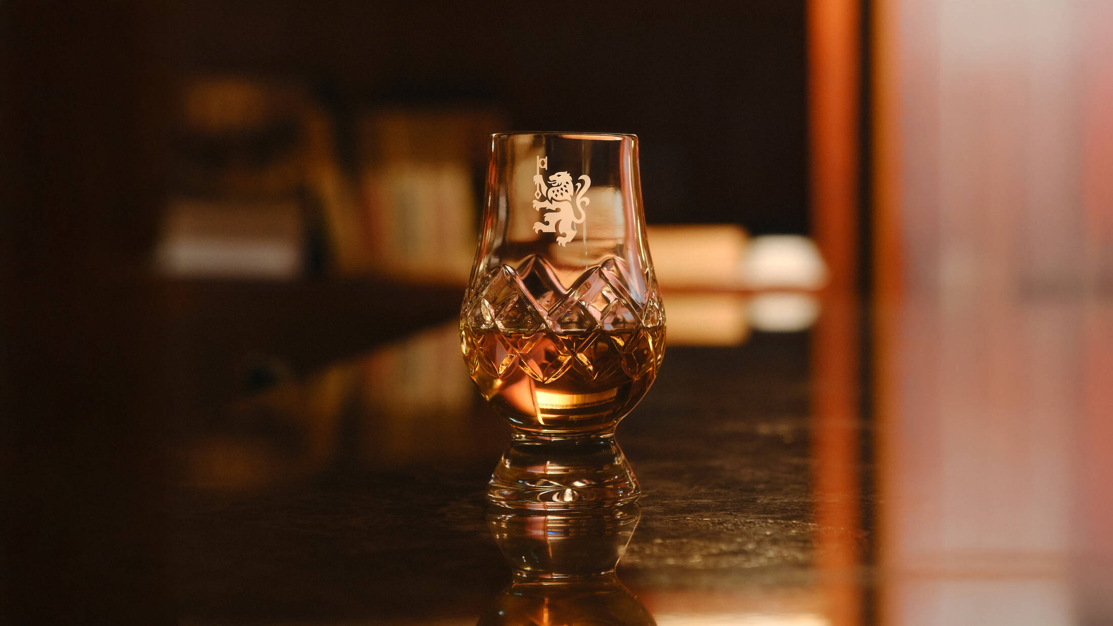
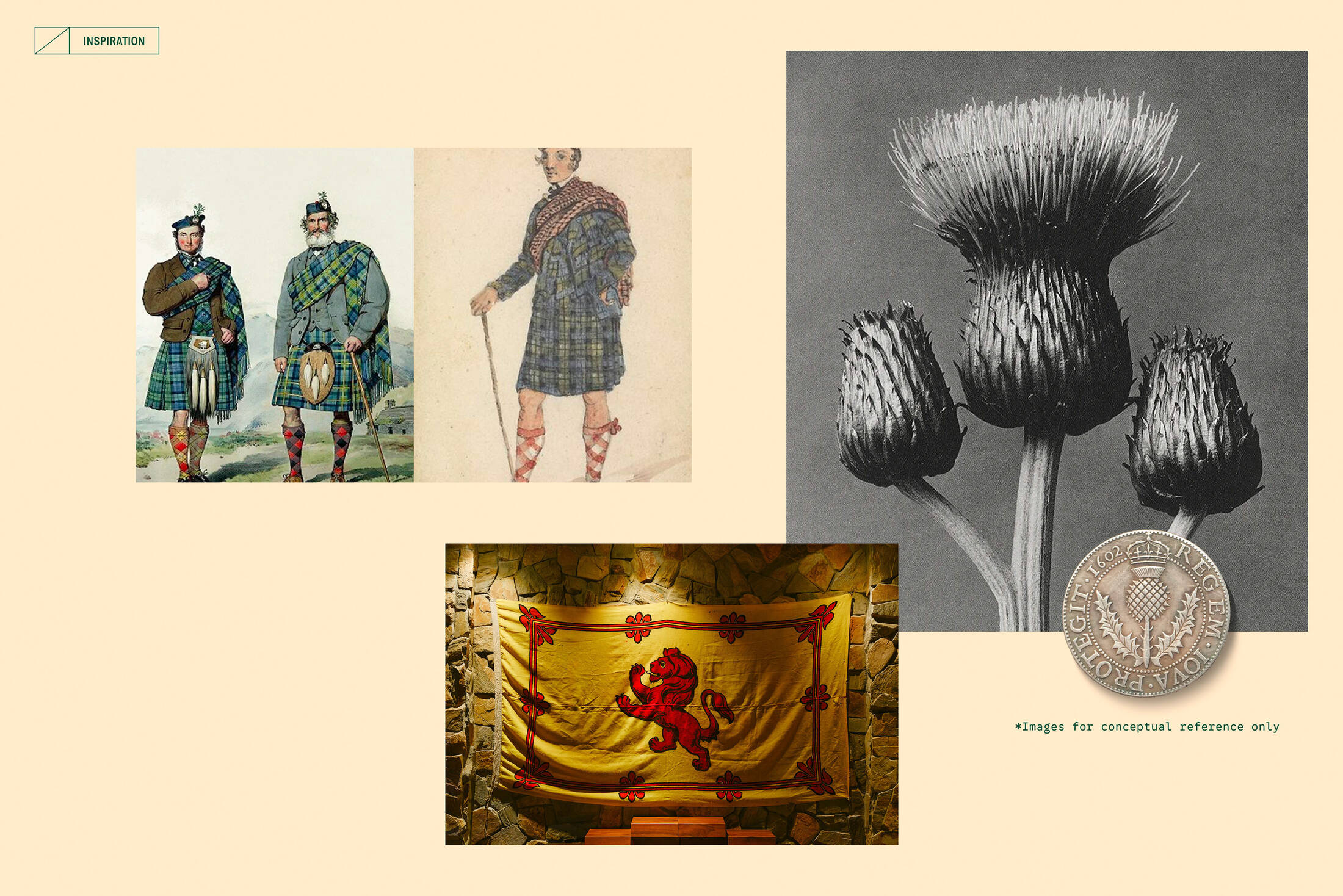
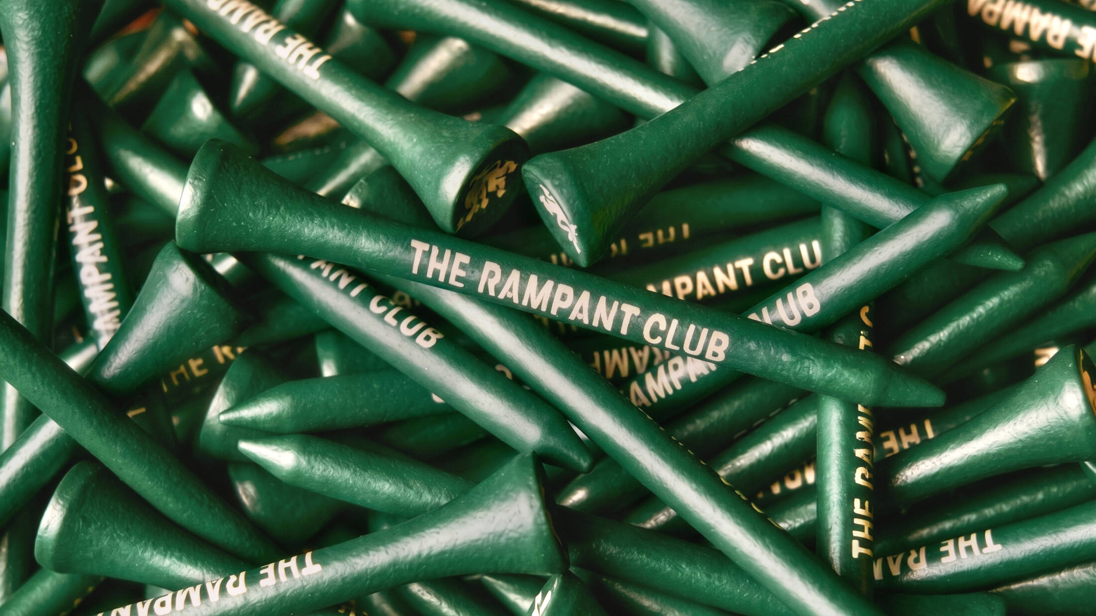
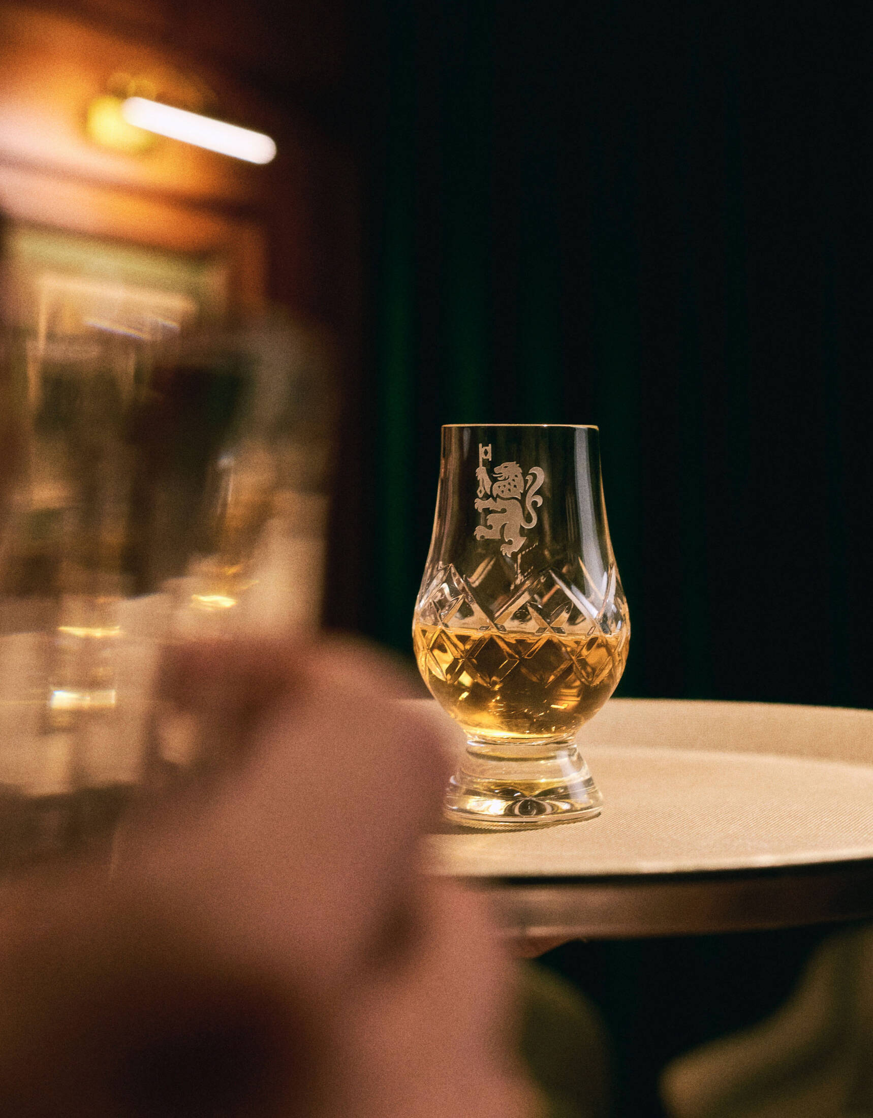
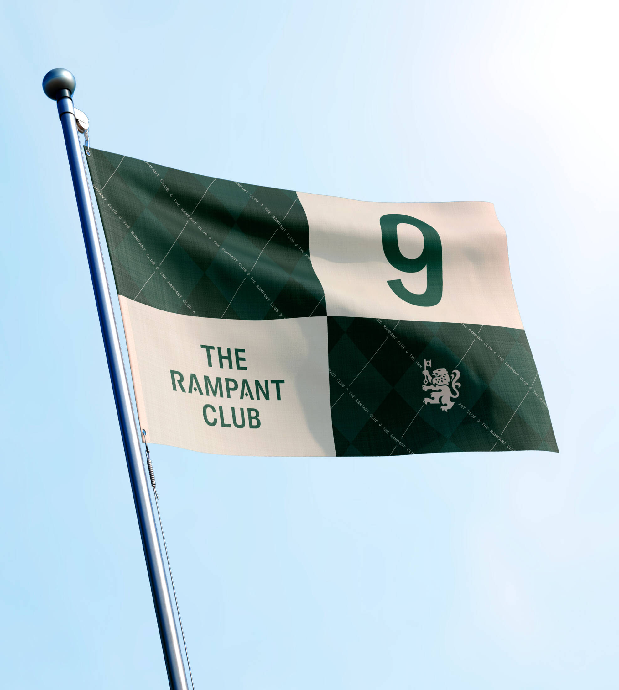
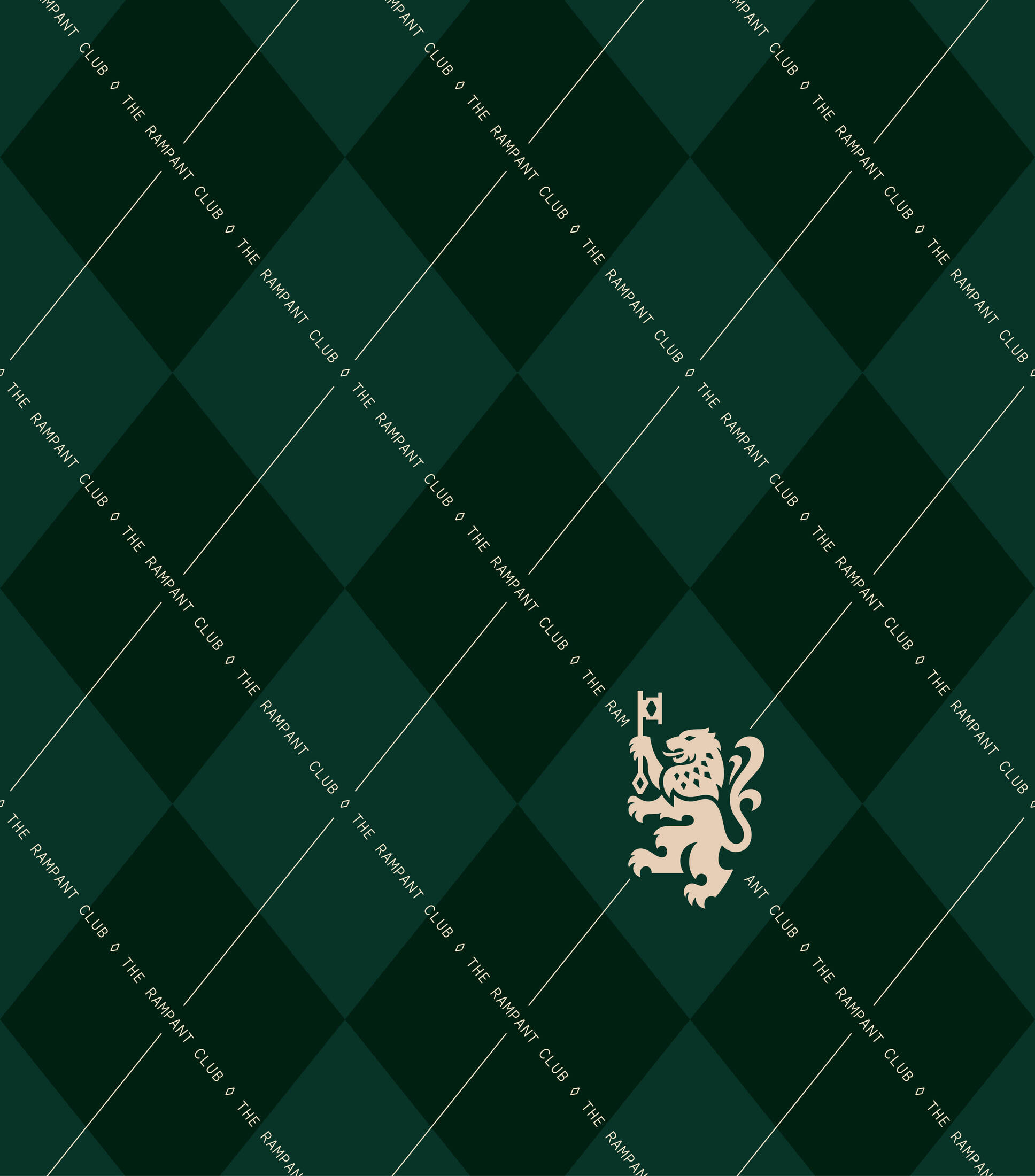
For this narrative, we immersed ourselves in Scotland’s rich whisky heritage, translating its symbols into a contemporary visual language. Woven throughout the identity are Scotland's most enduring symbols, from the Lion Rampant of the Royal Banner of Scotland and the nation's enduring thistle, to Highland dress, tartan and heraldic motifs. Anchoring it all is a wheel-cut diamond pattern, abstracted from the faceted surface of a classic whisky glass, that ties the identity together.
RAMPANT MARK
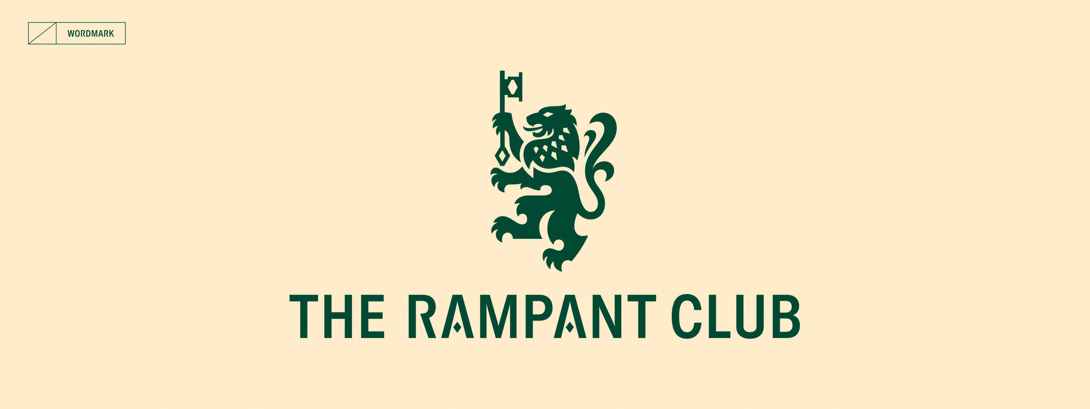
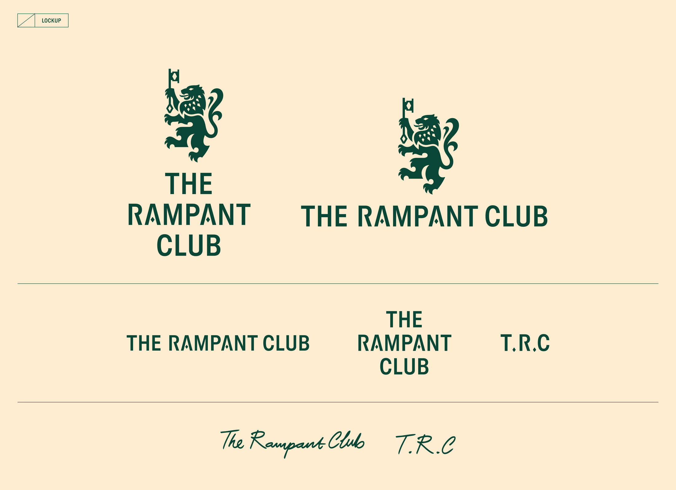
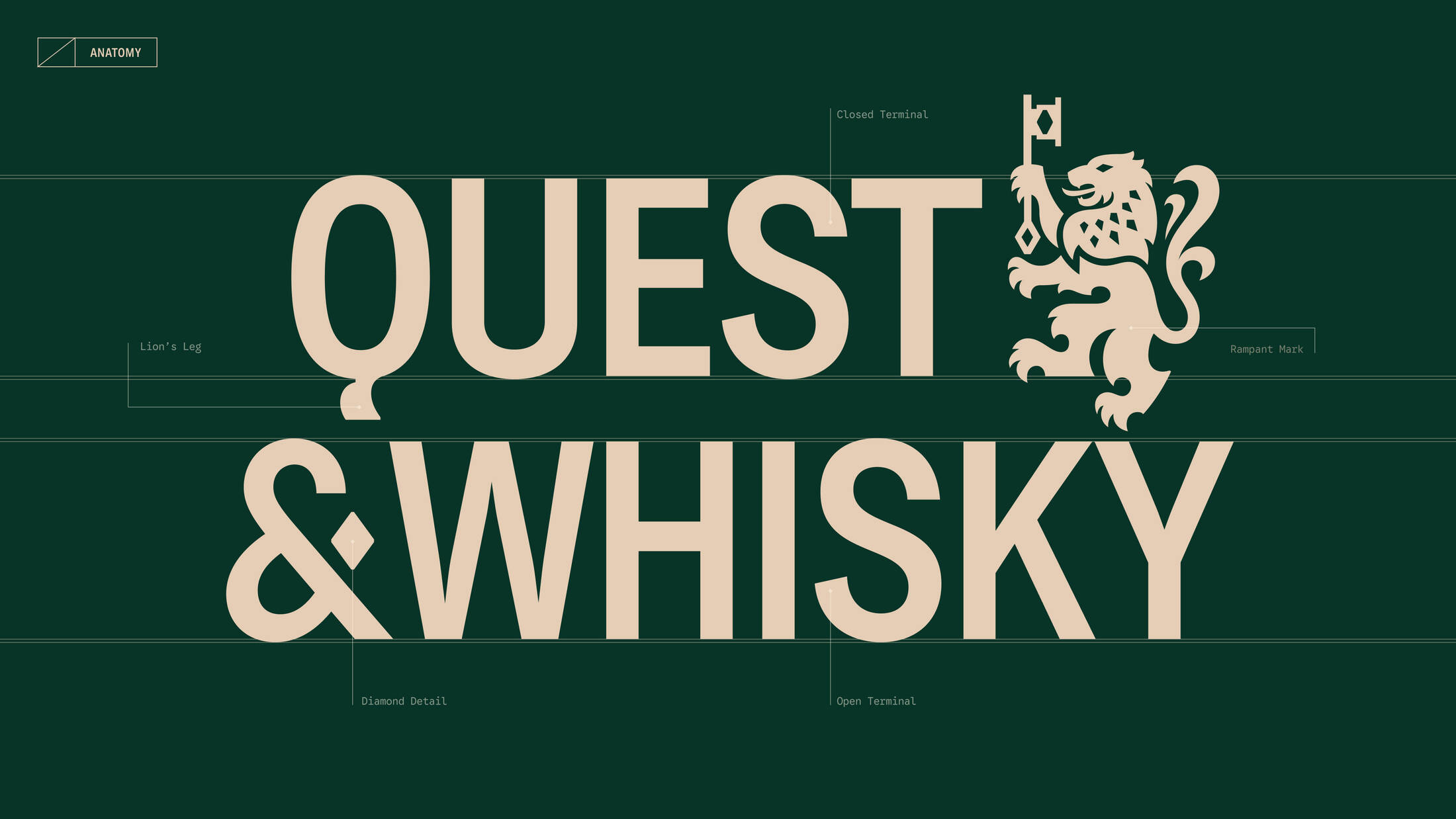
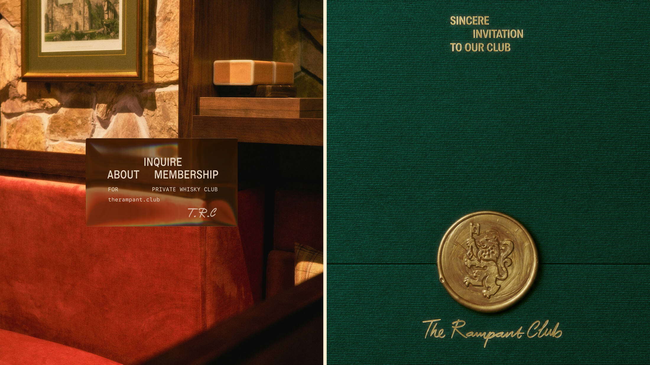
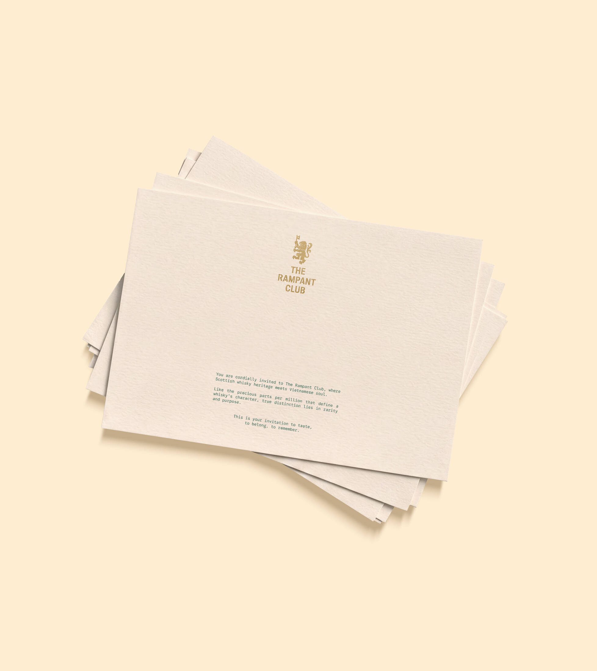
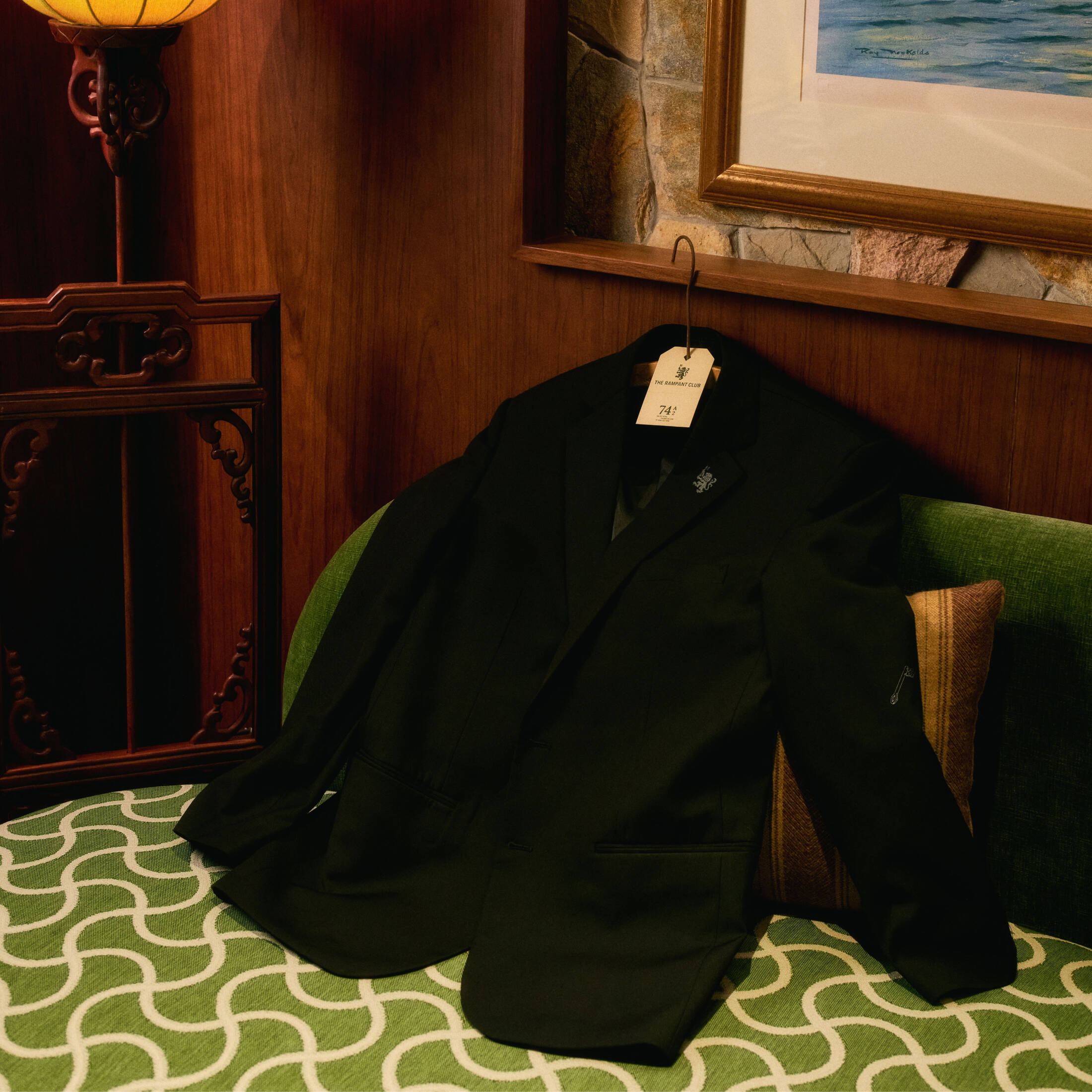
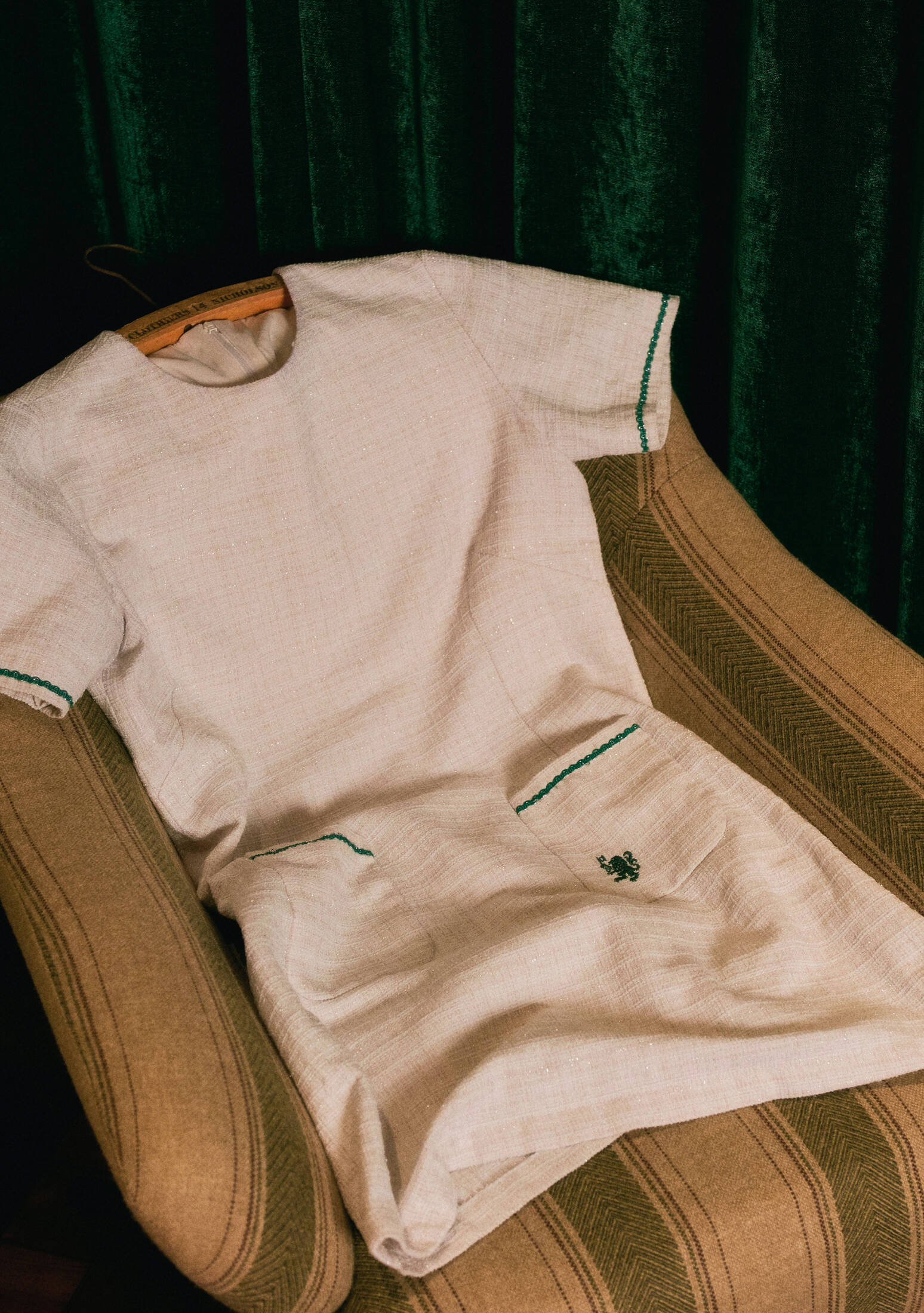
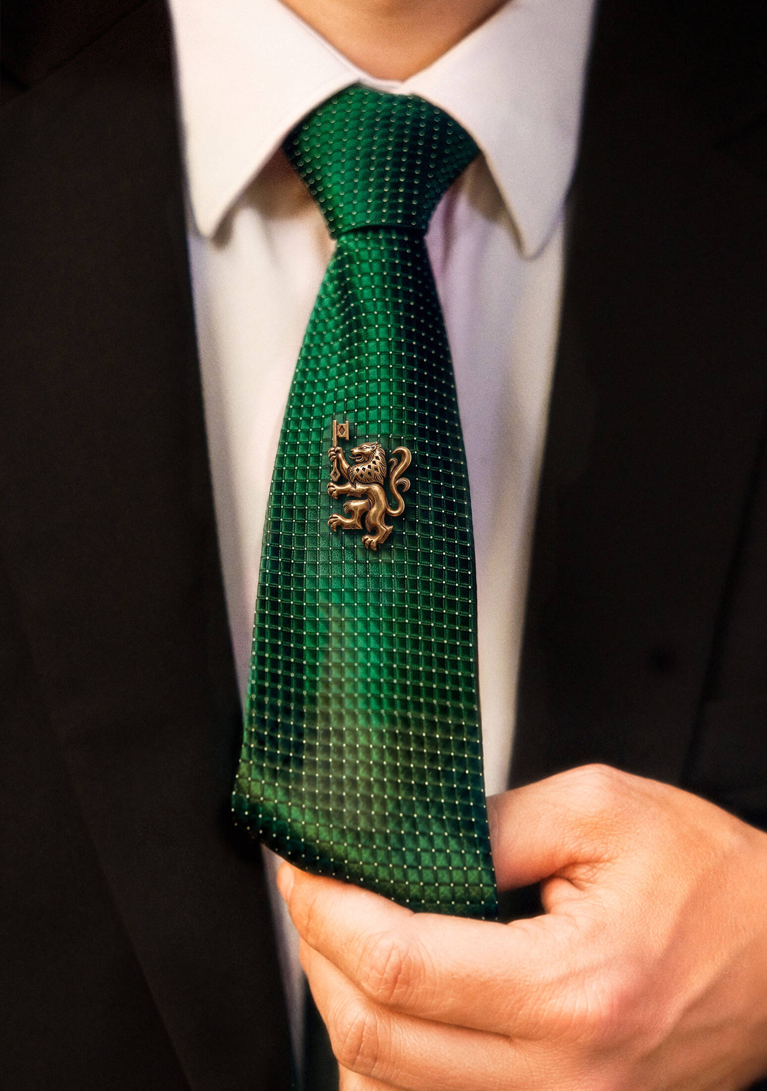
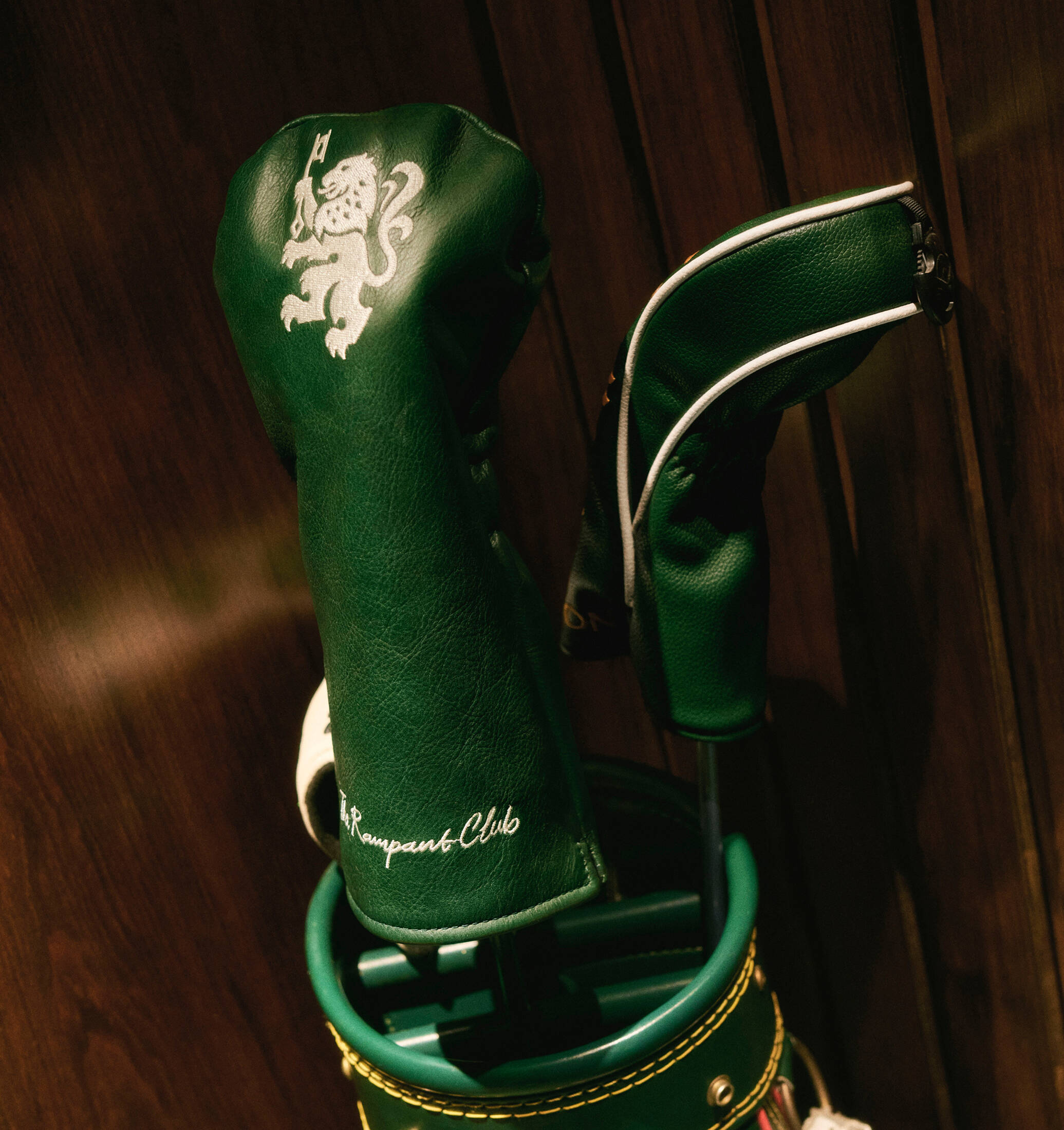
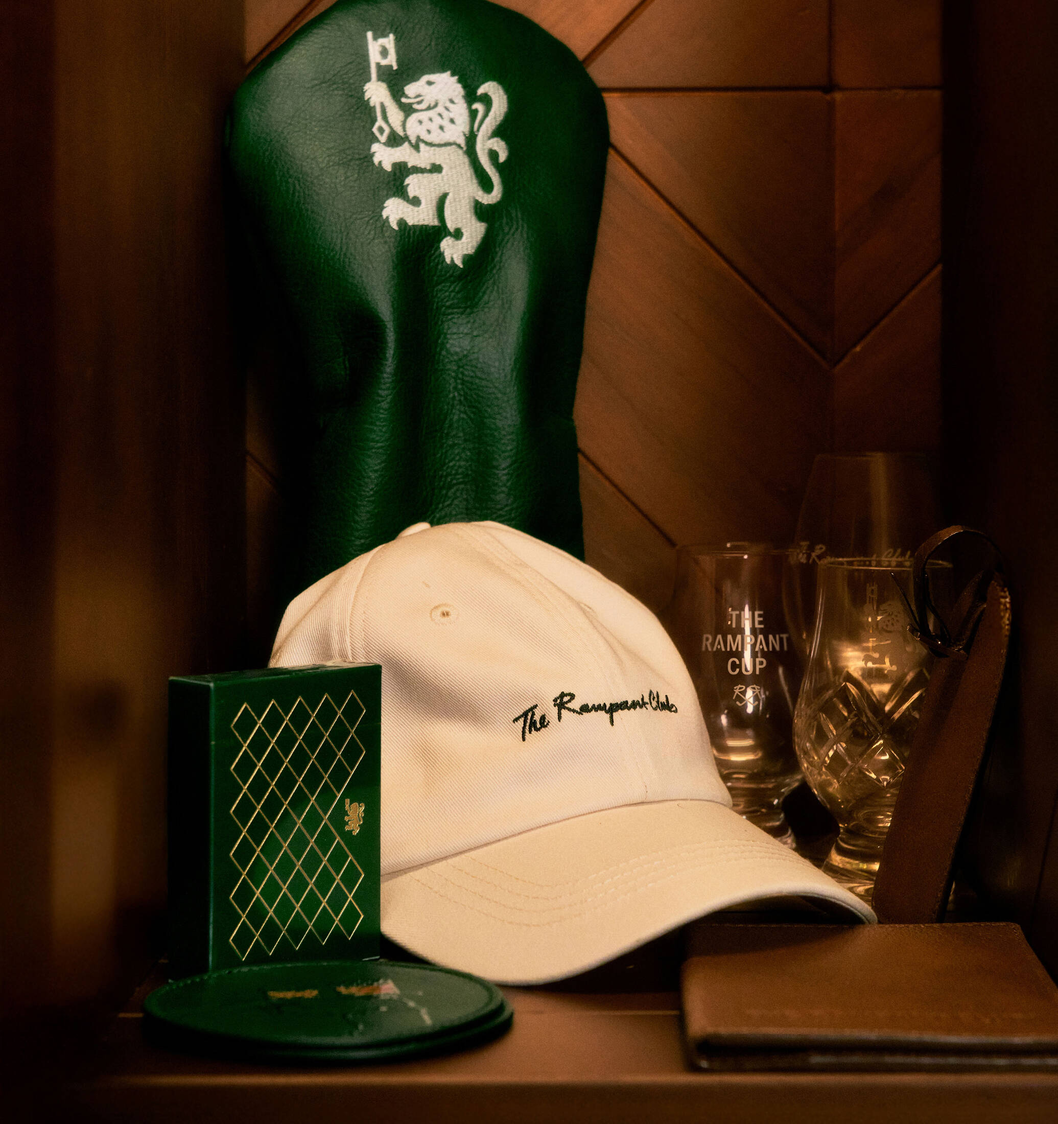
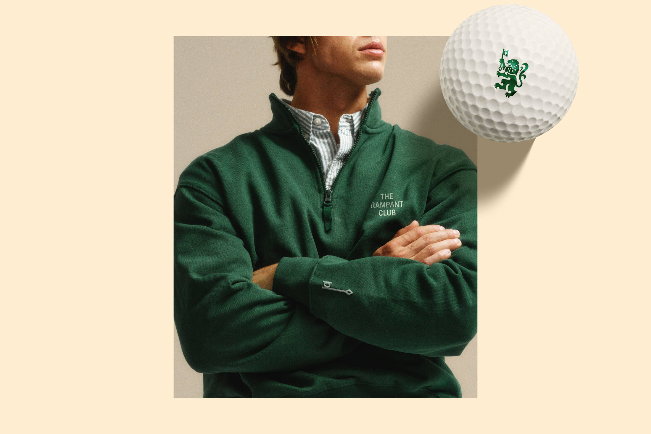
There is luxury in knowing what to leave untouched. That is why the centre of this identity preserves the distinctive, outstretched stance of the Lion Rampant from Scotland’s Royal Banner, while reimagining it with subtle details drawn from the world of whisky. The Rampant’s mane echoes the signature form of the Great Highland bagpipes, bringing an unmistakable Scottish character to its majestic silhouette. Meanwhile, our adjustments to the ornamental tail and triangular details, adapting from elements of the original Duncan Taylor Whisky mark, forge a quiet link between the club and the house from which it was born. Just like a glass of whisky, this mark is best appreciated slowly to reveal layers of heritage and discovery.
WORDMARK
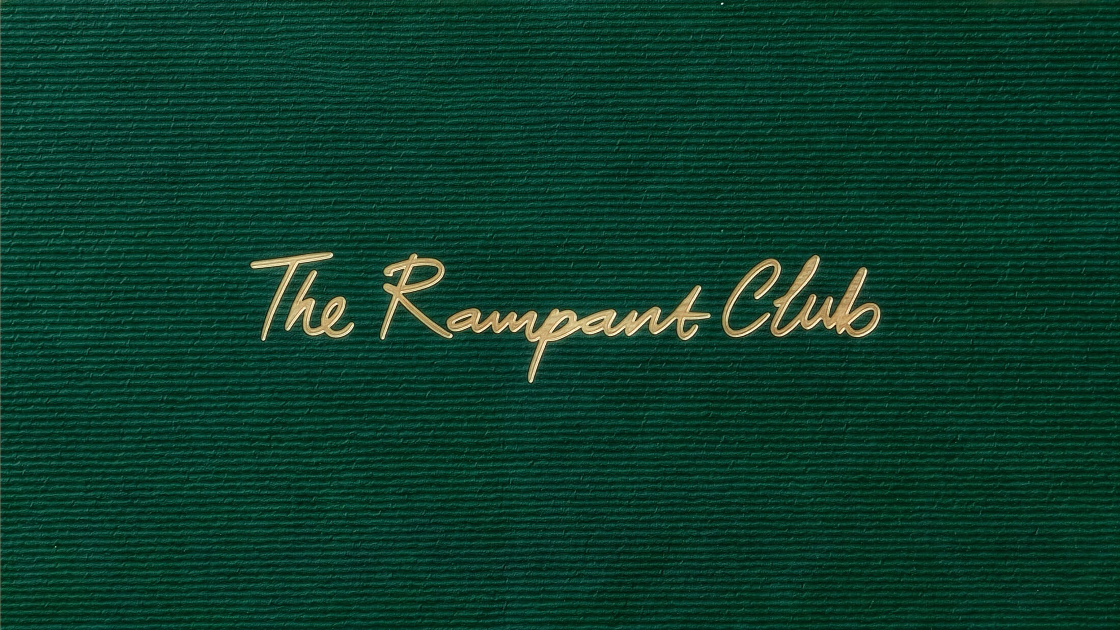
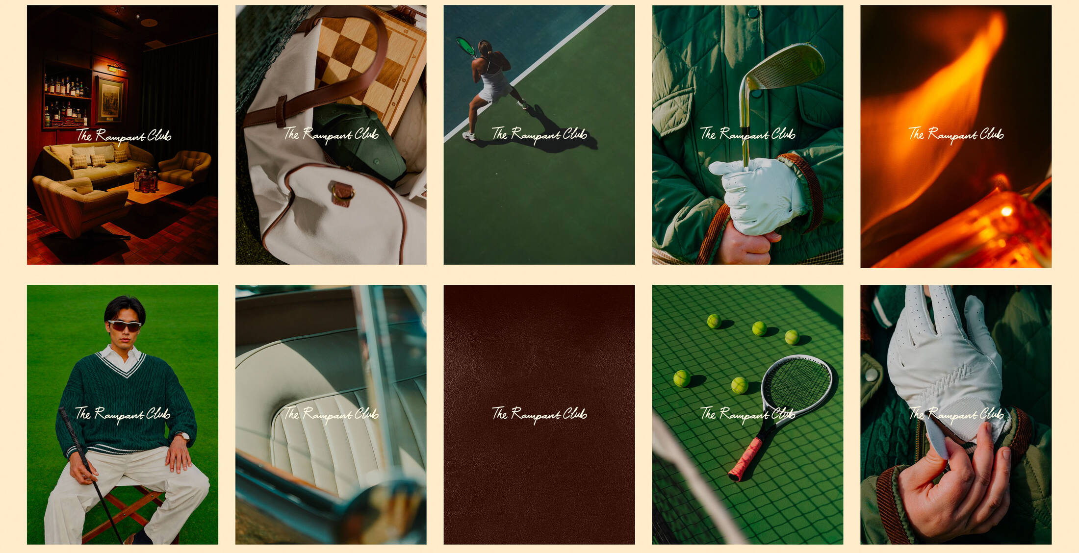
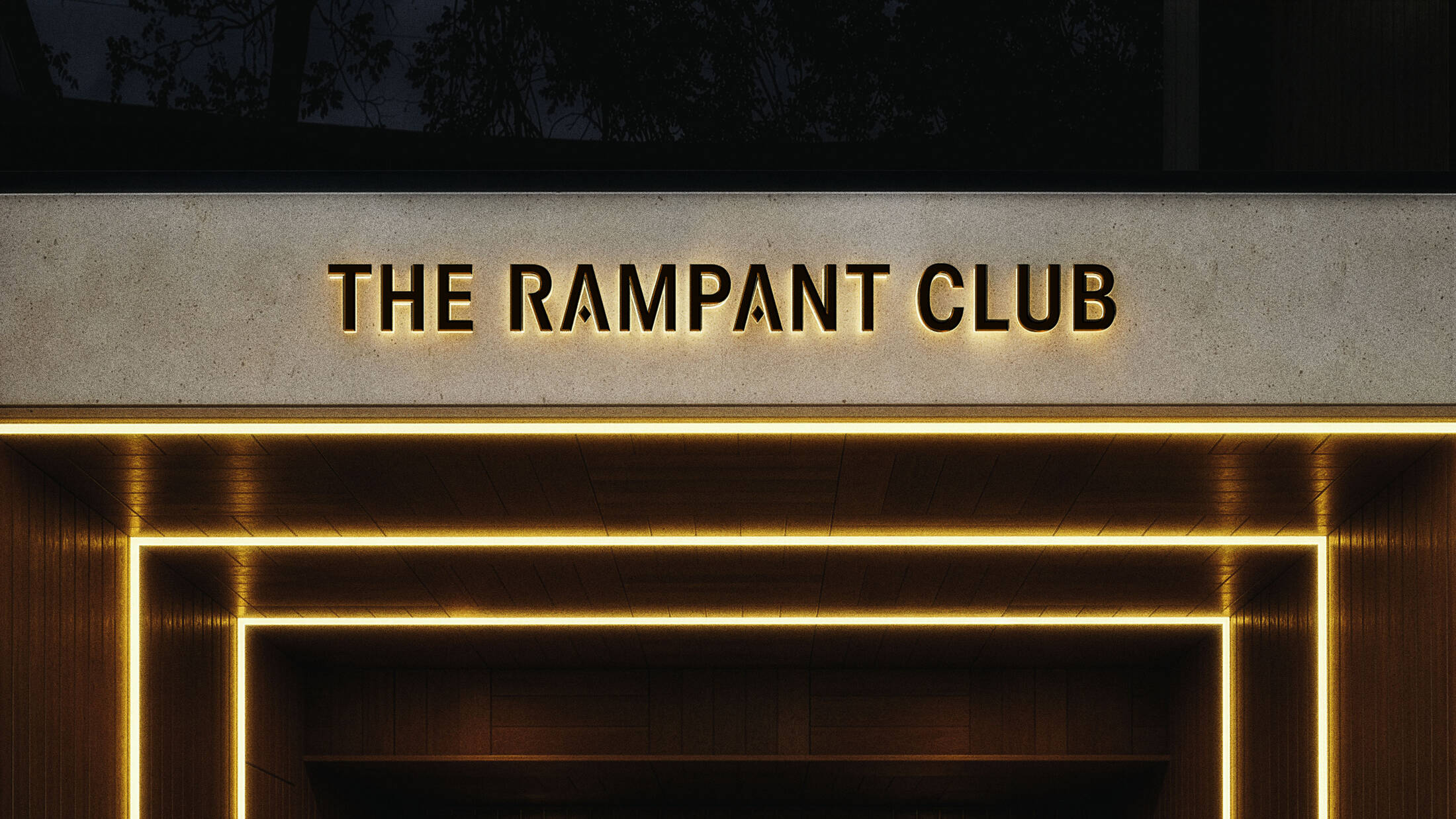
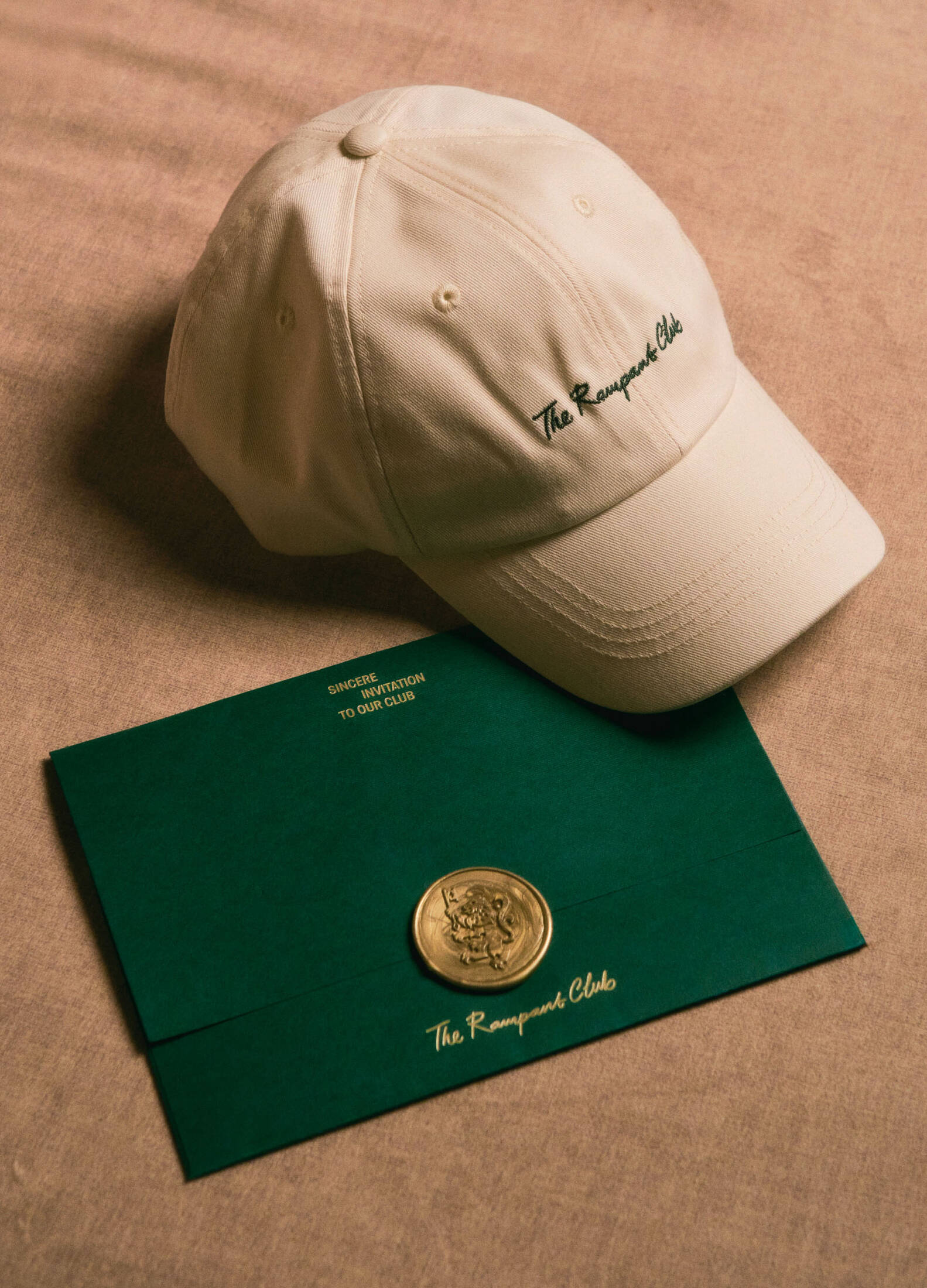
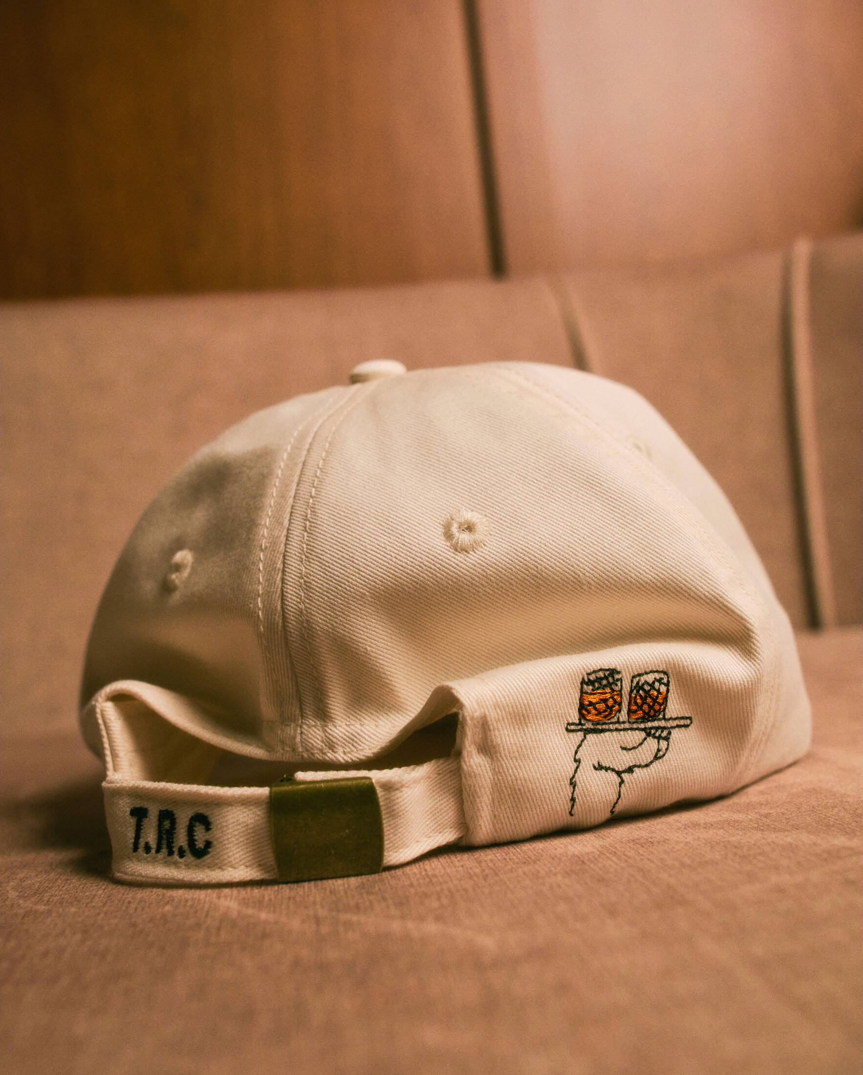
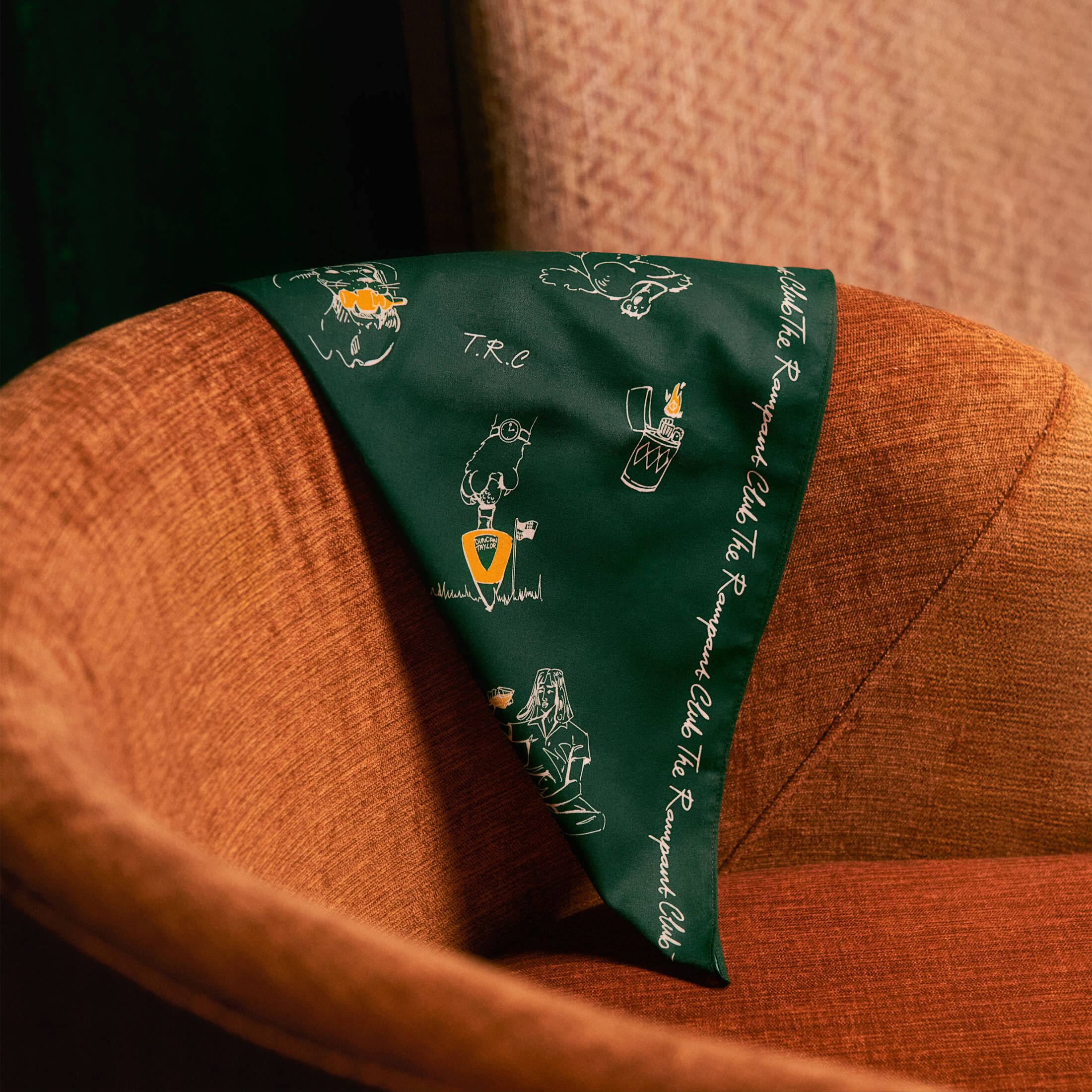
Elegant, minimal and sophisticated, the wordmark trio sets the tone for refined exclusivity. The primary wordmark uses a Gothic-inspired sans serif with a straight, upright posture that balances the bold, expressive Rampant Mark above. Its tightened spacing creates a sense of enclosure, referring to the club’s discreet private entrance. The letter ’A’ has its conventional crossbar replaced with a diamond detail to become a quiet signature reserved for those with curious minds and discerning eyes. Similarly, the abbreviated T.R.C. distils the club into a subtle shorthand. Short in form, yet rich in character and spirit. Finally, the handwritten wordmark brings an authentic and personal touch to the identity, softening its formal character across the club’s activities and social touchpoints.
CUSTOM TYPE & LAYOUT
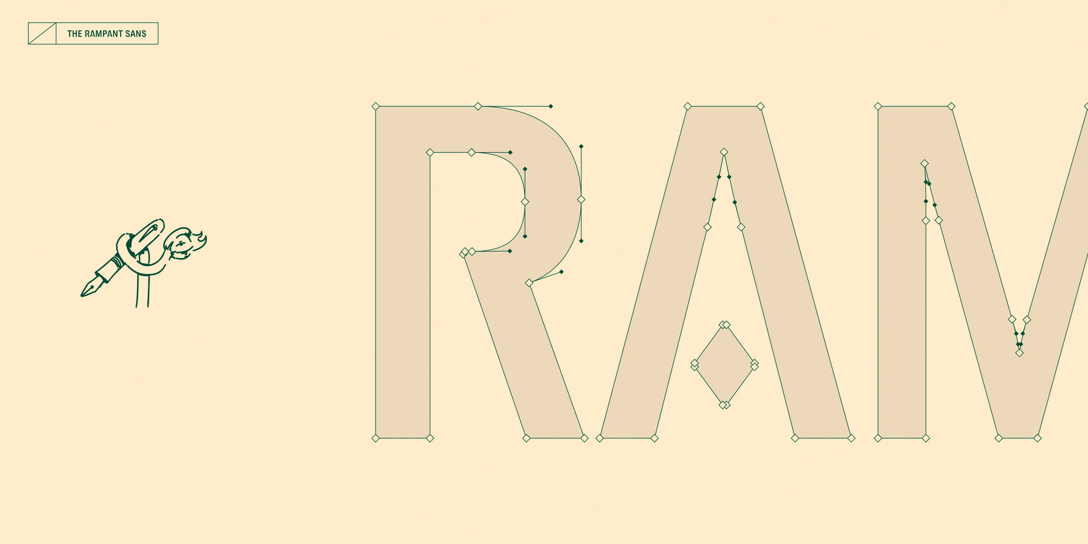
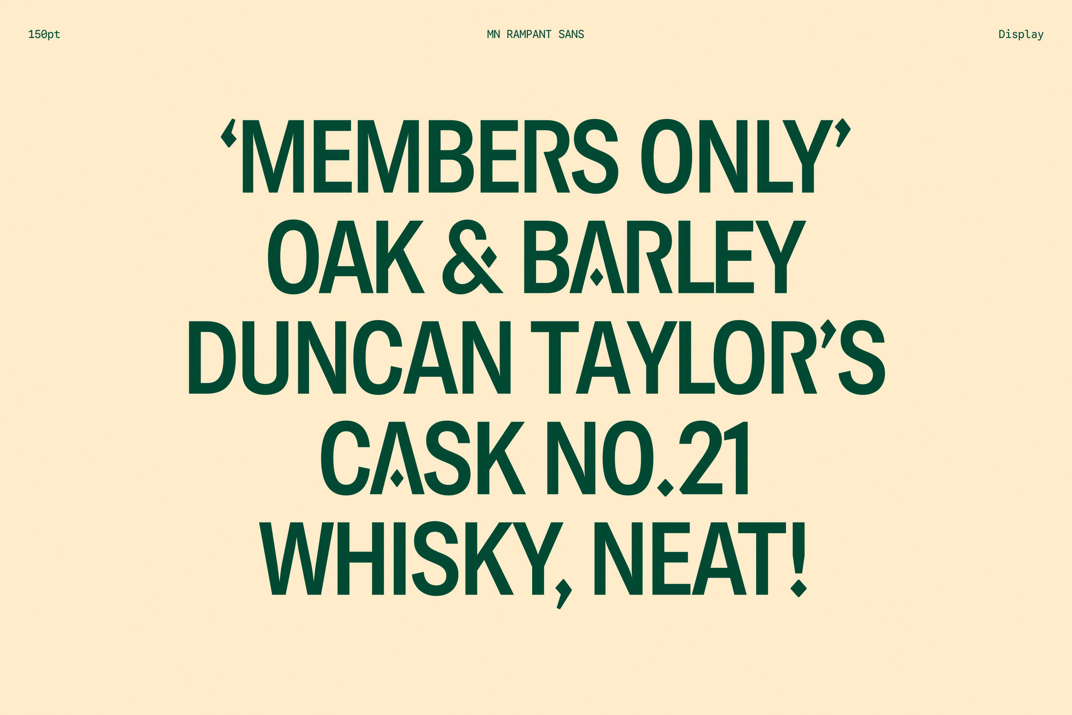
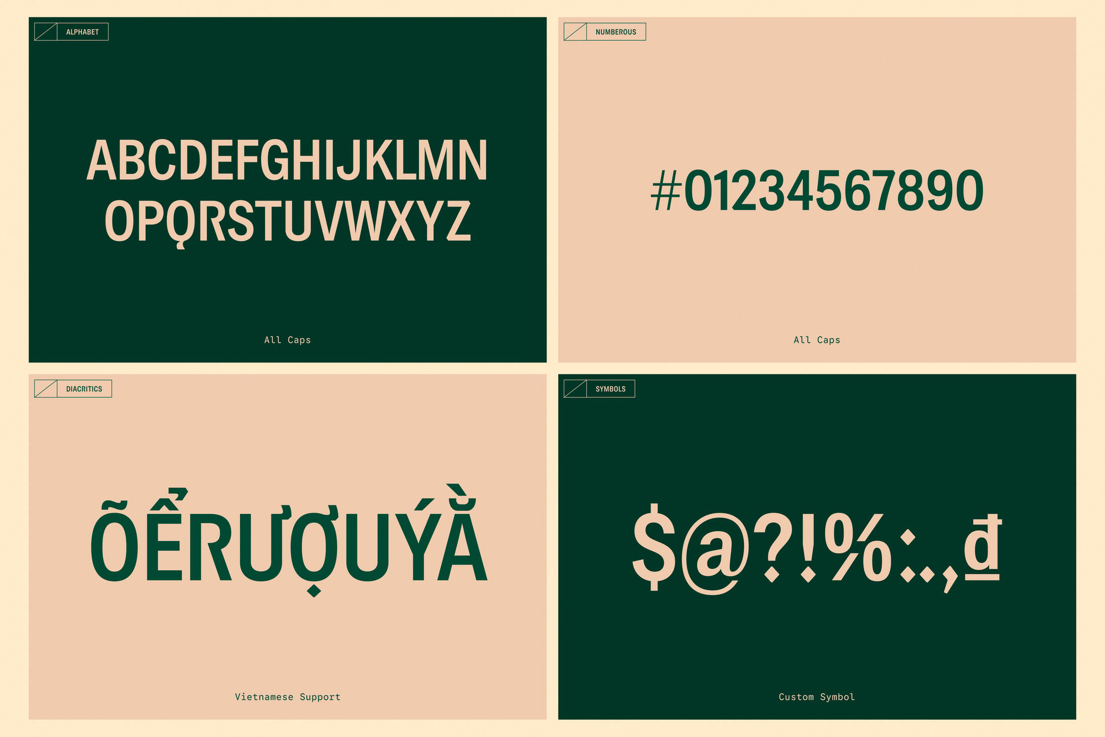
The Rampant Mark and its signature diamond detail extend beyond the logo to shape the anatomy of our custom Rampant Sans, allowing the club’s distinctive character to live within the typography. Elements of the Rampant’s figure such as the curved sweep of its tail, the rounded ends of its limbs and the defining shapes within its body, are carefully abstracted and translated into letterforms, creating a bespoke typographic system. Whether used boldly in headlines or at a smaller scale across club messages, the Rampant Sans carries the club's spirit throughout its branding experience, even when the Rampant Lion is nowhere in sight. The font’s final touch lies in its full support for Vietnamese diacritics, lending the old soul of Scottish whisky a new nuance shaped by Vietnam's cultural rhythm.
LAYOUT PRINCIPLE
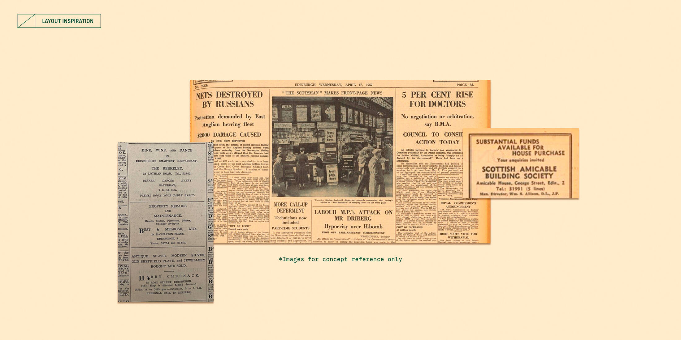
Even on screen, the club retains the vintage pleasure of turning a page. Taking cues from old Scottish newspapers, The Rampant Club’s editorial layout treats spacing and whitespace as deliberate units of measure, creating a composition as precise as one shaped by a craftsman’s ruler. Such generous margins and considered proportions seamlessly translate the tactile sensibility of print into a digital setting. Breaking from the contemporary habit of scrolling, this layout invites members to pause, explore and discover. It is truly a reward for those who appreciate the finer details and feel them deeply.
ILLUSTRATION
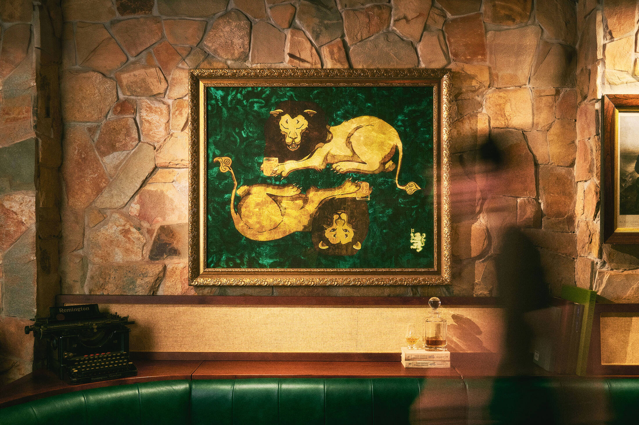
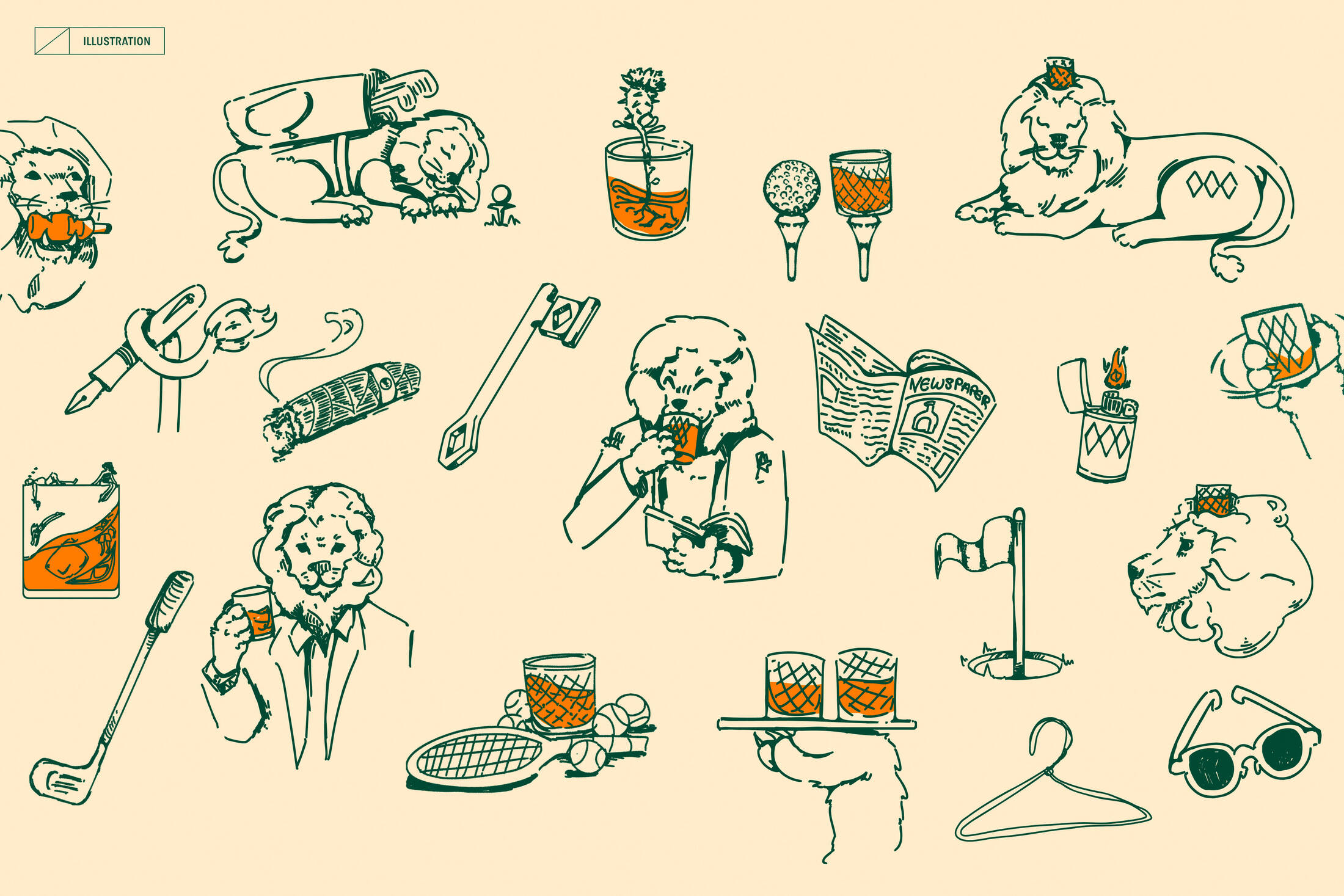
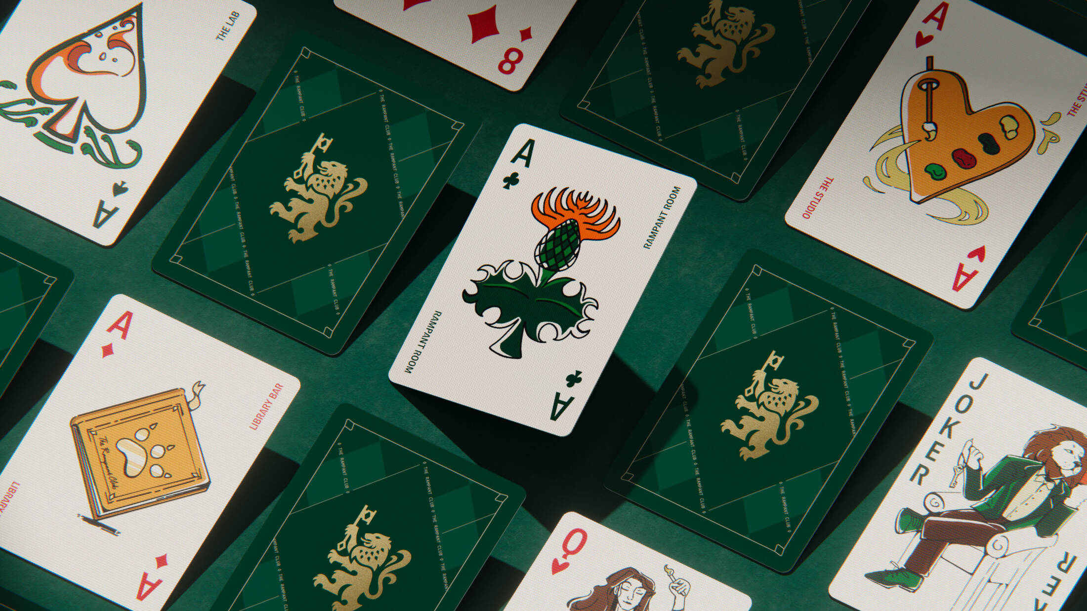
If other assets represent the club’s exclusivity and discretion, this illustration series offer a closer look at what The Rampant Club is truly about to its members by capturing pursuits from golf and tennis to art, dining, and shared rituals. Here, the Rampant Lion feels warmer and more playful, while orange accents and recurring diamond geometry tie the illustrations back to the wider identity. This resulted in a world that’s cultured but not formal, Scottish without folklore and playful without losing sophistication.
DIGITAL
To extend the club’s private world, the website presents activities, spaces and membership enquiries in an editorial layout. On social media, Rampant Sans, the wordmark trio, and illustrations create a warmer voice for gatherings and club stories. More than a public brand channel, both serve as an open window into its discreet membership.
This professional campaign titled 'Distilling Legacy Into Refinement, An Ode To Heritage' was published in Vietnam in August, 2026. It was created for the brand: The Rampant Club, by ad agency: M — N Associates. This Design medium campaign is related to the Alcoholic Drinks and Hospitality, Tourism industries and contains 49 media assets. It was submitted about 2 months ago.
Credits
Client: The Rampant Club
Branding firm: M — N Associates
Executive Creative Director: Duy — N
Project Manager: M — Lan
Junior Project Manager: Hồng-Chi Phan
Senior Designer: Bảo Trương
Designers: Thái-Tú Nguyễn, Amanda Moeller, Khánh Trần, Phương-Anh Nguyễn,
Đức-Thuận Lê, Văn-Tú Nguyễn
Main Illustrator: Amanda Moeller
Digital Designer: Phương Lưu, Hà-Chi Lê
Copywriter: Ly Nguyễn, Tân Nguyễn, Thảo-Vy Nguyễn
Typography under Type Associates
MN RAMPANT SANS by Bảo Trương, Duy — N
Portfolio Photography: Khôi Nguyễn
Portfolio Producer: Bảo Trương, Khánh Trần, Thái-Tú Nguyễn, Phương-Anh Nguyễn, Hồng-Chi Phan, Thảo-Vy Nguyễn