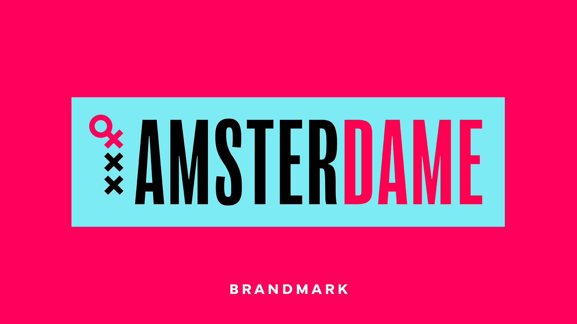
Amsterdame
Agency: Bulletproof

Description
Global branding agency Bulletproof has joined forces with Amsterdam’s top universities to launch ‘Amsterdame’, a campaign that highlights the increasing gender gap in the Netherlands and demands legislative action towards closing it.
Leveraging the city’s upcoming provincial elections on the 15th March and coinciding with International Women’s Day, Amsterdame will see the entire city plastered with witty slogans and hard-hitting statistics that demonstrate the real impact of ignoring the issue any longer.
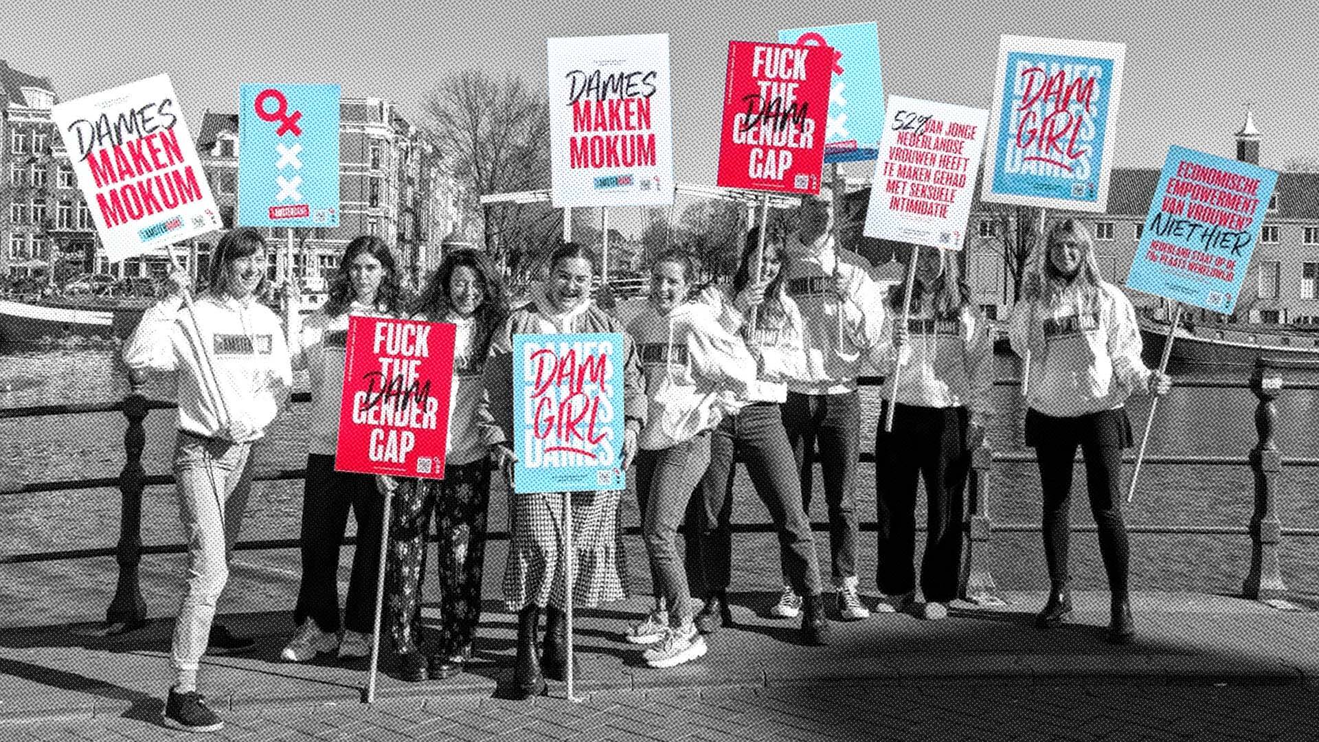
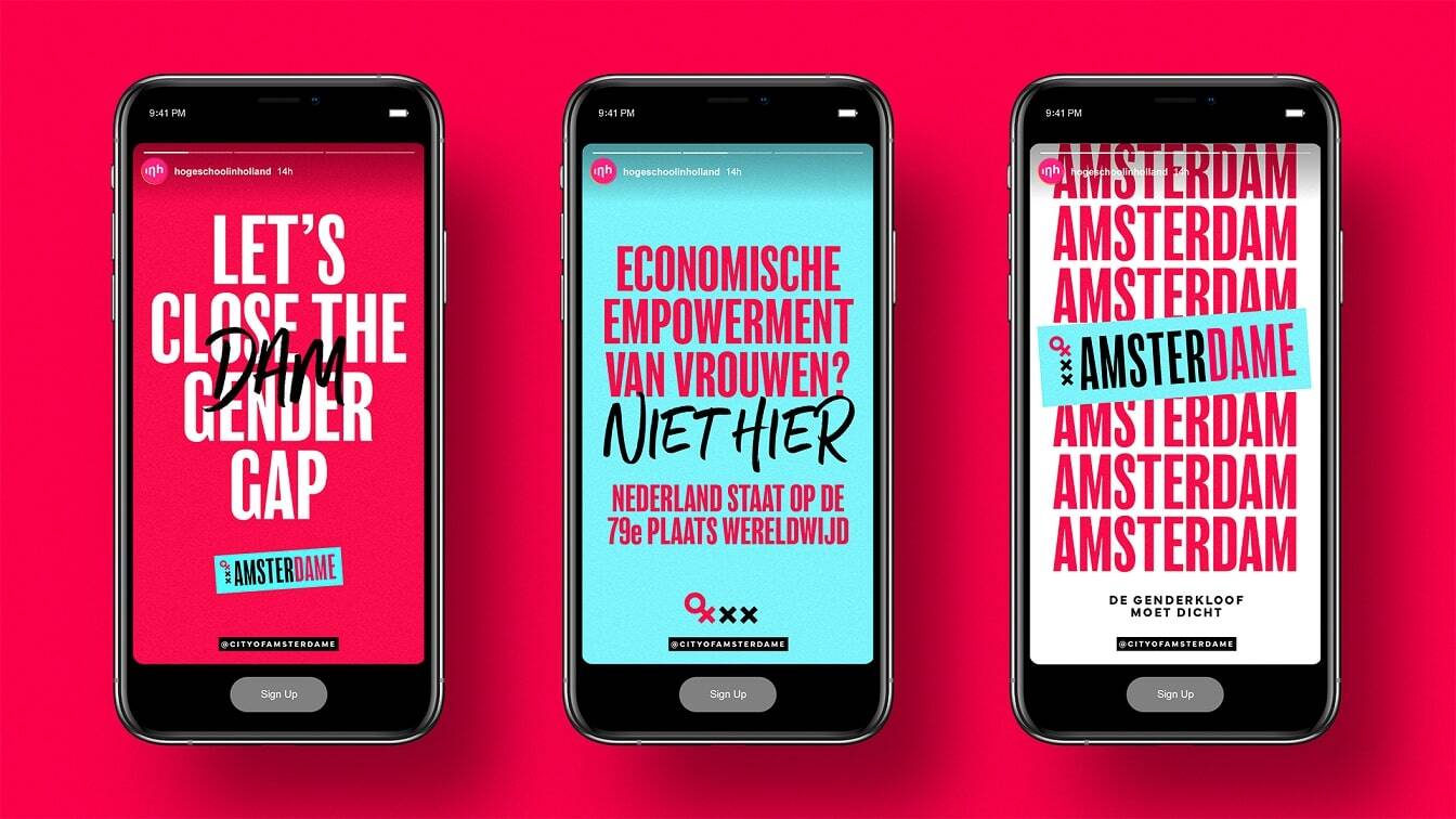
A collection of bold graphic posters, banners and custom stickers fuse symbols from gender politics and the city’s history to publicise the campaign’s three demands.
Two are addressed to the government: to implement an Equal Pay for Men and Women Act and to fund research into sex differences to improve healthcare for women. The final demand goes out to all eligible voters in the Netherlands: to vote for women on the 15th March to increase female representation in government.
To support the demands, the campaign is hosting a panel discussion at VU University on the 8th March, International Women’s Day. Split into two parts, the first half sees influential Dutch women including Marieke Samallo and Zahra Runderkamp reflect on their experiences of the gender gap. The second half is an interactive Q&A, where Dutch political leaders will be asked what they’re doing to create change going forward.
“This will not be a one-off campaign that ends in March,” says Jorijn Harms, Client Partner at Bulletproof. “Amsterdame will continue throughout the year, every year, until the gender gap is closed in this country”.
“Creativity has always been a powerful force to inspire change. Our hope is that by creating an identity for the Dutch fight for gender equality, we give the cause meaning beyond words, and inject an energy into it that unites the people of Amsterdam to take action”.
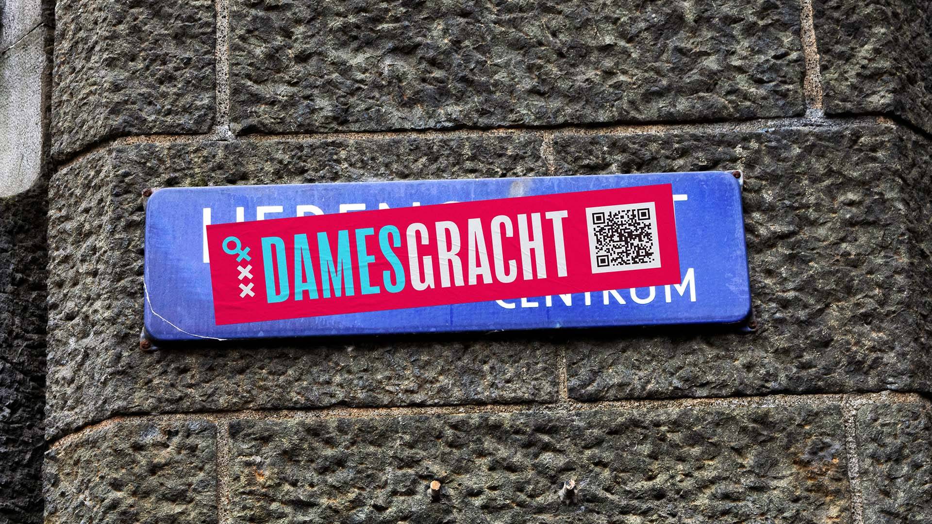
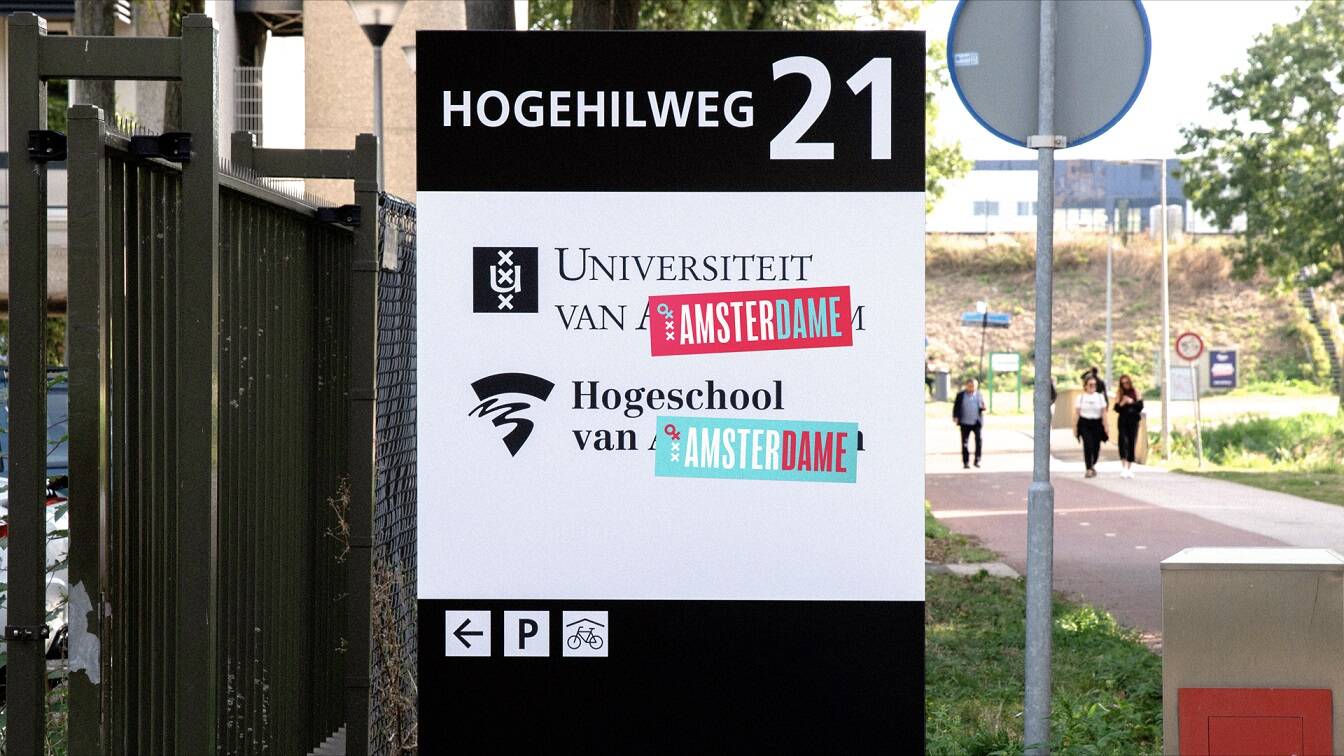
Bulletproof has designed six graphically striking posters to go live in 125 locations across the city, as well as “wildplak” locations. The studio has also created street sign stickers that will be placed over the names of the most famous canals - Herengracht (Gentlemen’s Canal), Prinsengracht (Prince’s Canal), and Keizersgracht (Emperor’s Canal) – transforming them into their female counterparts, Damesgracht (Dame’s Canal), Prinsessengracht (Princesses’ Canal) and Keizerinnengracht (Emperesses’ Canal).
The campaign also includes placards, banners, flyers and stickers that, with the help of university students, will be distributed throughout early March, particularly at the WMNL’s Feminist March on the 5th. As well as drawing people into the movement, these contain QR codes that link to the campaign website, also designed by Bulletproof, where people can find out more information including the full list of demands, an interactive events map, inspirational stories from Dutch women and downloadable assets.
To get the campaign off the ground, Bulletproof created a vivid identity for the campaign that unites likeminded people in the city. Disruptive and visually arresting, the design forces people to stop and take notice of the issues it highlights.
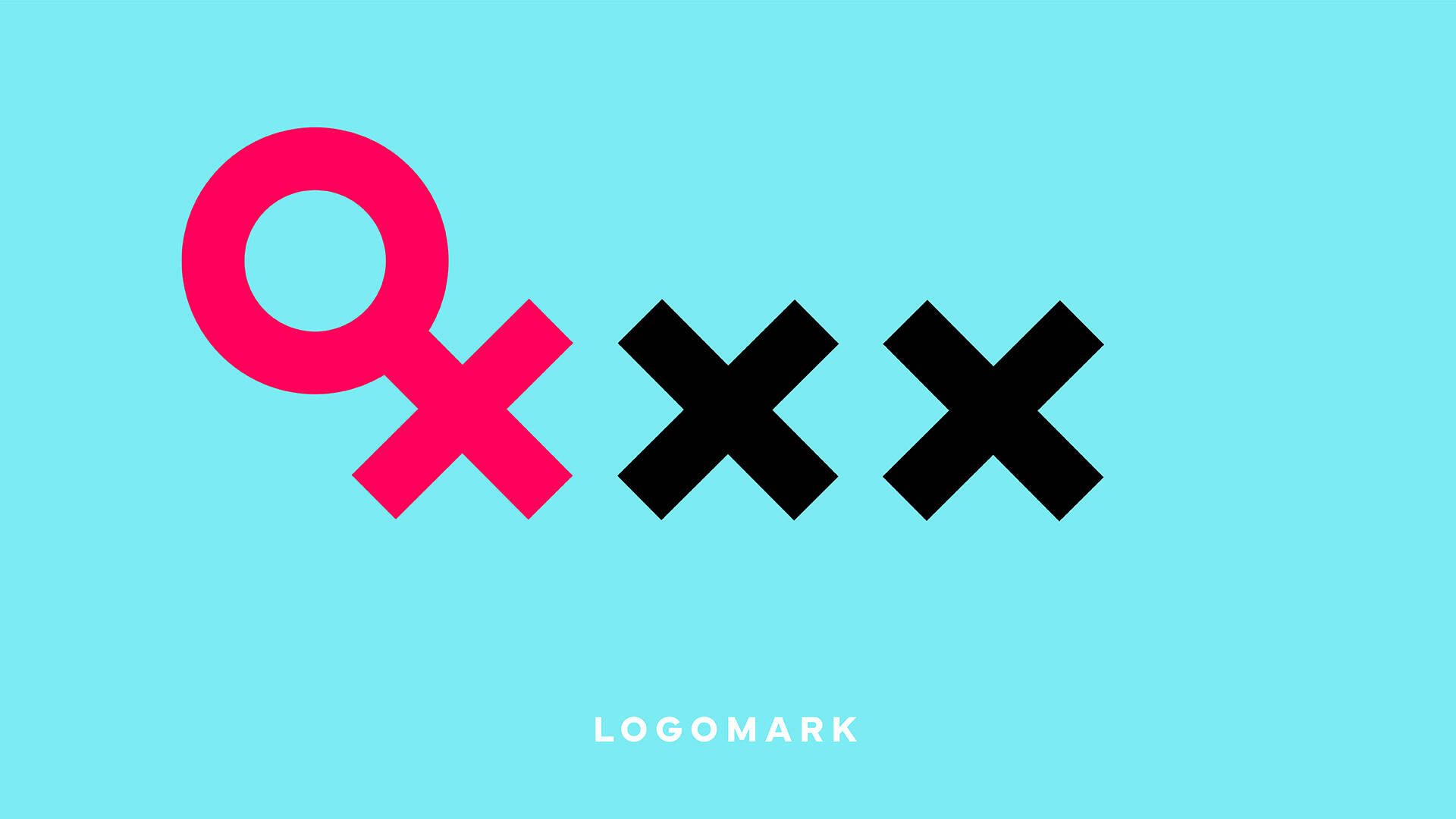
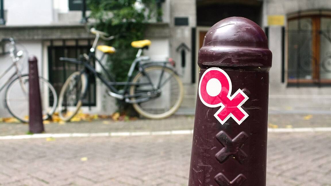
The concept itself originated from the campaign’s root: the city. Taking its emblem of the three crosses and superimposing the female symbol, the idea was to represent a takeover; a seizing of control by the city’s women that demonstrates how they will no longer stay quiet. In combining two such well-known symbols, this icon becomes an effective shorthand for the campaign without the need for any additional context, therefore making it an ideal logo to plaster across the city and drive momentum.
By adopting the city council’s colours – red, white and blue – and enhancing them into a trio of more vibrant shades, Bulletproof injected a fresh energy to inspire people to get involved. At first the accent pink felt like an all too obvious choice of femininity. But the team decided to embrace and harness its connotations, applying it in a way that felt powerful rather than pretty.
The campaign’s contrasting typefaces are reminiscent of historic protest placards and create an interesting tension that allows for moments for emphasis. This is particularly useful for stressing figures in statistics and building in a more emotional level to the campaign.
The campaign will be officially launching on 3rd March with the website (www.cityofamsterdame.com) and a digital takeover across socials. The posters will be going live on the 6th of March, and the street names are being changed on the 7th in time for International Women’s Day.
This professional campaign titled 'Amsterdame' was published in The Netherlands in March, 2023. It was created by ad agency: Bulletproof. This Design and OOH Outdoor media campaign is related to the Public Interest industry and contains 8 media assets. It was submitted over 3 years ago.
Credits
Concept, Design, Strategy: Bulletproof
Campaign support: InHolland University of Applied Sciences, University of Amsterdam, Vrije University, Amsterdam University of Applied Sciences, Mediacollege Amsterdam.


