


Description
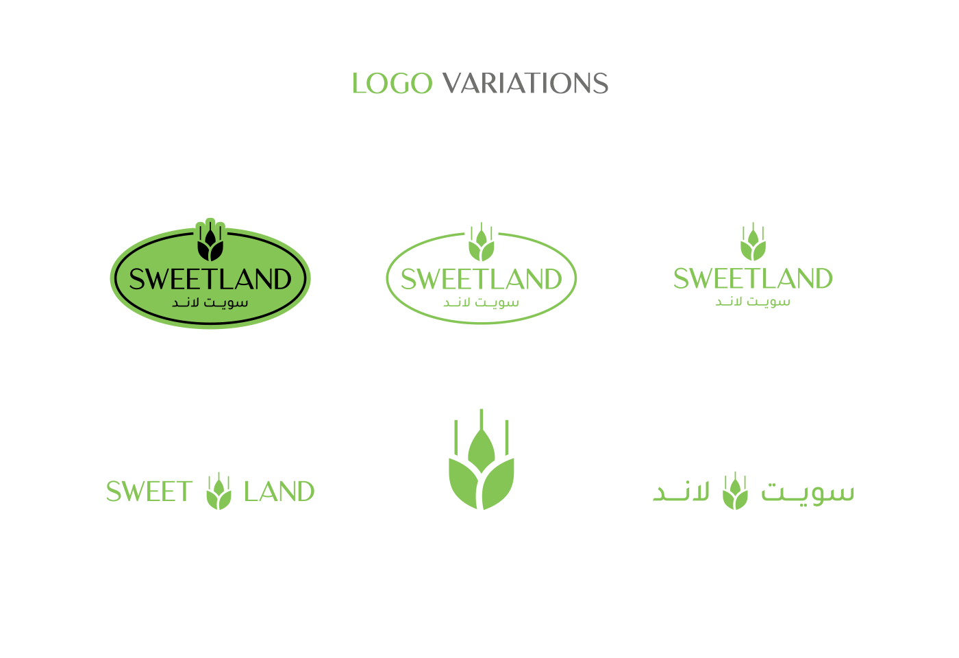
Sweetland opens a new era in its communication: a new logo that has more impact and visibility with all its consumers.
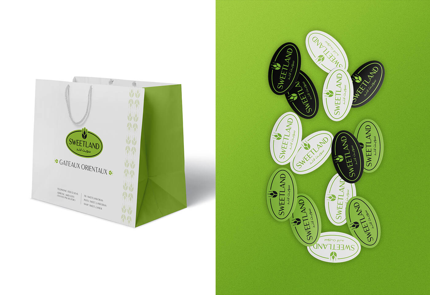
This campaign reveals the freshness of this new launch of the company and reflects the true values of Sweetland: quality, trust & authenticity.
The symbol of the wheat peak has been reworked in a more modern and authentic way. The green color to change shade, to give a spirit of calm and confidence.
The font has become more modern and reflects the quality of the Sweetland products.
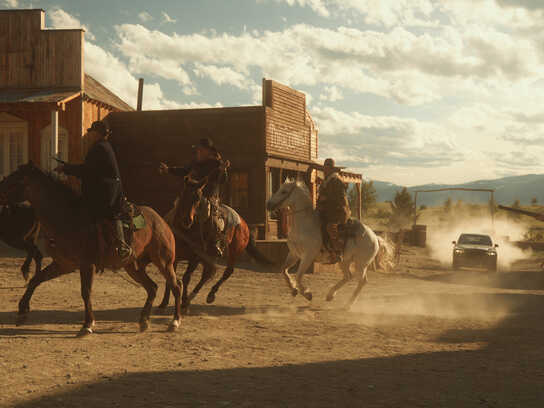
This professional campaign titled 'The Oriental Pleasure' was published in Algeria in July, 2022. It was created for the brand: Sweetland, by ad agency: SABD Agency. This Design medium campaign is related to the Food industry and contains 21 media assets. It was submitted almost 4 years ago.
Credits
Advertising Agency: SABD Agency, Alicante, Spain
Production Company: SB Advertising
Art Director: Sidahmed Badredine
Copywriter: Salah Bensmaïne
Photographer : Sofiane Bouziane