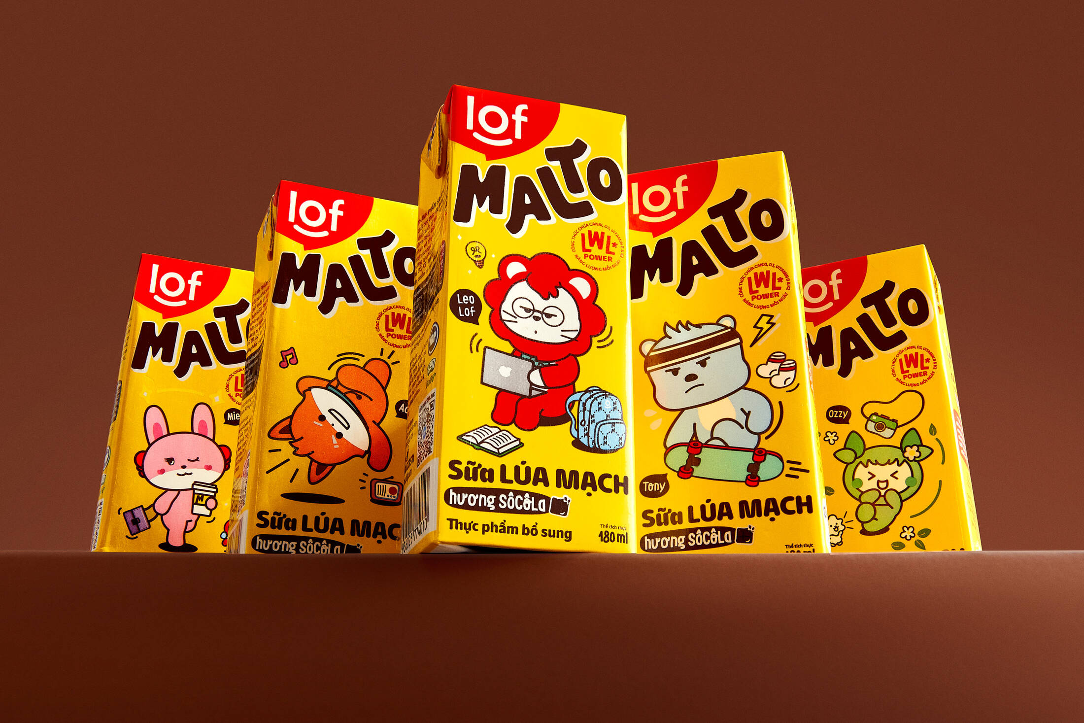
Packaging design
Logotype
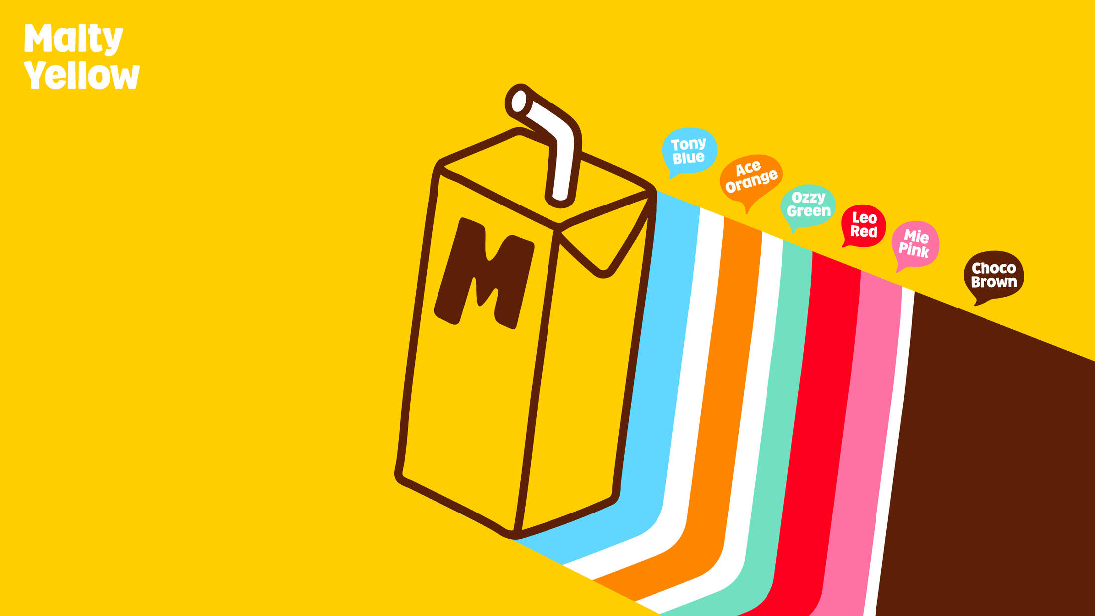
Color Palette
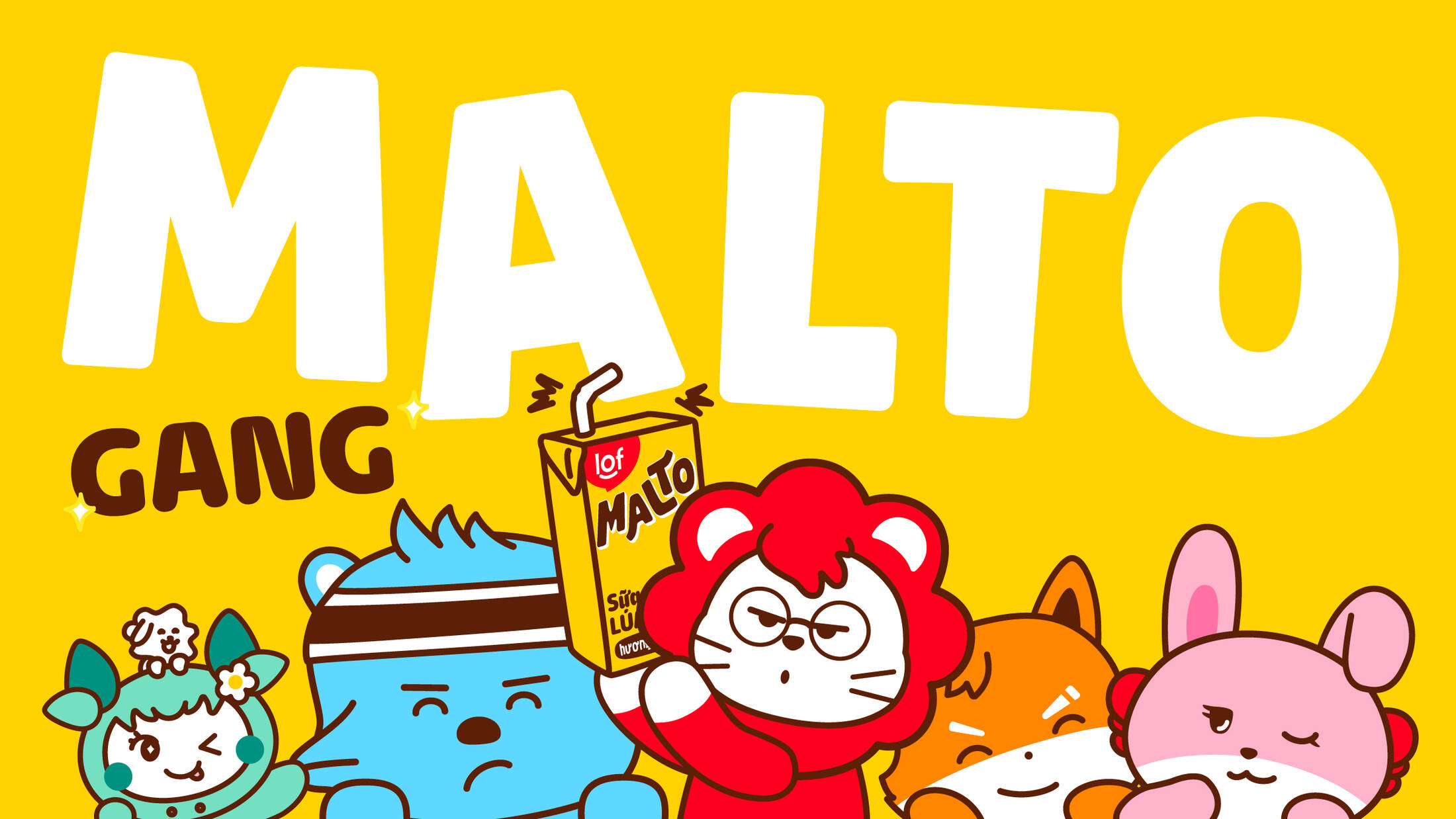
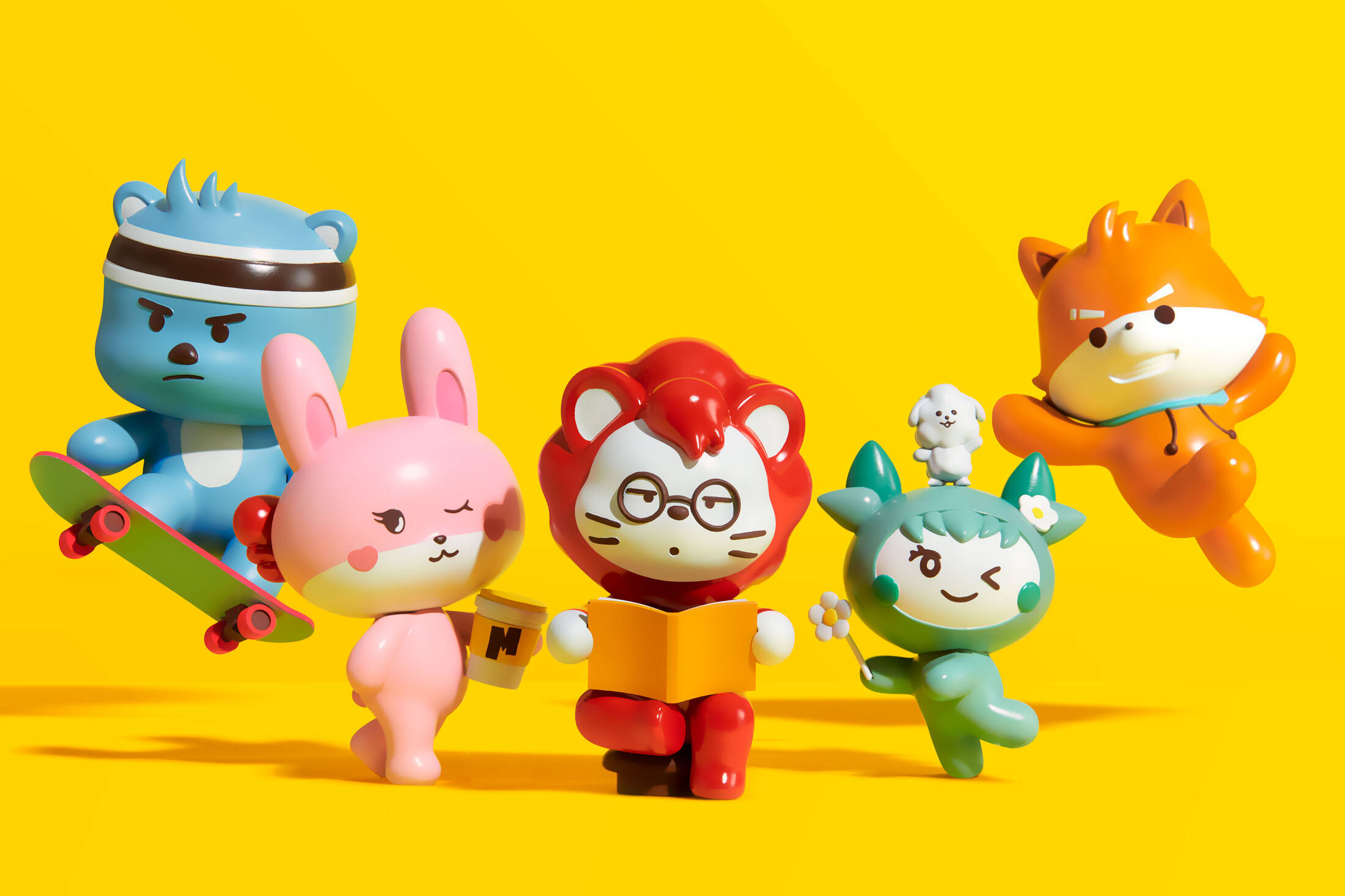
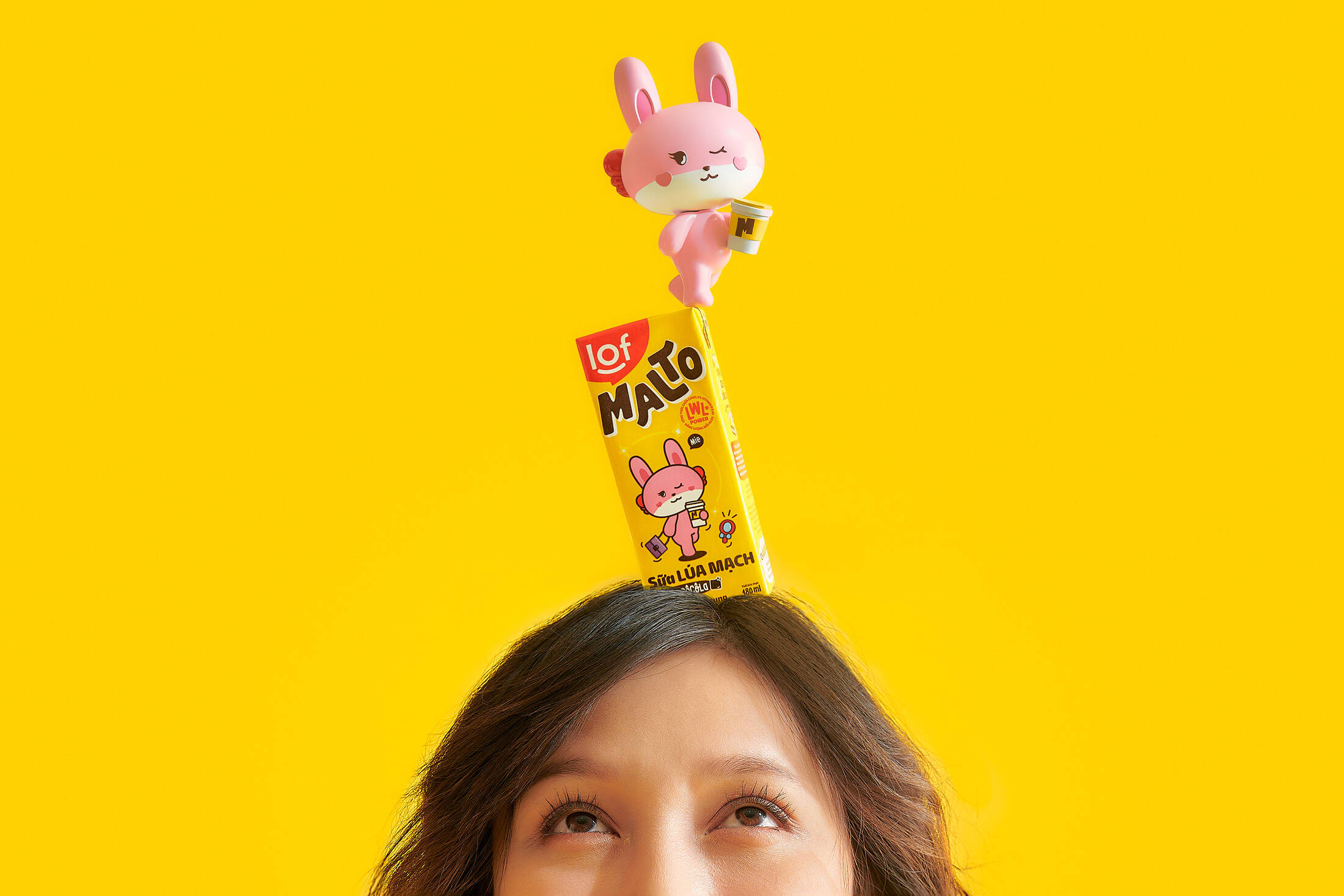
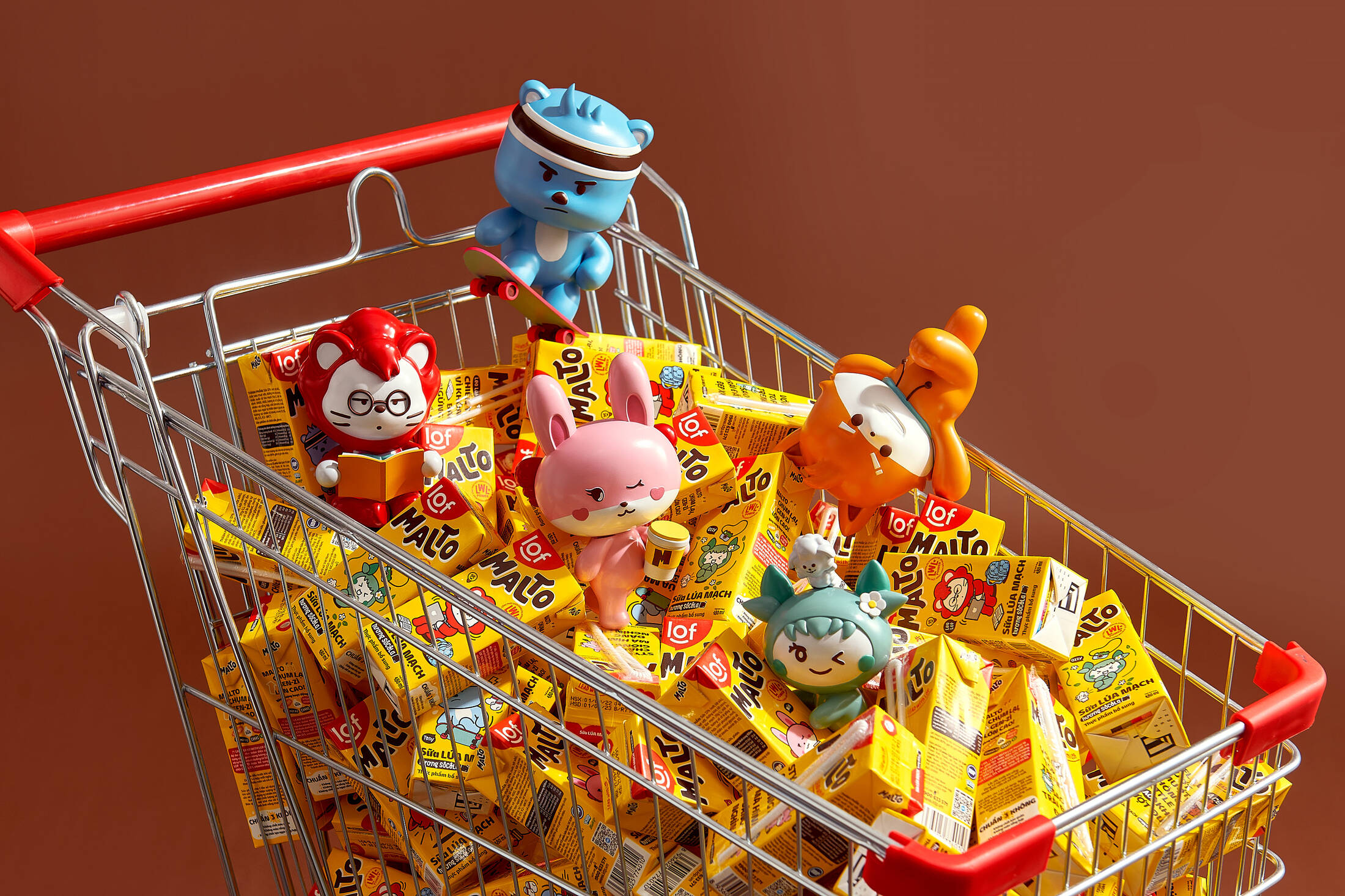
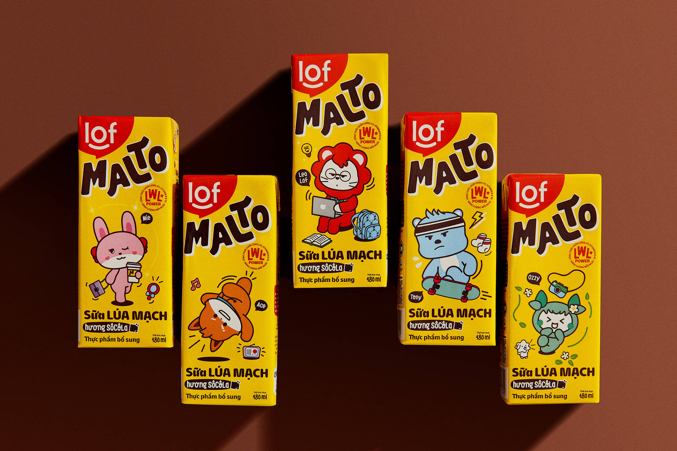
Malto Gang
Leo
Tony
Mie
Ozzy
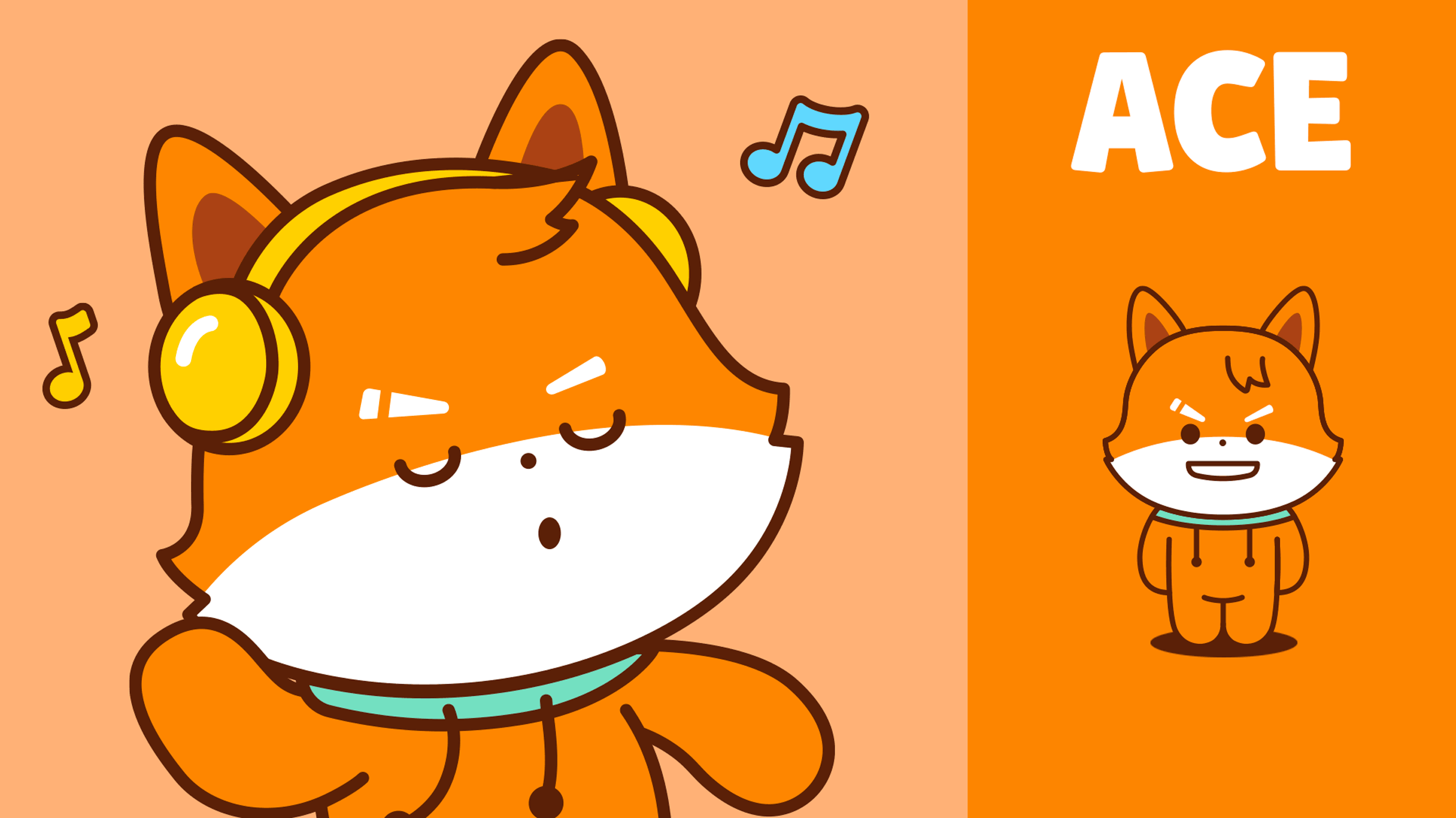
Ace

Brand Voice

Description
Malto is a teen milk brand that stands out from the competition with its distinctive approach. The brand is tailored to align with Asian teen culture, presenting a cute and relatable appearance that captures the essence of youthful joy and satisfaction.
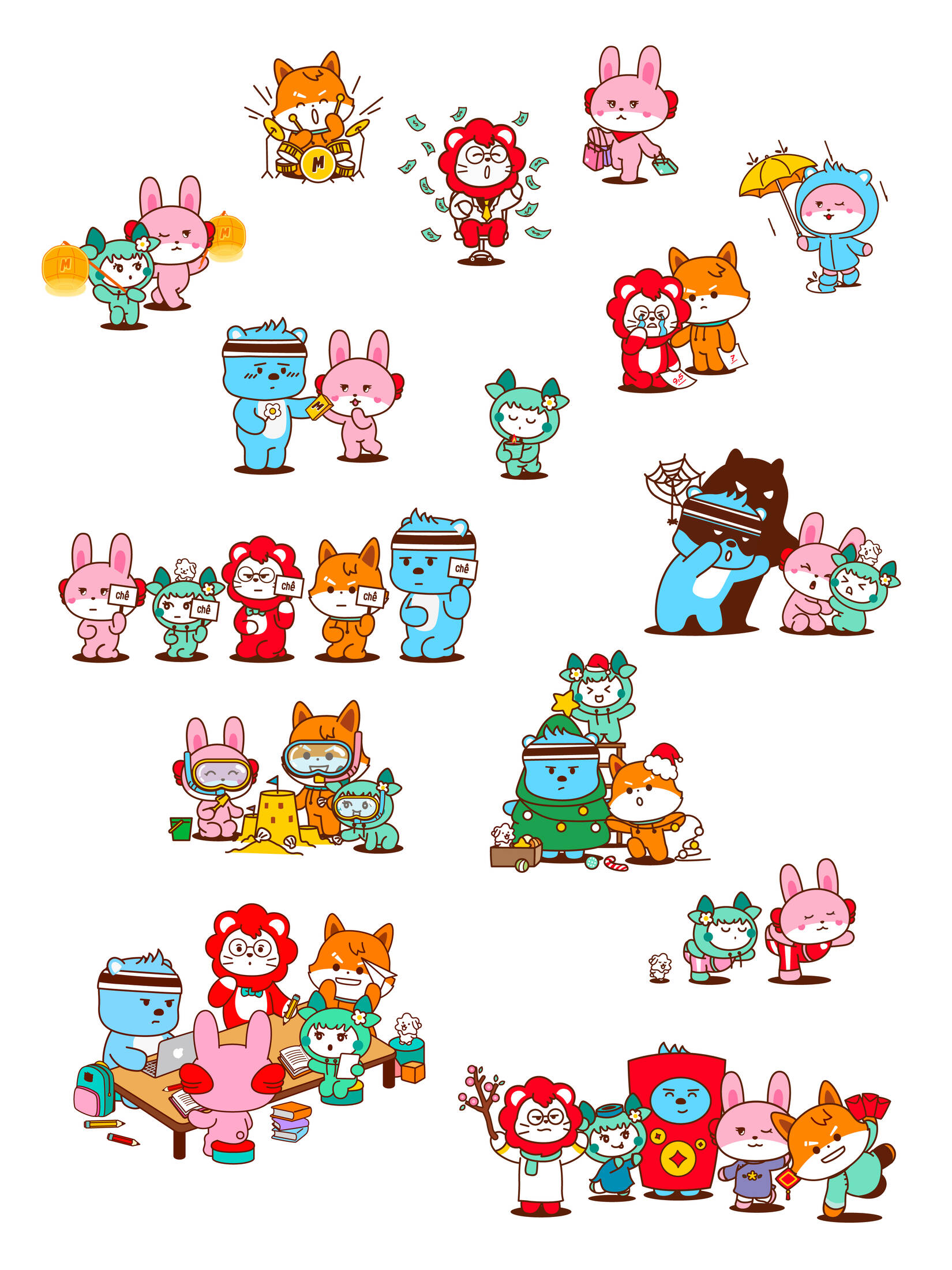
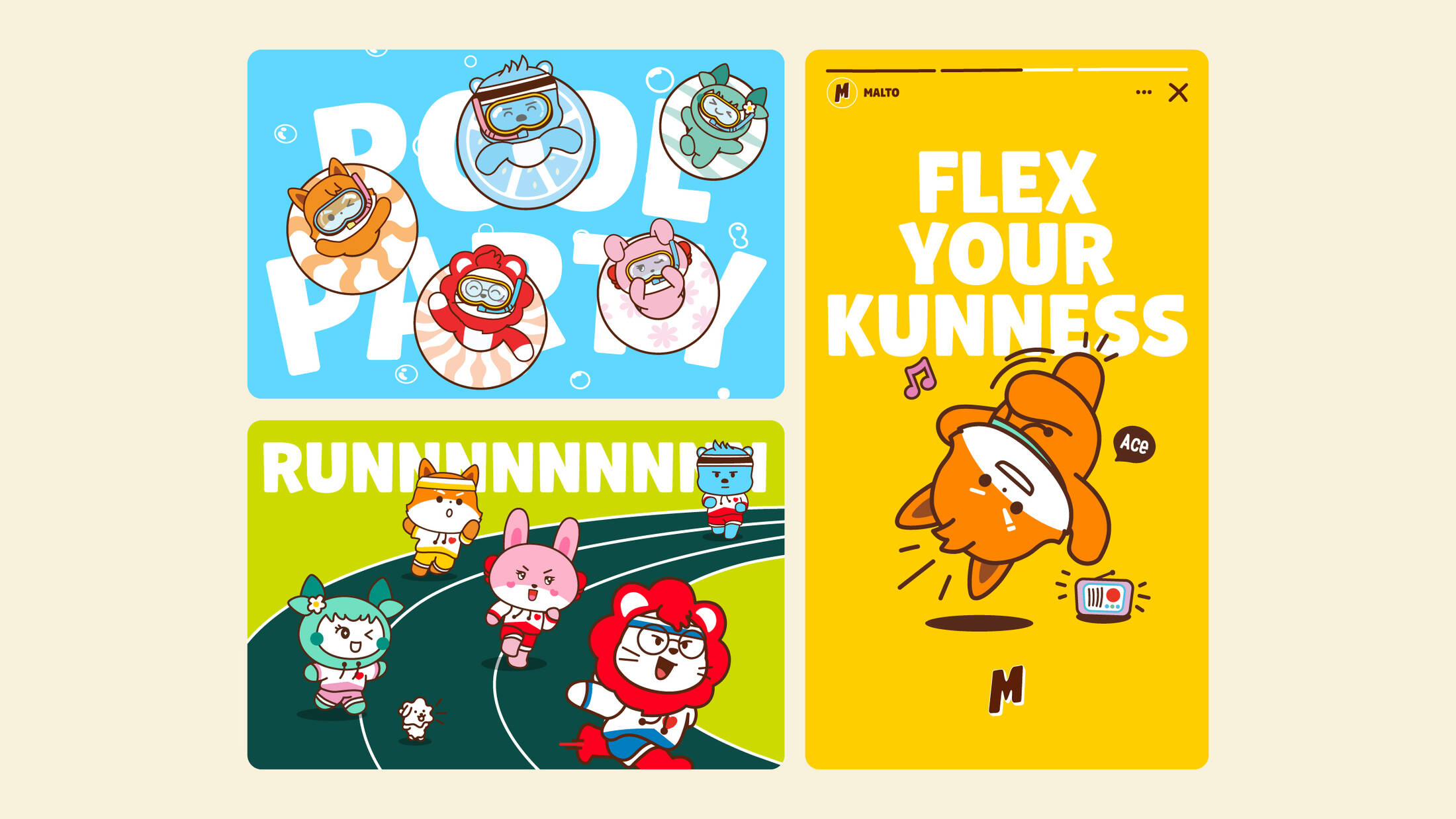
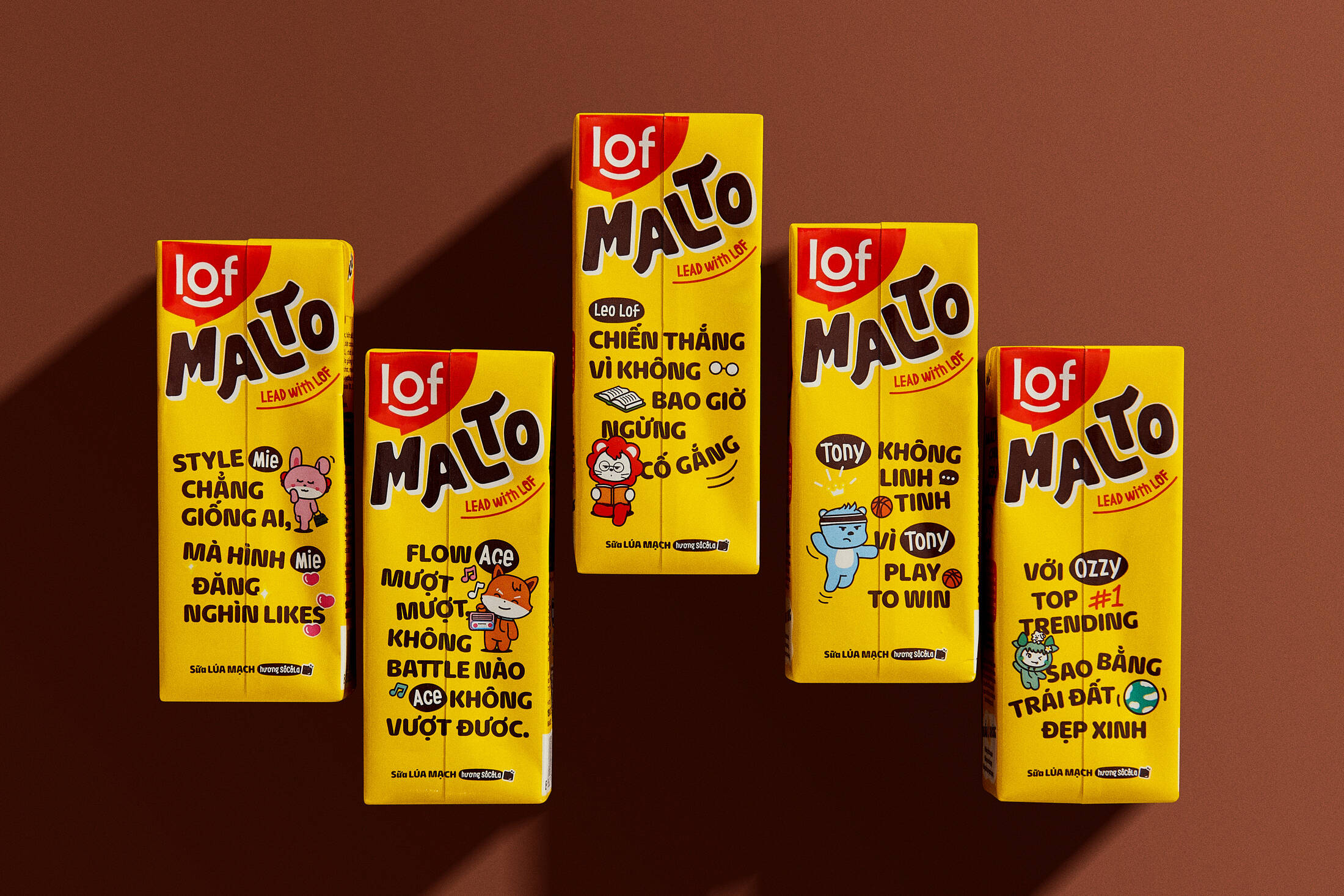
The Malto Gang characters are a vital part of the brand, shaping the brand and connecting with the audience on a profound level. They have moved beyond being mere emoticons on Malto packaging, becoming trending icons. They feature in merchandise, animations, and exciting collaborations, capturing the hearts of teenagers with their relatable personalities and charming designs.
The Malto Gang characters embody a brand narrative that celebrates friendship, diversity, and the simple joys of life.
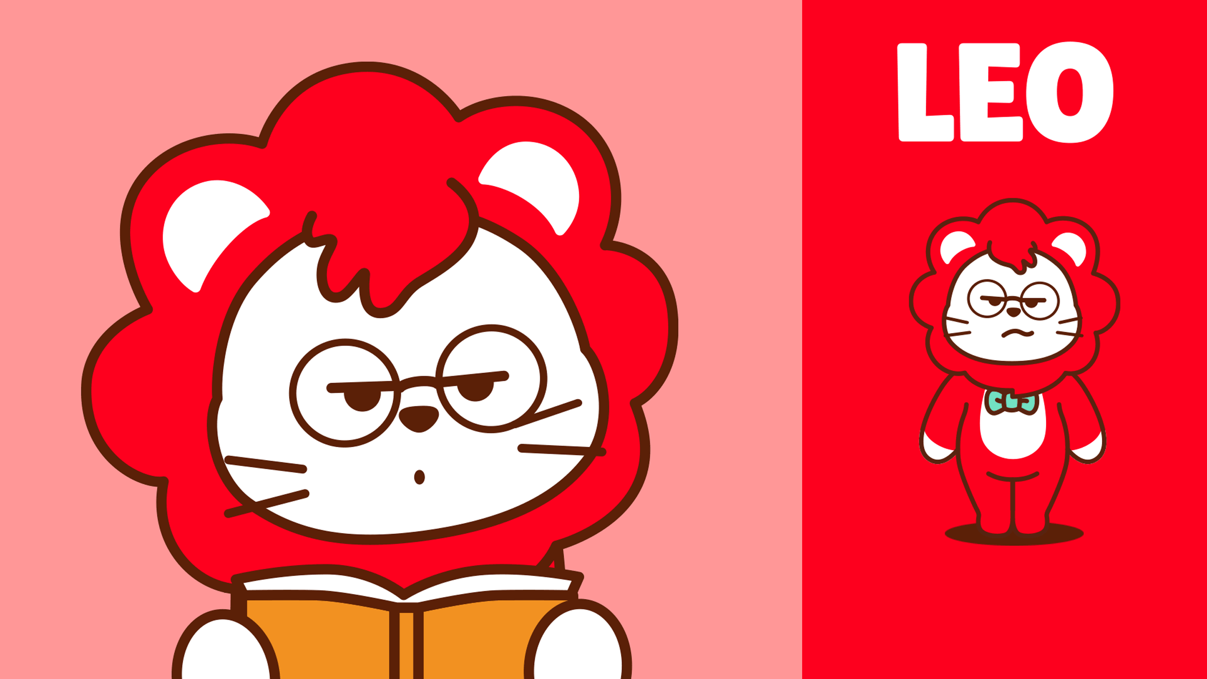
- Leo: The lovable leader who is also a total nerd and calm. He is super smart and a problem solver, but he can also be a bit of an introvert.
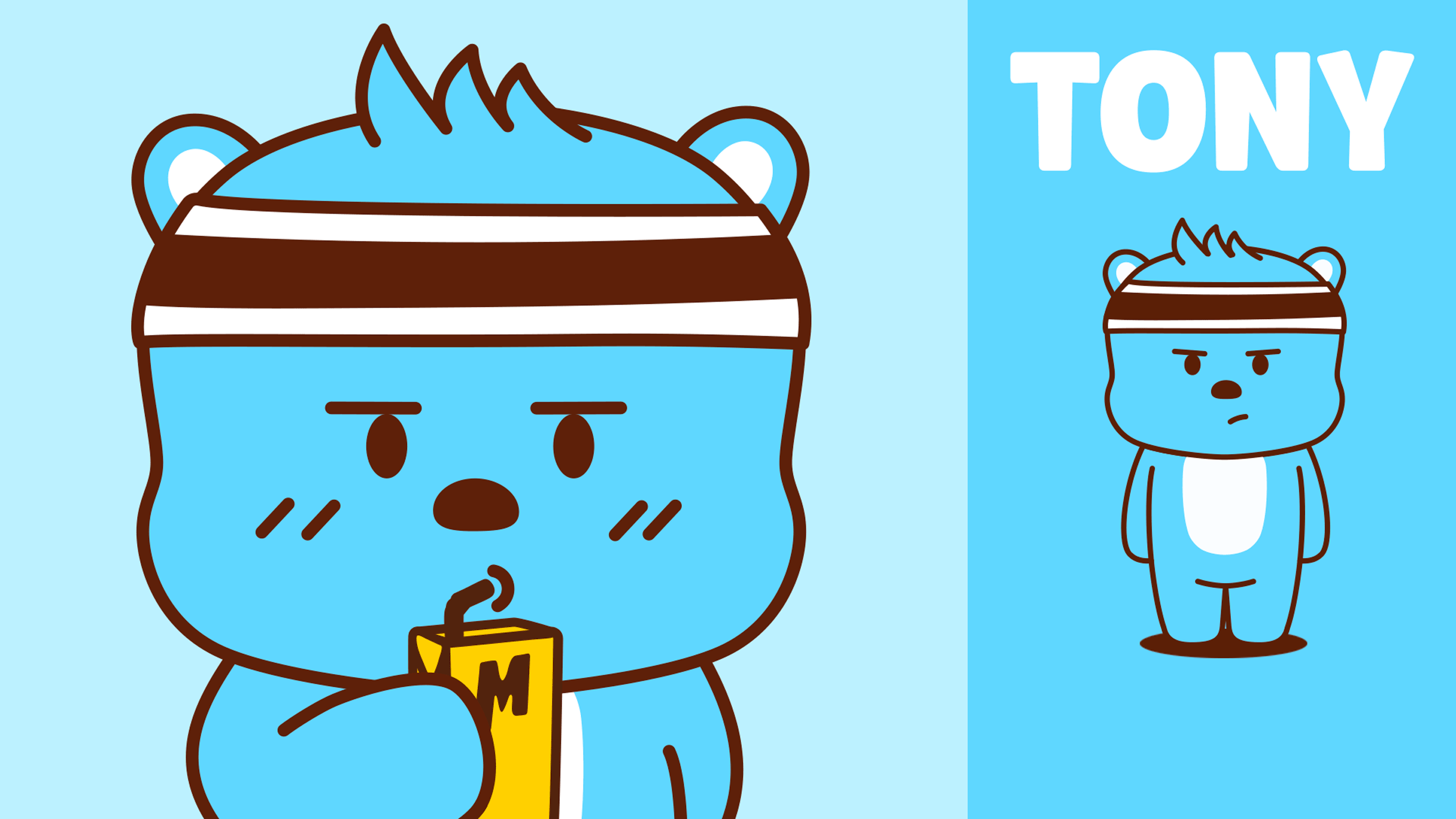
Tony: The sporty champion who is kind and strong, but sometimes clumsy at expressing emotion.
- Ace: The trendy dancer who is super active and funny. He cares about fashion, social media, and trends.
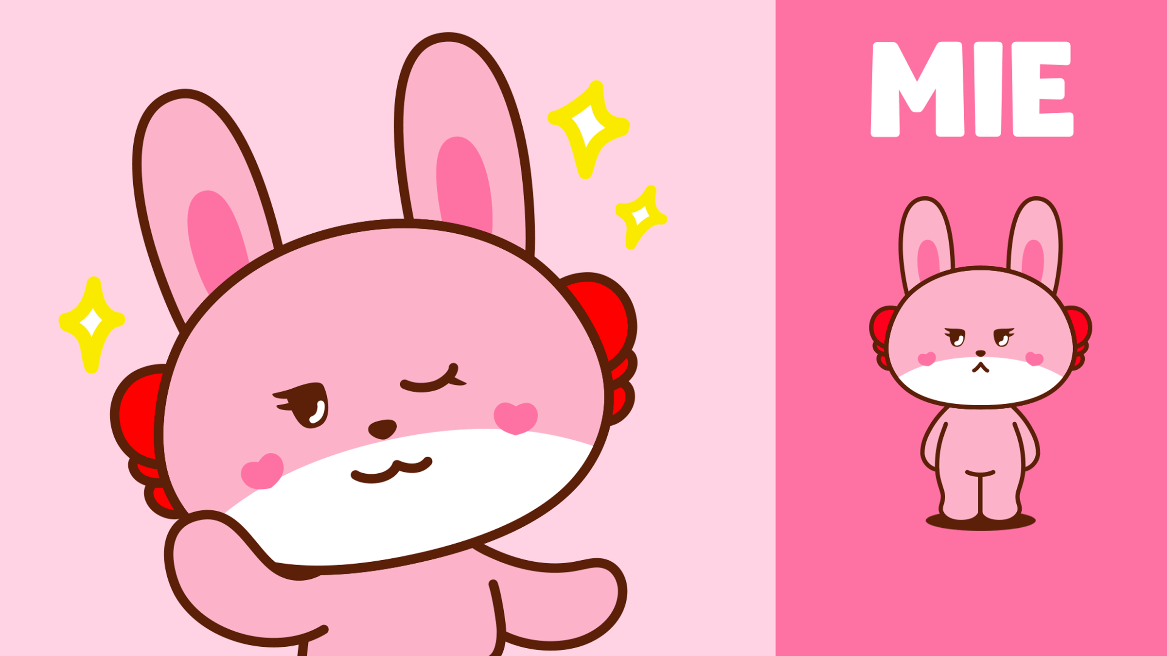
- Mie: The hotgirl fashionista who is usually cold-faced but warm inside. She loves to give advice and critique.
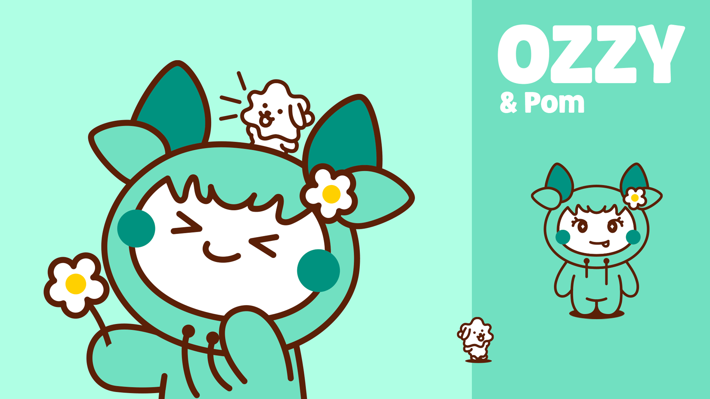
- Ozzy: The mysterious tree spirit who is an environmentalist and cares about nature. He is always thoughtful and loves to make content vlogs.
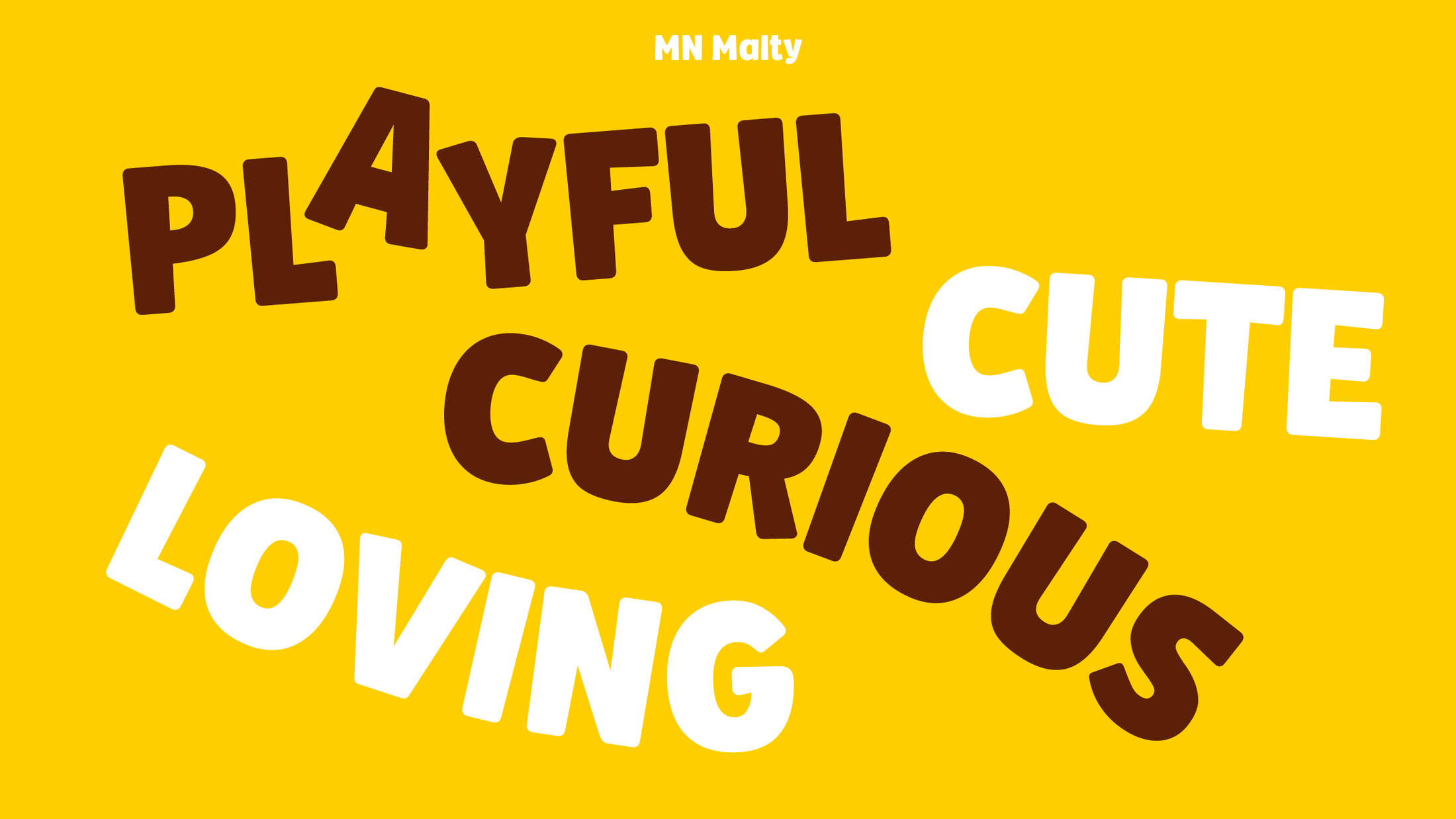
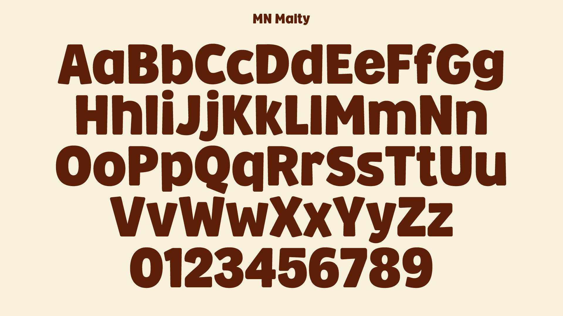
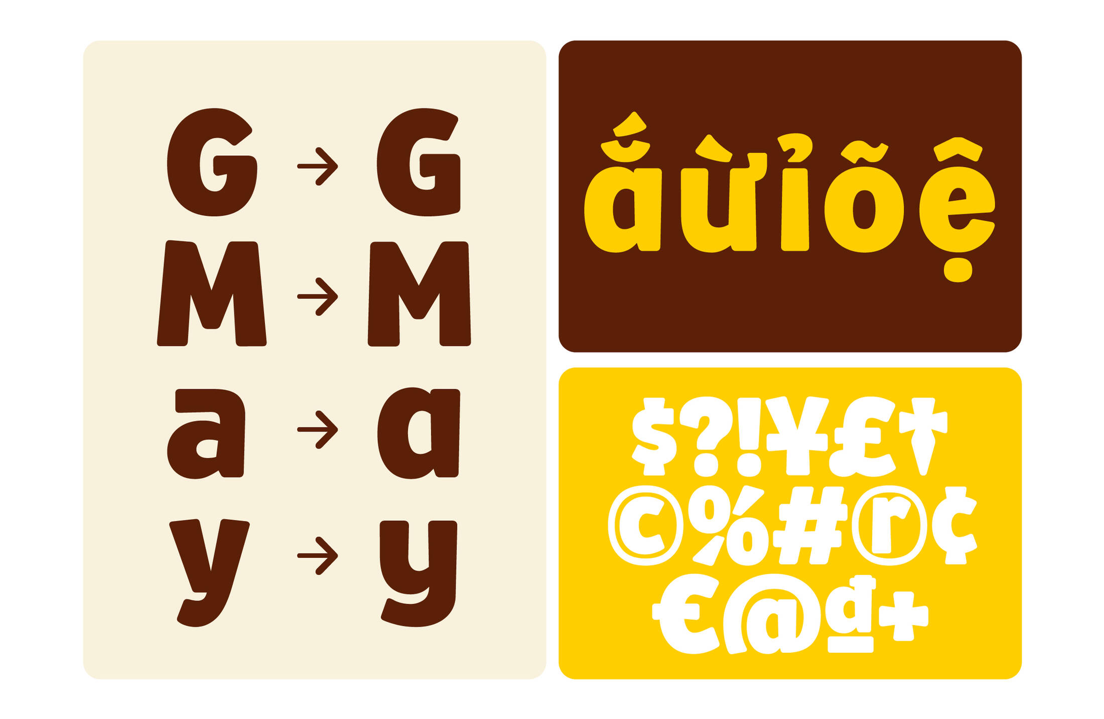
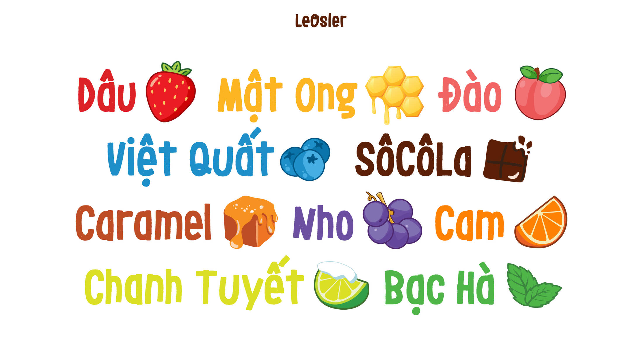
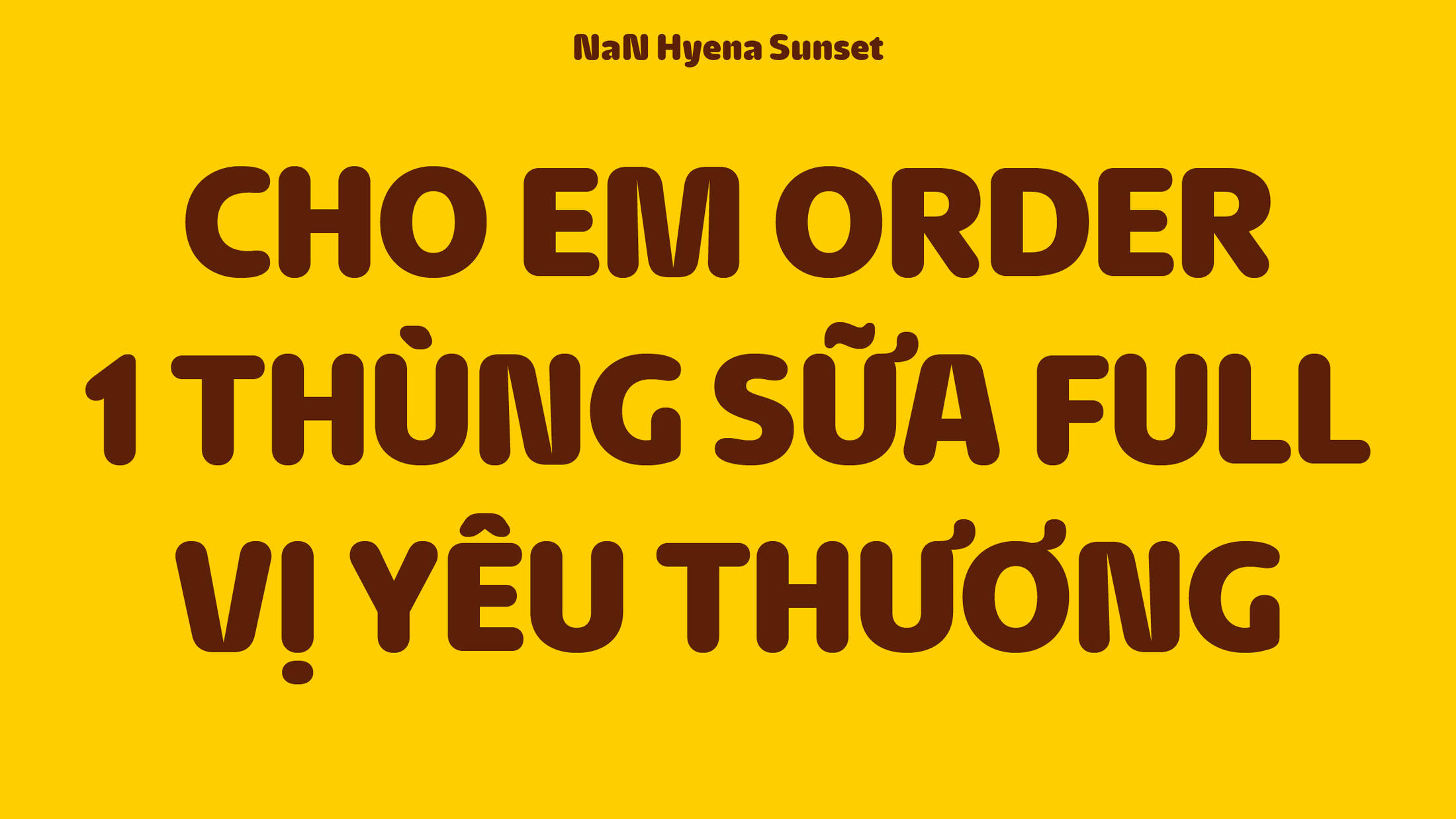
The Malto brand also has a distinctive typography and brand voice. The MN Malty custom font is characterized by rounded trapezoid stems and serves as the go-to choice for naming categories and headlines. The NaN Hyena and LeOsler fonts are used for sub-headlines and body text, ensuring a harmonious and stylish typographic ensemble.
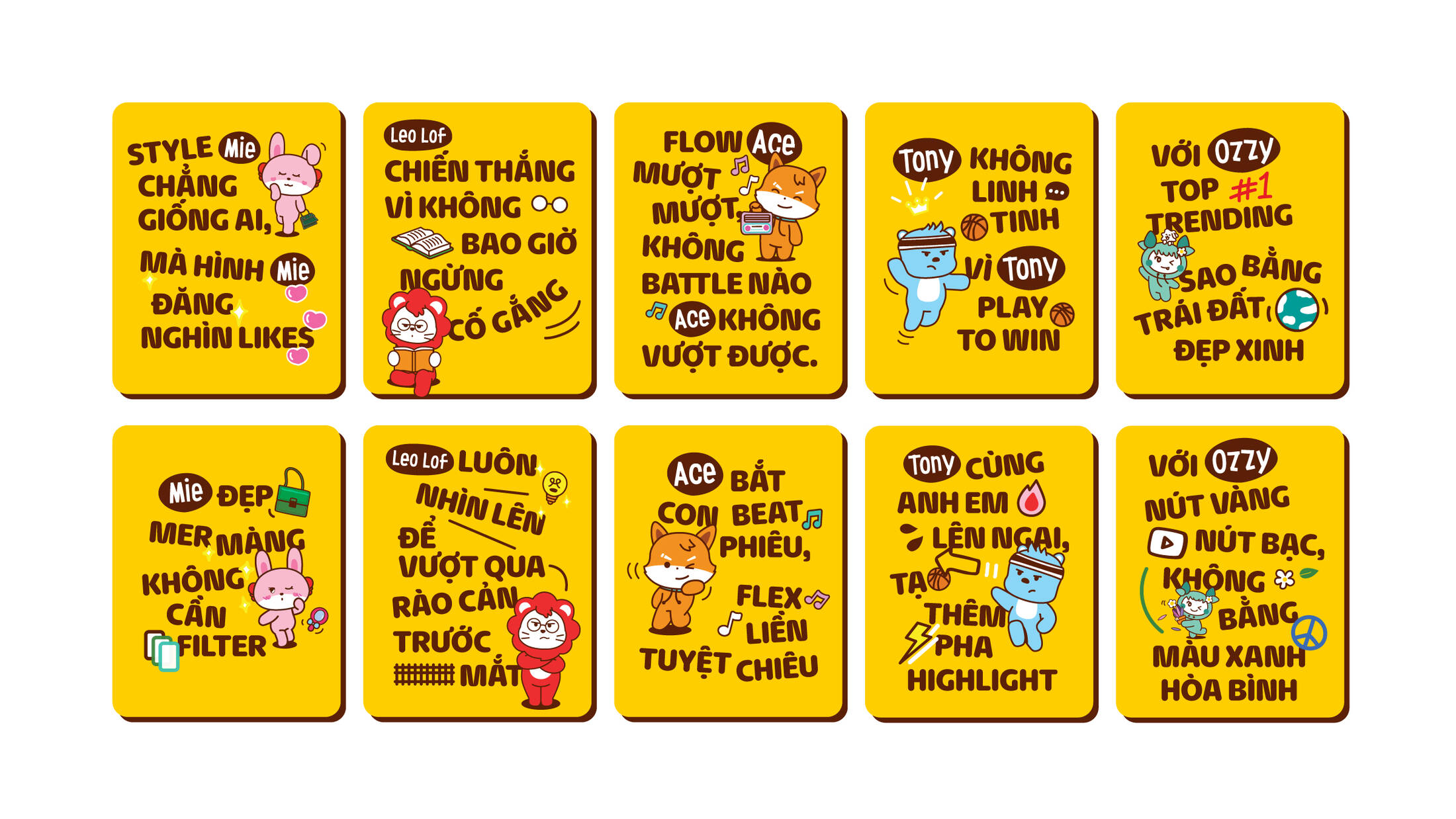
The Malto brand voice is all about embracing the latest linguistic trends and wordplay wave, inspired by the creativity of the youth. The brand injects humor into its content, making it relatable and engaging.
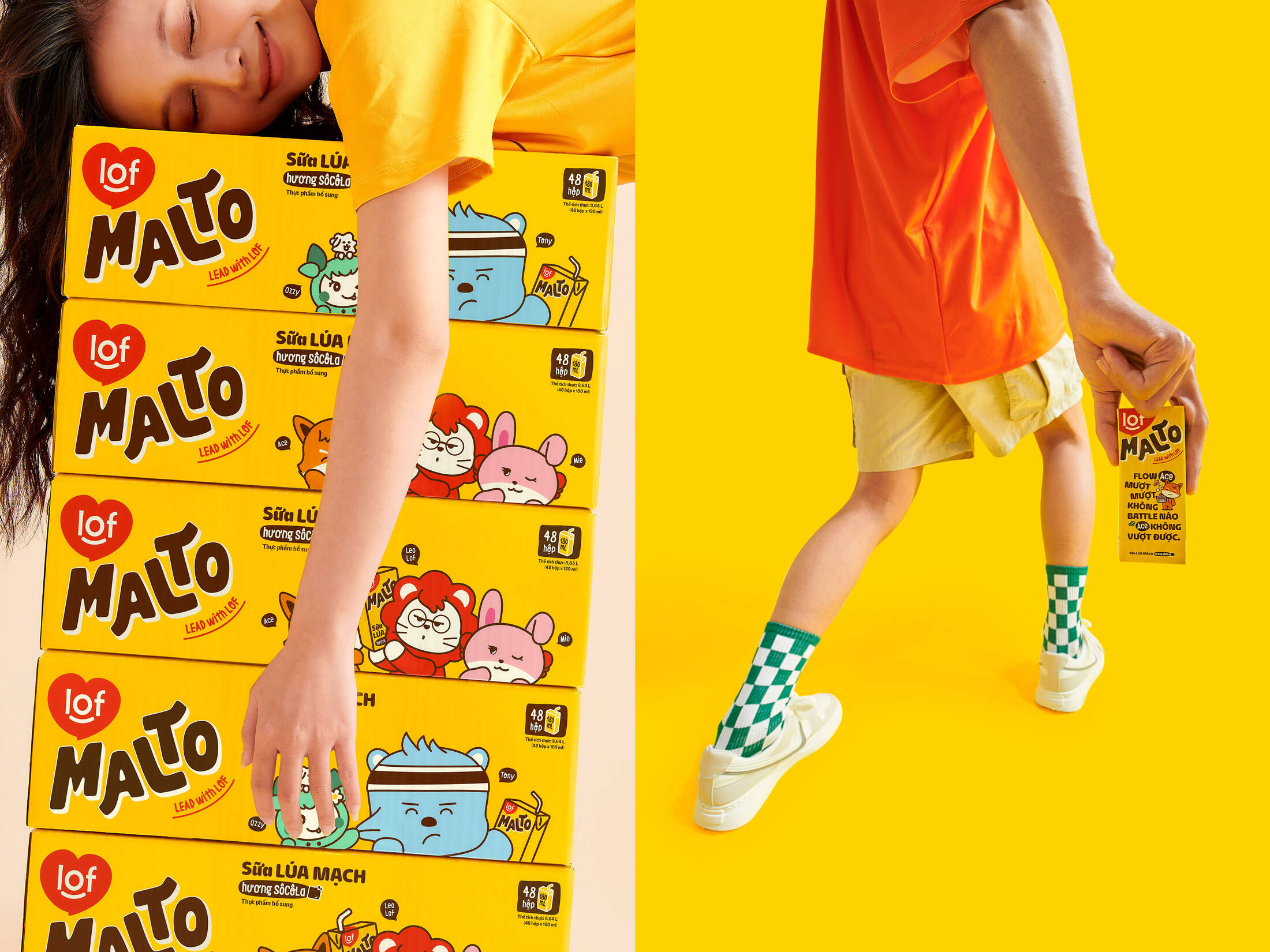
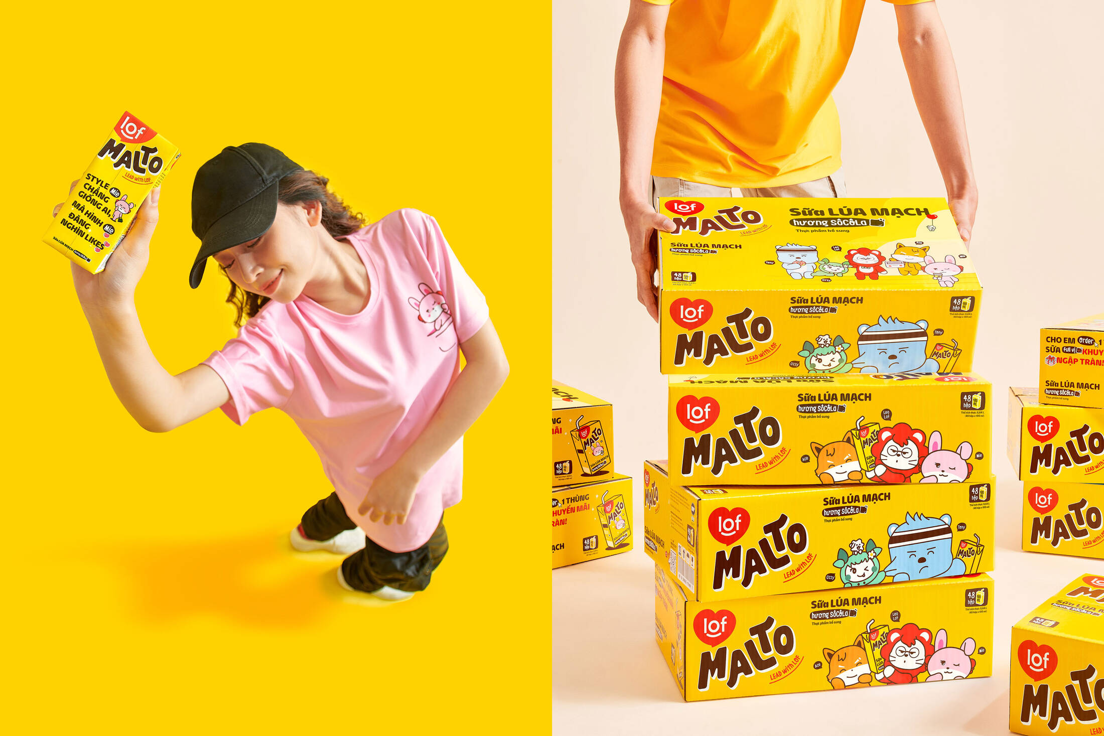
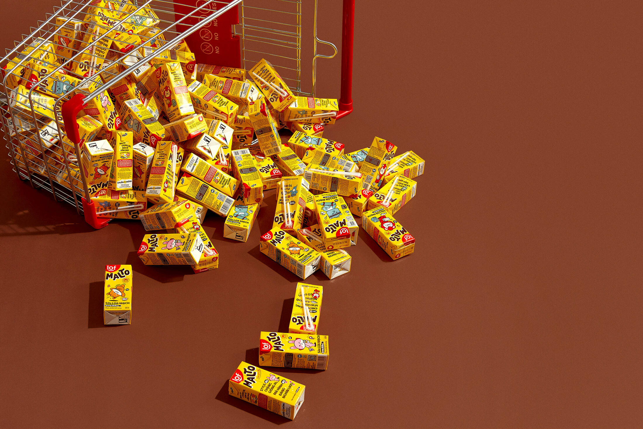
The Malto packaging is a harmonious blend of elements, embracing bold minimalism to create a distinctive look that sets it apart from its competitors. The forefront of the packaging dedicates ample space for the Malto Gang characters to take the spotlight. On the backside, the packaging features witty and up-to-the-minute brand voices from each character, establishing connections with consumers based on their unique characteristics and personas.
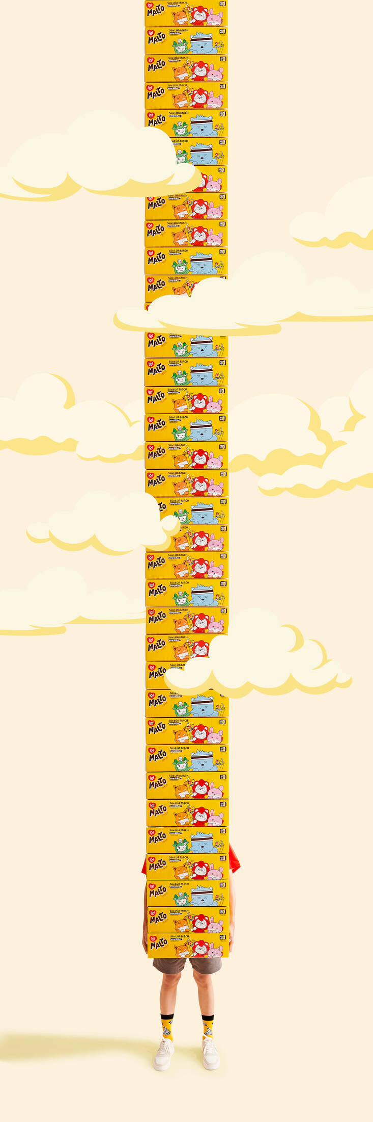
This professional campaign titled 'Shake and Flex your milk' was published in Cambodia, Laos, and Vietnam in September, 2023. It was created for the brand: Malto, by ad agency: M — N Associates. This Design, Integrated, and Print media campaign is related to the Food industry and contains 28 media assets. It was submitted over 2 years ago.
Credits
Design firm: M — N Associates
Creative Director: Duy — N
Design Director: Anh Nguyễn, Anh Phạm
Designer: Phúc Trần, Giang Nguyễn
Digital Designer: An Phạm
Content Director: Quân Nguyễn
Character Concept & Illustrator: Duy — N, Anh Phạm
Character Developer: Monstio Studio, Phúc Trần, Giang Nguyễn
NaN Hyena: NaN
LeOsler: Antipixel
MN Malty: Type Associates
Portfolio Photography: Wing Chan
Digital Retoucher: An Nguyễn, Phúc Trần
Toy Manufacturer: 8K Creative