Description
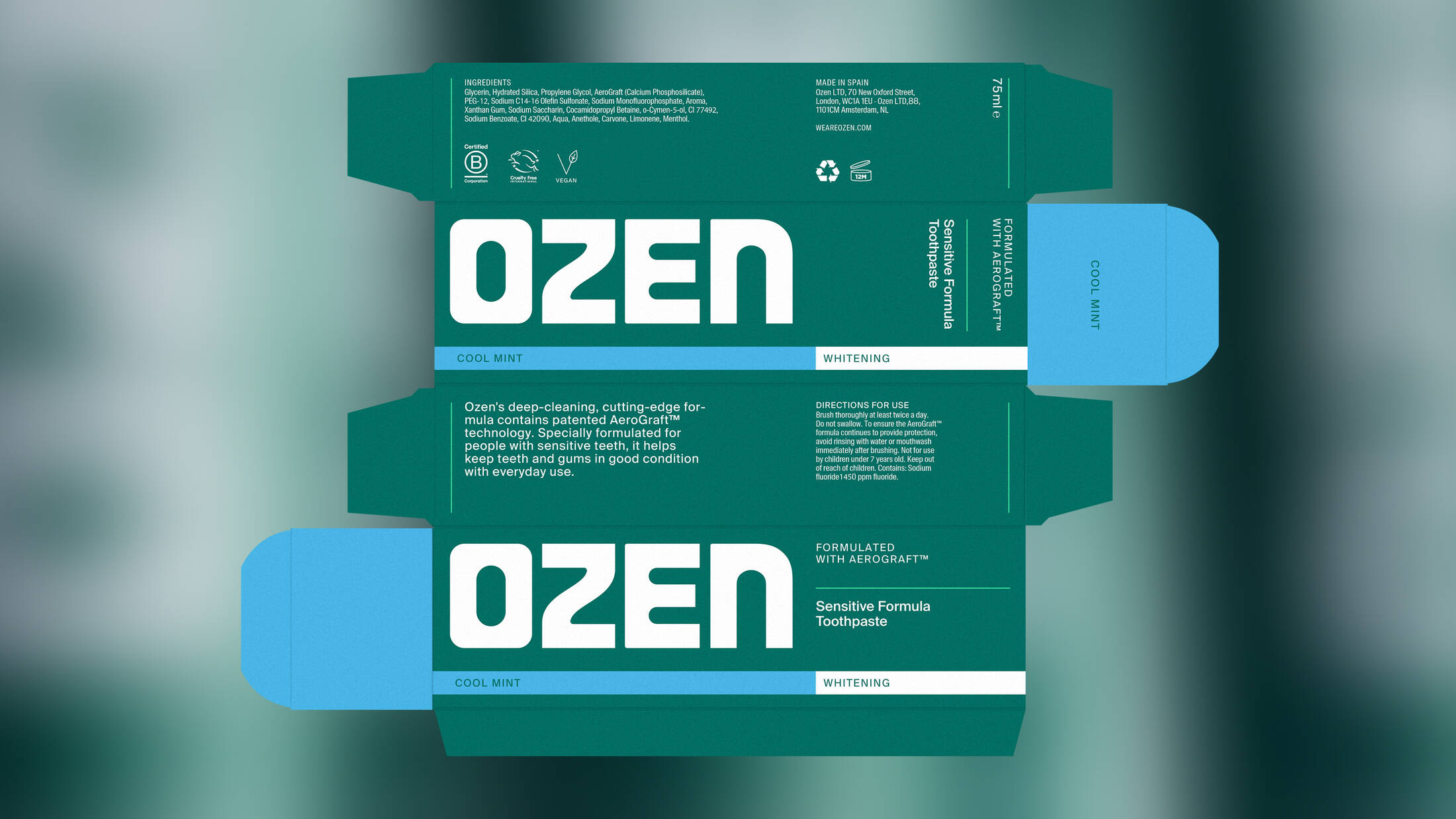
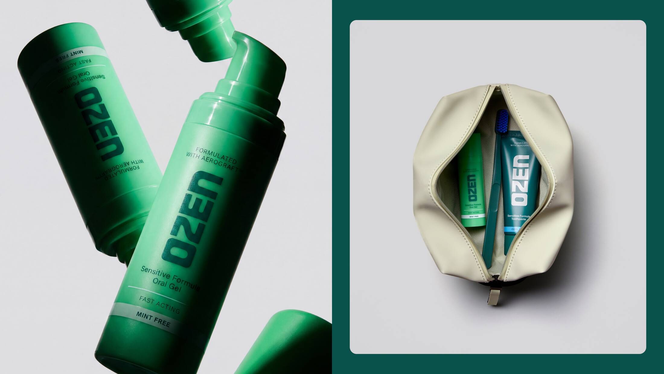
Independent branding and design studio Mother Design, part of the Mother Family, has created the brand identity for OZEN, a new oral care brand founded by NHS maxillofacial surgeon Dr Niall Kent. Formulated with AeroGraft™, the first new patented sensitivity technology to enter the category in around 30 years. OZEN combines breakthrough science with a distinctive new brand designed to bridge the gap between traditional clinical players and a new generation of design-led challengers. The project was delivered in partnership with Broody, Mother's start-up incubator, which worked alongside the founders to launch the business from inception.
Launching nationwide in Boots, OZEN enters a category increasingly split between long-established incumbents and a wave of modern challenger brands. While big corporate players continue to dominate through scale and familiarity, many newer entrants have focused on creating distinctive aesthetics without bringing meaningful product innovation to the category. Mother Design's challenge was to create a brand that reflected the breakthrough nature of OZEN's technology while balancing scientific credibility with contemporary appeal.
The answer was not to reject category codes altogether, but to carefully calibrate which ones to keep and which ones to leave behind. OZEN retains the cues that signal freshness, efficacy and scientific credibility while moving away from the familiar visual language that dominates the sector. The result is a brand world that feels progressive, certain and accessible, helping OZEN stand apart from established players without sacrificing trust.
At the heart of the identity is the platform "Creative Scientist", inspired by OZEN's own origin story. While researching bone grafts at University College London, Dr Kent worked with his brother, a Royal Academy-trained sculptor, to explore new materials. Through that process, he discovered how aerogel technology could be adapted for dentistry, ultimately leading to the technology that became the foundation of OZEN. OZEN is powered by Aerograft™, a patented bioactive aerogel technology developed from research at University College London and inspired by materials originally developed for rebuilding bone.
The platform embodies OZEN's belief that scientific rigour and creative thinking are not opposites but partners, combining precision, curiosity and experimentation in pursuit of better outcomes.
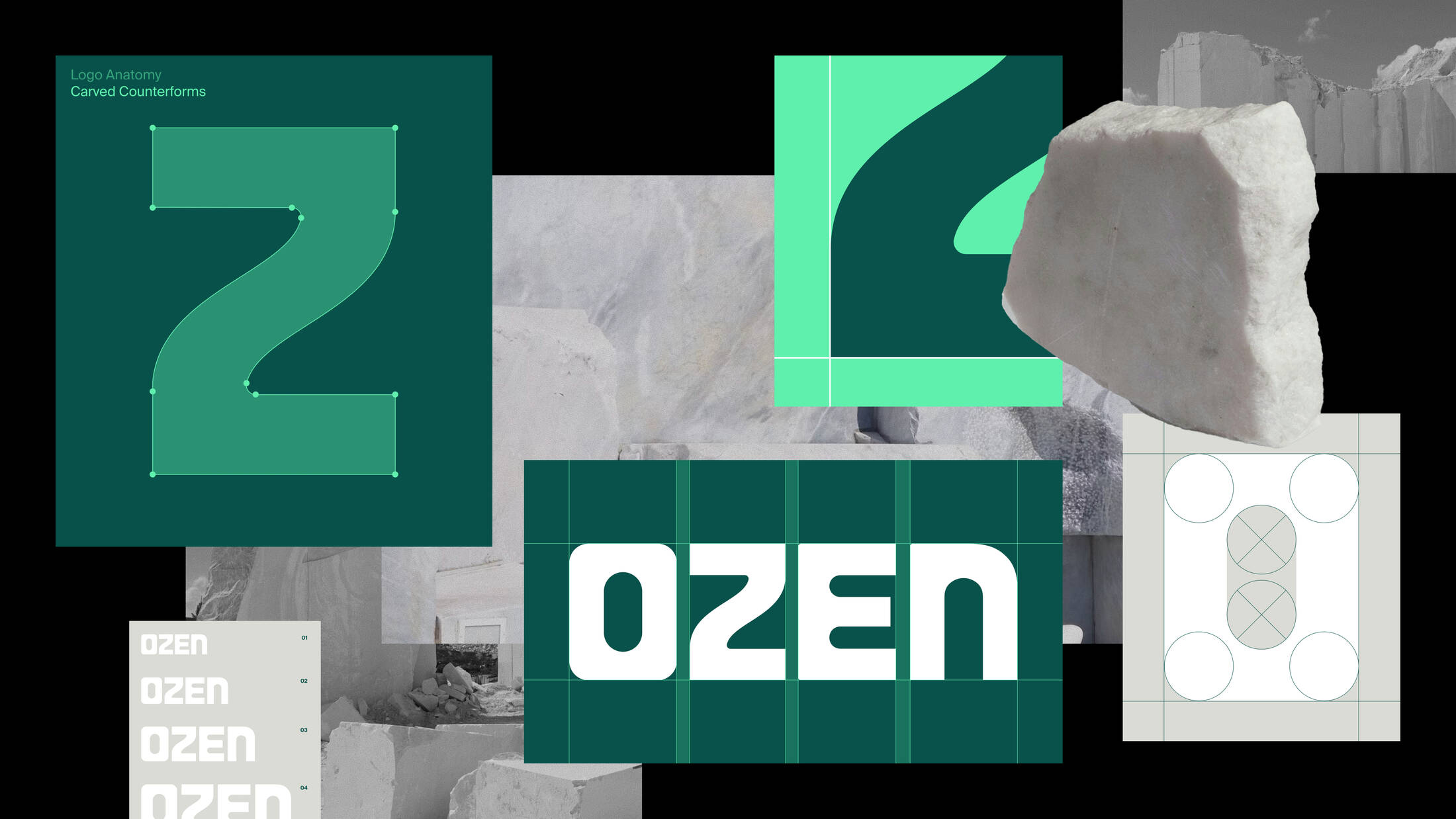
The identity system translates that philosophy into a distinctive visual world. The logo is strong, confident and sculptural, drawing directly from the coming together of artistic experimentation and scientific discovery that created the brand itself. Across the wider system, structural lines and graphic elements reference scientific and medical symbolism, helping reinforce efficacy and trust while avoiding the coldness often associated with the category.
Humanity is introduced to the design approach through texture, craft and subtle references to everyday life, creating a world that feels considered rather than clinical. Together, these elements balance the brand's scientific credentials with warmth and personality, creating an identity that feels human, approachable and reassuring.
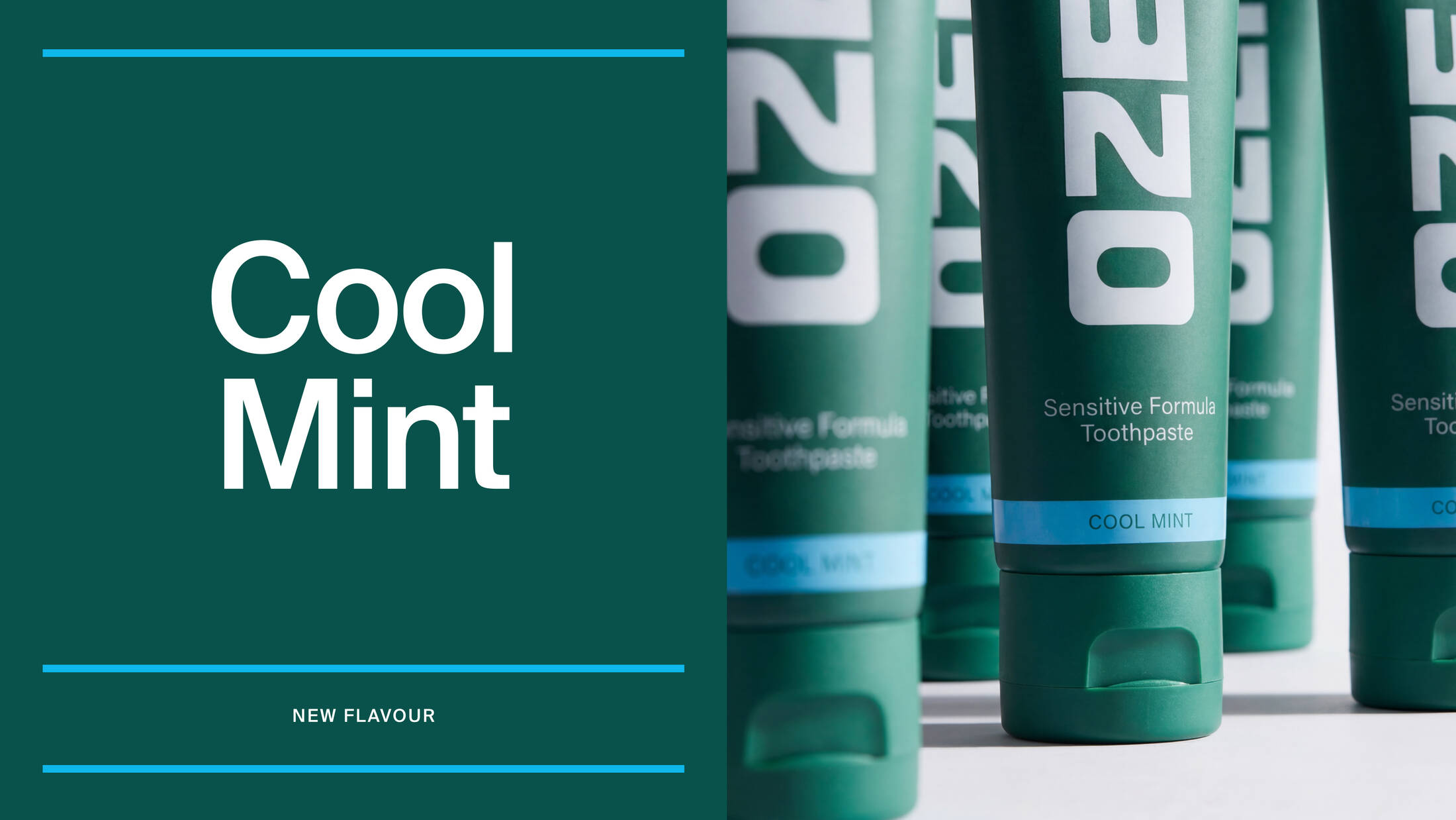
Colour plays a strategic role throughout the identity. A deep green gives the brand a more premium presence and stronger shelf stand-out, while a brighter green retains the freshness cues consumers expect from oral care. This balance allows the brand to feel familiar enough to inspire confidence, yet distinctive enough to avoid becoming another anonymous toothpaste pack.
Typography follows a similar principle. A bold, sculptural logotype is paired with clean, highly legible geometric sans-serif typefaces, balancing authority with accessibility and ensuring the brand remains easy to navigate and understand.
The overall system is deliberately restrained. Rather than relying on the claims-heavy visual language common across the category, the identity uses clarity and simplicity to create confidence, reflecting the reassurance sensitivity sufferers are seeking when choosing products.
The work spans brand strategy, positioning, visual identity, packaging, digital experience and communications, creating a distinctive new brand world that is now rolling out across packaging, digital channels and customer touchpoints as OZEN launches nationwide in Boots.
This professional campaign titled 'New brand' was published in United Kingdom in July, 2026. It was created for the brand: Ozen, by ad agency: Mother Design. This Design medium campaign is related to the Health industry and contains 5 media assets. It was submitted 3 months ago by Owner: Julia Conroy of Julia Conroy Limited.
Credits
Agency: Mother Design
Start-up incubator: Broody