Banking in Safe Hands
Description
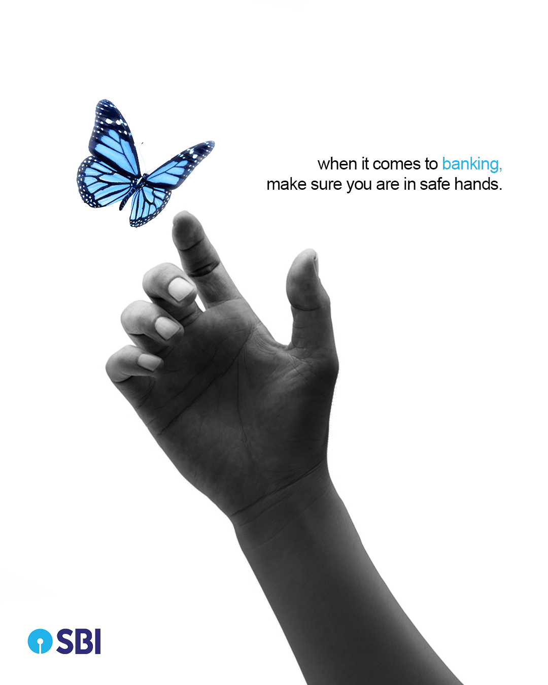
This advertisement for SBI (State Bank of India) uses a minimalistic and symbolic approach to convey trust, security, and care in banking services.
The creative effectively communicates SBI's positioning as a dependable and secure banking partner. It reassures customers that their financial needs are handled with care, precision, and stability—just like a delicate butterfly being safely supported by a strong hand.
Visual Symbolism:
The black-and-white hand represents stability, trust, and reliability, symbolizing the bank’s strong foundation and secure services.
The blue butterfly represents freedom, financial growth, and delicate care, which ties into the idea that SBI handles its customers' finances with utmost precision and responsibility.
The contrast between the monochrome hand and the vibrant butterfly draws attention to SBI’s core message of trust and reliability in handling delicate financial matters.
Tagline:
"When it comes to banking, make sure you are in safe hands."
This statement reassures customers that SBI provides a secure and reliable banking experience, emphasizing the importance of choosing a trustworthy institution.
This student campaign titled 'Banking in Safe Hands' was published in India in January, 2025. It was created for the brand: State Bank of India, . This Design, OOH Outdoor, and Print media campaign is related to the Media industry and contains 1 media asset. It was submitted over 1 year ago by Graphic Designer/Art Director: Koushik Lahiri.
Credits
Art Director: Koushik Lahiri
Copywriter: Koushik Lahiri