


Description
The "Balance" Dairy Brand: A Holistic Approach to Redefining Dairy
The journey of the "Balance" dairy brand began with a bold vision: to redefine the very essence of dairy consumption. Balance, a company driven by a profound understanding of the evolving consumer landscape, sought to transcend the traditional role of a dairy provider. They aspired to create a brand that not only offered a range of delicious and nutritious products but also embodied a philosophy of balance, harmony, and well-being. This ambitious goal presented a unique and complex challenge: to develop a brand identity that would not only resonate with health-conscious consumers but also establish a powerful and enduring presence within the fiercely competitive dairy market. Recognizing the need for a strategic partner with a deep understanding of consumer behavior, brand strategy, and creative execution, Balance approached Innovāt®, a leading brand consultancy, to embark on this transformative journey.
The Task:
Balance presented Innovāt® with a multifaceted set of objectives that extended far beyond simply creating a new product line. The task at hand demanded a comprehensive and integrated approach to brand building. Firstly, Balance sought to establish a strong and defensible market position, differentiating itself from the crowded landscape of dairy brands and carving out a unique niche within the consumer consciousness. Secondly, the creation of a truly compelling and unique brand identity was paramount. This required a deep dive into the core values of the brand and translating them into a visual language that would resonate with the target audience on an emotional level. Furthermore, developing a diverse range of high-quality dairy products was crucial. This involved meticulous product development, ensuring that each offering aligned with the brand's philosophy of balance and provided consumers with a range of delicious and nutritious choices. Building a loyal customer base was another key objective. This necessitated a deep understanding of consumer needs and preferences, fostering meaningful connections through a consistent and engaging brand experience. Finally, the brand identity had to reflect the highest standards of quality, sustainability, and ethical practices, aligning seamlessly with the brand's vision of promoting a balanced lifestyle.
Solution:
Innovāt® embarked on a comprehensive brand development process, successfully creating the "Balance" brand and positioning it as a premium class dairy product in the market. We meticulously addressed all of the client's objectives and, in many instances, exceeded their expectations by delivering innovative solutions in areas such as illustrations, packaging design, color palettes, and overall brand elements. To effectively manage and differentiate the various product lines within the Balance portfolio, Innovāt® strategically separated the brand's occupation and work aspects into four distinct sections: Dairy Products, Prefabricated Foods, Ready-to-Eat Meals, and Desserts. Each section was assigned a unique color and pattern, creating a visually cohesive yet distinct identity for each product category.
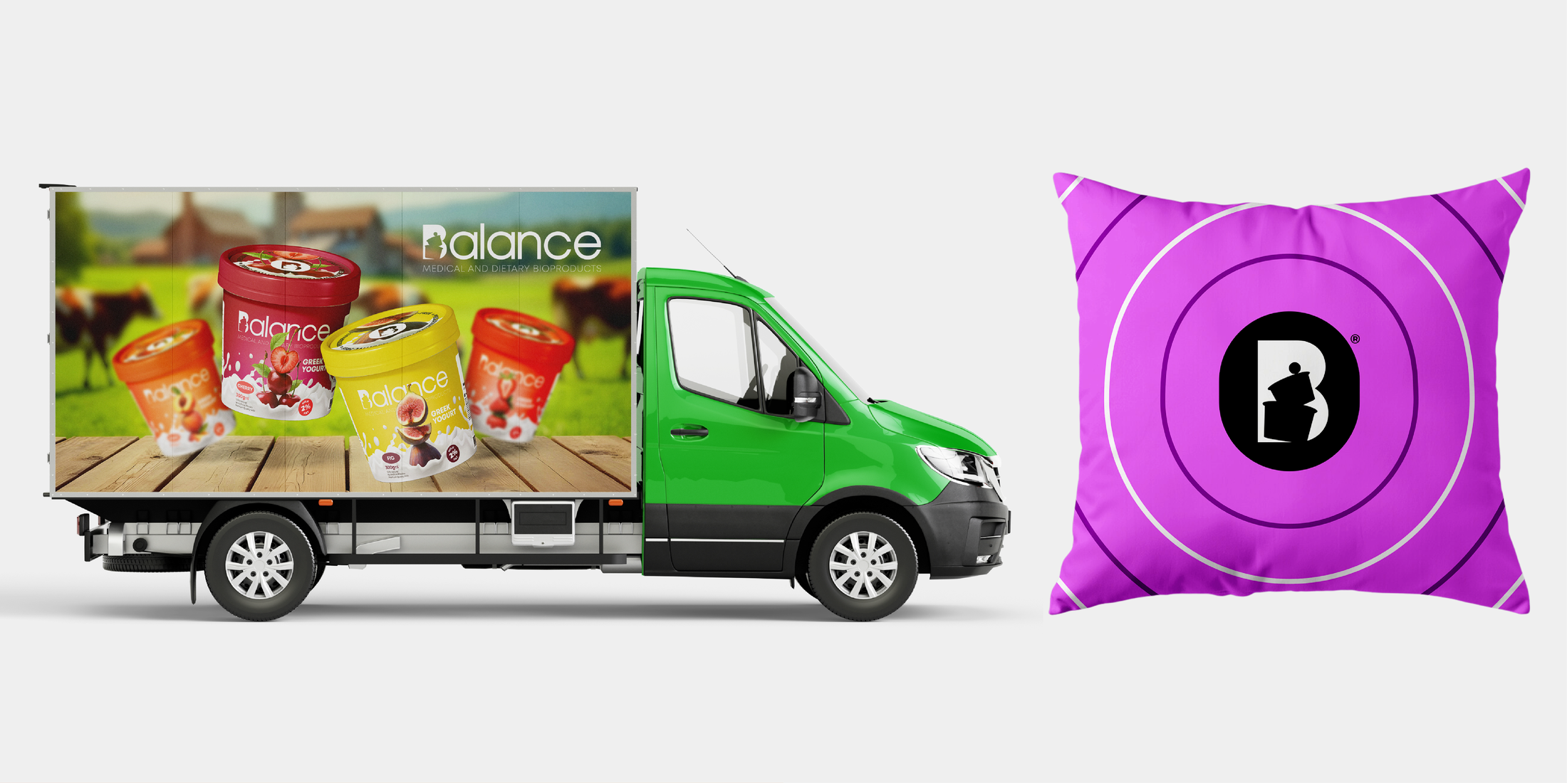
Color Separation and Patterns Management:
The "Balance" brand employs a strategic color separation model to visually differentiate and manage its diverse product lines.
Dairy Products: This category is represented by a soothing green palette, symbolizing nature, growth, and vitality, perfectly complementing the dairy product category. The pattern, featuring the balanced containers from the logo, reinforces the brand's core values and visually represents the foundation of a balanced diet.
Prefabricated Foods: This section is characterized by a vibrant cyan palette, evoking freshness and energy, perfectly aligning with the convenience and vitality associated with these products. The dynamic wavy lines pattern creates a sense of movement and fluidity, suggesting the ease and speed with which these meals can be prepared and enjoyed.
Ready-to-Eat Meals: This category is represented by an energetic orange palette, suggesting warmth and vibrancy, perfectly aligning with the comforting and satisfying nature of these meals. The pattern of stacked containers mirrors the layered nature of these meals, suggesting the simple steps involved in their preparation and evoking a sense of anticipation for the delicious meal to come.
Desserts: This section is enveloped in a luxurious Heliotrope palette, evoking indulgence and delight, perfectly aligning with the indulgent nature of the desserts category. The concentric circles pattern, reminiscent of the swirling motion of a whisk or the delicate layers of a beautifully crafted dessert, symbolizes unity and shared enjoyment.
This approach ensures that each product line maintains its own distinct identity while remaining cohesively connected to the overarching Balance brand.
Brand Strategy:
The brainstorming process was a dynamic and iterative phase, exploring a multitude of brand names and concepts. The goal was to identify a name that not only captured the essence of the brand but also resonated with consumers on an emotional level. After careful consideration, the name "Balance" emerged as the most compelling choice. This was a deliberate and strategic decision, signifying far more than just a product attribute. "Balance" encapsulated a holistic philosophy of well-being, extending beyond mere nutrition to encompass mental, emotional, and social aspects of a fulfilling life. This positioning elevated the brand experience, positioning Balance not merely as a provider of dairy products, but as a partner in achieving a balanced lifestyle. This approach aimed to cultivate a deeper connection with consumers, positioning Balance as a brand that understood their aspirations and supported their journey towards a more fulfilling life.
Visualization: The Conceptual Foundation:
Translating the abstract concept of "Balance" into a visually compelling and engaging brand identity presented a significant creative challenge. Inspired by the intricate beauty of nature, where diverse elements coexist in perfect harmony, Innovāt® envisioned a visual language that mirrored this delicate equilibrium. The core concept revolved around the idea of a harmonious composition, where different elements, representing the diverse flavors and textures of the products, would come together in a balanced and aesthetically pleasing arrangement. This visual metaphor, inspired by the natural world, perfectly captured the essence of Balance – a harmonious blend of flavors, textures, and ingredients working together in perfect unison. This conceptual framework served as the guiding principle for the development of all visual elements of the brand, from packaging design to advertising campaigns.
Bringing the Vision to Life: The Art of Illustration:
The next phase involved bringing this conceptual vision to life through the art of illustration. The illustrations were meticulously rendered using traditional hand-drawn techniques, employing colored pencils to capture the vibrancy and texture of each fruit and vegetable with exquisite detail. Achieving the desired balance and harmony within each composition presented a unique artistic challenge, requiring numerous iterations and refinements. The aim was to create illustrations that were not merely visually appealing but also conveyed a sense of natural abundance and wholesome goodness. Seamlessly integrating these intricate illustrations onto the packaging while ensuring optimal print quality and maintaining brand consistency demanded a high level of technical expertise and a meticulous attention to detail from the Innovāt® team. The result was a series of captivating illustrations that not only enhanced the visual appeal of the packaging but also communicated the brand's commitment to quality and natural ingredients.
Brand Storytelling:
The brand narrative was carefully crafted to resonate with consumers on an emotional level. It revolved around the journey of achieving a balanced lifestyle through mindful choices and a focus on well-being. This narrative extended beyond product information, exploring the deeper human connection with food and its role in creating a fulfilling life. Engaging content was strategically created across various channels, including social media platforms, the brand website, and in-store materials. This content aimed to share the Balance story with consumers, connecting with them on an emotional level and fostering a sense of community among those who shared a common interest in health and well-being. By sharing inspiring stories of individuals who had embraced a balanced lifestyle, the brand aimed to create a sense of aspiration and motivate consumers on their own wellness journeys.
Brand Positioning:
Balance was strategically positioned as a premium brand that transcended the ordinary. It emphasized quality at every step, from sourcing the finest ingredients to adhering to the highest standards of production and processing. Integrity was paramount, with a commitment to transparency in sourcing practices and a focus on sustainable and ethical production methods. The brand emphasized a holistic approach to well-being, recognizing that true balance encompasses more than just nutrition. It aimed to inspire consumers to embrace a mindful approach to their lifestyle, encouraging them to prioritize their physical, mental, and emotional well-being. This holistic approach resonated with the evolving needs of consumers who were increasingly seeking brands that aligned with their values and supported their overall well-being.
The Logo Concept:
The development of the Balance logo was a critical step in establishing the brand's visual identity. The logo was designed to be both visually striking and conceptually meaningful, effectively communicating the brand's core values. The logo was anchored by a circle, symbolizing the cyclical nature of balance and the interconnectedness of all things. Within this circle, a stylized 'B' represented the foundation of the brand and its unwavering commitment to quality. Upon this foundation, two containers emerged, signifying the diversity of choices and the importance of building upon a strong base. These elements culminated in a delicately balanced ball, symbolizing the dynamic equilibrium, aspiration, and the continuous journey towards a more fulfilling life. This harmonious interplay of elements, seamlessly integrated within the logo, effectively communicated the brand's core values and created a powerful and memorable visual representation that resonated deeply with the target audience.
Naming Concept:
The name "Balance" transcended a mere label; it embodied a lifestyle philosophy. It resonated with individuals seeking harmony in their lives, whether it's achieving a healthy diet, managing stress, or finding inner peace. This resonated deeply with the target audience, fostering a stronger connection with the brand.
Beyond a Name:
"Balance" was more than just a name; it was a powerful concept that resonated deeply with the target audience. It embodied a lifestyle philosophy, encouraging individuals to embrace a holistic approach to well-being. It went beyond the mere consumption of dairy products, inviting consumers to integrate the principles of balance into their daily lives. This resonated with the evolving consumer consciousness, where health and well-being were increasingly seen as interconnected aspects of a fulfilling life.
This professional campaign titled 'A Holistic Approach to Redefining Dairy' was published in Armenia, Multinational Europe, and United States in January, 2025. It was created for the brand: Balance Dairy, by ad agencies: Habeshian Graphics and Innovāt. This Content, Design, and Print media campaign is related to the Candy, Snacks, Food, and Health industries and contains 26 media assets. It was submitted over 1 year ago by Creative Design Agency: Innovāt - Empowering Creative Innovation .
Credits
Creative Design Agency: Innovāt® - Empowering Creative Innovation
CEO/Art Director & Senior Designer: Sako Habeshian