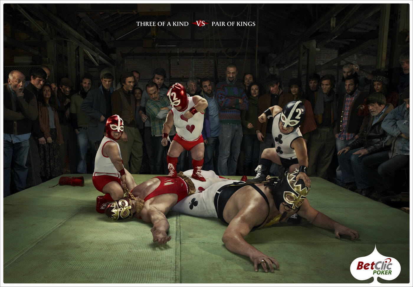
Description
Print advertisement created by La Chose, France for Betclic, within the category: Gaming.
Three of a kind vs Pair of Kings
Creative Director: Pascal Grégoire
Art Director: Mathieu Dubray
Copywriter / Designer: Tanguy Gallis
Agency Account Executives: Alain Roussel Bérengère Mangin
Project Manager: Gareth Thomas
Photographer: Jean Yves Lemoigne
Great example of the way some ideas only work in a given medium. The TV spot with this concept is pretty funny and entertaining. This print ad loses the impact and the humor.
- Jeff
– – – – – – – – –
President, Singularity Design | www.SingularityDesign.com | Blog.SingularityDesign.com | Is your brand getting the attention it deserves?
You're perfectly right.
.. / .-.. --- ...- . / .- -.. ...- . .-. - .. ... .. -. --.
Well actually, I play poker and I found this print very funny...I think this is great examplle of idea that everything say in one shot (which is really hard for 90% of tv ads) so it's even better on print.
I personal think, that with small correction in art direction it colud really HIT the target (poker players)...for examplle: it would be great to see more green floor like the real poker green table...
Innovation & Art Director
https://www.behance.net/darkobosnar
I have to agree with "Darko". I think this works in a different way than the TV spot. This lets the viewer take in what's happening as opposed to having it thrown at you (as in the TV spot). I actually think the TV spot is a bit too much (and too long). Take about :30 seconds off the TV spot to tighten up the story, getting us to the message faster, would give it more punch. (no pun intended) I also think the rating of this ad versus the TV spot depends on which you see first. I happened to see this ad first, so the TV spot lacked luster...perhaps if it were the other way around I'd feel a bit different. But, I still stand by my view that they work differently to accomplish the same goal. This ad lets you look around, see the people's reactions and take in the message at a pace. The TV ad is "in your face", which is the point, and executes the message in a different, but equally effective, way.
-Richard Todd Aguayo (razorsharp creative)
http://razorsharpcreative.com
love it, great concept, amazing execution, congrats.
=== Looking for concept/art creative to form a team to work in independent advertising projects. ===
Alexandre Brito
Personal Page | Blog |
Encuentra el par (entre las personas del público) jajaja
Buena idea de todas formas.
Chief Creative Director Nexus BBDO
Como jugador ocasional de poker hay algo que no entiendo.
¿Cual es la razón de que las cartas que lleva unmismo jugador luchen entre si?
No le veo sentido alguno.
En cuanto a lo de transformar el poker en lucha libre la idea me gusta pero creo que el ejemplo es un poco confuso o tal vez soy yo el que no lo entiende...
Reminds me http://www.youtube.com/watch?v=-0uTN8hPpP0 at 1:34
Really nice. Great idea and original.
Congrats from Brazil
Remins me "strongly" a 2006 print campaign by ZIG Toronto :
http://www.joelapompe.net/2010/04/08/canadian-molson-betclic-lachose/