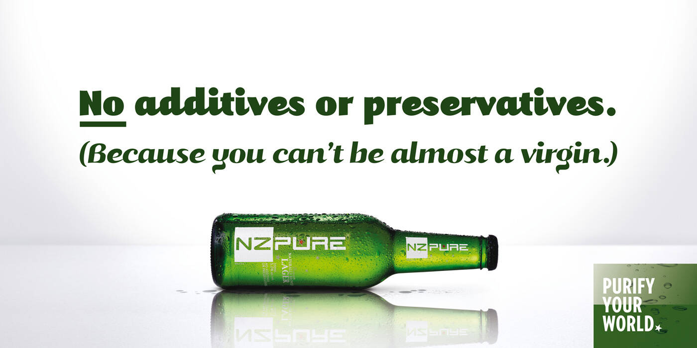
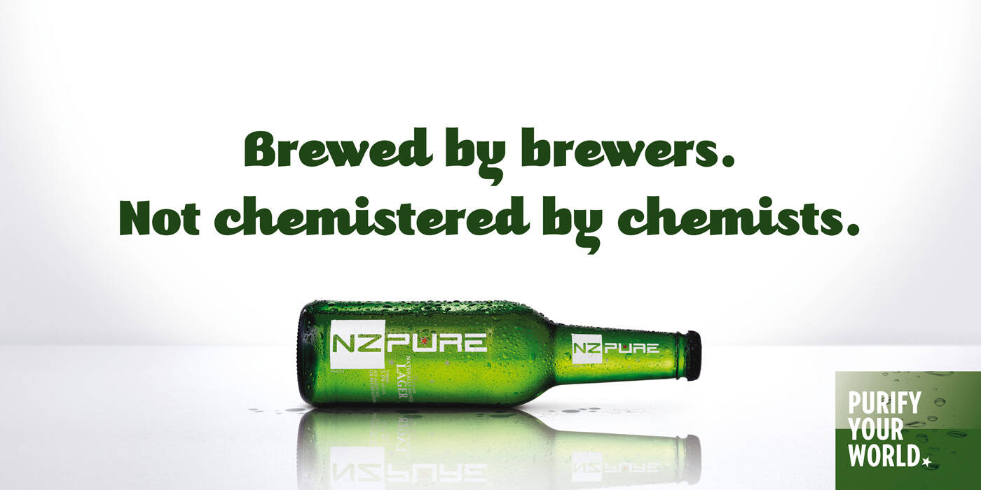
Description
Outdoor advertisement created by Barnes Catmur & Friends, New Zealand for NZ pure, within the category: Alcoholic Drinks.
Brewed by brewers.
Not chemistered by chemists.
Purify your world.
Executive Creative Directors: Paul Catmur
Copywriter: Paul Catmur
Art Director: Crispin Schuberth
Photographer: Rory Carter
Retouching: The Lounge
Typography: Brad Stratton

Not chemistered by chemist but the visual is very clinical, imo it leans more to chemist then brewers because it's having no signs of tradioditional brewarage (or anything to relate brewers with) in the visual.

Agree with jack...
The whole look of the brand seems very clinical and modern.. even the NZ in the white box seems to be right out of the periodic table. It's like a bunch of chemists created something they like and then decided they need to hide the fact it was created by star trek nerds, so they wanted to place it as a mans beer made by brewers... contradicting visual and message
in my humble opinion
Always try to be unique even when forced to conform.
Agree with ACreativeSpirit..
"Bright ideas bring better results"
you guys mean it should've been placed somewhere between the barley fields...
yea true...!
Agree above
M Munir Bhatti
http://twitter.com/munirgee | http://facebook.com/munirgee | http://www.xperts.net.pk

hey, it is a very very good mimicry of neil french's xo beer campaign... bottle placed horizontally... even the style of copy... good "copy"work indeed

'Pure' aka 'P' or 'meth' is indeed a chemical. The joke is that NZ males get more angry and aggressive on beer than they do on 'Pure', so this is appealing to the metrosexuals who want to write themselves off, but not their wives. It NEEDS to look chemical. The copy is a red herring.