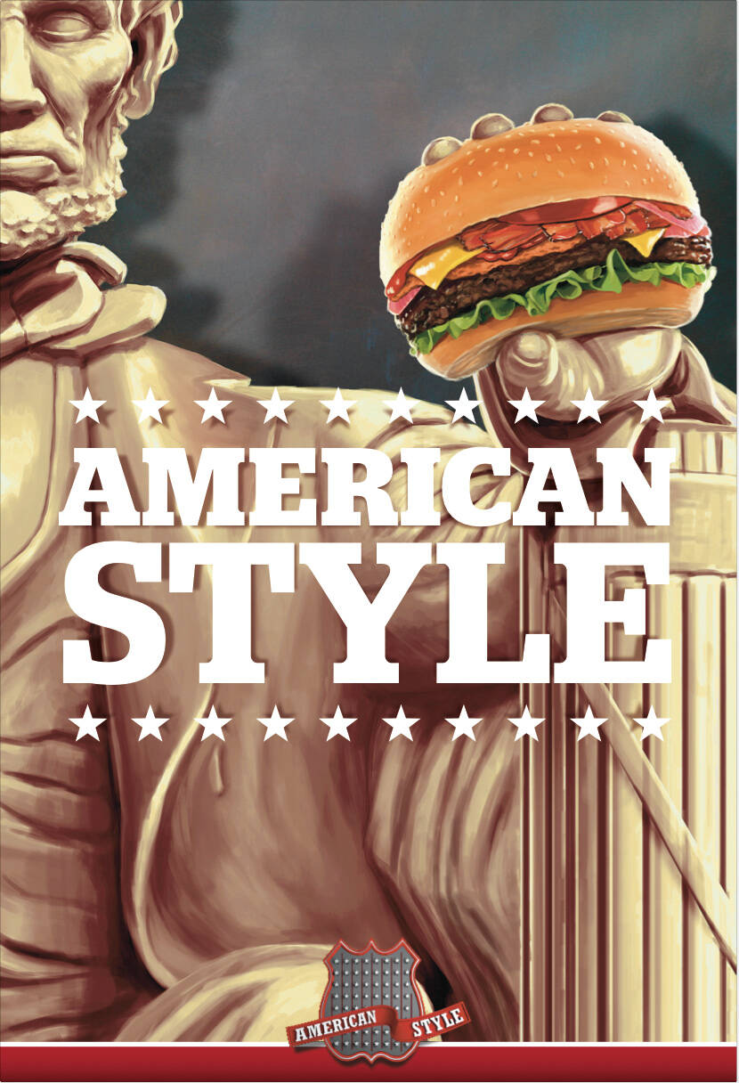
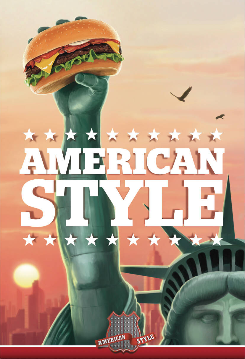
Description
Poster campaign for a hamburger restaurant chain called American Style.
This professional campaign titled 'Statue' was published in Iceland in August, 2012. It was created for the brand: American Style, by ad agency: Brandenburg. This OOH Outdoor medium campaign is related to the Food industry and contains 2 media assets. It was submitted over 11 years ago.
Credits
Advertising Agency: Brandenburg, 101 Reykjavik, Iceland
Creative Directors: Hrafn Gunnarsson, Gulli Adalsteinsson
Art Director: Hrafn Gunnarsson
Illustrator: Doddi