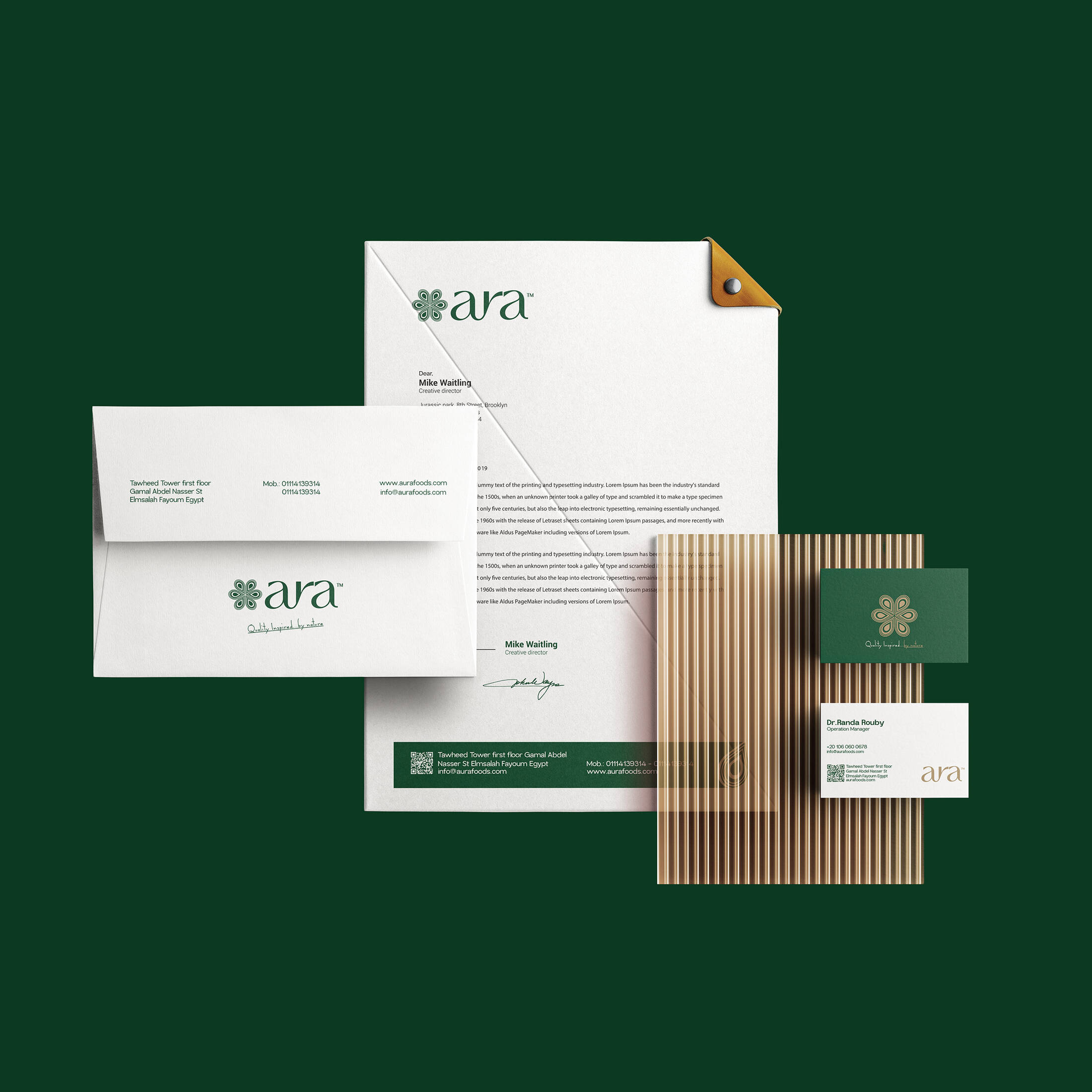
Stationery Design
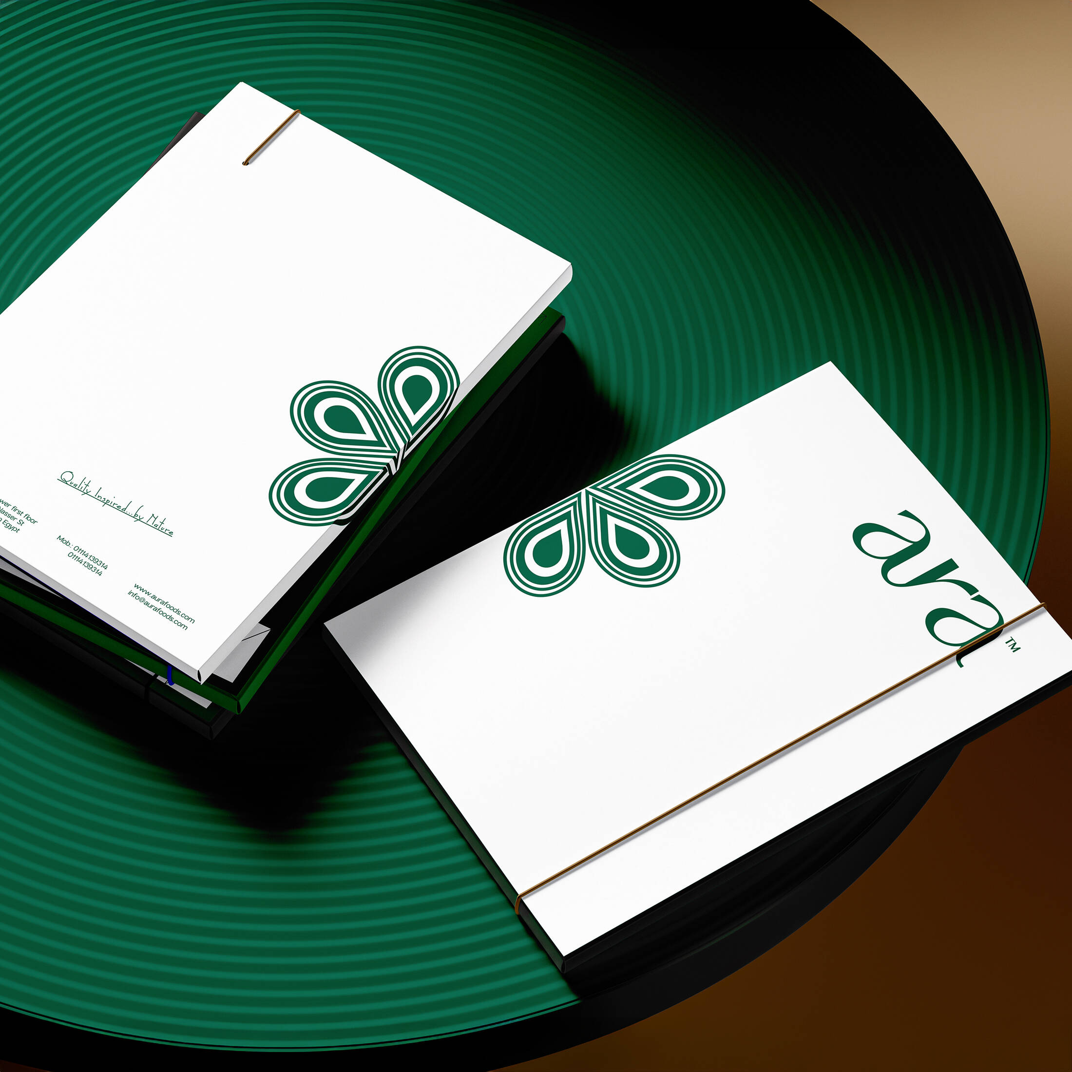
Folder Design
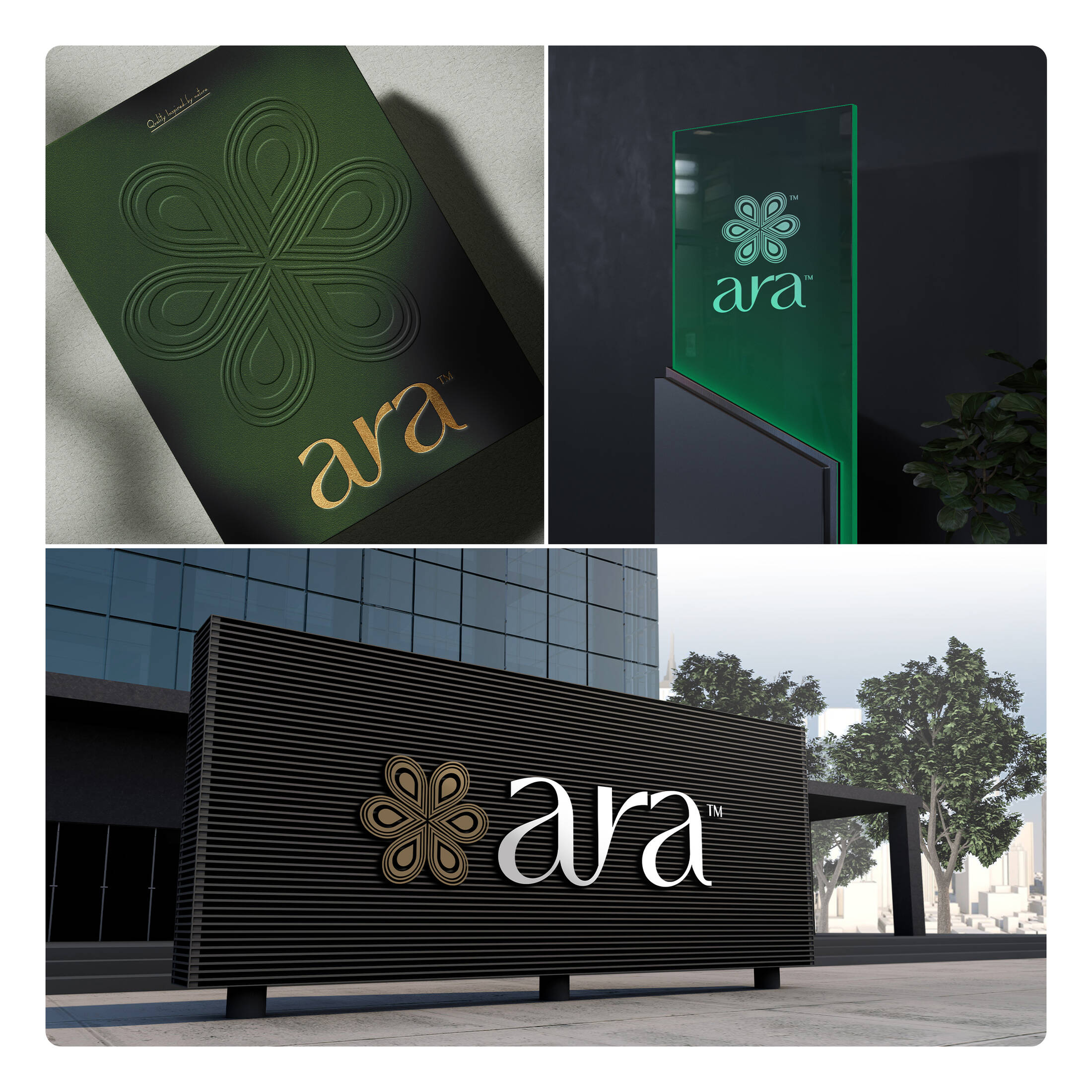
Brand Touchpoint
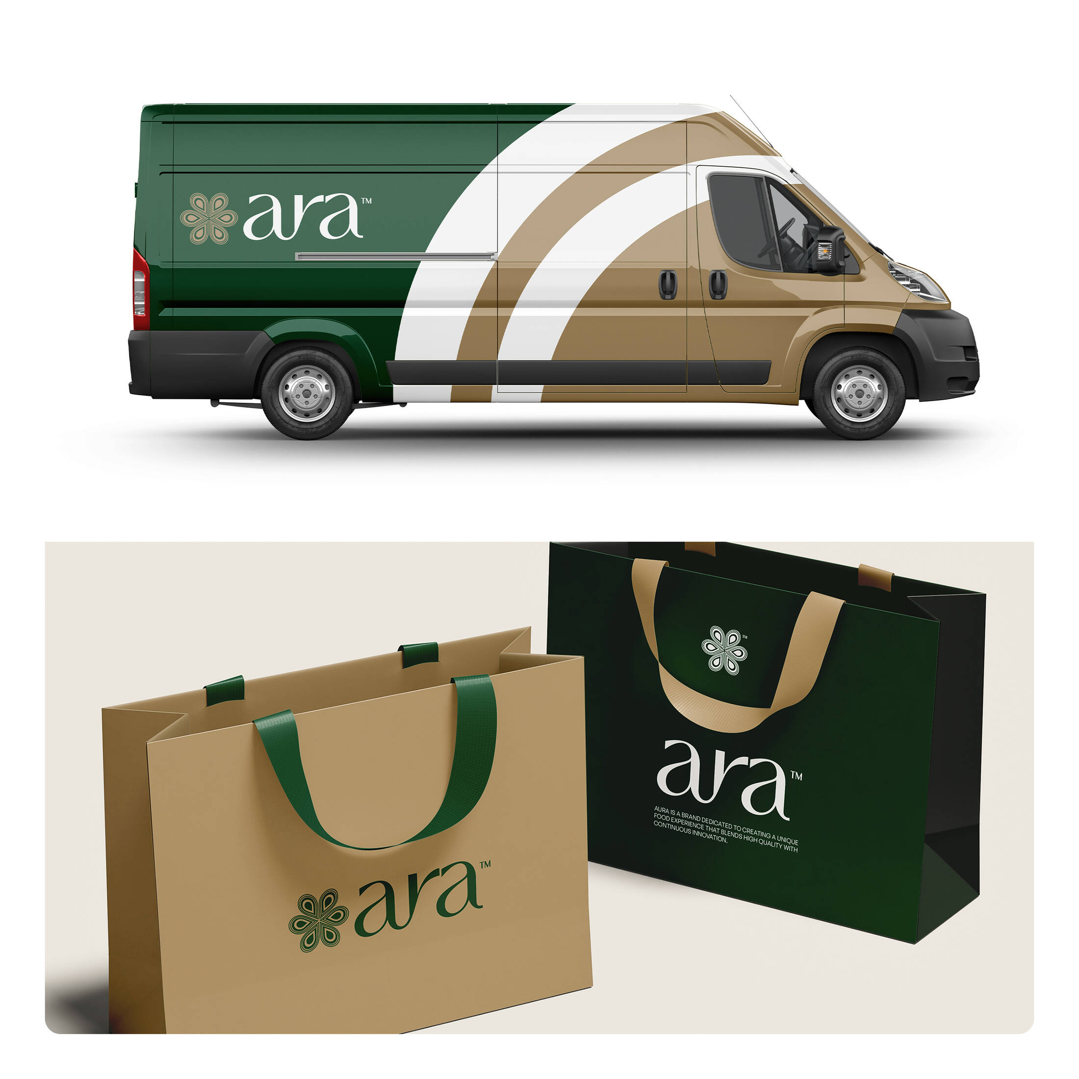
Van Design & Bag Design
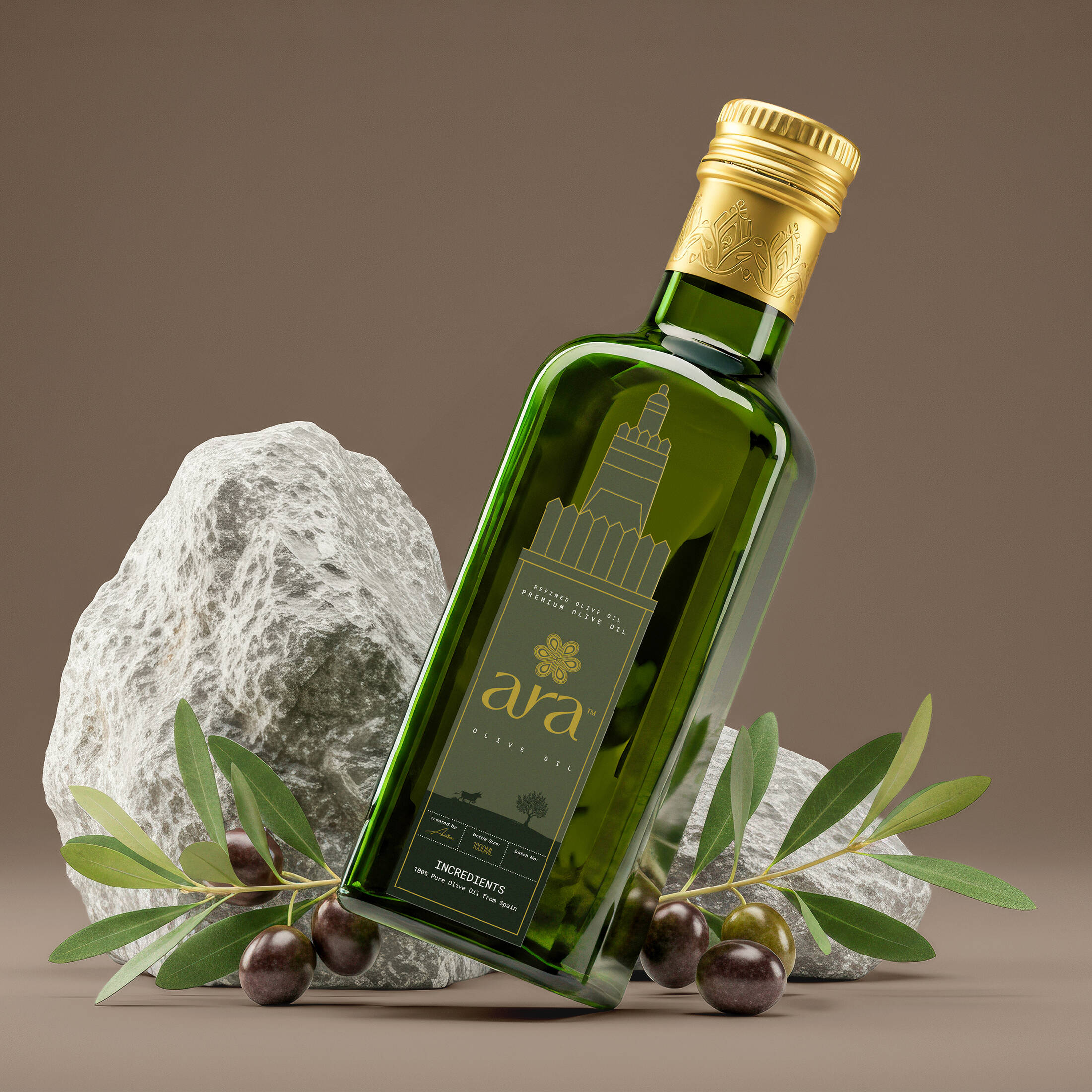
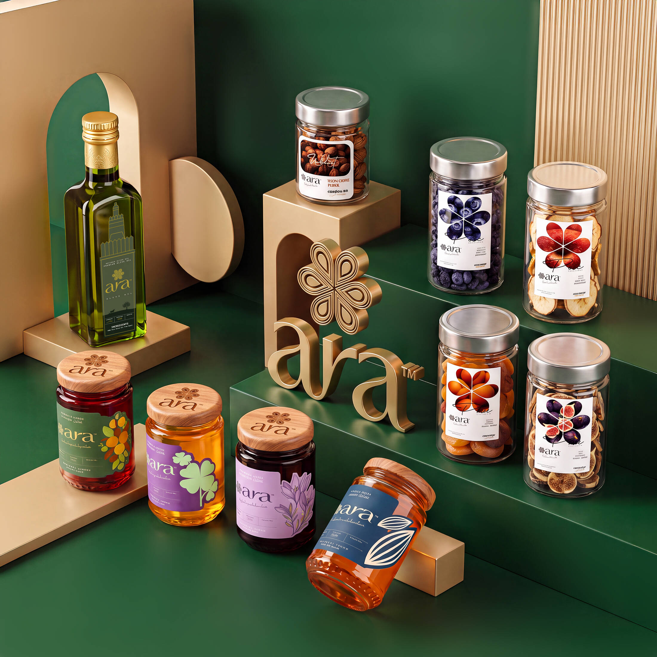
Olive Oil Packaging Design
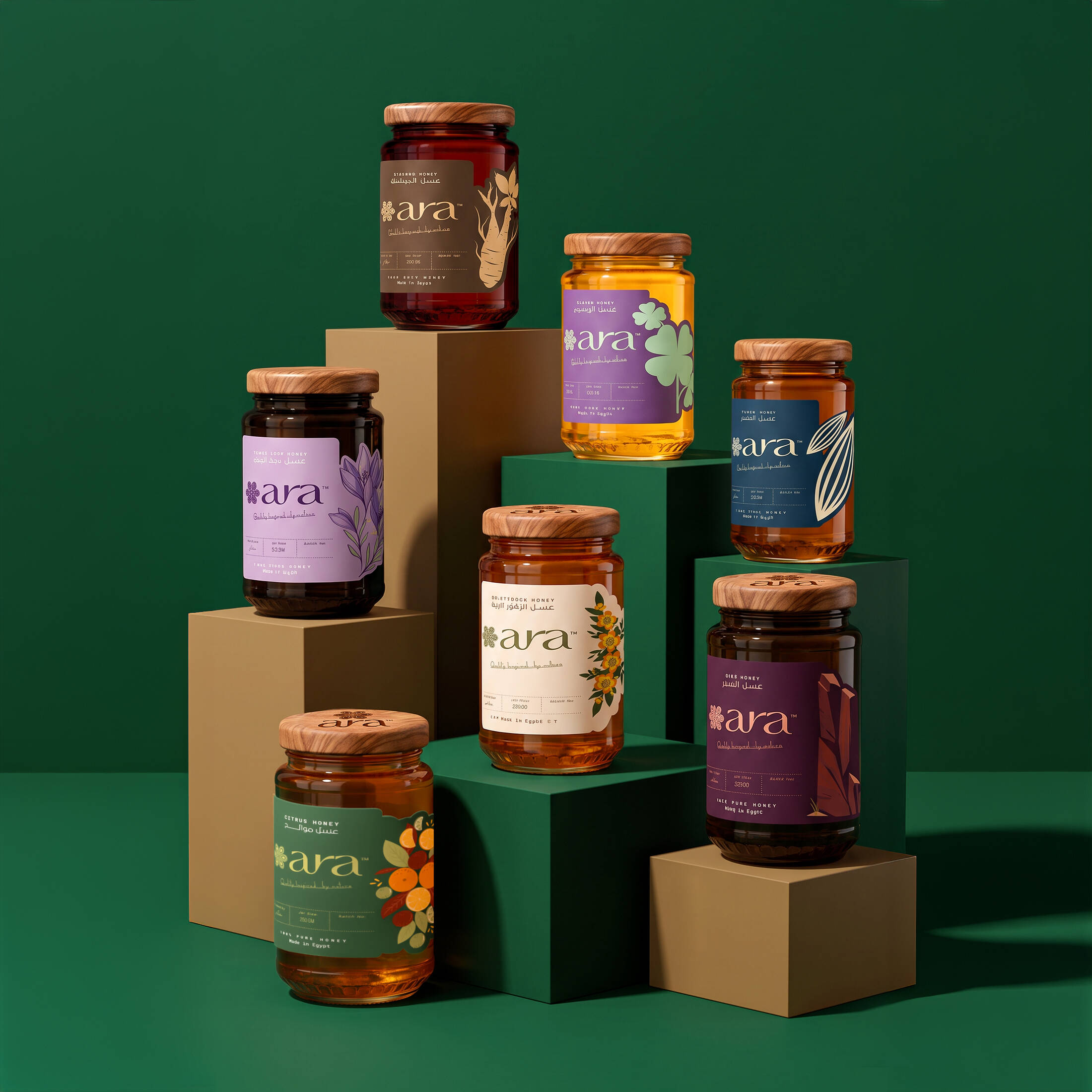
Honey Packaging Design (Black seed Honey / Citrus Honey / Clover Honey / Fennel Honey / Ginseng Honey / Sidr Honey / Wildflower Honey)
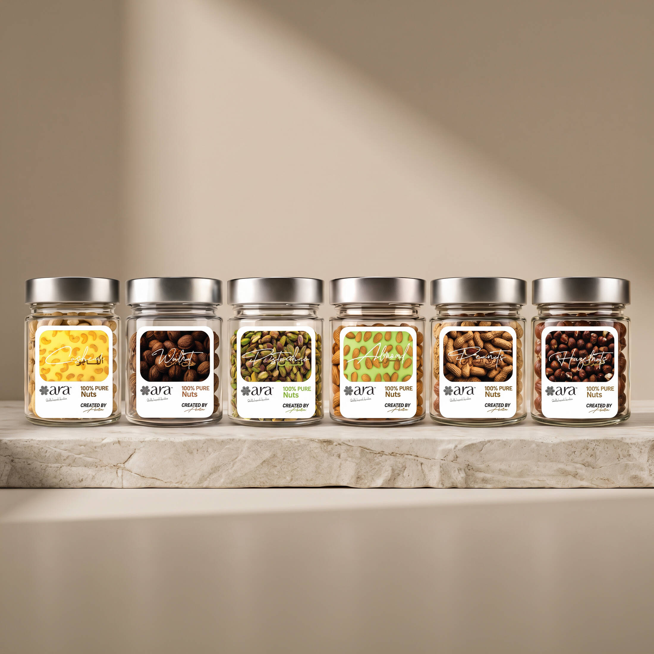
Nuts Packaging Design (Cashew / Hazelnut / Almonds / Peanuts / Pistachios / Walnut )
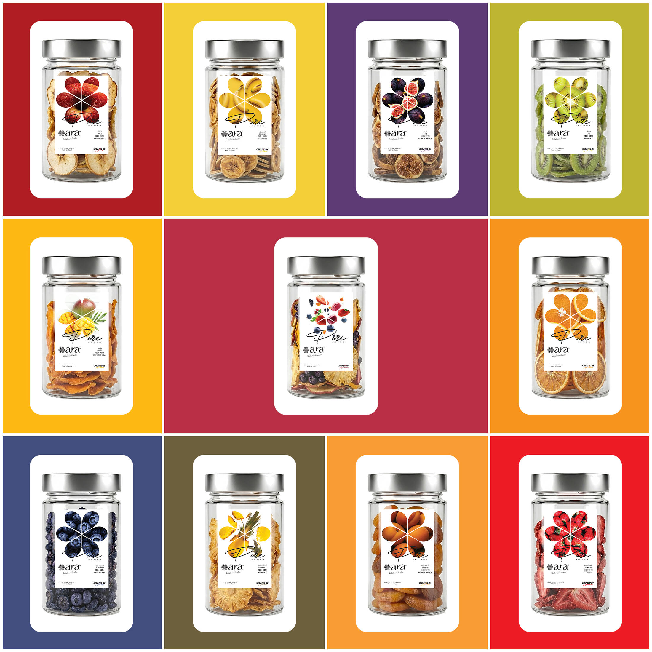
Dry Fruits Packaging Design (Dry Apple / Dry Apricot / Dry Bananas / Dry Blueberry / Dry Fig / Dry Kiwi / Dry Mango / Dry Orange / Dry Pineapple / Dry Strawberry / Dry Mixed Fruits)
Every successful brand begins with a powerful identity. For Aura, Sara Communications developed a complete branding experience from strategic brand identity creation to premium packaging design ensuring every visual element reflects the brand's personality, values, and market positioning. Our creative process included: • Brand Strategy & Positioning • Logo Design & Visual Identity System • Color Palette & Typography Selection • Packaging Design Concept & Production Artwork • Label & Product Packaging Design • Brand Guidelines & Creative Direction The result is a cohesive and memorable brand that stands out on the shelf while creating a strong connection with customers. At Sara Communications, we believe branding is more than a logo it's the complete experience customers remember. Whether you're launching a new product or rebranding an existing business, our team delivers creative branding solutions that combine strategy, creativity, and commercial impact.
Description
Aura was created to introduce a fresh food and beverage brand with a strong visual presence from day one. The challenge was to build a distinctive identity that could establish immediate brand recognition while supporting the launch of a new product in a highly competitive market.
Our approach focused on creating a brand that feels modern, approachable, and memorable. Every element from the logo and colour palette to the packaging system was designed to communicate freshness, quality, and confidence while remaining flexible across different product lines and customer touchpoint.
The packaging was developed as an extension of the brand identity rather than simply a container for the product. Clean layouts, carefully selected typography, and bold visual elements work together to create a consistent experience that stands out on the shelf and strengthens consumer recall.
The result is a cohesive visual identity that balances simplicity with impact, giving Aura a recognisable presence and a scalable foundation for future growth.
In today's crowded food and beverage market, consumers often make their first decision visually. Our objective was to create a brand identity that captures attention within seconds while communicating trust, freshness, and quality.
Rather than relying on decorative elements, the design system was built around clarity, strong visual hierarchy, and a consistent brand language. This allows the packaging to become the primary brand asset—instantly recognisable, easy to navigate, and memorable long after the first purchase.
Every design decision was made to ensure that Aura's first impression would be as strong as the product itself.
This professional campaign titled 'Visual Identity & Packaging for Artisanal Food' was published in Egypt in April, 2026. It was created for the brand: Aura, by ad agency: Sara's Communications. This 360° medium campaign is related to the Food and Health industries and contains 10 media assets. It was submitted about 2 months ago by Sara's Communications of Advertising Agency.
Credits
Advertising Agency: Sara's Communications
Ceo: Salwa El-kasbky
Creative Director: Mohamed Salah
Art Director: Ataa El-Rahman