Penfolds elevates its flagship wine Grange into an in-store spectacle, designed by Denomination
Agency: Denomination

Description
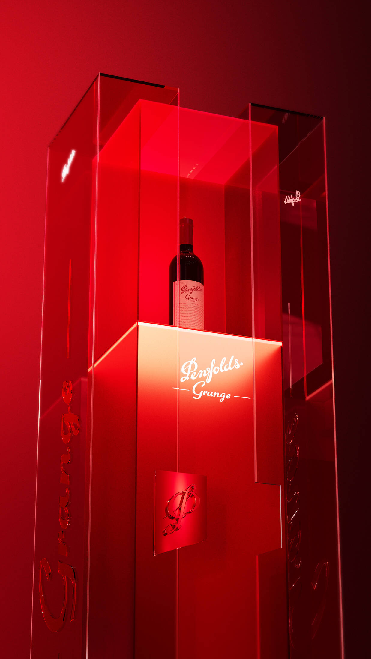
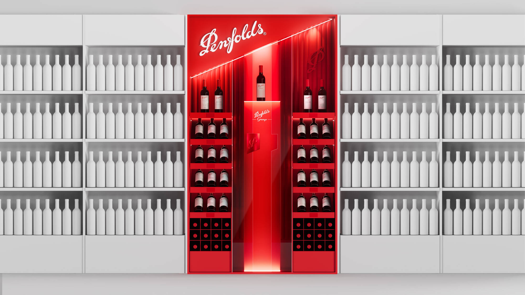
The new Penfolds Grange in-store installation, rolling out globally and designed by Denomination, brings its flagship status to life in three dimensions.
Penfolds has launched a new global in-store activation for its flagship wine, Grange. Created in partnership with long-time design collaborator, Denomination, the installation debuts in Asia and Australia today before rolling out to key markets worldwide, redefining the shopping experience for one of the world’s most revered wines.
“This installation blurs the lines between retail design, exhibition and product display, inviting consumers into a considered moment of encounter with Grange, a product that sits outside of category norms and defies convention,” says Penfolds global creative director Luke Anton.
“This is why we entrusted Denomination, who bring an intimate understanding of the brand’s codes, heritage and standards. The team has created an experience that blends design and storytelling to elevate Grange’s presence in retail.”
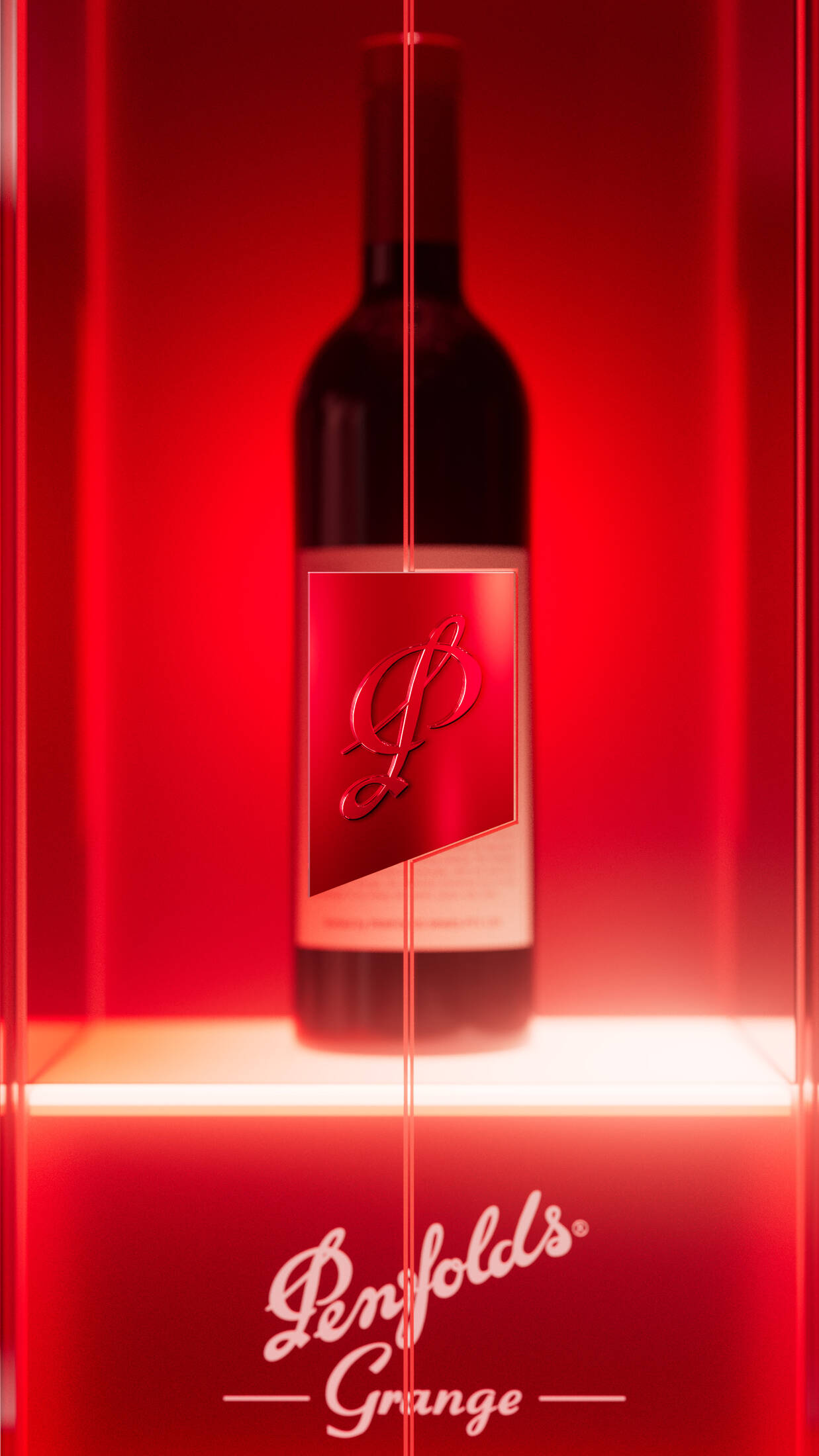
Bringing “preciousness” to life
The new installation is designed to express the preciousness of Grange, treating it as a rare, luxury icon rather than a conventional product on shelf.
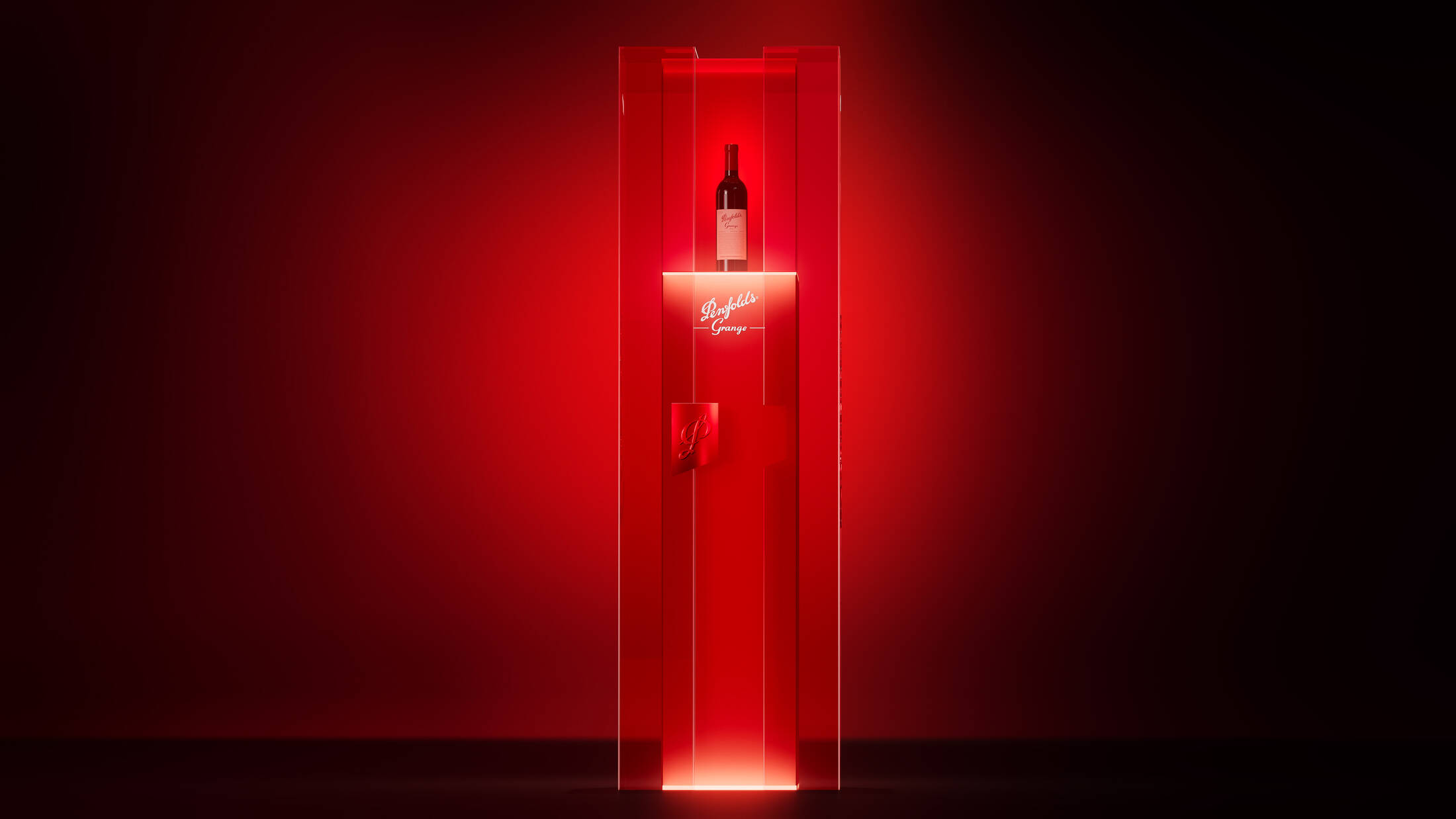
The design places Grange behind glass, framed by an architectural structure, with carefully choreographed lighting and mechanics that enhance the consumer experience, signalling its status as the pinnacle of the Penfolds portfolio.
The installation incorporates layered glass, precision lighting and carefully selected materials, with illumination used to both reveal and obscure the bottle. This creates a controlled sense of tension, reinforcing Grange as something to be approached with reverence rather than immediacy.
Every detail, from metal finishes to structural proportions, has been designed to express rarity, permanence and restraint, turning the act of viewing the bottle into a moment of quiet theatre, where lighting and materials create a sense of awe.
Denomination has defined a set of core principles to create a scalable framework for Grange displays worldwide, ensuring clarity, consistency and impact across diverse in-store displays worldwide.
Elevating an icon
Denomination explored multiple design territories before refining the final execution, an in-store presence that draws on Penfolds’ established yet ever-evolving luxury visual language.
“The key challenge was elevating Grange, the icon of Penfolds, above an already prestigious portfolio in a category saturated by luxury cues,” says Denomination executive creative director Graeme Offord.
Compounding this was Penfolds’ strong and singular ownership of red, which has been elevated beyond a logo colour to serve as a spatial cue, used selectively to draw the eye and anchor the installation in store.
The question became how to create distinction, impact and elevation without introducing additional colours. The solution lies in the innovate use of form, layering, scale and materials, such as the symbolic mechanism and layered glass construction.
Here, the Penfolds “P” becomes a hero form, reimagined as a symbolic locking mechanism realised in red anodised metal. This element functions both practically and metaphorically, implying rarity, protection and preciousness, reinforcing the idea that Grange is something to be unlocked rather than freely accessed.
The mix of glass, metal and refined finishes references contemporary luxury flagships more than traditional wine merchandising. Safe-like layered glass construction allows translucency and illumination to obscure and reveal the bottle simultaneously, creating tension between visibility and restraint.
The overall clarity, confidence, and restraint of the execution ensure Grange stands apart in crowded retail settings, commanding attention without ever needing to shout.
A new chapter in a decades-long story
Grange sits at the heart of the Penfolds story, a wine born from radical innovation in the 1950s that went on to win global acclaim and redefine Australian wine – appreciated by collectors and casual wine drinkers alike.
The in-store installation reframes Grange not simply as a product, but as an experience – creating designated theatrical moments within retail environments that draw in new consumers, particularly those encountering Grange for the first time in travel retail, while reaffirming its status for existing connoisseurs.
“Grange has always been our benchmark. This installation gives it the setting it deserves and offers people a chance to experience the story behind the wine, not just the bottle on shelf,” says Luke Anton.
Denomination has partnered with Penfolds for more than 23 years, shaping brand books, core packaging, limited editions and luxury gifting. This project represents a step change, taking that deep brand understanding into global retail spaces.
“Grange has always been treated as precious in language. We simply asked what that might look and feel like in three dimensions,” says Denomination co-founder and CEO Rowena Curlewis. “Our ambition was to embody Grange’s lore, so you don’t just see a bottle; you feel that you’re standing in front of something iconic and worthy of ceremony.”
This professional campaign titled 'Penfolds elevates its flagship wine Grange into an in-store spectacle, designed by Denomination' was published on February 04, 2026. It was created for the brand: Penfolds, by ad agency: Denomination. This Design medium campaign is related to the Alcoholic Drinks and Retail Services industries and contains 5 media assets. It was submitted 5 months ago.
Credits
Drinks brand specialists: Denomination