Description
Marks & Spencer Fashion, Home & Beauty has rolled out a new packaging system by Mother Design across thousands of Home and Lingerie products, bringing the retailer’s wider transformation of its style credentials to one of its most frequently experienced customer touchpoints.
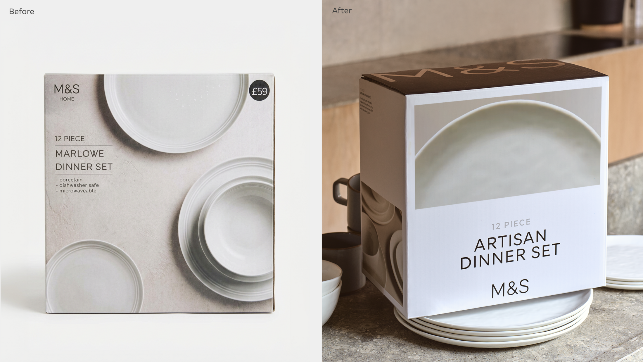
The new brand-first system responds to packaging that had become increasingly crowded with sub-brands, range names, claims and competing hierarchies, and was at risk of feeling disconnected from the confidence and simplicity M&S Fashion, Home & Beauty now expresses elsewhere.
As part of the ongoing nationwide rollout, the Home & Lingerie system spans 1000s of SKUs across a breadth of formats, stripping back complexity to put the M&S core brand firmly back at the centre.
Mother Design has developed the system around three ambitions: to make M&S packaging feel as stylish as the brand it represents; strengthen the role of the M&S core brand across thousands of products; and make ranges easier for customers to navigate and shop, particularly in an increasingly self-service retail environment where packaging has to work harder to support purchase decisions.
At the heart of the redesign is a new brand architecture across Home and Lingerie, developed by Mother Design in partnership with the M&S team. As part of this, every sub-brand and range was given a clearer role in strengthening the M&S core brand, allowing M&S itself to reclaim greater prominence.
The visual system is deliberately restrained. At a time when packaging design can often equate impact with expression, Mother Design took the opposite approach: using clarity, craft and considered reduction to give greater prominence to the product and the M&S brand. Rather than adding more visual noise, the system strips away what customers don't need, creating a clearer hierarchy around what they do.
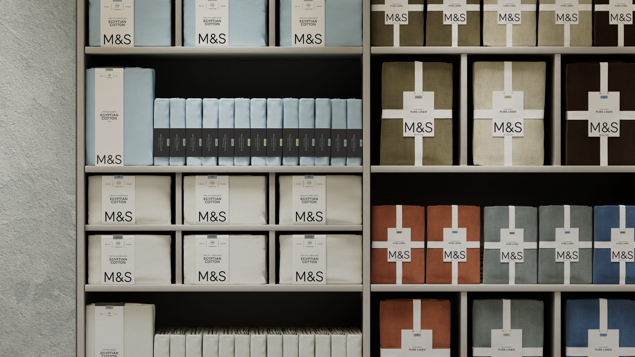
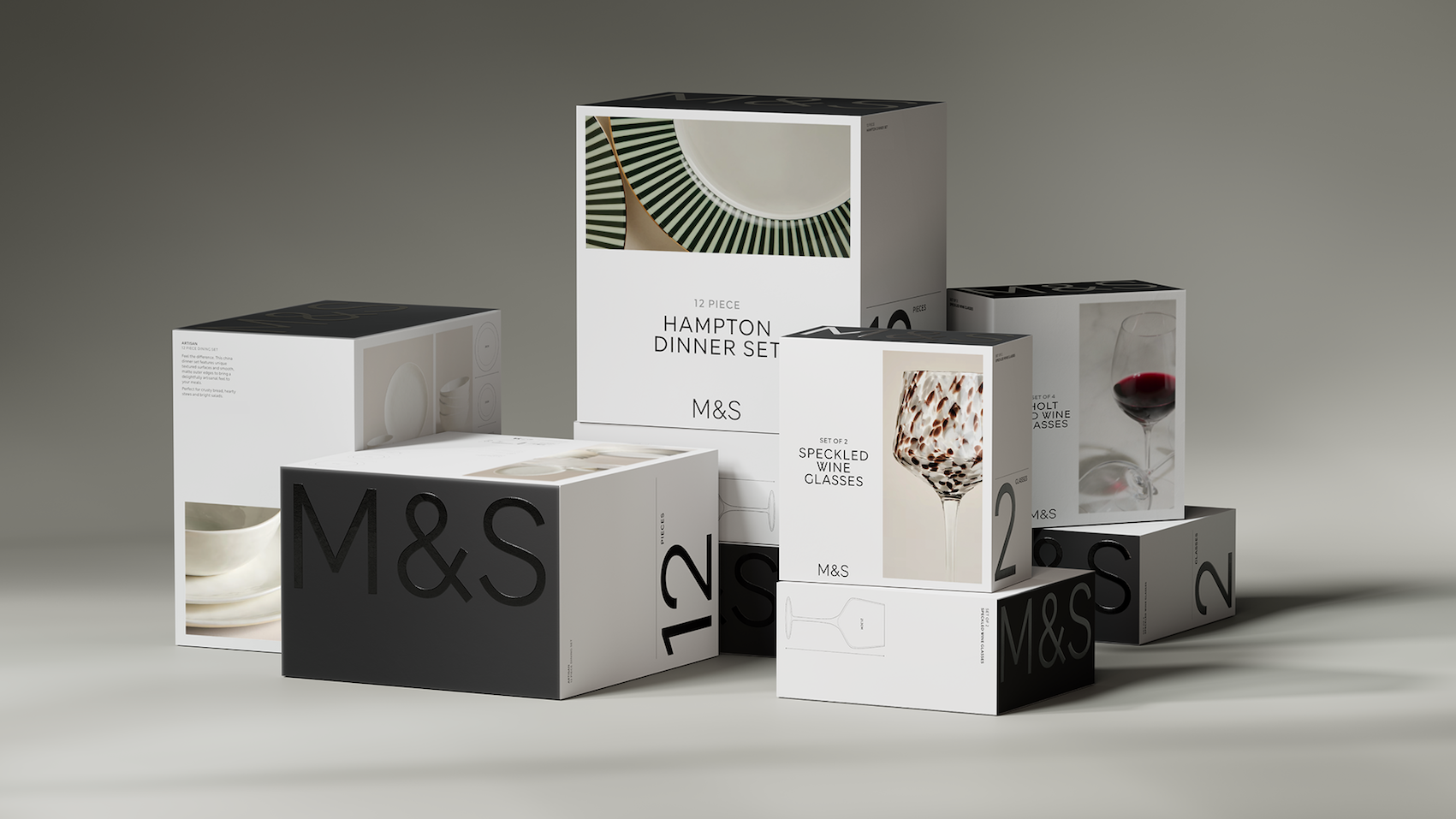
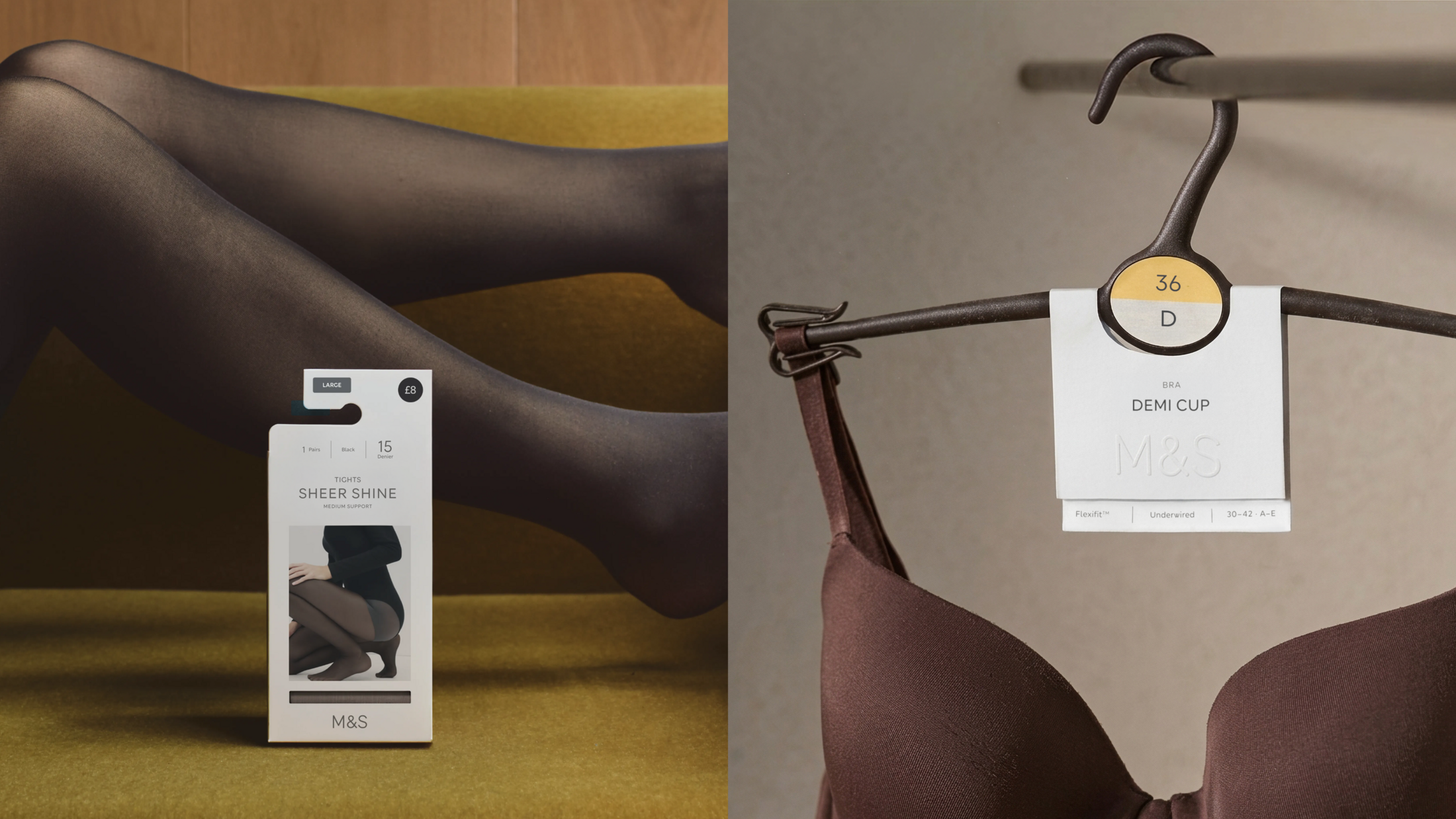
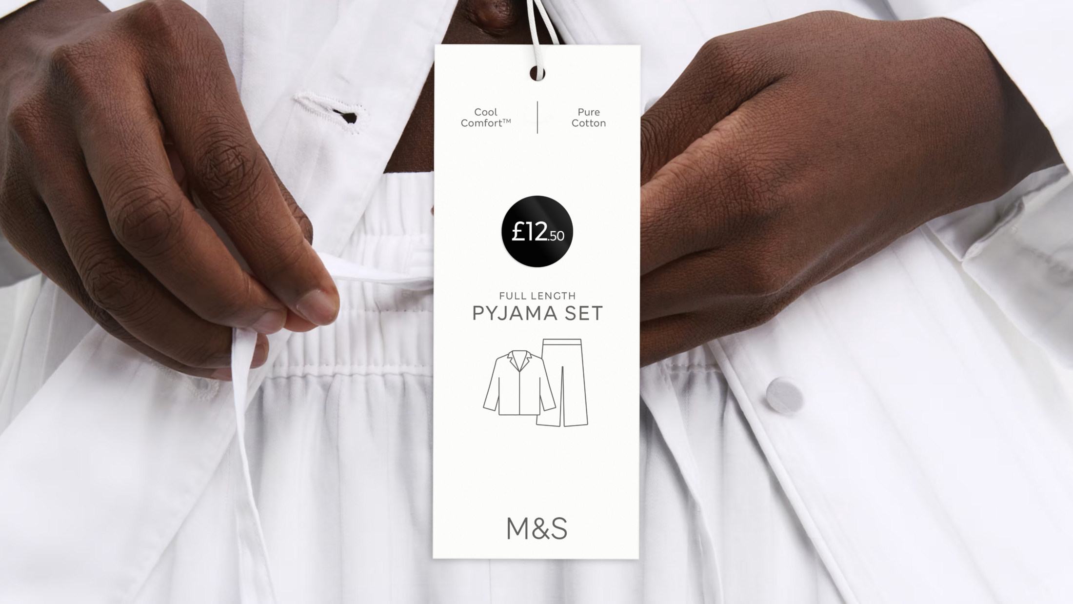
In Home, a disciplined hierarchy separates front and back-of-pack information, while a consistent benefits grid and MS London Geo numerals help shoppers identify key product features, pack contents and sizing at a glance.
A monochrome palette built around M&S black and white creates a sharper presence on shelf, supported by colour-coded bedding size stickers to aid navigation.
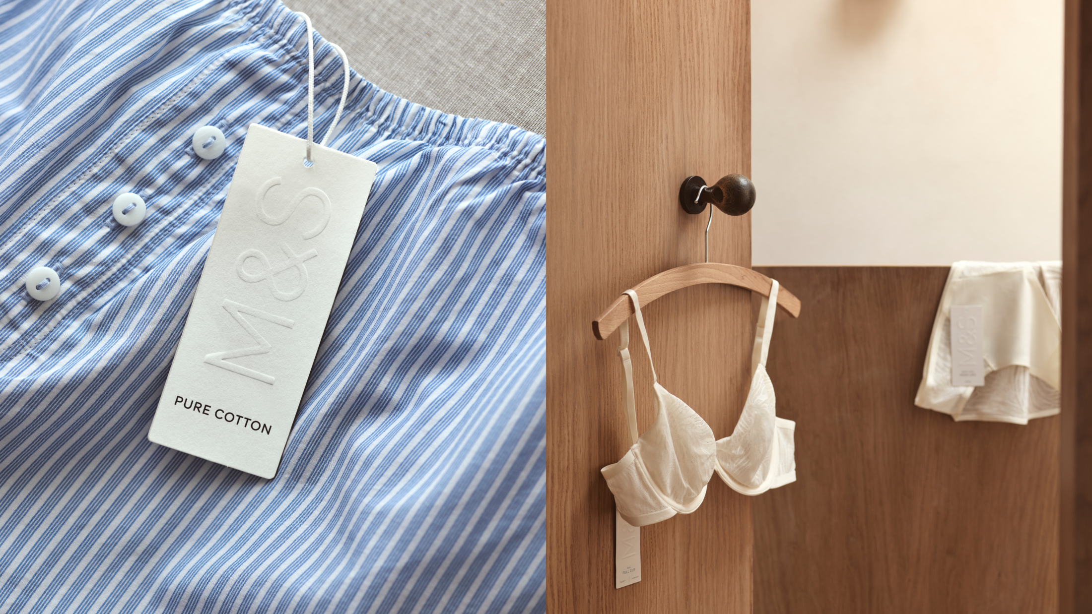
In Lingerie, warm whites and charcoal tones are complemented by the colour-coded sizing system. Across both categories, the MS London typeface creates a consistent hierarchy that supports navigation without cluttering the pack.
The colour-coded navigation system brings all sizes into the same range, rather than separating larger cup sizes into a standalone branded range. Colour replaces descriptive language as the organising principle, making the range easier to shop while creating a more inclusive customer experience.
Photography, language and material choices extend the same thinking across the packaging system. Tightly cropped Home imagery highlights craftsmanship, material quality and detail, while the core Lingerie collection uses natural light and relaxed styling to balance authenticity and sophistication.
Tone of voice brings the wider M&S personality into the pack, with tongue-in-cheek levity in Home and relaxed, guiding confidence in Lingerie.
Products have moved from plastic bags into premium box formats where appropriate, while duvet packaging has shifted to reusable natural cotton bags. Blind embossing, spot varnishes and higher-quality paper stocks add tactility, while bespoke Lingerie structural formats were developed with M&S production teams to align with the retailer’s Plan A commitments.
Seen together on shelf, the new packaging has been deliberately pared back to let the products take centre stage, creating a calmer, more consistent retail environment where quality and craftsmanship become the focus and clear hierarchy makes products easier to find and compare.
The new system is designed to work as hard commercially as it does creatively: stylish enough to reflect the M&S brand at its best, clear enough to help customers buy with confidence and consistent enough to ensure M&S itself – rather than the sub-brand or range – remains at the centre of the customer experience.
This professional campaign titled 'New packaging system' was published in United Kingdom in October, 2026. It was created for the brand: M&S, by ad agency: Mother Design. This Design medium campaign is related to the Fashion, Household Products, and Retail Services industries and contains 6 media assets. It was submitted about 1 hour ago by Owner: Julia Conroy of Julia Conroy Limited.
Credits
Agency: Mother Design