Fun Filled Food Logo
Agency: Sting Communications
Fun Filled Food Logo
Description
Eatables Food Court is a vibrant multi-cuisine dining destination designed around the joy of food, fun, and togetherness.
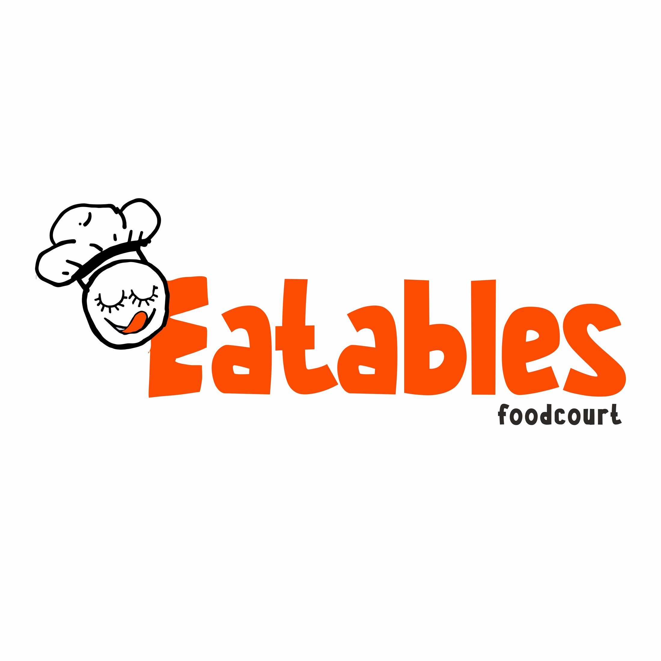
The brand identity reflects its lively personality through a playful logo featuring a cheerful face integrated into the letter “E”, topped with a chef’s hat to symbolize culinary expertise and hospitality. The remaining letters are crafted to convey energy, excitement, and the diversity of experiences that await guests.
Serving a wide range of cuisines under one roof, Eatables brings together flavors from around the world in a welcoming, family-friendly environment. The visual language celebrates variety, discovery, and shared moments, positioning the food court as more than just a place to eat—it’s a destination for memorable experiences.
The logo captures the essence of the brand: approachable, fun-loving, inclusive, and deliciously diverse.
This professional campaign titled 'Fun Filled Food Logo' was published in India in June, 2026. It was created by ad agency: Sting Communications. This Design medium campaign is related to the Food industry and contains 1 media asset. It was submitted 1 day ago by Sting Communications of Advertising Agency.
Credits
Advertising Agency: Sting Communications, Kolkata, India
Creative Director: Mr. Somnath Banerjee
Art Director: Mr. Manas Das
Art Director: Mr. Jayanta Chakraborty
Company Director: Mr. Somnath Banerjee