Description
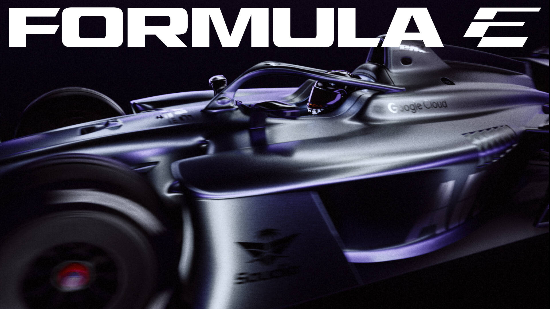
Formula E has unveiled a dynamic new brand identity, signalling a decisive evolution as the ABB FIA Formula E World Championship enters its next era.
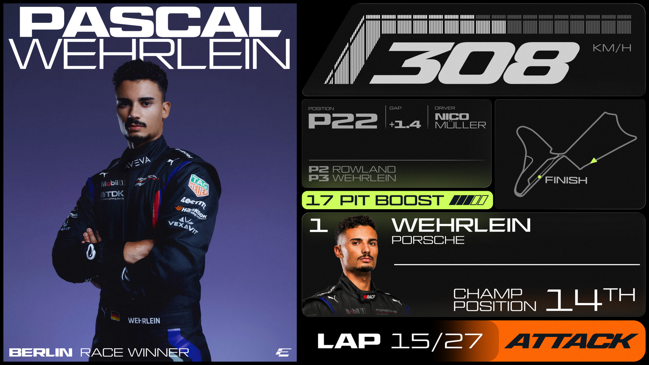
Designed by global creative practice MOX, the new brand was inspired by the way Formula E manages energy. The new identity is able to shift and change in-line with the velocity of the race.
The updated look reflects a Championship that is faster, more ambitious, and more culturally relevant, moving forward with confidence and bringing its core DNA to life around a central platform: making progress thrilling.
The decision to rebrand and step into the world with a new look comes at a natural inflection point and transformative moment for the championship. Headlined by the arrival of the first-of-its-kind GEN4 race car, its biggest global race calendar yet, an exciting new streaming partnership with Disney+, and an all-new sporting product in the form of E-PrixUnleashed.
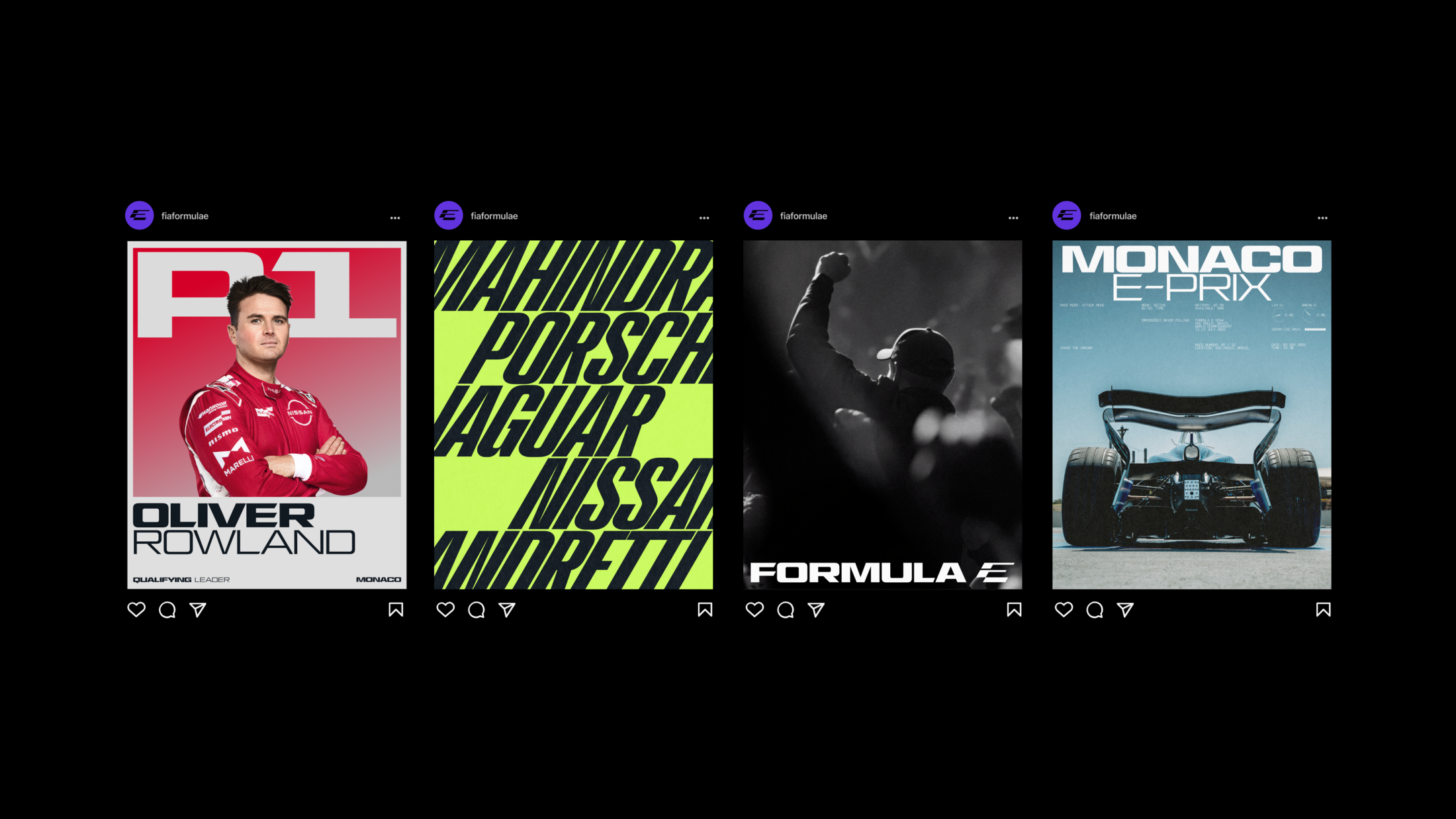
MOX worked across every disciple of design to produce the brand identity that includes a modernised logo, wordmark, icon, typography, colour systems, intuitive broadcast motion graphics and more, designed to enhance clarity for race viewers.
The new Formula E icon is built on a 30 degree angle, giving it the forward lean that runs through the wider system. The E lands first, the F appears inside it upon a second look.
A bespoke typeface family, was created in conjunction with All Purpose Studio, a London based type foundry. It has velocity settings, Turbo Mode is a condensed italic built for maximum speed. Micro Mono handles timestamps, reference codes and technical data. Inter carries longer copy.
Matt Bolton, Creative Director and Co-Founder, MOX said: "Formula E asked MOX to blow up the existing identity and start again. This was about creating something that could match the ambition, scale and energy of where the championship is heading.We didn’t want to make Formula E simply look more modern. We wanted to give it a visual language that feels alive. Visceral, unpredictable and built to move at the pace of the sport. The design system captures that tension between control and chaos, precision and instinct. It gives Formula E an identity that can shift, change pace and keep evolving as the championship does. The ambition was to create something that doesn’t just reflect where Formula E is today, but gives it the confidence and character to define where it goes next. It’s designed to cement Formula E as the next generation of motorsport.”
The identity will roll out fully across all Championship touchpoints ahead of the 2026/27 season.
This professional campaign titled 'Brand Identity' was published on September 25, 2026. It was created for the brand: Formula E, by ad agency: MOX. This Design medium campaign is related to the Sports industry and contains 4 media assets. It was submitted about 2 hours ago.
Credits
Agency: MOX
Graphic Design: All Purpose Studio