
Description
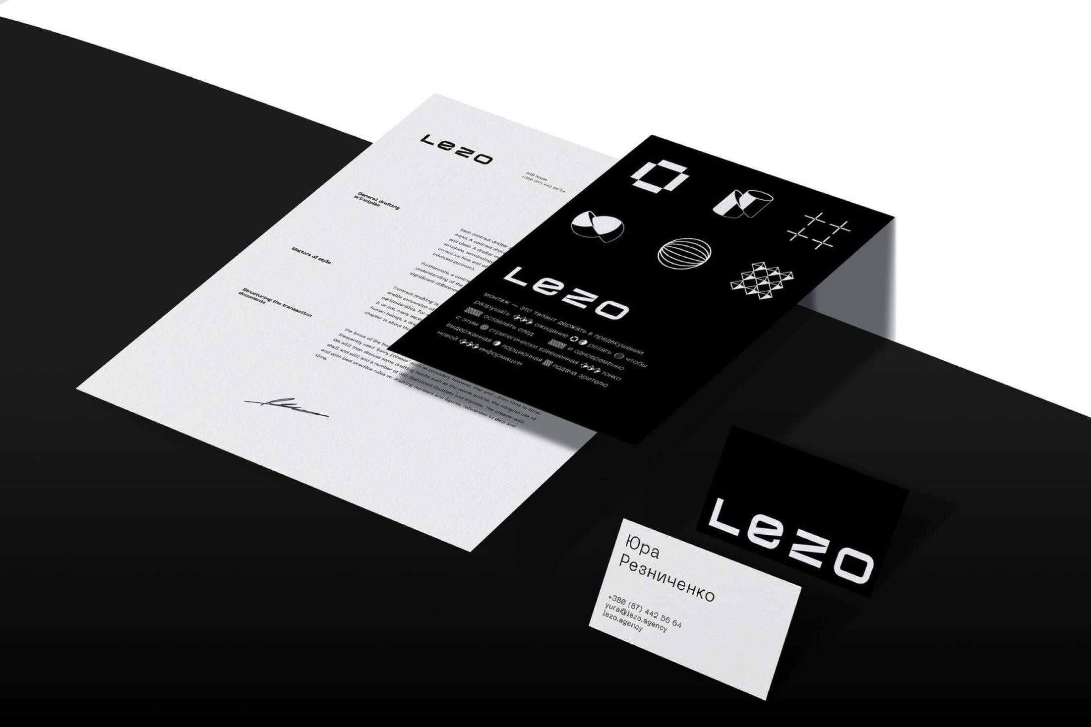
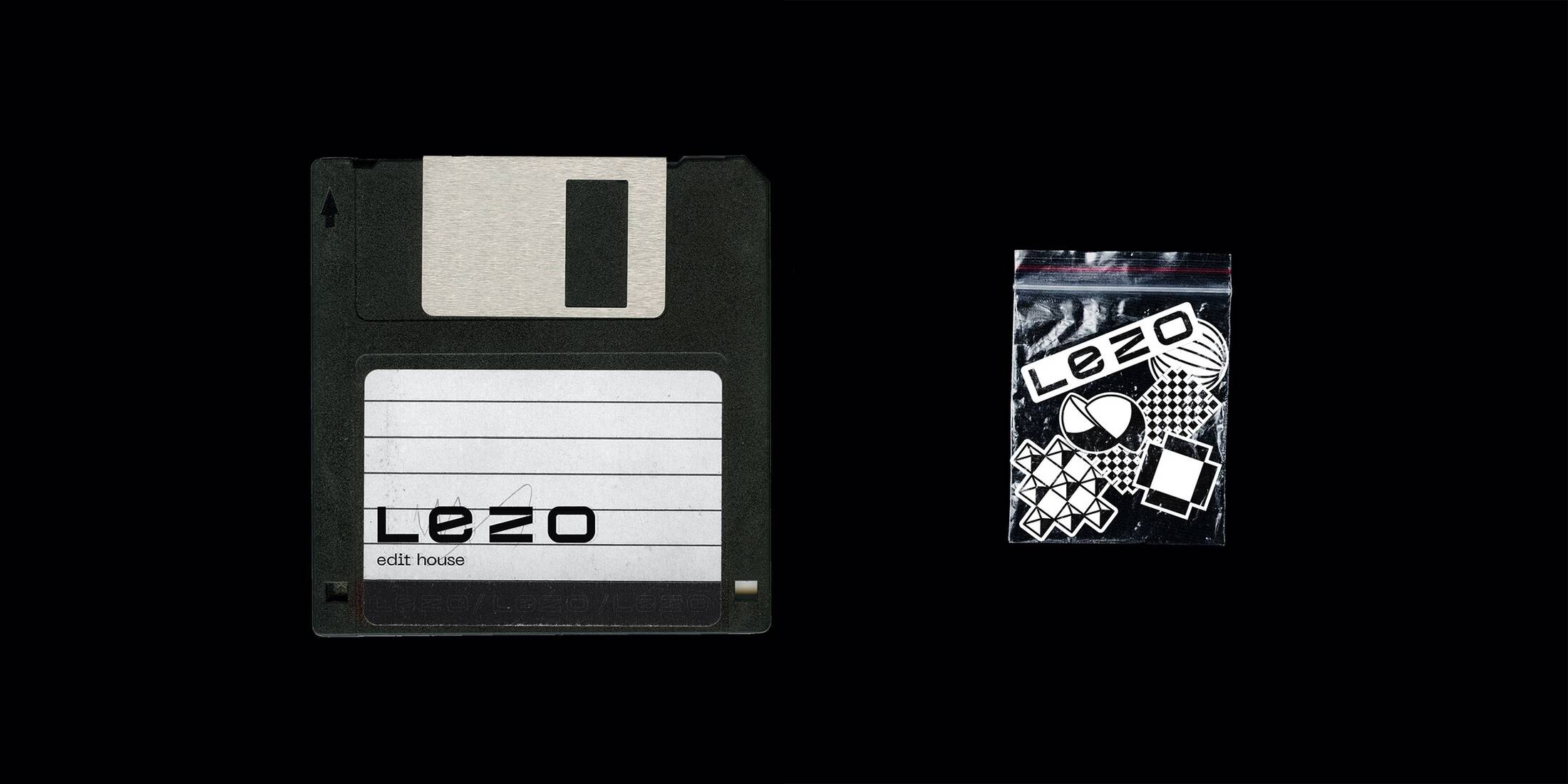
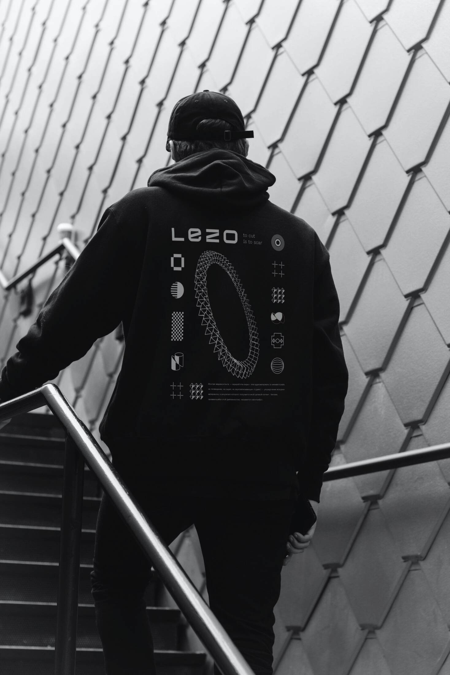
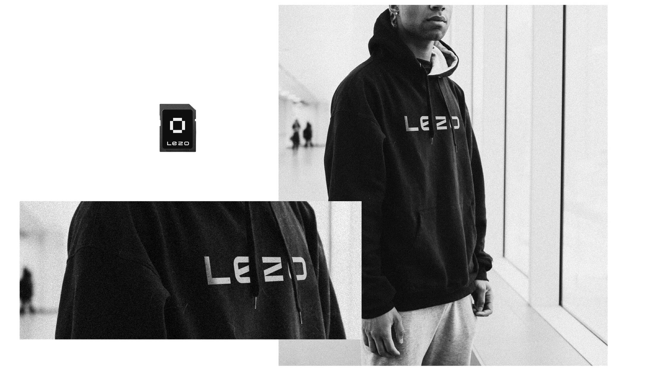
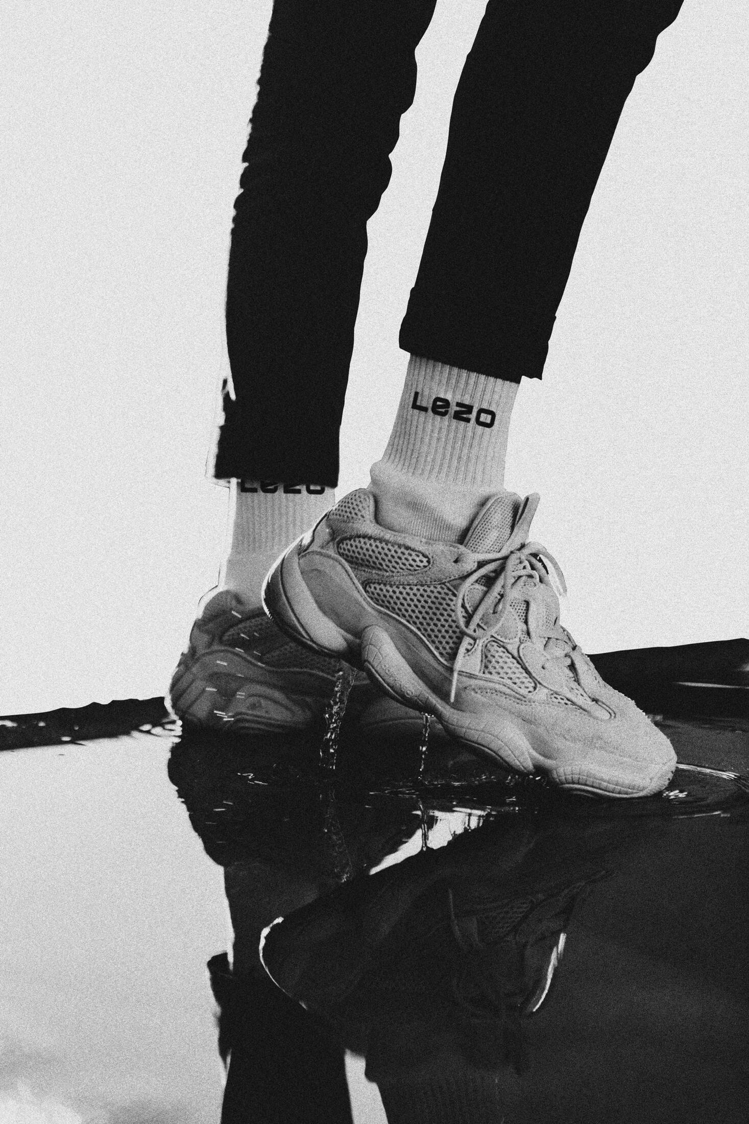
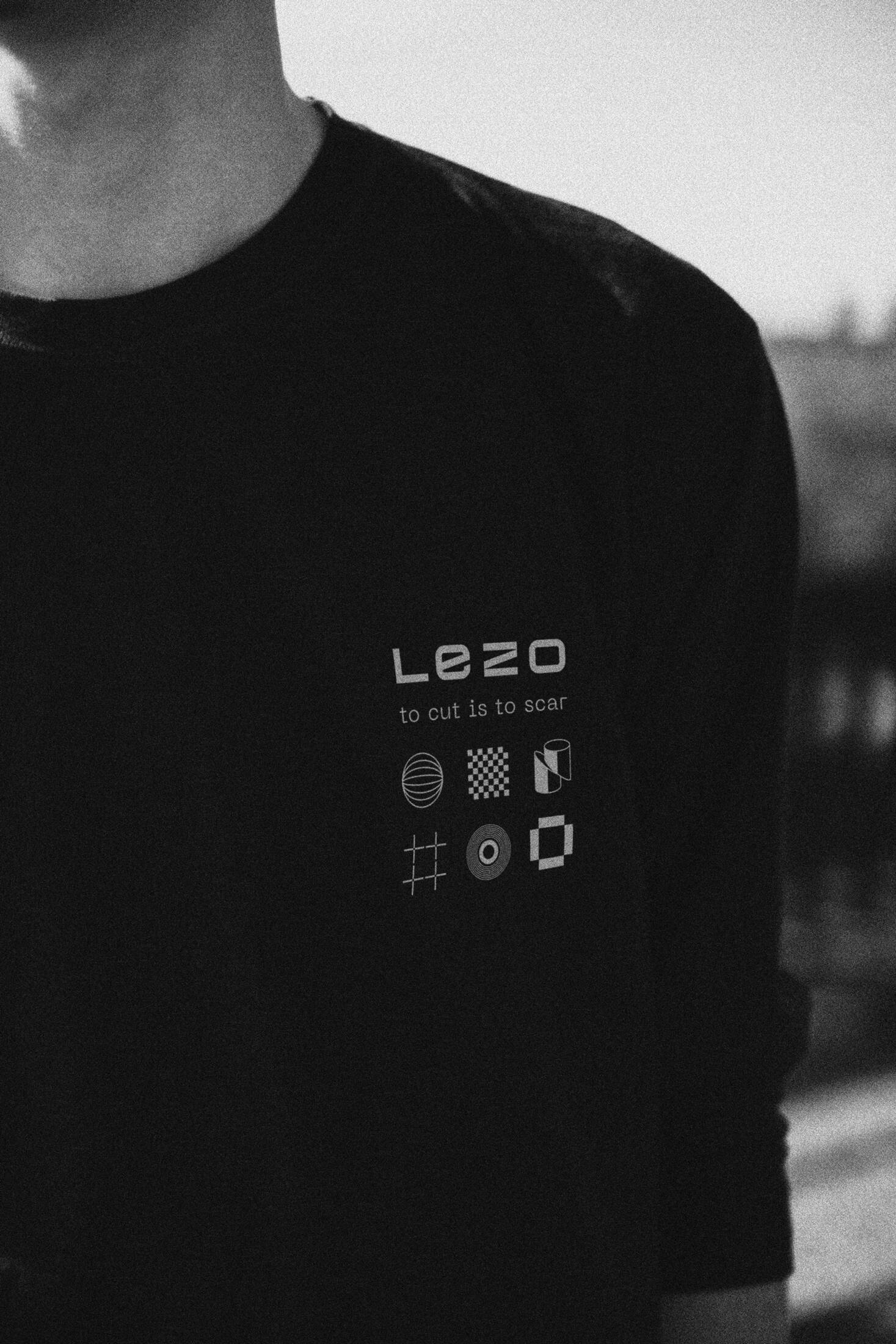
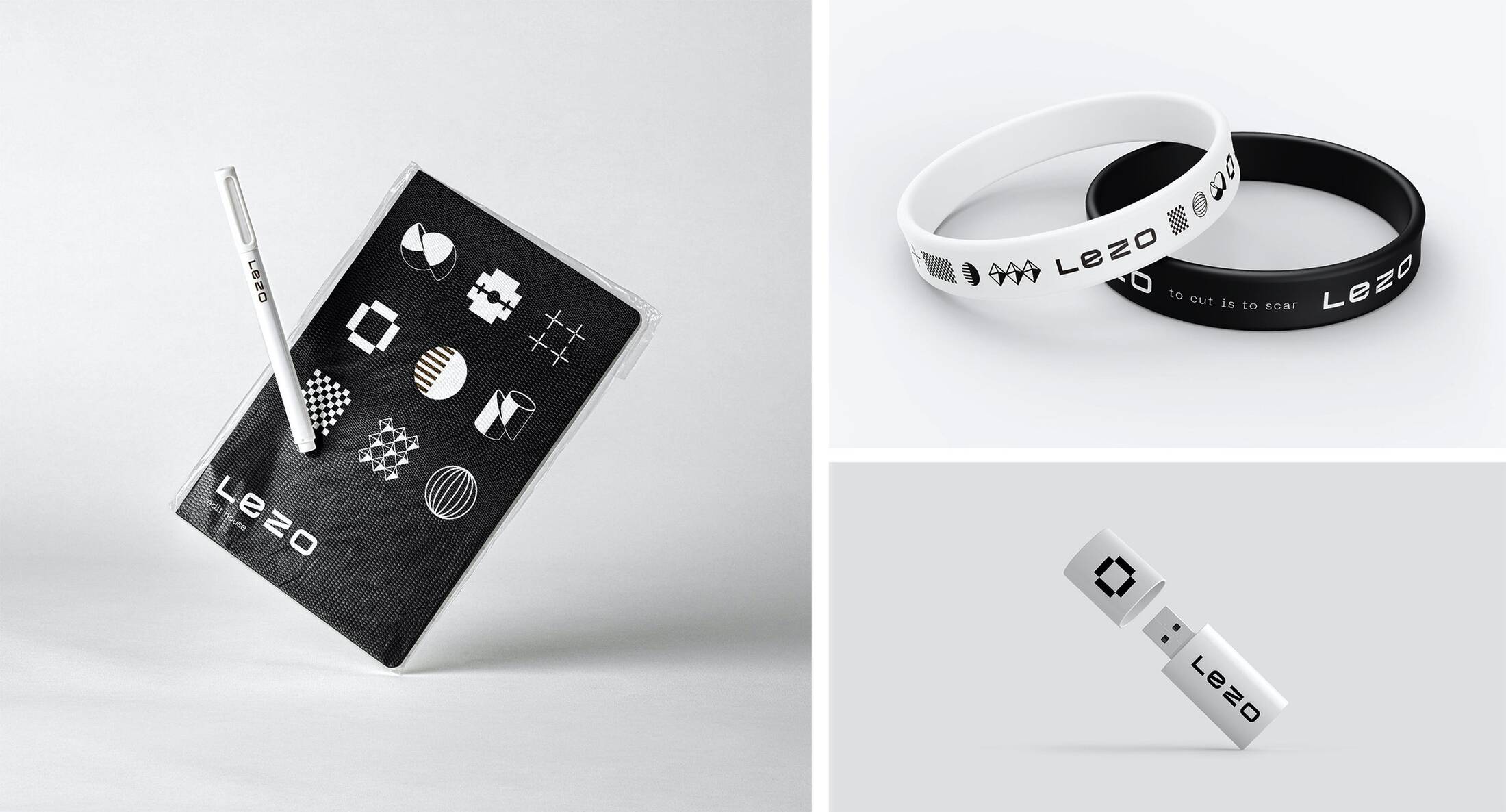
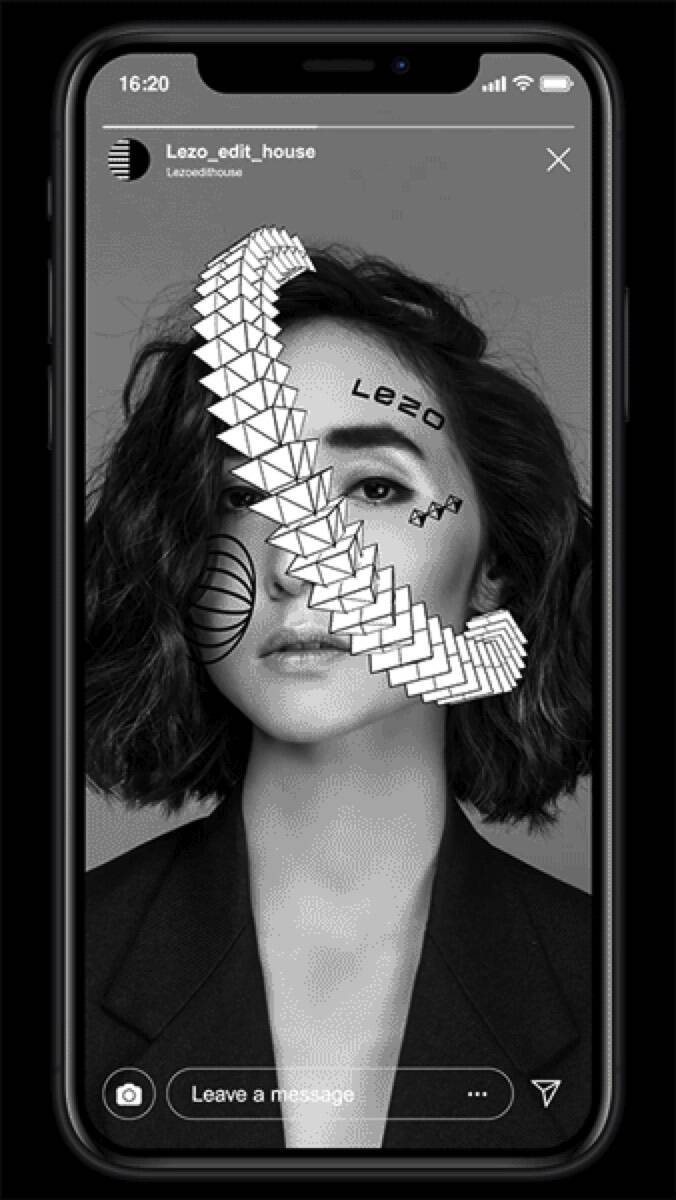
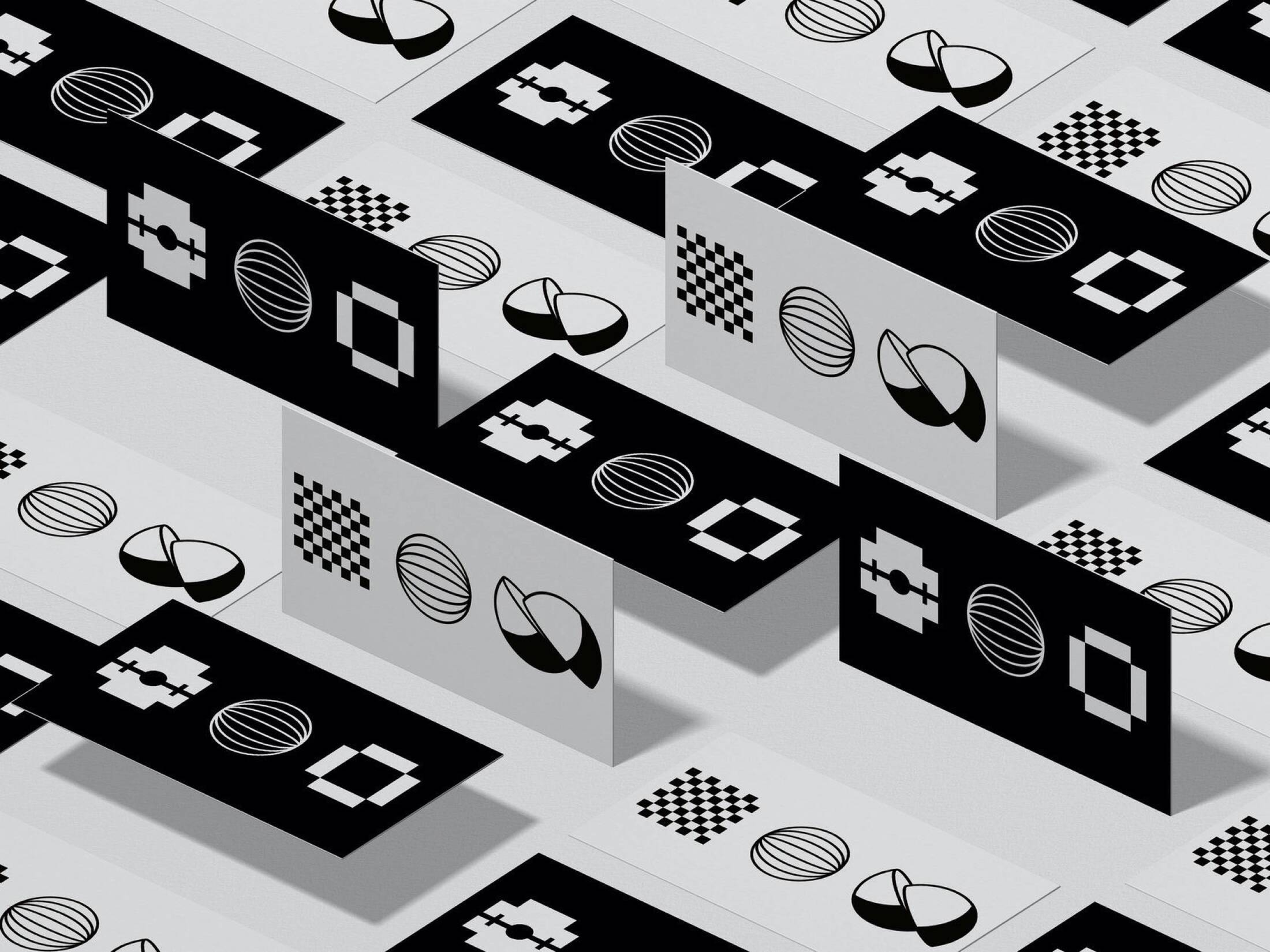
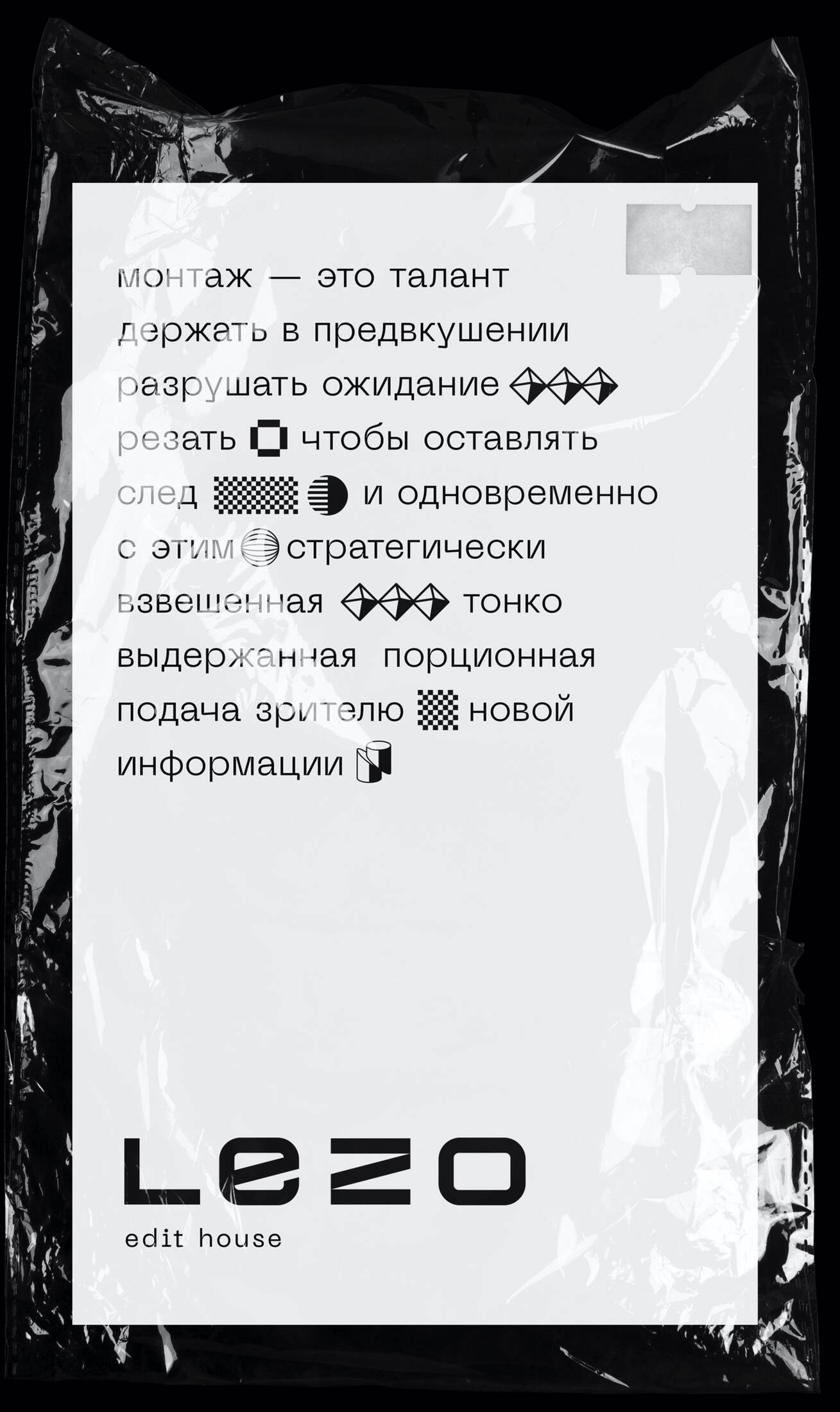
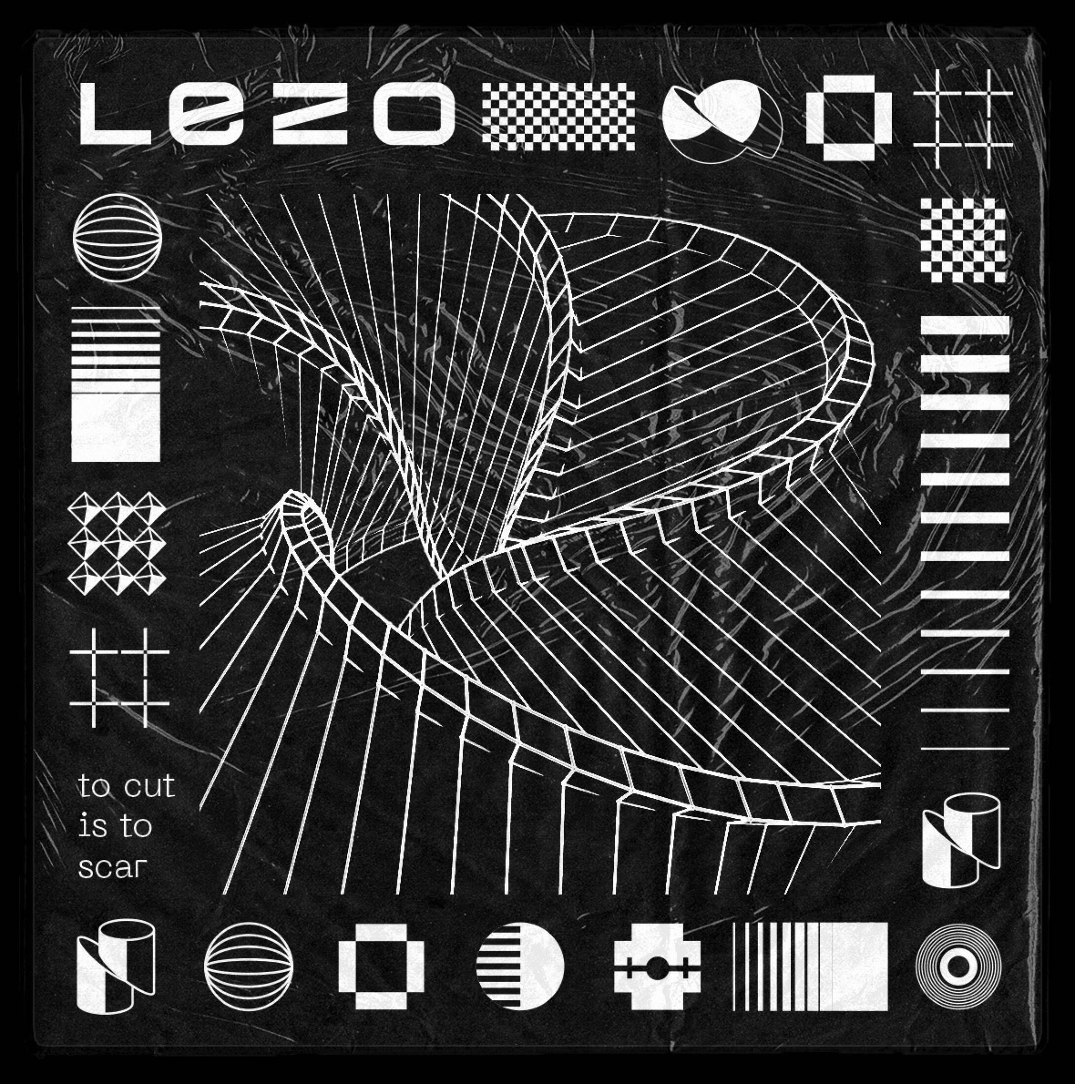
LEZO – the first Edit House in Ukraine. This is where professionals edit videos, and do it great because this is the only thing they do. Edit House found a perfect place in the market by gathering several professional editors. Editing is a whole philosophy for LEZO. It combines features of art, sculpture, dance and surgery. They say here: to cut is to scar. Editing is the art of leaving the scar on viewer`s heart. The name LEZO ( word “blade” in English) reflects this philosophy. Topographic logo depicts the blade. It looks like a precision instrument, its’ sharp edges overlap with each other, and Z reminds of a guillotine. Editing is not only about art, it is a complicated technical proses. This is the style foundation for basic elements that build together a combination of a line, a blur and volume. LEZO`s identity, just like firm editing, consists of different things created one after one with a help of a cut. The cutting lines are noticeable in each and every piece: some of them we see on the surface, the others are piercing the volume. LEZO is also active in education. They run workshops and masterclasses. This is why you can find their identity in posters, merchandize and other stuff. The elements of LEZO`s identity not just match, they fit into a text, turning its` typography into some kind of editing.
This professional campaign titled 'Brand Identity' was published in Ukraine in April, 2020. It was created for the brand: Lezo, by ad agency: Shots. This Design medium campaign is related to the Professional Services industry and contains 13 media assets. It was submitted almost 6 years ago by Alina Taratun of shots/creative.
Credits
Advertising Agency: shots/creative, Kyiv, Ukraine
Head Of Art: Peter Storozhenko
Senior Designer: Mihaylo Polivanov
Designer: Tatiana Prisyagnyuk


