Balance Cheese Wedges: Holistic Packaging Identity by Innovāt
Agencies: Innovāt • Habeshian Graphics
Description
CLIENT
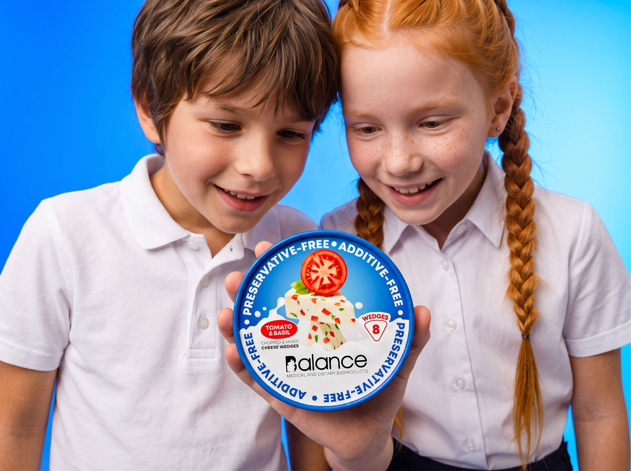
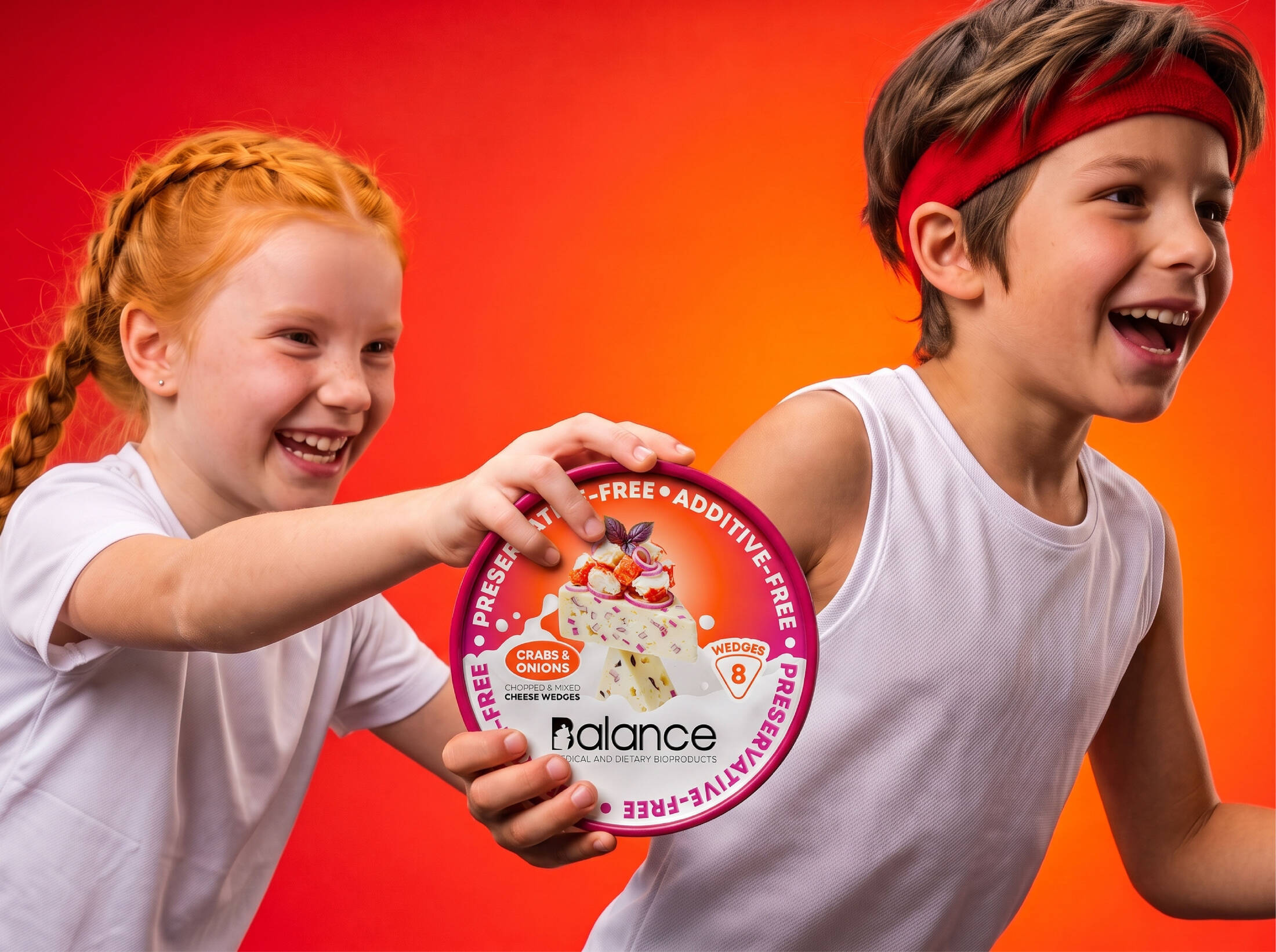
Balance is a brand of medical and dietary bioproducts, created by Innovāt® from its name and logo to its illustration language and packaging architecture. Its founding principle is that nothing in the product should need an excuse: no preservatives, no additives, only ingredients that do their job. That makes Balance a dairy brand for every table in the family, from the first foods of a child to the careful diets of older adults.
ASSIGNMENT
After the first Balance products, the brief was a line of spreadable cheese wedges in eleven flavors. The packaging had to carry the brand's core idea into a new category, speak with one voice across every flavor, and stand out among round cheese boxes that mostly look the same. The box itself is a classic round form, a base and a lid. All the communication therefore had to live on the lid, the only surface the shopper sees on the shelf.
SOLUTION & PROCESS
Every Balance product is built on one idea: balance you can see. We started by asking how a product could prove it is balanced without saying so. Our answer came from nature. Think of stones stacked on a beach, each one resting on the next at its single point of equilibrium. They look impossible, and they hold. Balanced things feel calm and trustworthy, and that is the feeling we wanted people to have about this food.
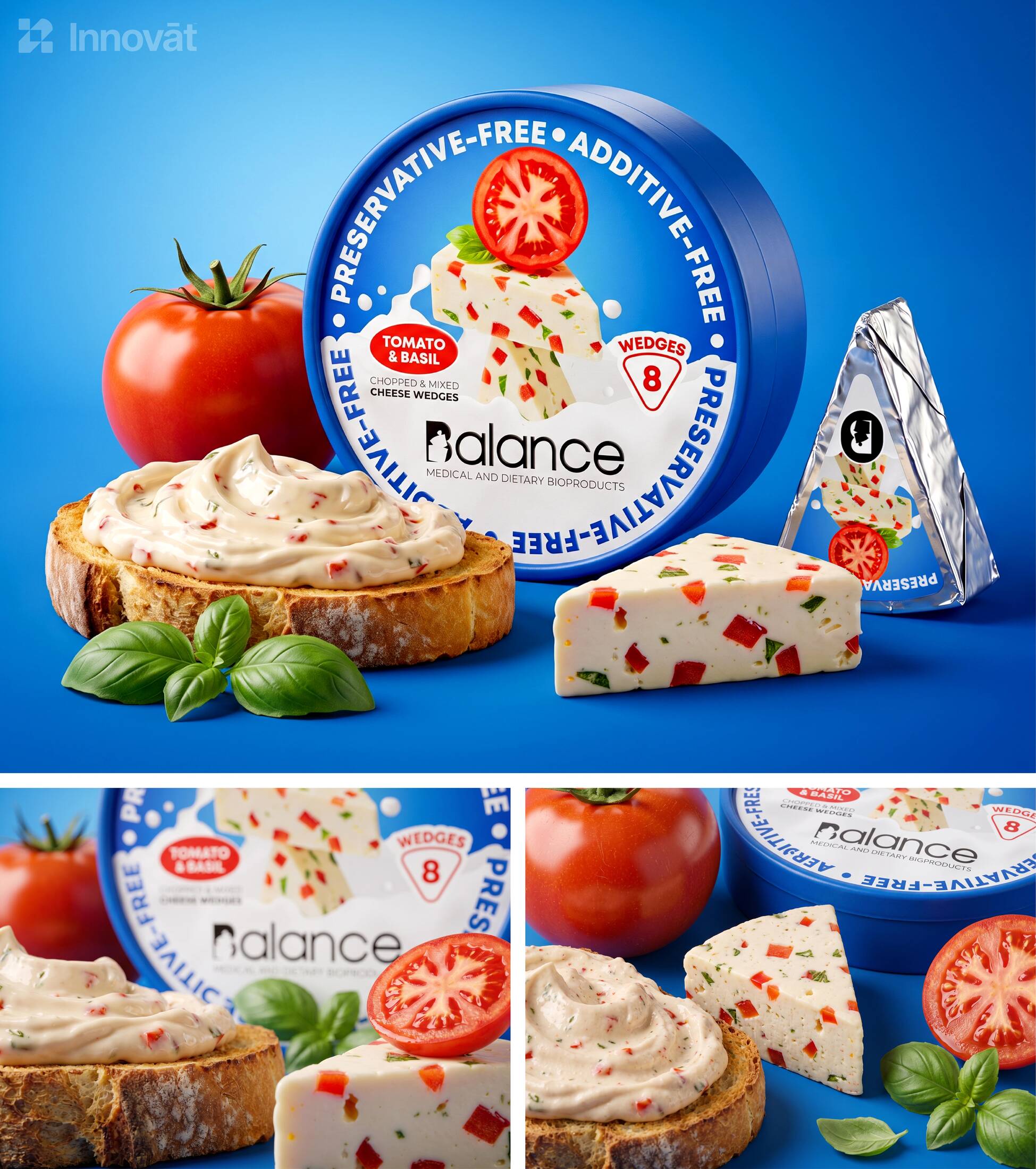
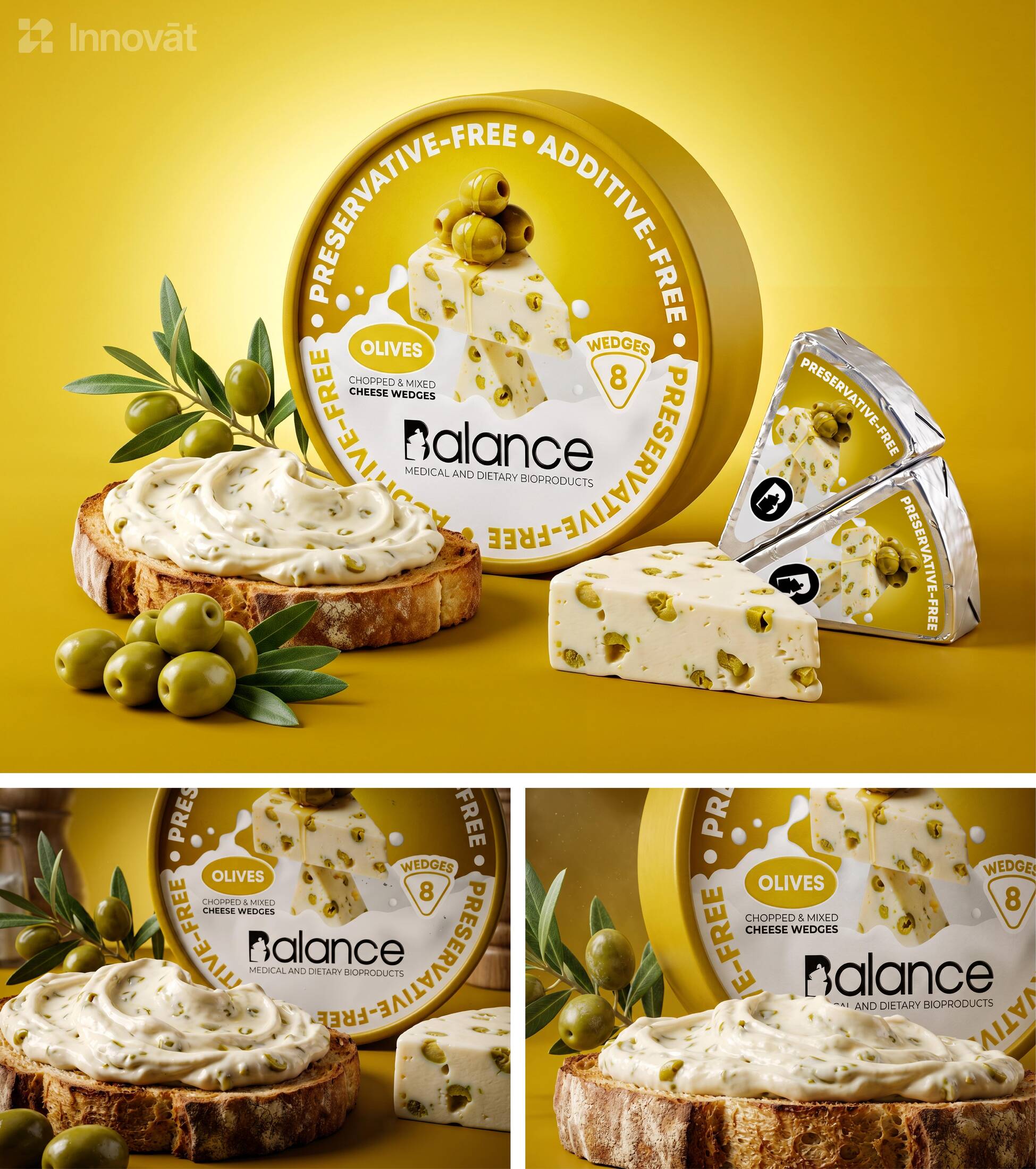
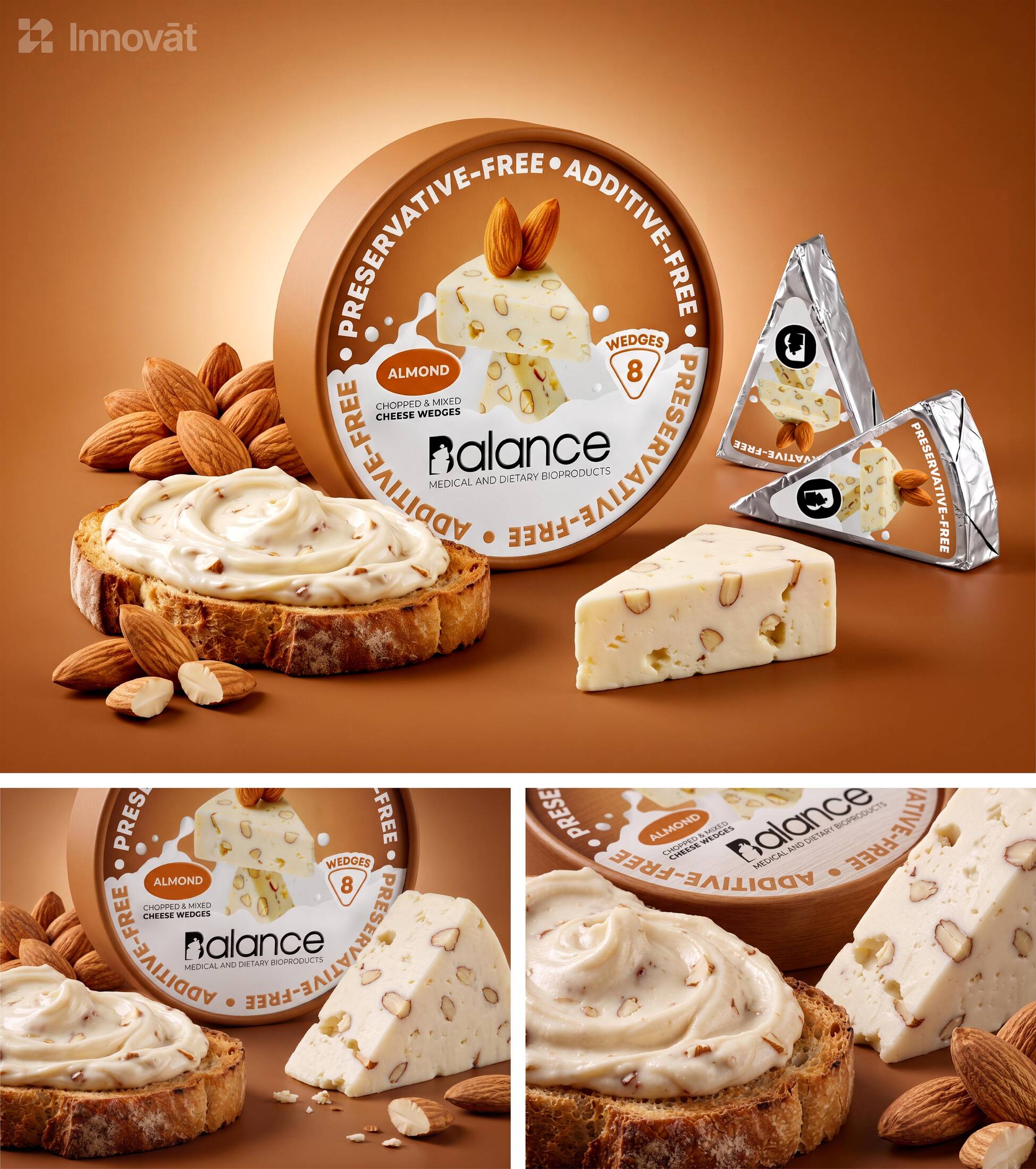
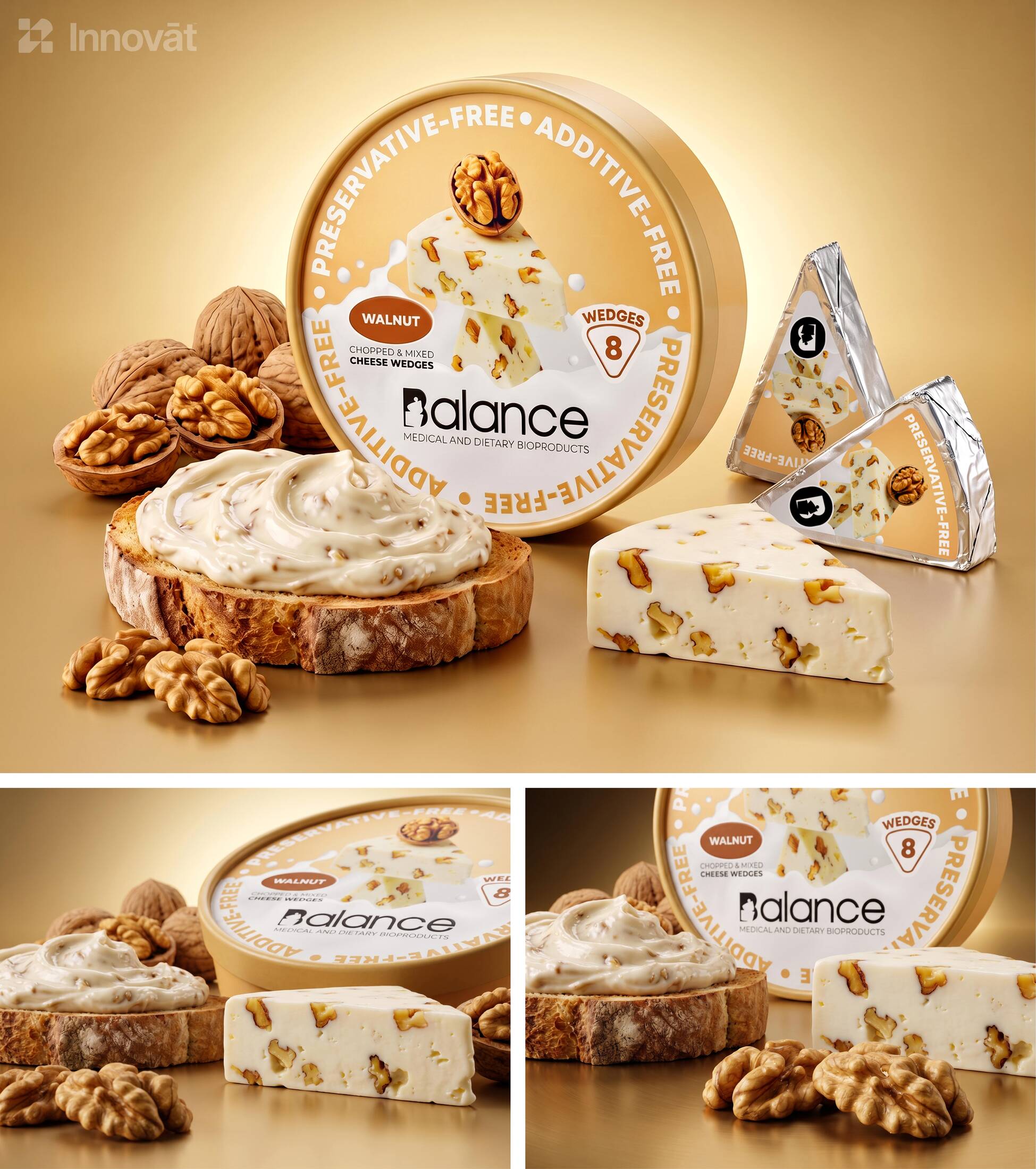
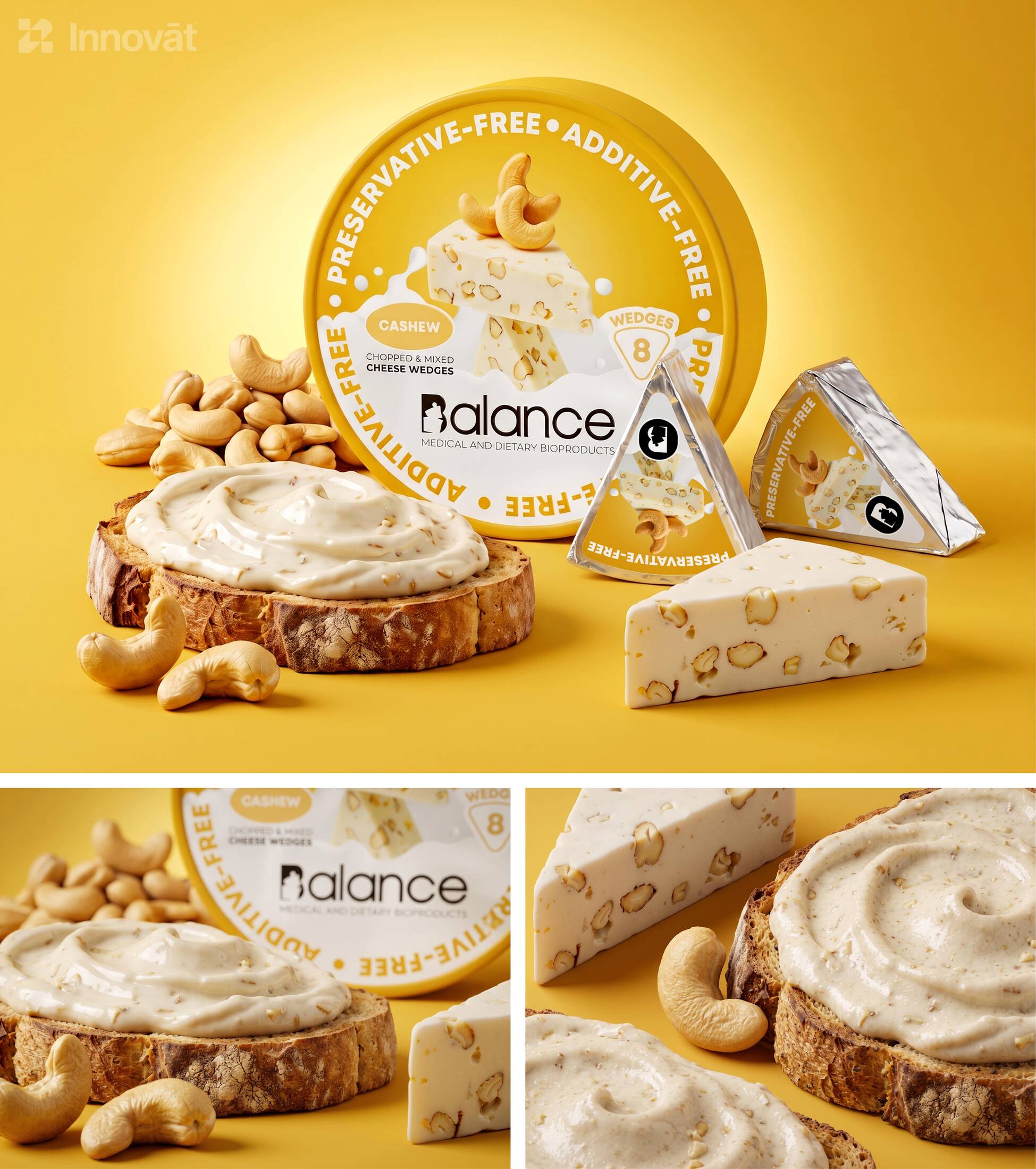
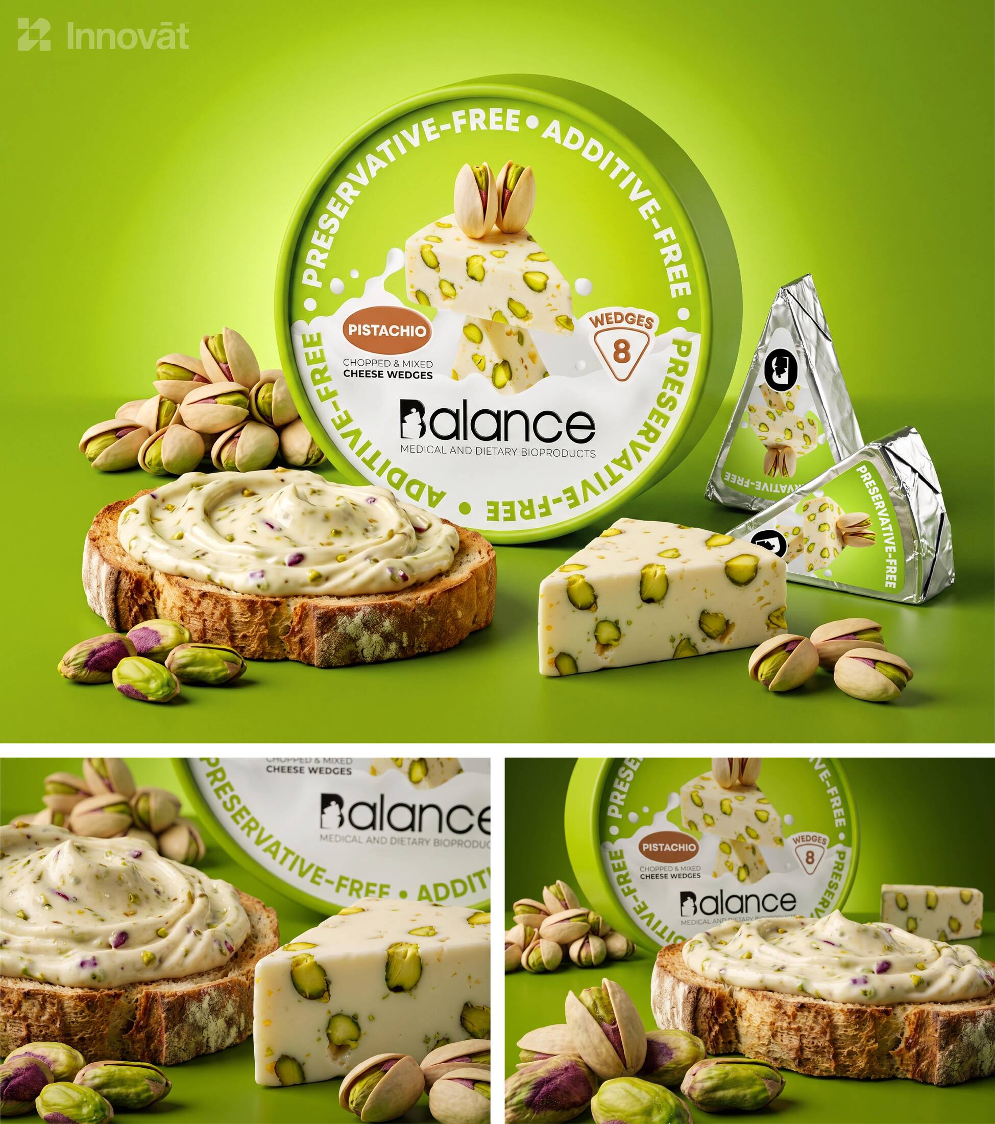
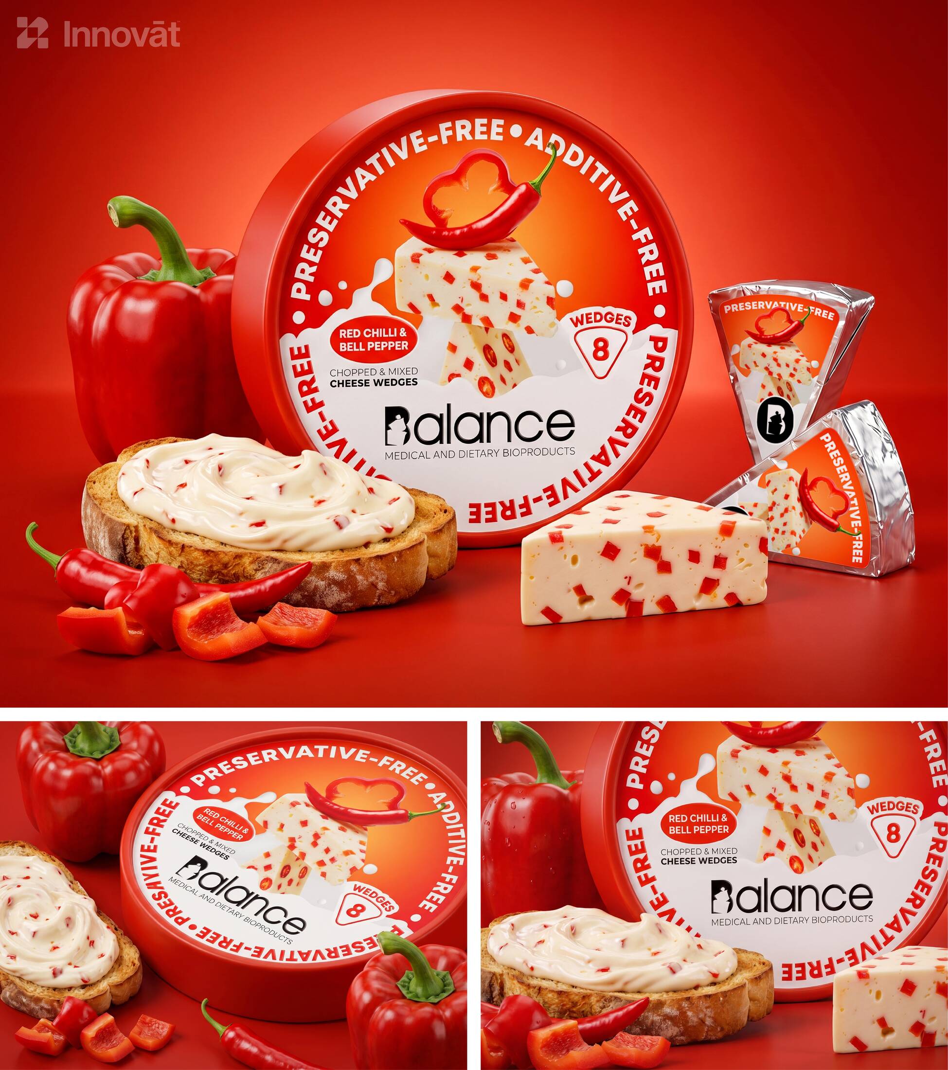
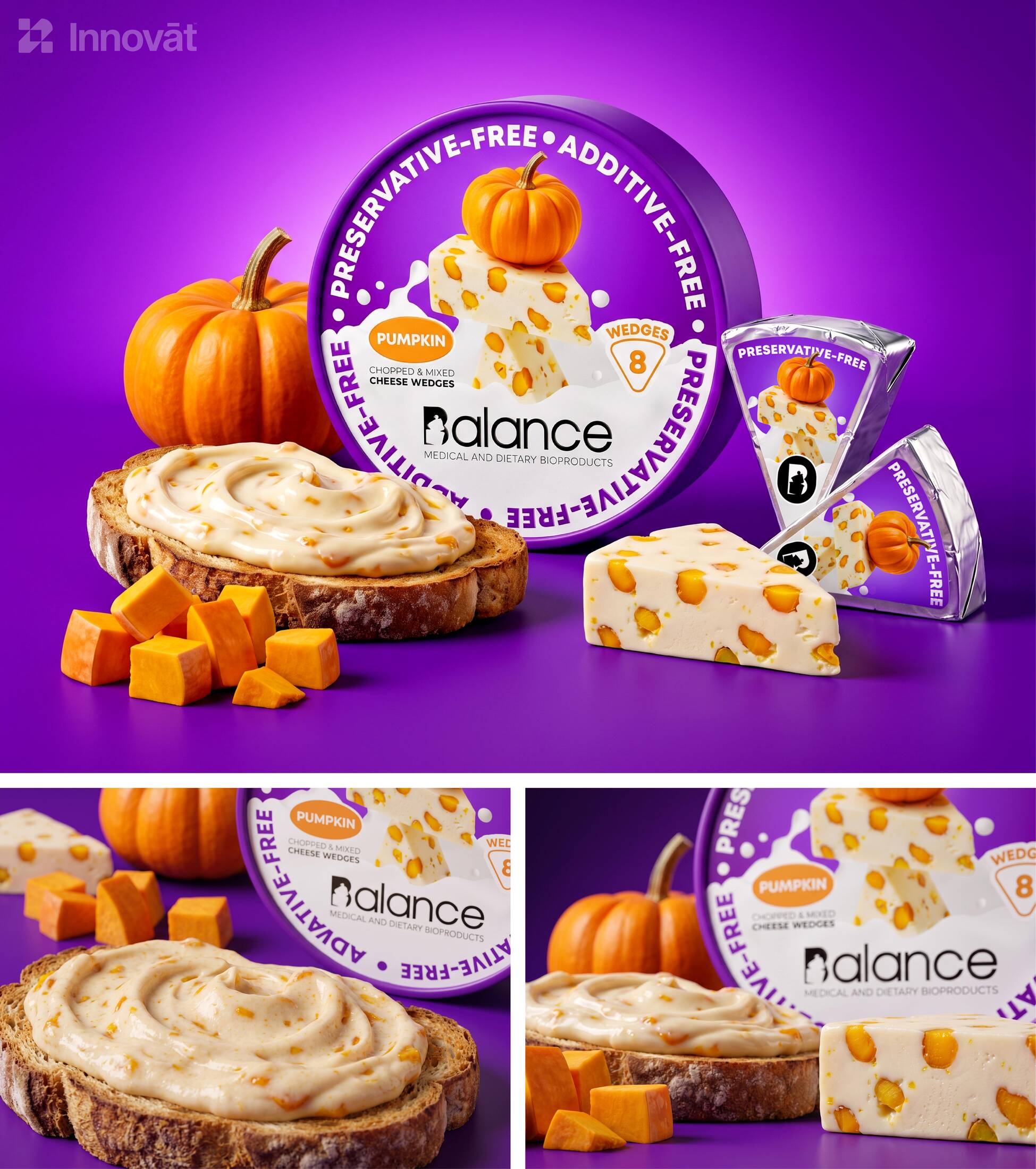
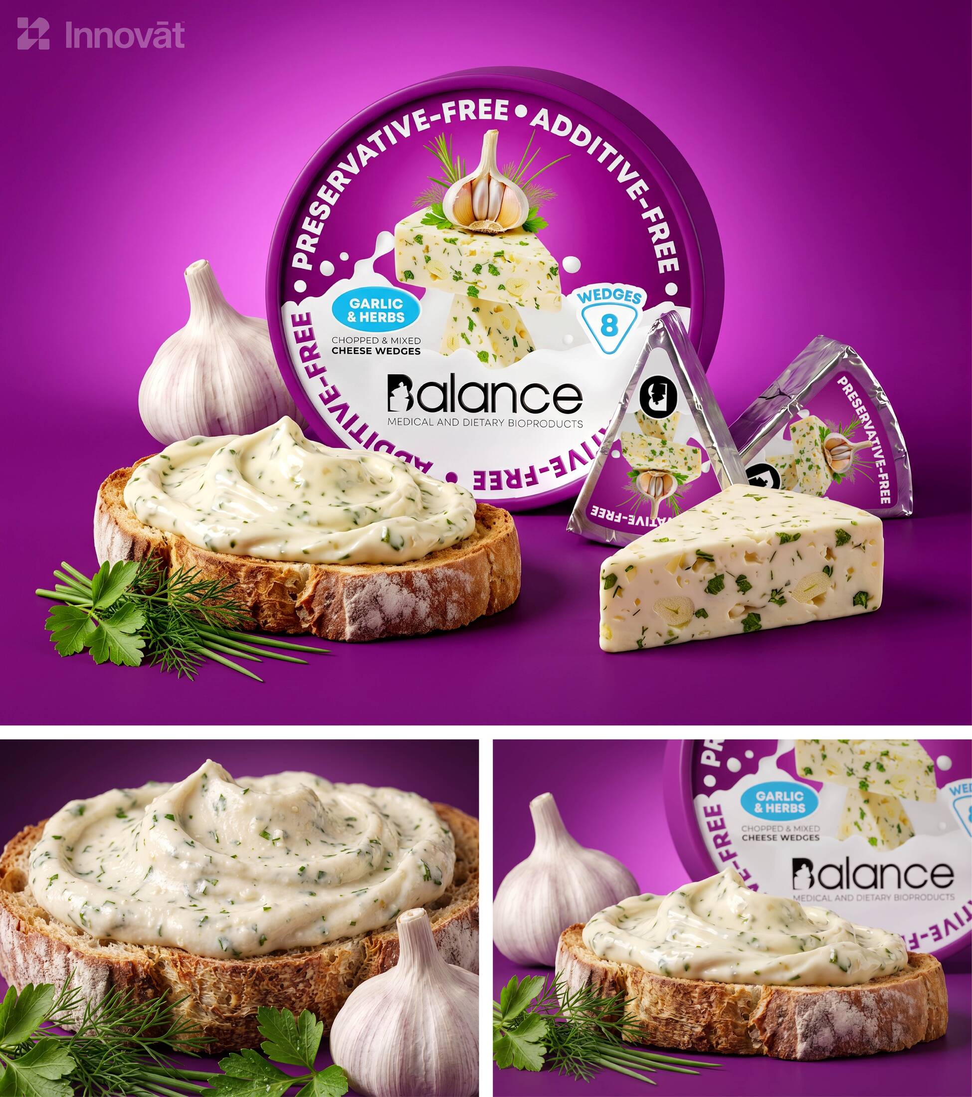
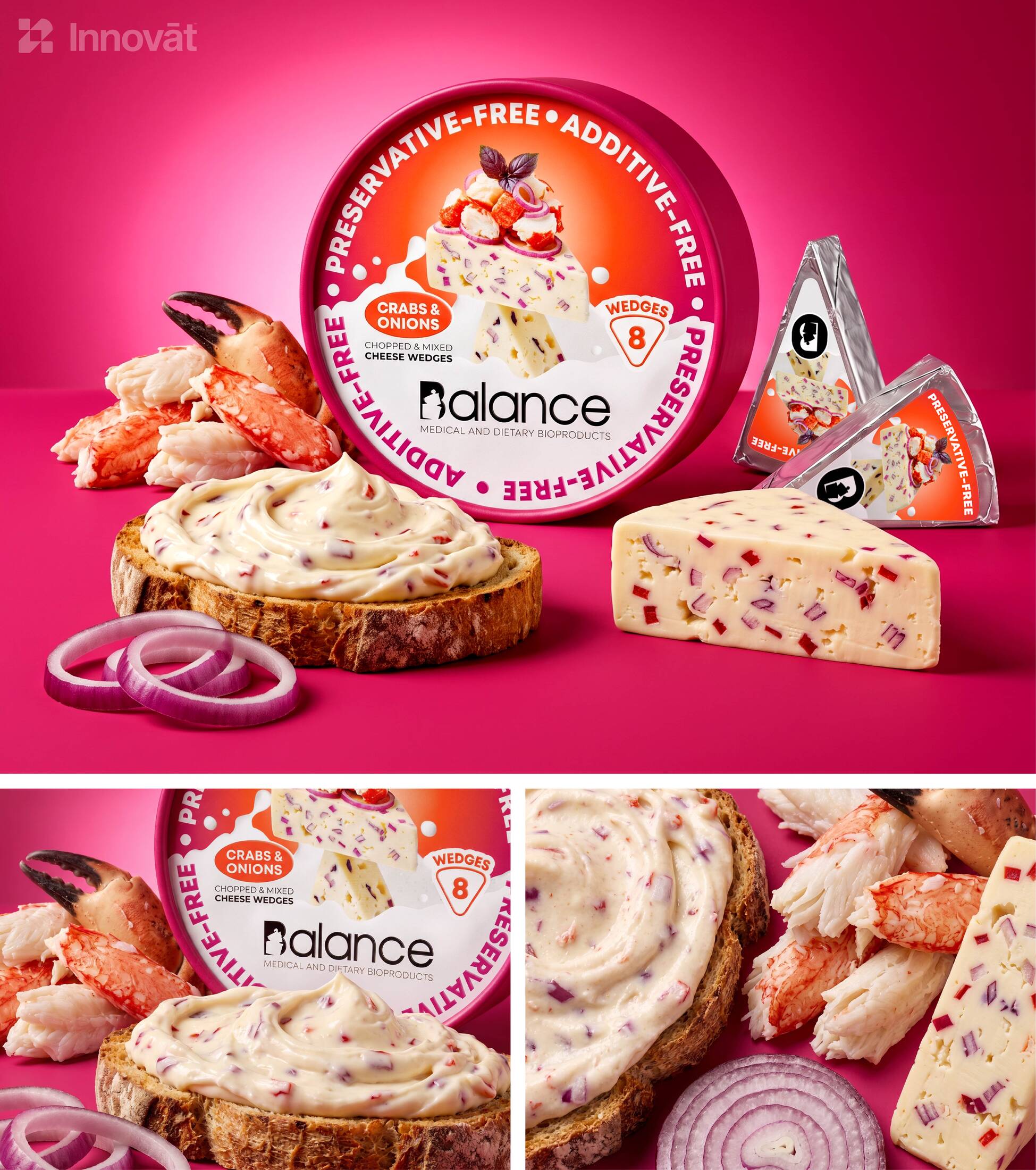
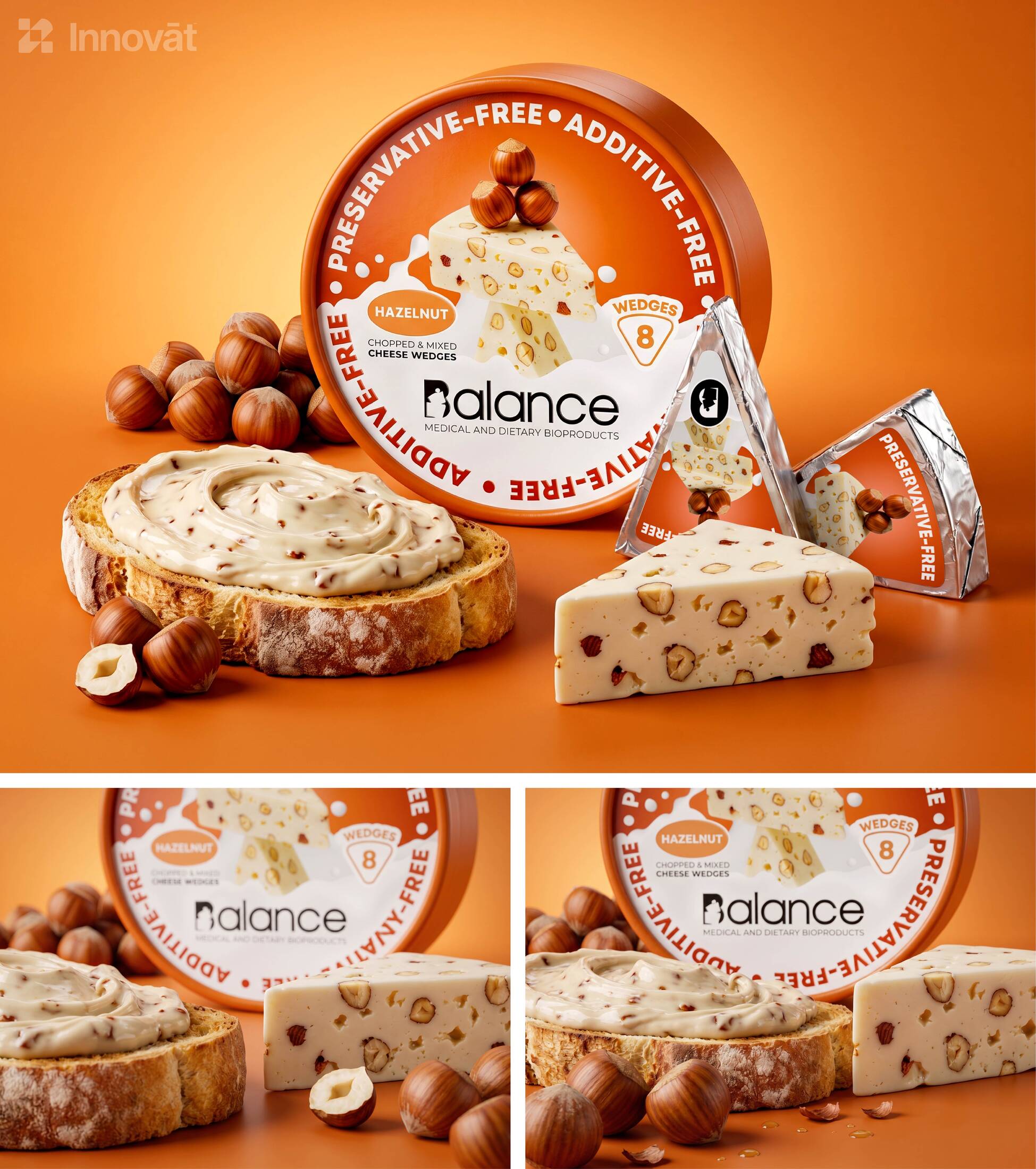
We translated it literally. On each lid, the raw ingredient sits on top of the cheese wedge made from it, and that wedge rests on another. Ingredient, flavor and finished product are stacked in a quiet moment just before they fall. The work was in the details: finding the angle where the stack looks daring but sure, choosing the exact point where each wedge touches the next, and giving every flavor its own composition without breaking the rule. A milk wave rises beneath the stack like the ground it stands on, and the Balance logo sits on it.
The lid is the only designed surface. We left the sides of the box clean and minimal on purpose, so the lid speaks alone and nothing competes with it. It became a small still life, close to a sculpture, which says what the product is made of and how it is made without a paragraph of copy. Balance in flavor, balance in nutrition, and balance in how the product treats the people who eat it all become one image.
COLOR & NAVIGATION
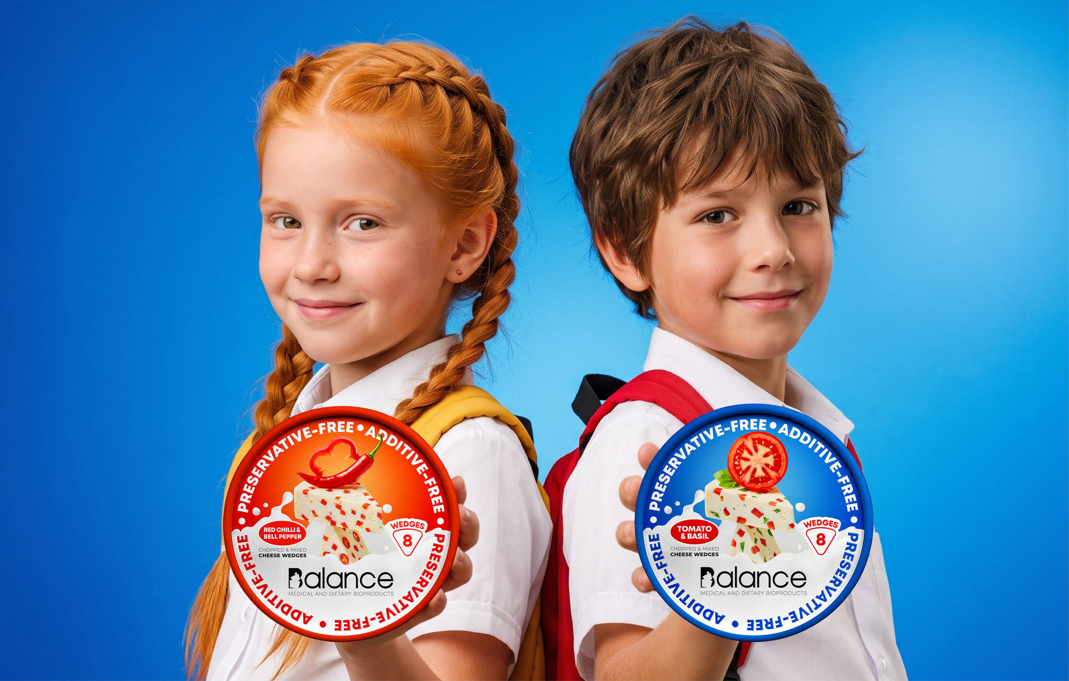
Each flavor takes its color directly from its hero ingredient, so the range is navigated by instinct rather than by reading. A contrasting accent on the flavor badge and the wedge count adds energy and keeps every lid clearly its own. Side by side on the shelf, the lids form one bright, orderly family that is easy to scan and hard to pass by.
BRAND EXPERIENCE
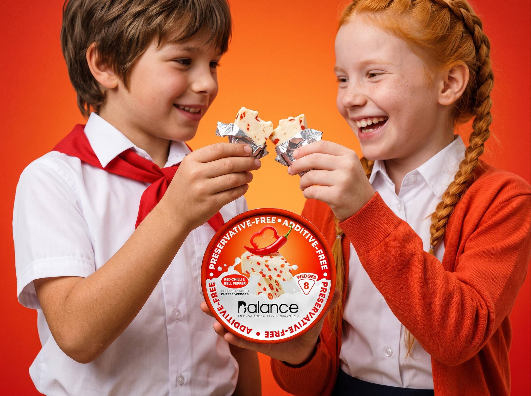
The idea continues inside the box. Each foil-wrapped wedge carries its own flavor-coded label and the Balance emblem, so the brand stays present when the lid is off and the cheese is on the table. Campaign imagery of creamy spreads on toasted bread and clean-cut wedges extends the same calm, natural language beyond the pack.
This professional campaign titled 'Balance Cheese Wedges: Holistic Packaging Identity by Innovāt' was published in Multinational Europe in October, 2026. It was created for the brand: Balance, by ad agencies: Habeshian Graphics and Innovāt. This Design medium campaign is related to the Food industry and contains 16 media assets. It was submitted about 1 hour ago by Creative Design Agency: Innovāt - Empowering Creative Innovation .
Credits
CEO & Founder - Art Director, Senior Designer: Sako Habeshian
Creative Design Agency: Innovāt® - Empowering Creative Innovation