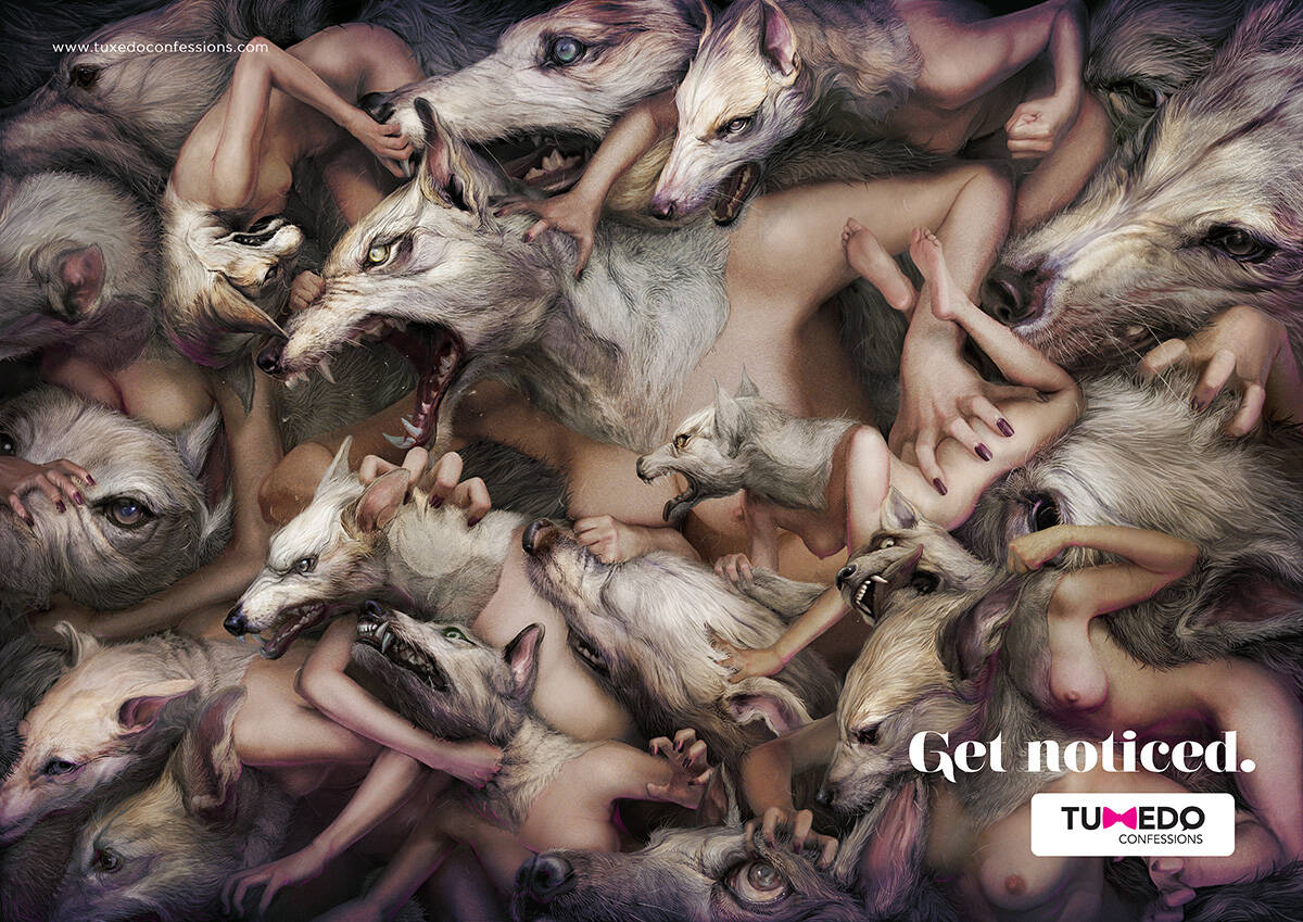
Get noticed
Description
Print advertisement created by Jandl, Slovakia for Tuxedo Confessions, within the category: Fashion.
Creative Director: Pavel Fuksa
Art Director: Alexis Blanco
Copywriter: Eugen Suman
ooowwwwwwWWWWWWWOOOOOOOOOOOOoooooooooo!
The Jobless Writer
Will Think for Salary
There is a cognitive dissonance between the ad & the products.
If anything, the woman who'll buy their clothes will get noticed only for her bad (very gentle word in this case) taste.
THERE'S NO HEAVIER BURDEN THAN A GREAT POTENTIAL
No illustrator credit. And it is all the ad has going for it, the illustration. Hmm. We know how these things usually play out here.
That's it.
Hi. The illustrator is Ryohei Hase. I don't know why he's not credited here, it was probably a repost from somewhere.
Oh, I see. Ignore the brand and just write to the headline.
The Jobless Writer
Will Think for Salary
Please, tell me why. I'm here to learn. :)
The Jobless Writer
Will Think for Salary
Me too.
Am assuming this was the artist (and if not him, then probably *inspired* by his work): http://ryohei-hase.deviantart.com/gallery/
Ryohei Hase is the artist. The artwork was commissioned for this project.
Illustration: 10/10
Typography: 5/10
Clarity of Message: 3/10
The ad needs to have something that says what 'Tuxedo Confessions' is. Otherwise, it'll leave you wondering, 'Are they a tuxedo company?'.
I do expect professional people to check themselves before the spew utterly vacant words to the web.
First check the brand, and stop wondering... here for your convenience: http://tuxedoconfessions.com/
Second: Please do explain the message.
THERE'S NO HEAVIER BURDEN THAN A GREAT POTENTIAL
In the case of this ad, the agency has assumed that everyone knows what the brand is. In reality few people do. If if the ad requires the reader to check the website to understand the message - it's a FAIL. Simple as that.
No pal, you failed to understand.
The ad is for the local, not the global community. The fact that Sir Ivan posted this ad for critique from the ad community - the burden is on you, to check before you comment.
THERE'S NO HEAVIER BURDEN THAN A GREAT POTENTIAL
LOL. The lady doth protest too much, methinks.
LOL. Hamlet, Act III, scene II. Not.
THERE'S NO HEAVIER BURDEN THAN A GREAT POTENTIAL
without knowing the intended audience (and i most certainly am not the intended audience) i can not speak to the ads effectiveness. i for one was only able to guess the message which was confirmed through all of these comments. BUT the real purpose of this ad is to generate interest in the company/product and if the ad intrigues enough to get you to their website, is it still not a success?
I asked myself the question: If I were to see this ad in a magazine (its intended venue), would I put the mag down, walk to my computer and look this company up? The answer was absolutely. But the dissonance began there.
The ad did not reflect the dreck taste of the clothing designer.
The real measure of an ad's success for this type of product where personal taste is paramount, is whether there will be a sale as a result of viewing it.
All the comments here are reflecting the egos of our profession - everyone here is simply analyzing the ad from their POV.
It has nothing to do with the consumer's reality.
This site and the professionals who comment here have my utmost respect. We should all keep in mind that we are performing post mortems.
THERE'S NO HEAVIER BURDEN THAN A GREAT POTENTIAL
Then I predict you're going to love my comment about the Ming Vase with an ATM intern-jimmied onto the side of it. :D
That's it.
the store showcases and sells more than one young designer. maybe you just saw one you didn't like. dig around, you might be surprised. if it got you moving from the magazine to the computer (hypothetically), the ad did its job.
Hum... the woman is a wolf for the woman ?
May be better for a SALES period...
Wow, where to start?
To Hadron's behest, here's the (brief) company brief:
Tuxedo Confessions is a Romanian women's online fashion concept store. Their brand is built upon Yves Saint Laurent's 1966 Le Smoking, a tuxedo for the androgynous woman. While their clothing isn't very androgynous, I believe their name "Tuxedo Confessions" could be synonymous with the tagline "Man or woman? Only your tuxedo will know."
Okay, with knowing the company background I can appreciate the pretty pink bow tie "x" in Tuxedo a little bit more.
"Get noticed"?! Seriously? I'll tell you what isn't getting noticed in this ad. The Copywriting. How about "It's a dog eat dog world" or "Stand out from the pack" or some sort of variation of both like "It's dog eat dog, stand out from the pack".
As for the art direction? A bunch of she-wolves? How about showing some sort of benefit from owning your product? Unless their isn't one.. in which case just throw in some more boobs.
The ad looks bold, But I am not so sure this sells the brand.
i can see clearly the message.. nice ad.
life is a playground
Women! You will become like vicious rats fighting to be the one that owns clothes from TC and gets noticed. ... Is this the intended message?
The original illustration, was for Playboy Magazine.
My only feedback is that, ravaging wolves eating each other, betrays the 'get noticed' headline.
Don't get me wrong, ravaging half naked wolves with breasts will definitely get noticed, but its such a dominant visual, that you have to fight through it to make the relatively weak conclusion that these guys will help you win that fierce battle, and stand out from the rest.
It took me 10 minutes and a lot of comments to come to the conclusion.. Society else is fierce ravaging naked wolves, so i need some help to get noticed. Not bad once you get there,
this particular illustration has not been used anywhere else. other illustrations, in the artist's style, definitely. this illustration was created and paid for specifically for this project.
When I say 'the original' i mean the original. This is a derivative of one of his prior illustrations... so yeah I guess its 'original' but its still a derivative.
Not saying that's a bad thing. Although in this case, it feels like an idea was forced into a really cool illustration because the original was awesome.
http://ryohei-hase.deviantart.com/gallery/#/d39a2a0
PS: I like the derivative much more than the original.
People, it's simple: there's a wolf inside every woman, if you dress this brand you're gonna show your own wolf AND be noticed, That's why the most powerful "Wolfemale" is standing out in the center. . At least i got this.