Scorpion, Cobra, Shark
Agency: Hook
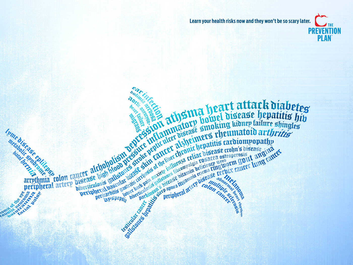
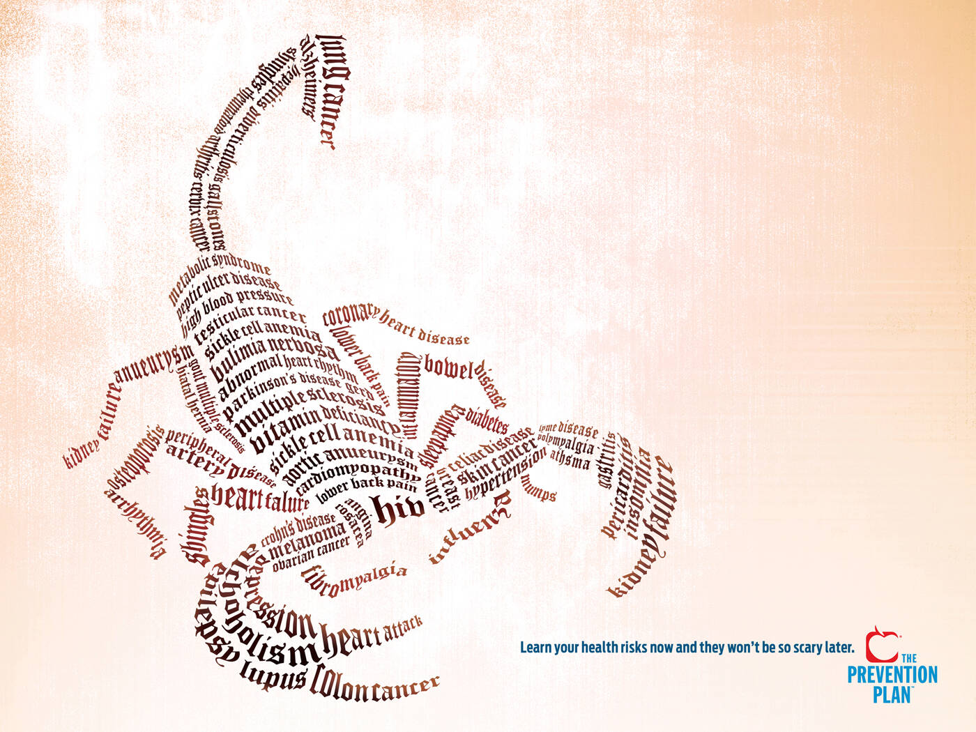
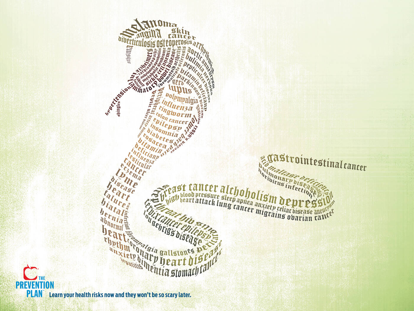
This professional campaign titled 'Scorpion, Cobra, Shark' was published in United States in February, 2009. It was created by ad agency: Hook. This Print medium campaign is related to the Public Interest industry and contains 3 media assets. It was submitted over 17 years ago.
Credits
Advertising Agency: Hook, Charleston, USA
Art Director: Brady Waggoner
Copywriter: Tom Jeffrey