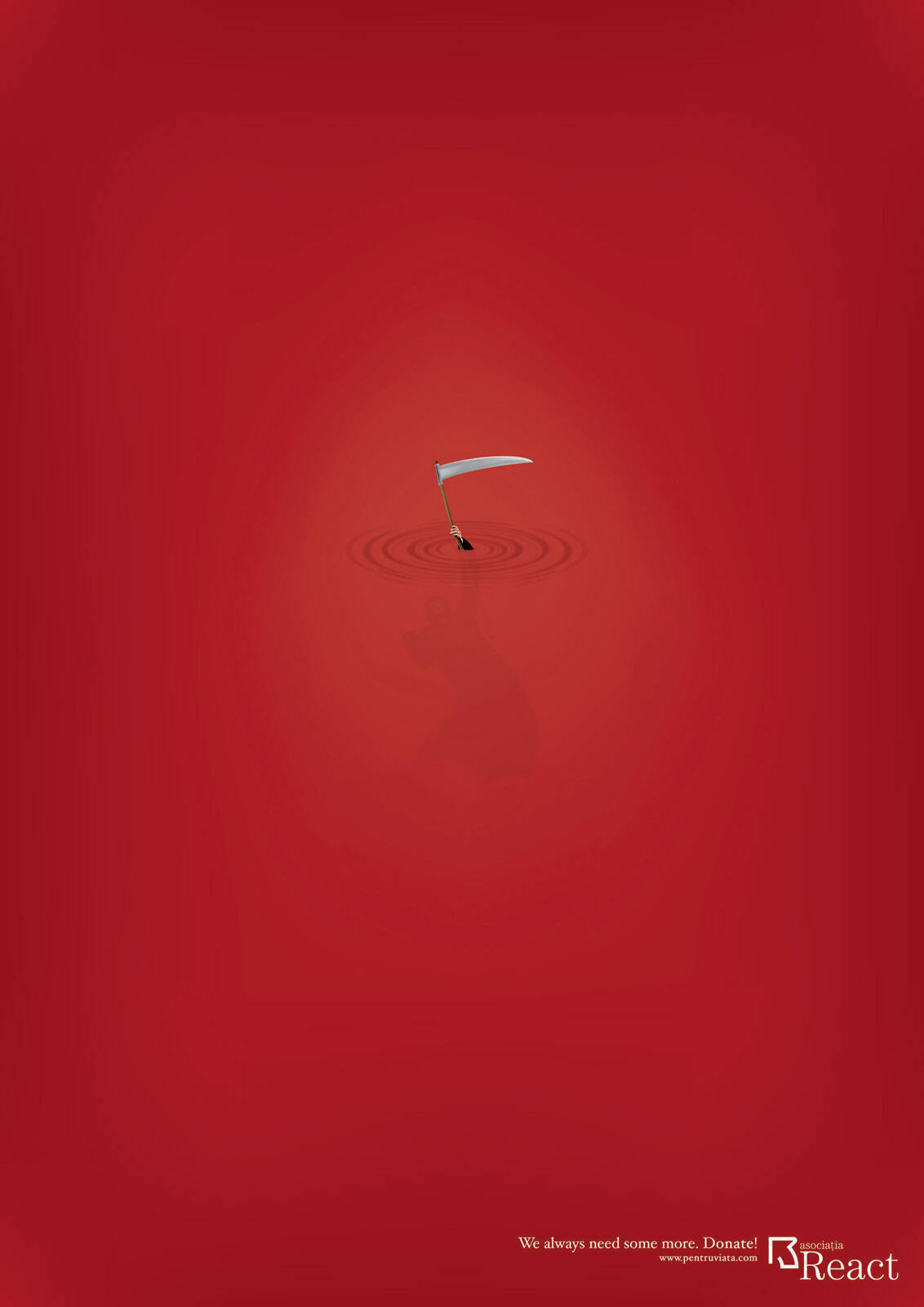
Description
Print advertisement created by BBDO, Romania for React, within the category: Public Interest, NGO.
We always need some more. Donate!
Creative Director: Mihai Gongu
Group Creative Director: Bob Toma
Senior Copywriter: Marius Tianu
Trying to rationalise this but I don't get it.
I get it.. its simple and it makes you think .. good job! i like it..
They seem to have enough.
Also, by showing Death's outline, they aren't giving their audience's intelligence much credit
This would've worked just fine only showing the hand and scythe.... the suggestion of the full body underneath was completely unnecesary. It dumbs it down.
Also, from now on I will always just write my call to action followed by an exclamation mark. (Buy this car! ... Drink this beer! ... Donate!)
I can't believe I haven't stumbled upon this formula before. So simple. So effective. (Use this ointment!)
That's a crazy cool idea. I agree. There is no need for the silhouette.
.. / .-.. --- ...- . / .- -.. ...- . .-. - .. ... .. -. --.
should be added some bubble there + no silhouette
life is a playground
Death definitely got a sinking feeling when it saw this ad.
http://lawsonhembree.wordpress.com | http://twitter.com/LawsonHembree | http://www.linkedin.com/in/lawsonhembreev
The scythe doubles as a white flag haha
Hmm...i like it but it's a bit confusing. Visually, you're saying the death is drown, which is a cool idea. But the words say we need more, which is another idea.
I mean, having this visual (without silhouette) and the only word "Donate." would be enough and, i think, stronger.