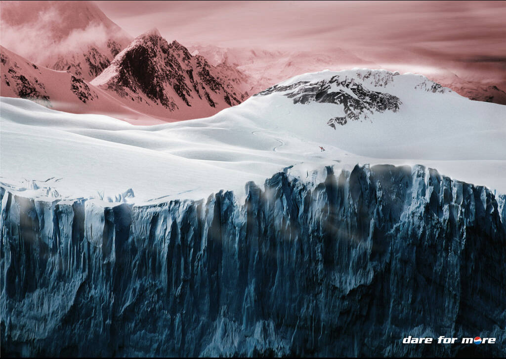
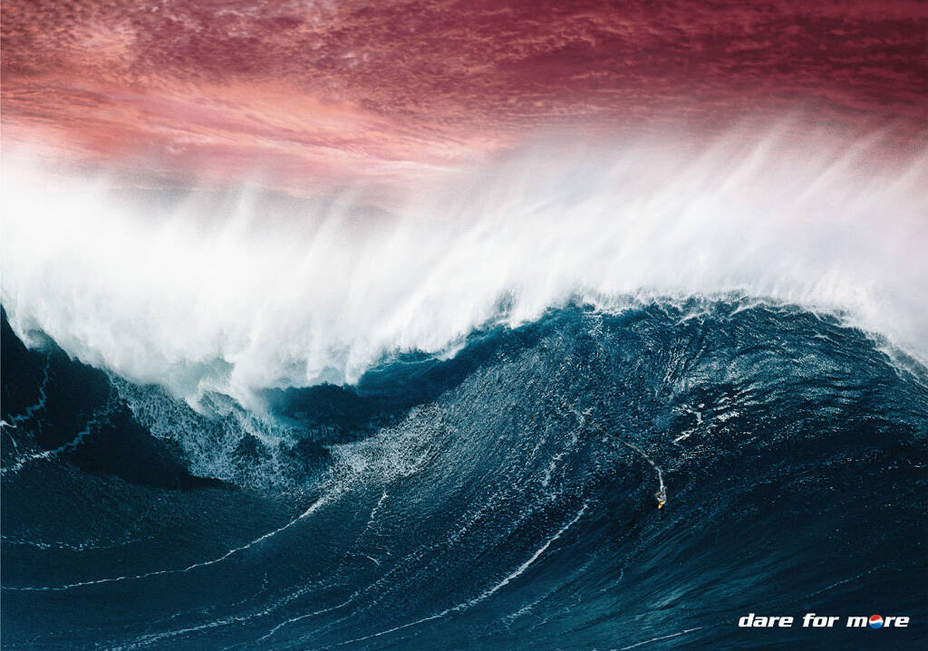
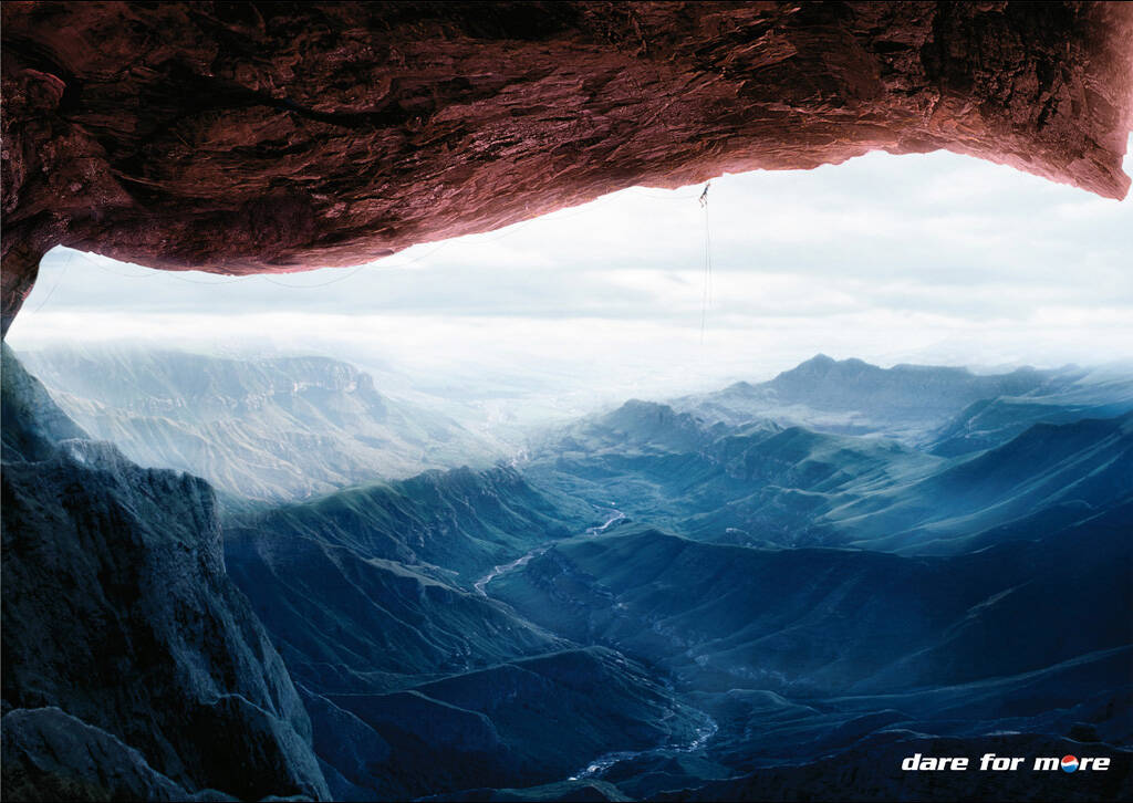
Description
Print advertisement created by BBDO, Germany for Pepsi, within the category: Non-Alcoholic Drinks.
Executive Creative Directors: Veiko Hille, Sebastian Hardieck, Toygar Bazarkaya
Art Director: Michael Plückhahn
Copywriter: Christopher Neumann
Production: Stefan Kranefeld Imaging
wow, beautiful art direction, i could recognise the pepsi logo right away from the thumbnails.
i don't see how "dare for more" has anything to do with pepsi, though.
dare put more sugar in your body?
dare experience the thrill of obesity?
beats me.
"dare for more" is the global positioning / slogan of pepsi, rocketman... didn't you hear it?
precisely that's one of the reasons why the ad is so good.
i agree with you, it's a beautifully crafted ad, i question not the creative solution but the strategic approach.
relating a soft drink like pepsi with extreme sports seems a bit of a strech, don't you think?
yeah, maybe you're right. Usually they relate with more "simple" stuff, for example tha tv ad in the roller coaster, don't know if you saw that one... that the guy goes in with a glass of pepsi and keep balancing it till the end so he doesn't drop the liquid. he succeeds and his friends yell, you know.
anyway, maybe surfing is not sooo extreme... the WAVE is extreme. And the same for climbing. I don't know, i like the ads but agree, maybe not so WOW.
i never looked for it, but i will since you´re a cool guy.
it´s not the same, by the way!! i just mentioned it because of the positioning/slogan thing.
i´ll see if i can find it.
thanks, i appreciate it.
do you remember the coca cola ad that won a film lion this year? the one with the recreation of the grand theft auto video game were the ¨bad guy¨turns out to be a really nice person to everyone? i think that's a great positioning for the product, soft drinks bring sweetness to life, smiles, fun and what not, and i think that's a believable promise.
even though ¨dare for more¨has been the slogan for pepsi for a while it seems a little misleading for me.
don't get me wrong, i think these creatives did a great job at solving the brief they were given, and they deserve all the awards they will win for this. it's the overall message that bothers me. ¨dare for more¨ seems presumptuous in this case, but that's something that needs to be dealt with from a corporation point of view, no doubt.
you´re completely right. actually now i don´t like these anymore, which makes me thinkmaybe they "wow" you for the first 4 seconds because of the kind of photo and the art, but then you feel like empty...
besides, if i "dare for more" i will definitely go with coke, hahahhaaaa.
look, rocket, this is the pepsi tv i was talking about (positioning, etc etc):
thanks, mm&i, i appreciate it.
even here, the tagline is "ask for more", no "dare" to be seen.
i think it's definitely more in line with the nature of the product.
cheers (definitely with beer :)
thanks, mm&i, i appreciate it.
even here, the tagline is "ask for more", no "dare" to be seen.
i think it's a lot more in line with the nature of the product.
cheers (definitely with beer :)
yeah, maybe you're right. Usually they relate with more "simple" stuff, for example tha tv ad in the roller coaster, don't know if you saw that one... that the guy goes in with a glass of pepsi and keep balancing it till the end so he doesn't drop the liquid. he succeeds and his friends yell, you know.
anyway, maybe surfing is not sooo extreme... the WAVE is extreme. And the same for climbing. I don't know, i like the ads but agree, maybe not so WOW.
'Dare for more' was the global positioning/slogan of Pepsi. They are all about the choreography (multiple experiences, living multitasking, infinite branches for a story) campaign right now, which make me think about the date of publishing.
Rocketman. Can you show your work?
Dont be so stupid talking like that. It feels like your mom didn´t hug you the necesary.
Isn't it very childish of you to ask Rocketman to show his work from his comment? His comment wasn't even harsh, and it makes sense for some people, like me. What is so daring about drinking more pepsi anyway? Maybe you should be showing your work to shut us up.
Maybe you should show your work liar - haha - just kidding javierjvc is an idiot.
"dare for more" is the global positioning / slogan of pepsi, and it has been so for a while, guys... nobody heard it before???
of course everyone heard of 'dare for more', like rocketman, i'm just not too comfortable with its strategy. It's just a little vague associating coke drink with dare for more. I need people to convince me on that.
wow javier, sounds like you're an angry little fellow, i wonder why you brought up moms not hugging children enough so abruptly and out of the blue.
hey people let's send che javi a big hug, sound like he's badly in need of one.
and don't worry about my work, as soon as i have new stuff that i'd like to share you will be seeing it, no question about it.
rocket, let´s introduce javier to gustavs0n, HAHAHHAHAHAAAAAA
they will have a lot of fun together talking about good advertising.
i said GOOD, not GREAT.
i'm with you all the way.
as long as GustavsOn promises not to throw the word ¨mierda¨ at any of javier's favorite ads, i think they'll be ok. :)
first of all the ad isn't very good at all, it might look cool but I don't see the connection to extreme sports. It's just an excuse to have a cool visual. Plus the three attributes (mountains, snow, and rock) don't line up, the rock and snow are their natural colours and the sky/mountains are pink? when art mountains pink? anyway javierjvc don't get upset with people sharing their opinions, because they're just opinions.
Dare to buy pepsi? Is it really that challenging to buy a soda? Art direction is off the charts, but I'm a bit confused by the message.
Don't see it so difficult... it's just talking about a way of life... People who choose for Pepsi are adventurous, daring... (at least according to the makers of this ad)
dear god, please take note: PHOTOSHOP DOESNT MAKE IDEAS.
Stay away from hue-saturation untill you have a idea that doesnt need a RED sky.
So this was just an idea of a macman experimenting with the irresistible hue and saturation, was it?
in this case i'm with juliangray... this one specifically really doesn't need the red part, it's waaay too forced. I like the other two but you don't need this one.
I don't get the tagline either, but the idea may have been lost in translation. I think it's a beautiful piece to look at, though.
although these look nice they somehow don't work for me. I still find Pepsi more of an urban thing not so much nature (or extreme sporting to this extent).
all in all: capturing visuals, doubtful pay-off.
btw, these won Epica award just today (don't know whether it's gold, silver or bronze).
...As an outdoor. Print Epica D'Or went to the France24 campaign.
Hey Plücki! Ich gratuliere ganz herzlich! Grüße, der Fabse
This campaign continue the construction of the Pepsi brand, it´s not a wow campaign, nice art.
http://micorazontusmanos.blogspot.com/
Jonathan Betancur
rockvertising.com
twitter.com/jonybeta
exactly, zafra. construction of brand. they have "platforms" such as sports and music, i don't remember the third one... a few years ago i worked in the pepsi account, but not anymore.
I can't help myself log in and comment: amazing, incredible, unbelievable!
Guys visual swapsies are old school. Making the logo into something is old school. And don't get me started about the contrived pink backgrounds. Obviously the whole agency is logging in and singing its praises because its beyond me why anyone would think this is good. I mean the ad holds no insight whatsoever. The engagement factor is zero and the payoff is... actually can someone tell me what these ads are saying to the consumer... pink sunsets are nice in the snow?
ron, i agree with you about the logo being old school and almost everything else, except that these ads are saying something: they're saying dare for more, or ask for more.
If it's a good idea or concept, is another story, but yes sir, they have a message.
In the 3 ads you can see this tiny little person in the snow, or surfing, or climbing, did you notice?...
Again: i'm not saying these are brilliant or even good, i'm saying there is certainly a message there. We don't like the message or the ads, but the message is there.
by the way, i agree: seems like BBDO Germany is commenting a lot, hahahhahaaa.
I said it SEEMS, don't kill me my german friends.
Coke already did this.
Playing straight off the logo graphic.
Twas on AotW just a few months back.
>>>> That's not an ad. THIS is an ad.
the grass is green and the rose is red and the sky is... well pink???
thanks, i was wondering about the sense of the red sky, too.
nice postproduction work anyway.