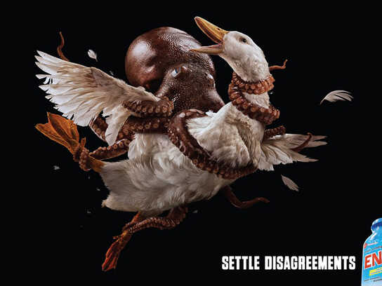
Description
Print advertisement created by Ogilvy, India for Eno, within the category: Pharmaceutical.
Eno. Food no coming back.
Art Director / Copywriter: Saji Johnny Kundukulam
So it's some fizzy digestive tablet that banishes food to a barren place from which it can't escape. For those people who can't banish it by flushing, presumably. This is the first ad I've seen since coming here after months away, and I'm exhausted already. What the FUCK is the point of a set of artful pictures that needs a background in marketing or a list instructions to understand. This is hopeless.
missed you, that's the way all this stuff should be commented, it gives possibility to learn. All the time everyone you should be responsible before saying smth here, because otherwise all the students like me are reading just the snobbish bullshit like "bad" "wtf?!" or "next" which means nothing, just that in advertising there are so many non educated people
Now that you're back, it's gonna be very entertaining seeing you come to blows with Hadrons.
Crap series of adverts.
wow! this is great!!!...
ok seriously guys whats this??
| everartz |
I don't get it....not without the explanation anyway.
And why didn't they do it in colour?
Eno is the most global of GSK's gastrointestinal products. The fast-acting effervescent fruit salts, used as an antacid.
This medicine helps relieves the symptoms and discomfort caused by excess acidity such as indigestion, nausea and flatulence.
This medicine belongs to the class of medicines called antacids. It works by neutralising excess acid which protects the stomach and also helps relieve symptoms of indigestion. It also helps release trapped wind which is expelled during belching or burping.
Now, what they tried to do is show rocks looking like a nice piece of lamb... and tell their clients the food won''t "come back" (puke)... taking the antacid.
Obviously it is too sophisticated. Nice approach though.
THERE'S NO HEAVIER BURDEN THAN A GREAT POTENTIAL
It's hard to see but i think the execution and idea is something different, there is a little sheep (or something else) on the rocks.
A little chicken in the next execution.
Still sophisticated but works.
creative jokes. obviously for their own pleasure, and their own only.
-------------------------------
Brand Design | Logo Design | Brochure Design | Website Design | Branding Packages
how can you people not get such a simple idea? food doesn't come back. shows food in places they're certainly not coming back from. it can't get any simpler. and yet, here you are, with your comments. if this was hard to get, I shudder to think what picking up a book might do to you.
I really think this is a ridiculous idea. And since Eugens has opened the door, let me mention quite frankly, that trying to give such a strong explanation isn't really going to sell - try saying all this to awards show judges. Sure lobbying might help this win at some local award, but it doesn't stand a chance at a level beyond that. And by the way, it's not about getting the idea, it's just that it's too forced. Lame, is more like it.
Love it. But I'm not quite sure b&w works better than colour in this case. I always imagined my insides to be colourful and more fleshy and b&w doesn't allude to that. But I have to see both side by side to really judge. Great effort though.