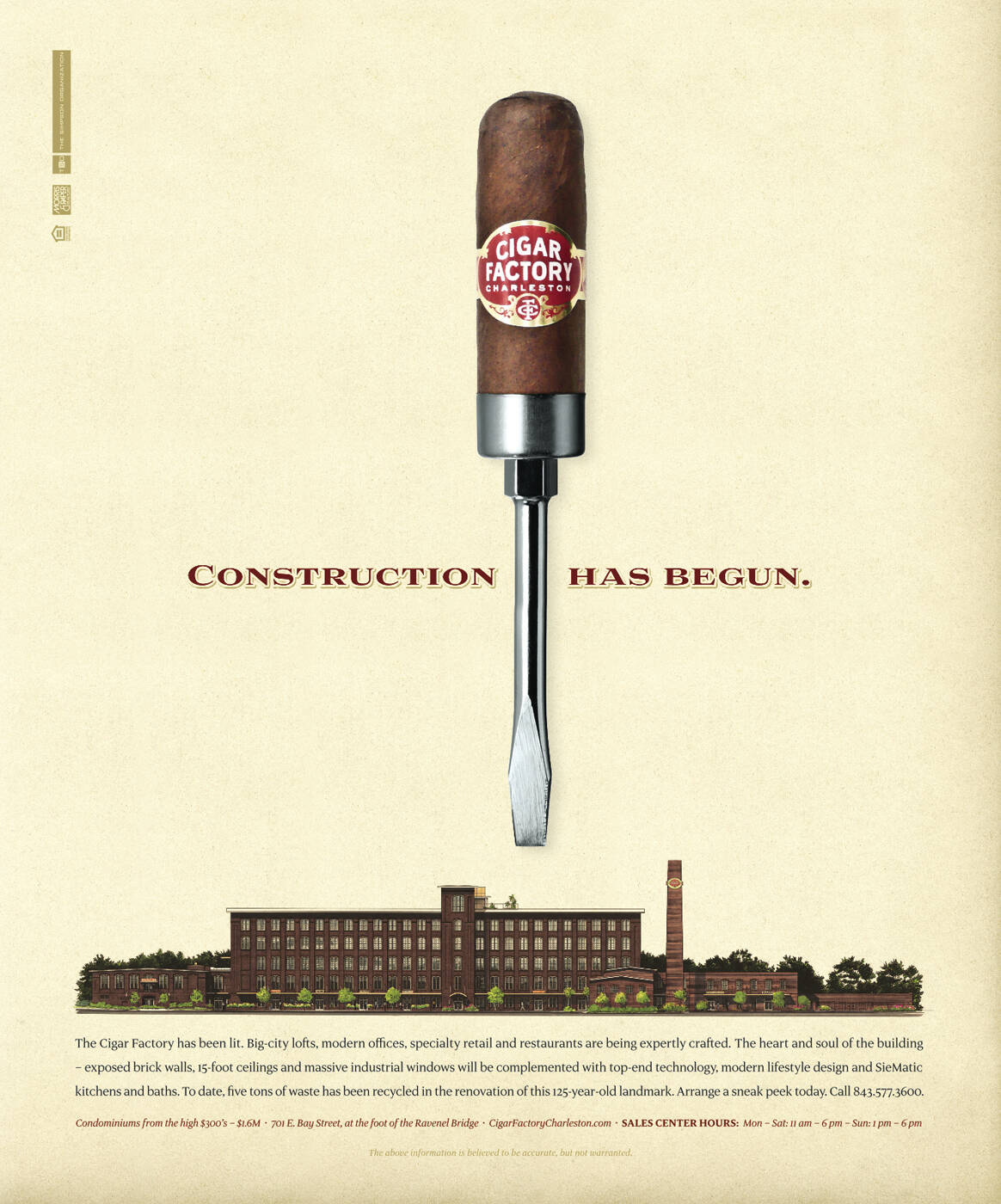
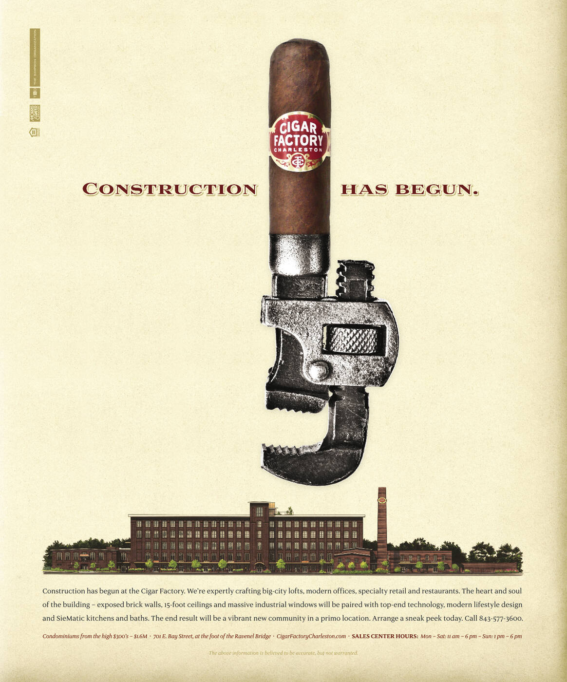
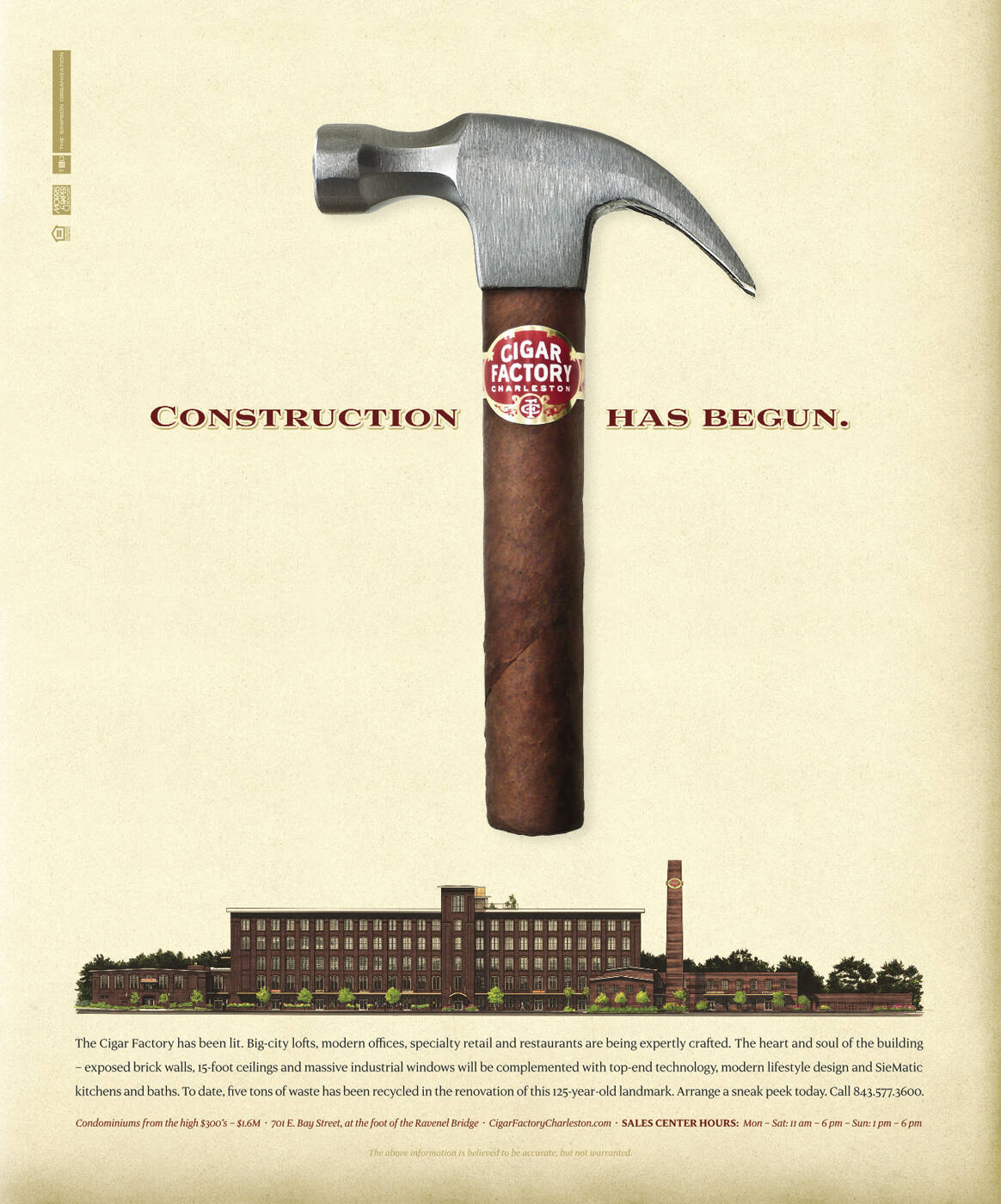
Description
Print advertisement created by Hook, United States for Cigar Factory, within the category: Industrial, Agriculture.
Construction has begun.
Creative Director: Brady Waggoner
Art Director: Jason Johnson
Copywriter: Tom Jeffrey
Absolutely love it.
From a creative standpoint, they could've crafted different headlines throughout the series, but those are solely for awards show people. Consumers don't give a rat's ass about how these hold together "as a campaign."
Gorgeous typography, beautiful illustration, nice use of color palette, clean and clear writing... Everything about this ad makes perfect sense unlike many other visual-only ads some creatives indulge themselves in as a form of masturbation. (Although, some no-copy ads ARE very smart and entertaining.)

Hmm.
"Visual masturbation for visual only ads?"
It takes a very special eye to be able to condense 2 pages (if you're lucky) of a brief in one single visual.
Kinda condescending, don't you think so? Even coming from a copywriter...
©
It just feels like I've been seeing too many no-copy ads on here that suggest the creators ONLY used their "very special eye" and not their brain in coming up with such an execution.
If a creative team decides to solve a problem only by means of showing a single visual (and logo,) that piece of communication better be super quick and CLEAR (i.e. not in any way open to interpretation) to the target audience.
Would I sound not condescending if I wasn't a copywriter? Maybe I'm really not even in the business. Maybe I'm just a regular Joe who's only interested in seeing great-looking ads that "make sense."
These adverts are okay, but with the state of the US economy – especially within real estate – I can't imagine that these will be winning any effectiveness awards... ;)