Description
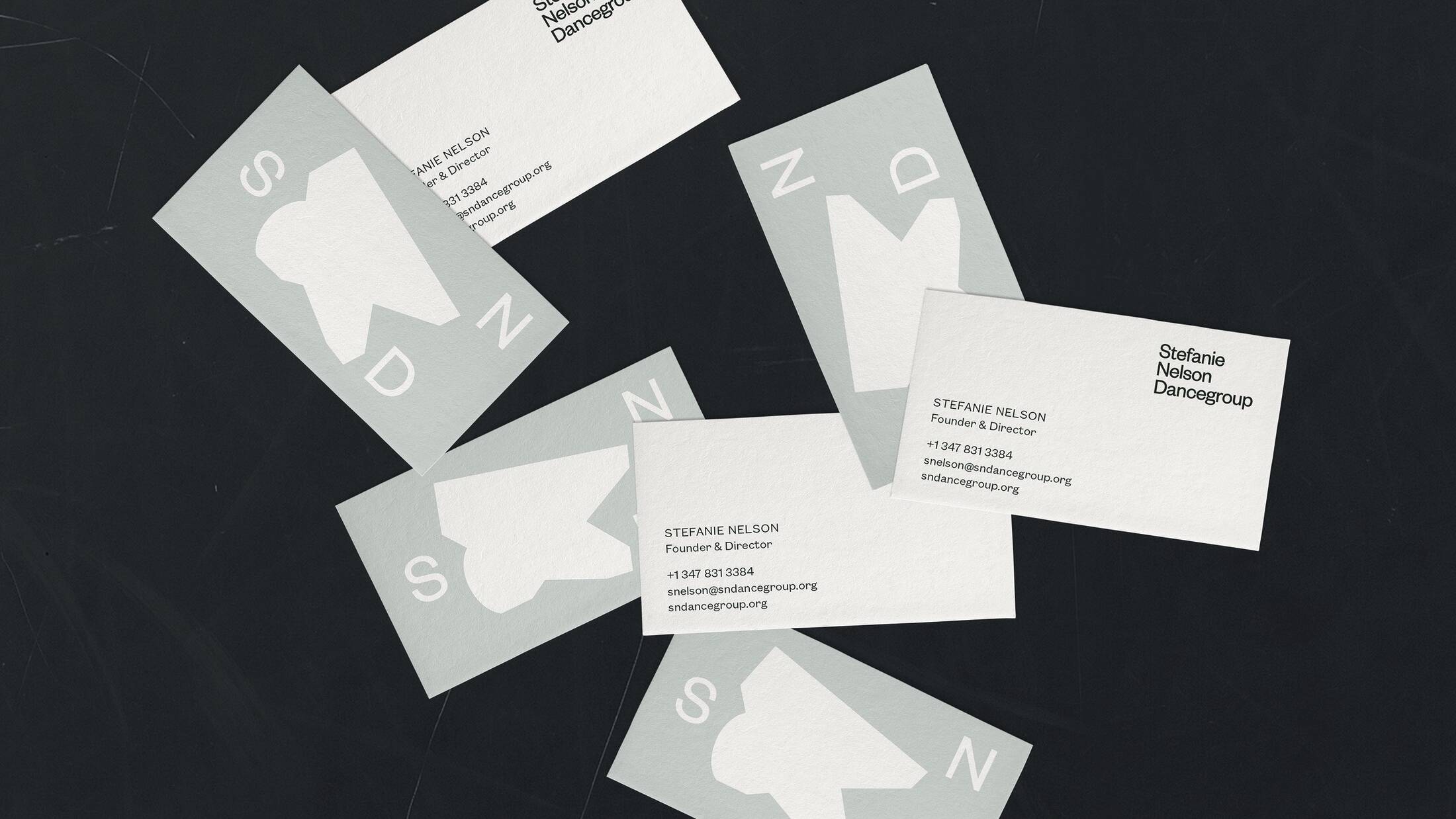
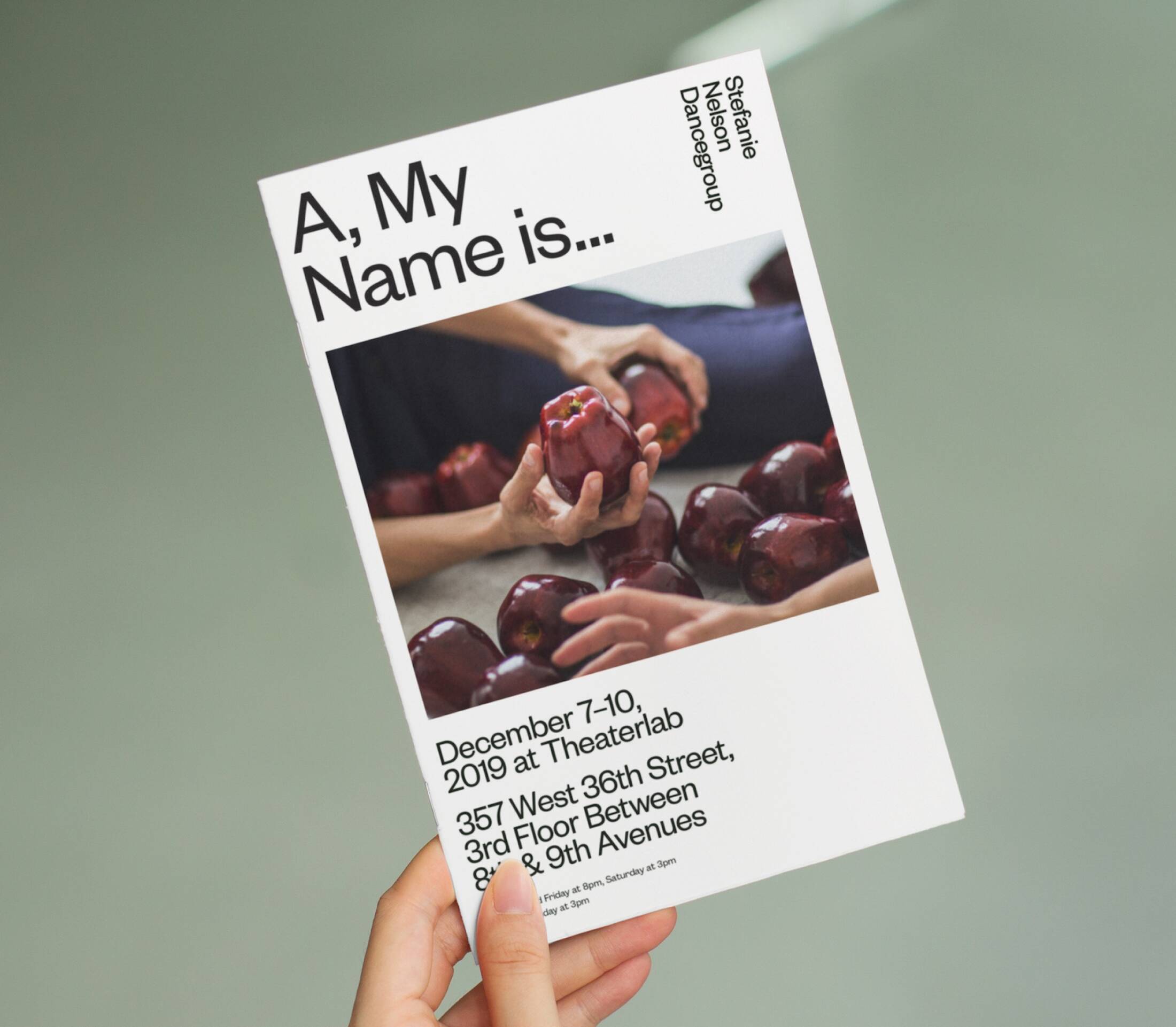
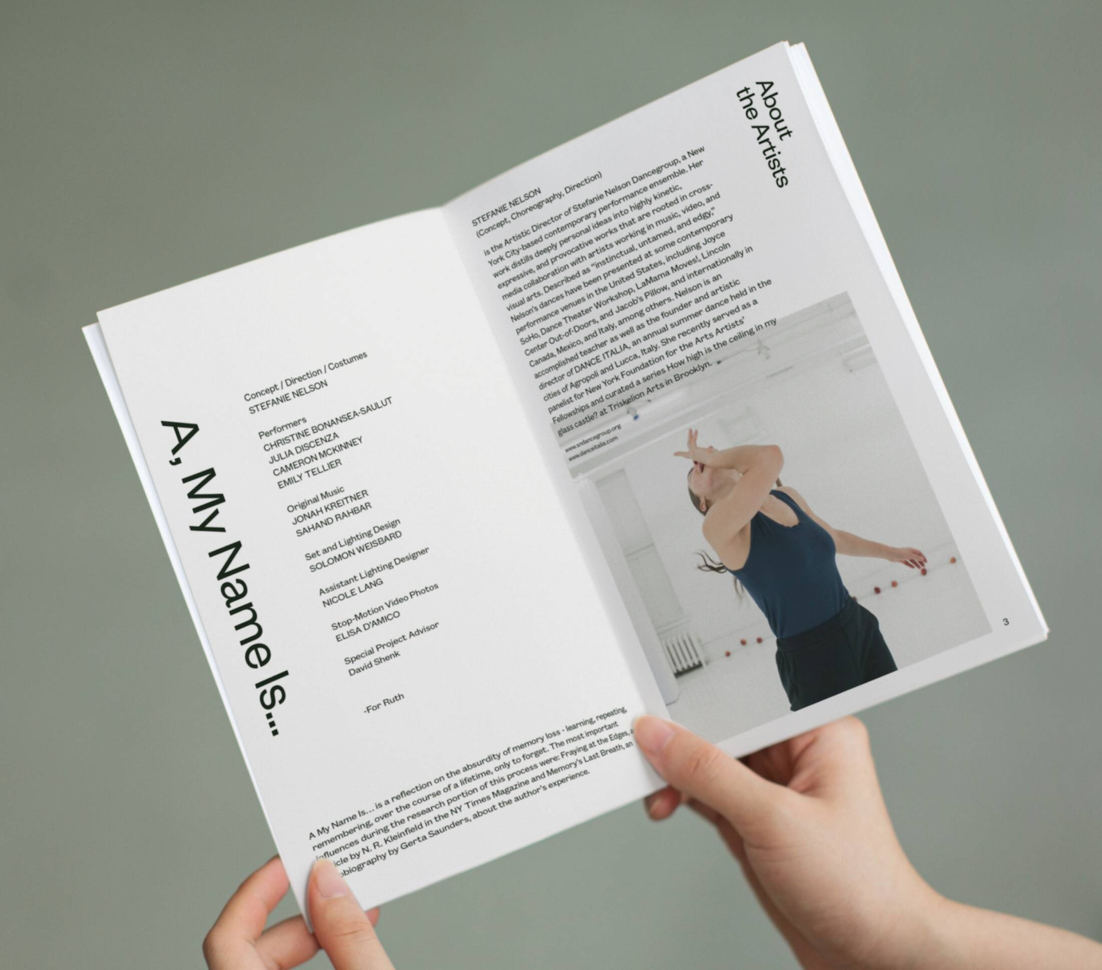
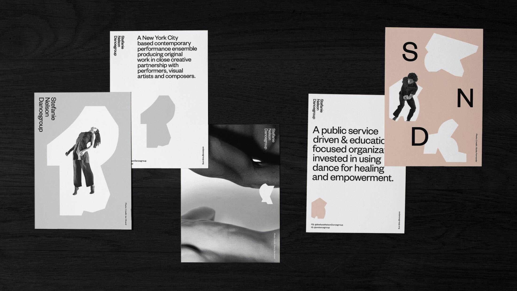
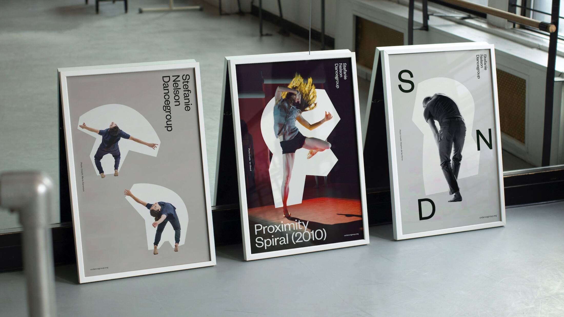
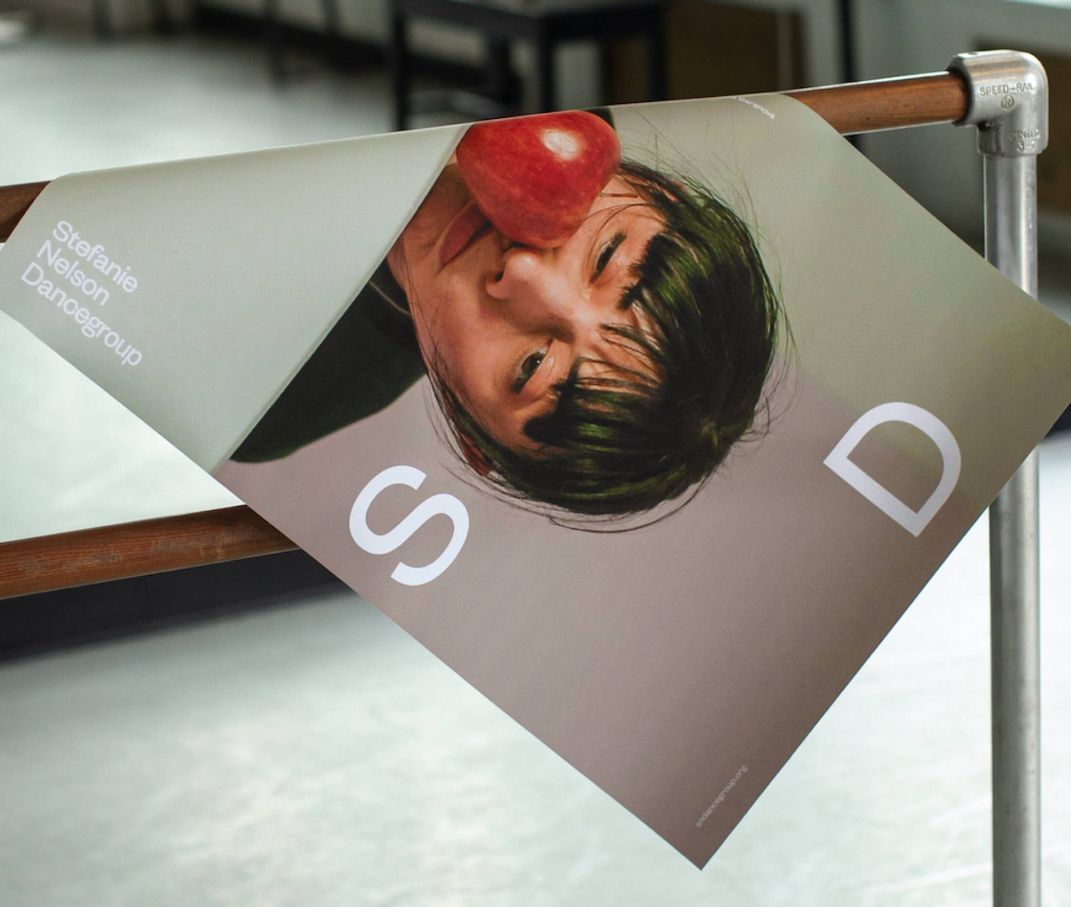
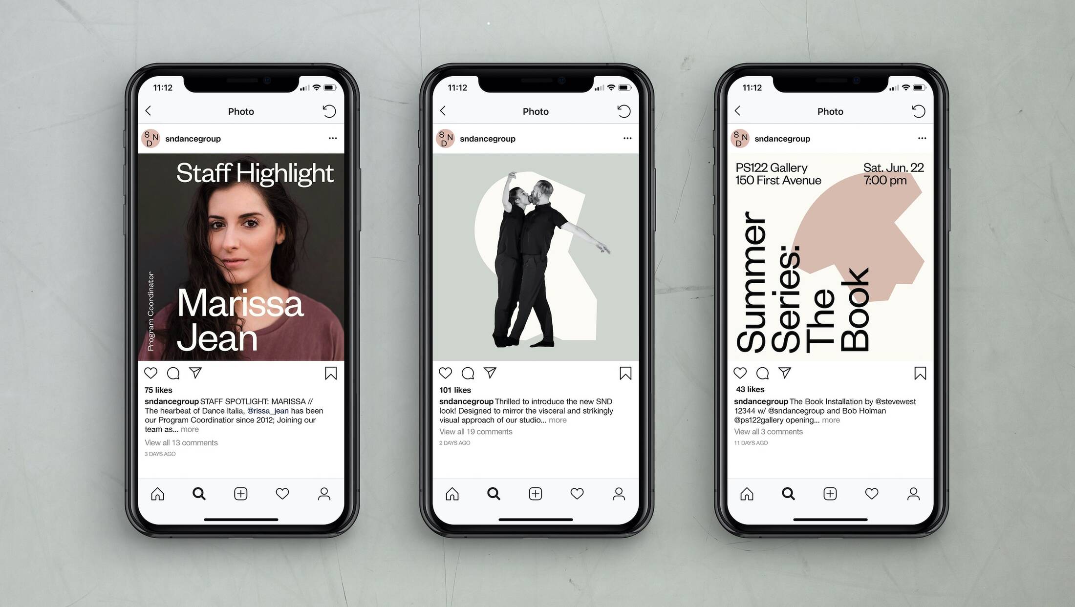
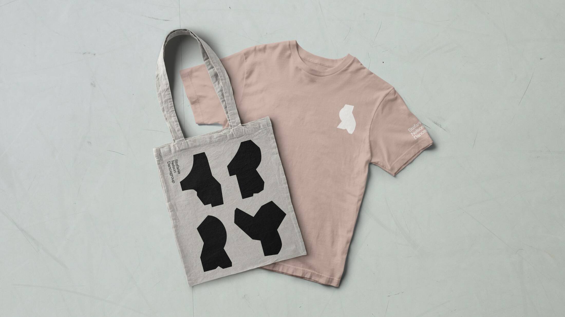
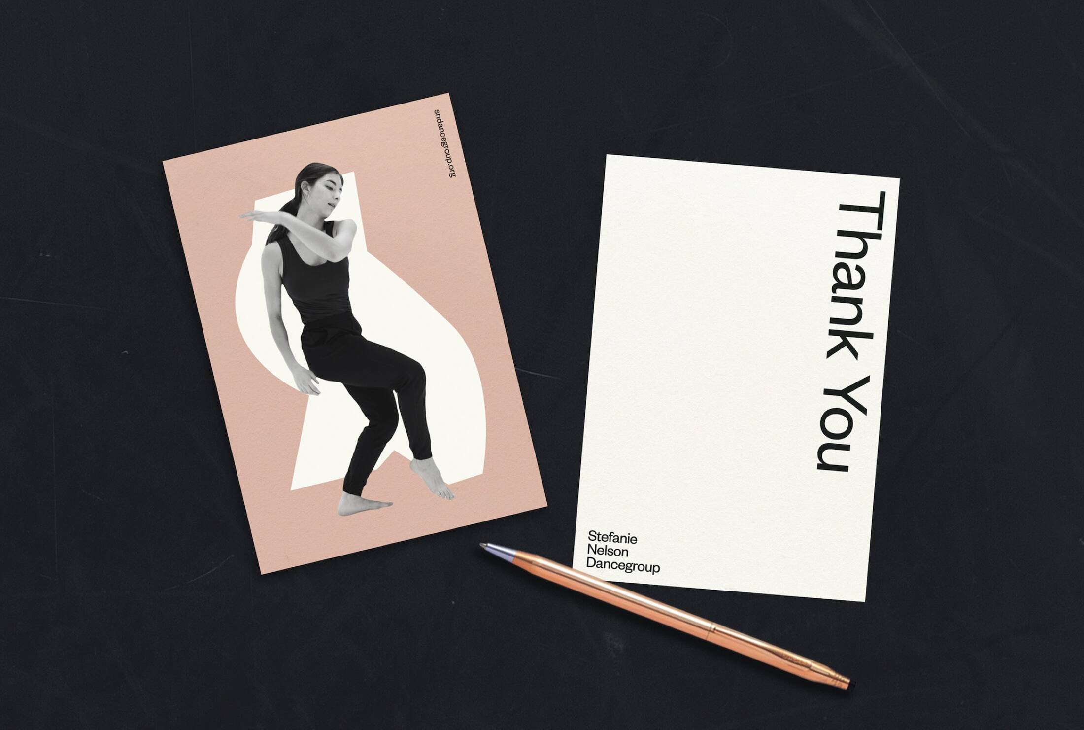
Design studio Gretel today unveils its rebrand for the NYC based Stefanie Nelson Dancegroup in advance of the group’s 20th anniversary. The rebrand by Gretel centers on a new design language that captures the unique movement style of SND. It’s fresh but classic, flexible but singular, and offers a brilliant blueprint for how a cultural organization’s artistic work can be translated into smart, adaptable design and branding systems. Reflecting art SND reached out to Gretel in 2019, looking to increase their presence in the NYC arts world and more clearly connect the dots between SND and its highly successful sub-brand for the dance program, Dance Italia. Gretel, known for its work for global brands including Vice, Netflix, and Nike, brought a commitment to deep strategy and design excellence to the project. Gretel founder Greg Hahn says: “Whether designing for a cultural institution or a global tech brand, we’re always looking for work that’s unique, beautiful, and above all, true to whoever we’re designing for. Even for a smaller client like SND we provide valuable insights into the way their business is operating, the way they present themselves to the world, the way they speak, on top of providing a unique identity.” Symmetry and asymmetry To form the backbone of the brand, Gretel designed a library of abstracted graphic forms based on SND’s expansive collection of archival performance photography. Hahn says: “We were drawn to the tension between elegance and awkwardness in Stefanie’s work: Quiet meditations and explosive movements. Symmetry and asymmetry. Hard and soft forms. Even in still photography you could sense all of this.” Using a combination of hard and soft lines which echo the dancers’ movements, Gretel created a language of shapes as the basis of the flexible but firmly-rooted identity. “The shapes can work to supplement or enhance a photo,” says Hahn, “and on their own they become a language of glyphs, unique because they’re based on SND performers.” “The goal for this project was to mimic movement and dance through the design in a way that is personal and specific to SND,” says Elaan Bourn, Gretel’s design lead on the SND project. “By creating a graphic library of forms that represent and abstract the edgy, contemporary and energetic nature of Stefanie’s pieces, we were able to visualize the spirit of the rebrand.” Harmonious layers “From the beginning we were conscious of how to create a secondary language for Dance Italia, with a different tone of voice, but which shares DNA with SND,” says Hahn. “We wanted to make sure that all of the layers of this brand could work on their own as well as harmoniously.” To achieve this, Gretel played with negative space and color to link SND and Dance Italia together while keeping them separate. A muted pastel, solid form execution of SND allowed for more sophisticated, refined visuals for the parent company. Outline forms with a vibrant yellow allowed for more playful compositions that helped mimic the spirit of the educational program of Dance Italia. Highest design standards Stefanie Nelson, founder of SND comments: “We paired with Gretel to investigate core values of our company and have those reflected artistically to the highest design standards in our publicity materials. The resulting work is a wonderful visual reflection of our past and a strategic springboard for our future.” This holistic approach to the SND rebrand shows how a deeply strategic approach can marry a cultural brand’s artistic aesthetic with highly functional design to connect clearly, effectively, and authentically with long time patrons and new audiences. Hahn says: “The work we created for this rebrand is so fitting for SND – it suits Stefanie’s personality and speaks to the nature of her work. Because of that, the public will have a more intuitive understanding of SND before they have the opportunity to see a performance.” The rebrand of the Stefanie Nelson Dancegroup and Dance Italia will be rolled out in the coming months across digital touchpoints and all publicity materials.
This professional campaign titled 'Design Studio Gretel Mimics Movement in Dance Company Rebrand' was published in United States in January, 2020. It was created for the brand: Stefanie Nelson, by ad agency: Gretel. This Design medium campaign is related to the Education, Professional Services, and Recreation, Leisure industries and contains 9 media assets. It was submitted about 4 years ago by Samantha Clark of Red Setter.
Credits
Advertising Agency: Gretel, New York, United States of America