New Brand Identity for the Kendall Square Association
Agency: Colossus


Description
Kendall Square, located in Cambridge, Massachusetts, has long been recognized as the most innovative square mile on the planet. Once an underdeveloped industrial area, it has transformed over the past several decades into a global epicenter of technology, life sciences, and research.
Supporting this influential ecosystem is the Kendall Square Association (or KSA). Founded in 2008 as a deliberate effort by Cambridge leaders to steer this transformation with purpose, KSA emerged to connect industries, amplify their impact, and steward the neighborhood’s growth in ways that serve both innovation and the public good.
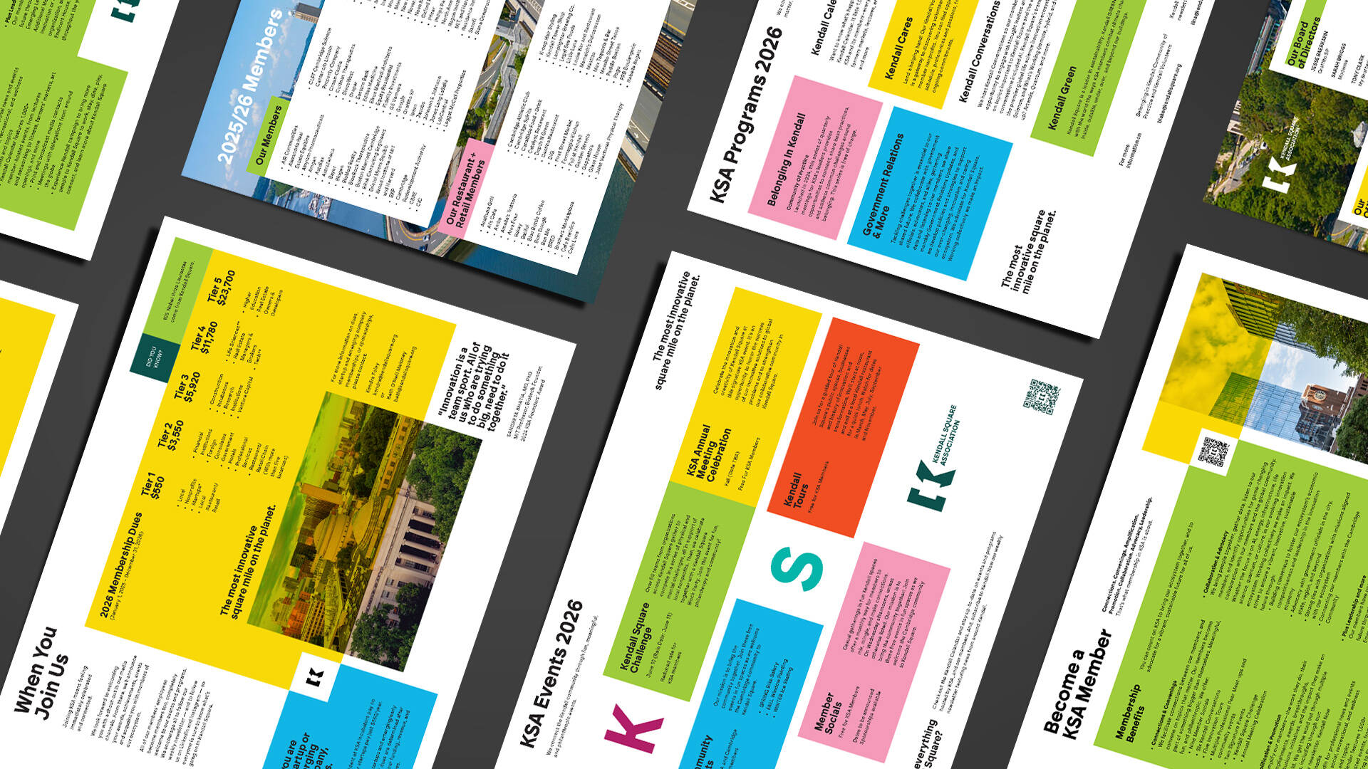
Today, KSA’s membership includes some of the world’s leading institutions and companies—names such as MIT and the Broad Institute, Moderna, Pfizer, Google, Meta, J&J Innovation, Novartis, Microsoft, LabCentral, and many others. In doing so, KSA becomes more than a networking hub for the 50,000+ employees in the district; it becomes an ecosystem integrator.
“Built with collaboration and community in mind, we’ve evolved to meet the current moment and beyond,” said Beth O’Neill Maloney, KSA executive director. “Amplifying our mission with smart, clear design is just one more way of connecting the world’s leading minds—along with the human ingenuity that makes our square mile thrive.”
This month, the KSA will debut its new brand identity, developed by Colossus. The work includes a new logo, color palette, typography, motion language and design system—all developed to help bring the KSA brand in line with the future-forward positioning of the community it serves.
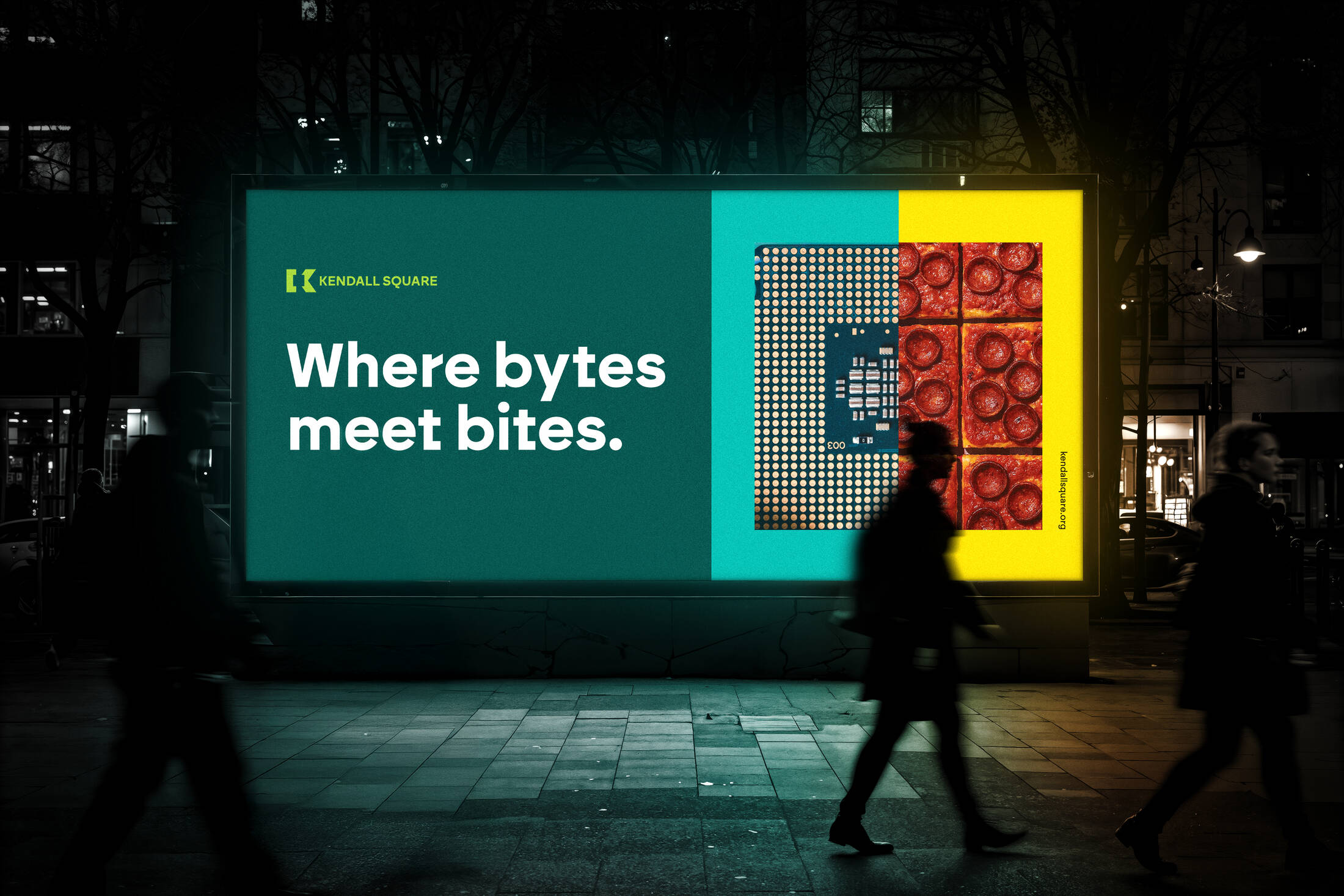
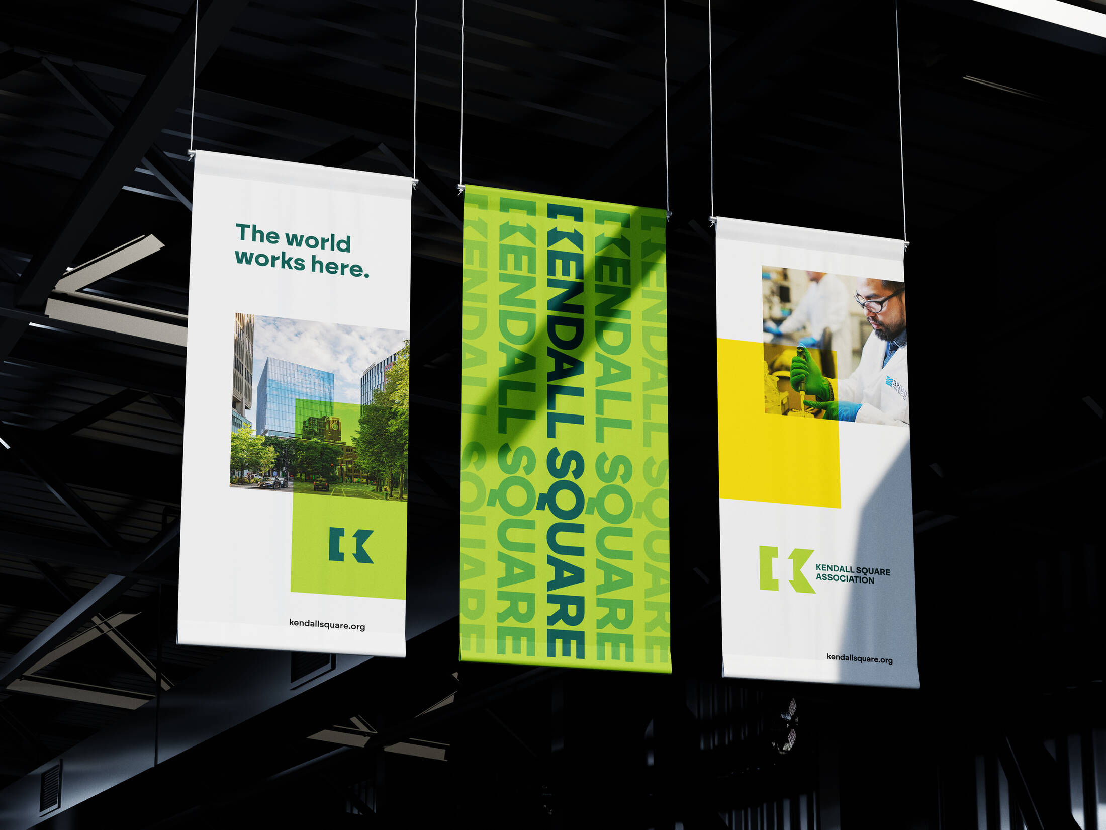
The new logo uses the power of negative space, knocking out a square shape from the body of a simple K letterform. In doing so, the logo can act as a clean icon on its own, or a kinetic frame for photography, illustration or color blocking.
The color palette is vibrant and modern, pulling inspiration from a variety of hues specific to Kendall Square. From the architecturally influenced blue-green patina (a nod to the pigment that forms on copper often found in the historical Boston neighborhood) to the deeply saturated yellow that gives tribute to academia (the highlighter was invented here). The unique palette serves to unify the energy of the tech sector and student population with the credibility of the pharma, finance and research sectors.
Typographically, the new identity introduces Brockman as its primary typeface. Inspired by Joseph Muller-Brockman and designed by Atipo Foundry, the modern geometric sans serif offers simple readability with quirky angles. From Atipo: “Drawing from the aesthetics of the Swiss school, this typeface encapsulates the timeless essence of its predecessors while infusing it with a modern touch. The design harmoniously combines geometric shapes, striking a delicate balance between formalism and innovation. It embodies technical precision alongside a distinct character, resulting in an austere yet captivating font that radiates personality.”
In addition, the new brand identity introduces a modular yet flexible grid system that uses color and photography as “blocks” that can be aligned to create unique relationships with one another, much like the Kendall community itself.
“Kendall Square is a literal intersection between some of the most influential institutions and thinkers in the world. The idea of convergence is at the heart of the new brand system,” said Colossus designer Tyler Sugg. “Working on this project was an absolute privilege. Seeing what members of the KSA do on a daily basis is awe inspiring. While we’re choosing color palettes and designing business collateral, they are literally landing on the moon and chasing the cure for cancer. I hope our work represents them well.”
Kendall’s importance extends beyond Cambridge or Massachusetts. It is a model for how innovation can be organized, scaled and sustained. The breakthroughs incubated here—from CRISPR and gene therapies to AI-driven diagnostics and sustainable materials—influence medicine, computing, energy and society. With KSA as its connective tissue, Kendall demonstrates that the interplay of academia, industry, capital, and civic purpose is not just visionary, it’s essential.
This professional campaign titled 'New Brand Identity for the Kendall Square Association ' was published in United States in December, 2025. It was created by ad agency: Colossus. This Design and OOH Outdoor media campaign is related to the Retail Services industry and contains 5 media assets. It was submitted 7 months ago.
Credits
Client: Kendall Square Association
Client Team:
Beth O’Neill Maloney, Executive Director
Lina Lahlou, Communications Manager
Cecelia Boyson, Membership Associate
Campaign Title: Kendall Square Association Brand Identity Redesign
Execution Title: The World Works Here.
Agency: Colossus Creative Co.
Exec Creative Director: Travis Robertson
Associate Creative Director, Designer: Armeen Shaidani
Designer, Motion: Tyler Sugg
Copywriter: Nat Lileks
GM, Colossus Design: Allison Doherty
Account Management: Emily Smith
Jr. Designer: Natalie Arsenault