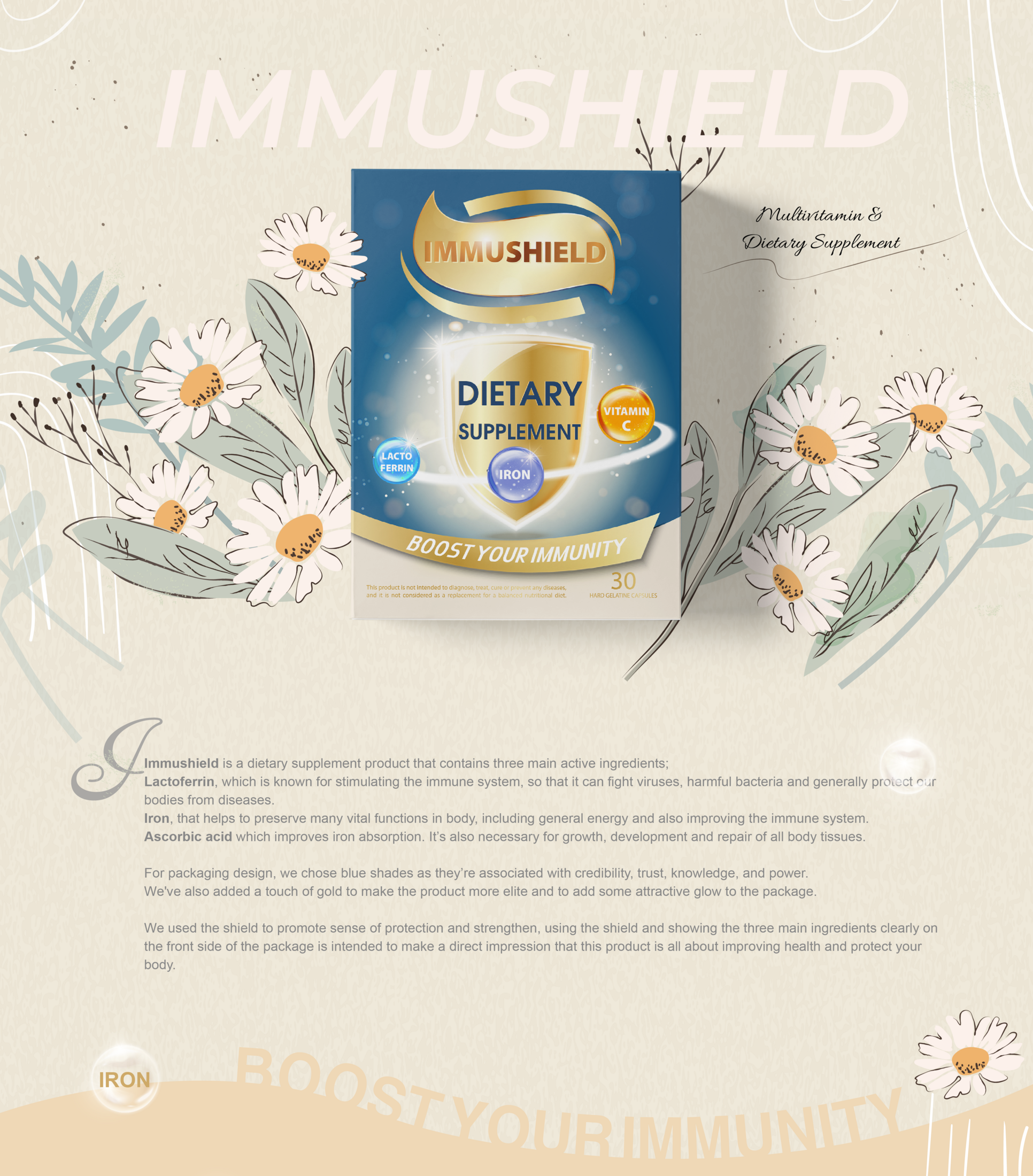

Description
What if protection looked as clear as it feels?
For Immushield, Marklinica turned immune support into a visual cue one that signals confidence, clarity, and clinical reassurance from first glance.
The challenge?
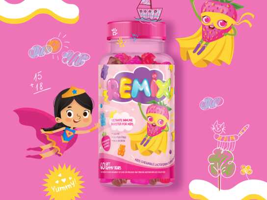
Make a multi-ingredient supplement (iron, lactoferrin, ascorbic acid) feel instantly trustworthy without falling into the clichés of pharma or wellness.
Packaging was rebuilt around that tension:
Deep navy for credibility. Gold accents for potency. A shield icon that frames the purpose. Typography is disciplined and legible. No slogans, no fluff just structure built for understanding.
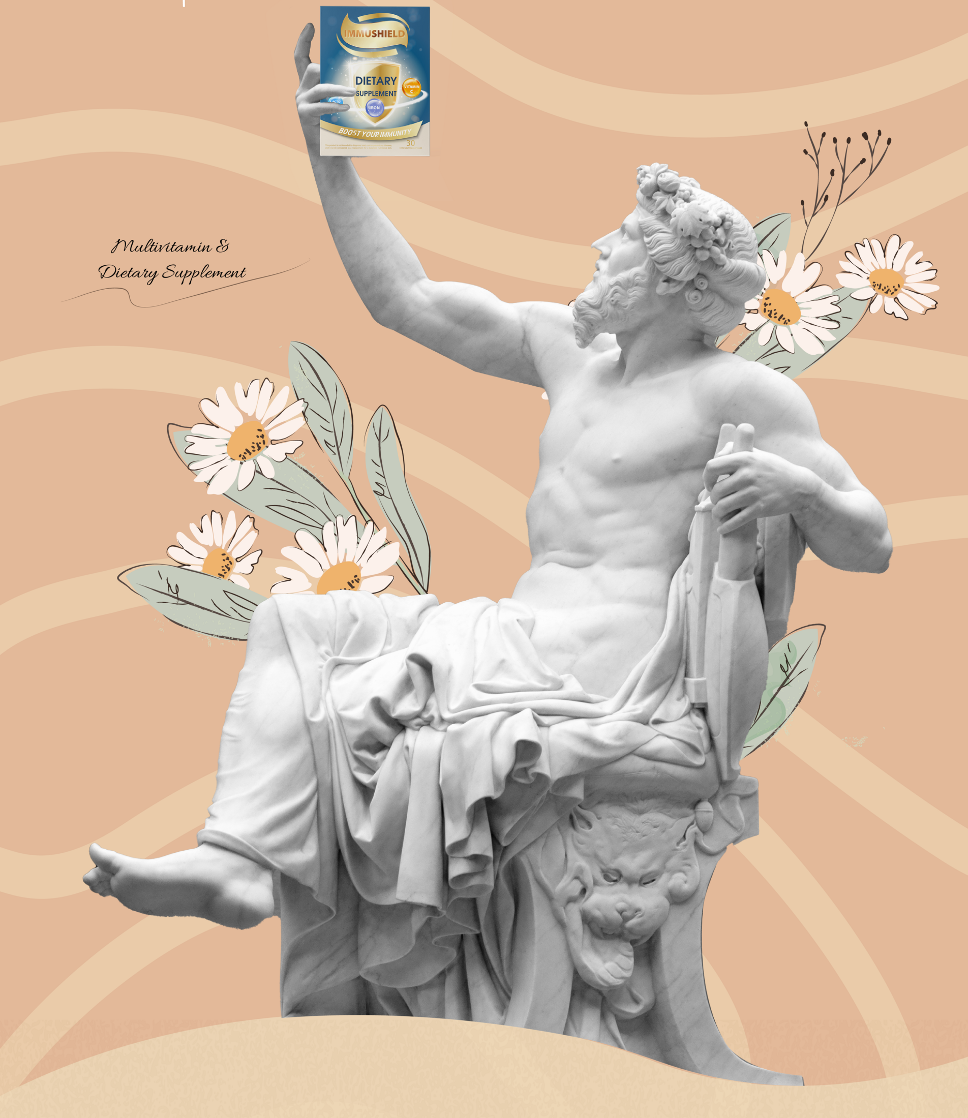
Art direction focused on precision and stillness:
Boxes stand like tools of defense. Reflections are minimal. Textures are matte and grounded. Every shot feels engineered for clarity, not decoration.
From dosage jars to outer packs, from color logic to icon language Marklinica crafted a visual story where Immushield doesn’t just protect immunity.
It makes you see it.
This project shows how Marklinica turns technical products into tangible trust through visual order, verbal restraint, and purposeful design.
This professional campaign titled 'Immune support you can see.' was published in Egypt in March, 2021. It was created for the brand: Immushield, by ad agency: Marklinica. This Design, Digital, and Print media campaign is related to the Health and Pharmaceutical industries and contains 3 media assets. It was submitted 7 months ago by CEO : Rana Mohsen of Marklinica Agency.
Credits
Art Director: Rana Mohsen
Agency: Marklinica