Description
Independent branding and design studio Mother Design, part of the Mother Family, has created a new global brand identity for Keen, the leading online marketplace connecting people with spiritual advisors. The new brand identity reframes psychic guidance for modern life, shifting perceptions beyond prediction and major life moments towards a more everyday role: helping people gain clarity and a different perspective on the questions in front of them.
The project began with a clear commercial ambition: to broaden the appeal of psychic services and establish Keen as part of modern wellbeing routines.
From meditation and coaching to astrology and AI, consumers are embracing an expanding range of tools to help them navigate the questions and uncertainties of everyday life. Mother Design's challenge was to position psychic guidance within that broader landscape, not by changing what makes the category distinctive, but by reframing the role it can play in modern life and, in doing so, shift perceptions not only of Keen, but of the category itself.
Looking beyond the category, the team identified a broader cultural shift. As people increasingly turn to AI assistants, coaching platforms and other sources for daily guidance, what they're really seeking is perspective: accessible support that helps them become unstuck in their daily lives.
This gave Mother Design a clear direction for the brand’s strategic positioning, shifting psychic services from predicting the future to something that can help people gain clarity and perspective on their present. Keen's network of spiritual advisors offers a source of clarity and fresh thinking, offering something AI and algorithms cannot: human guidance shaped by intuition, empathy and longstanding spiritual practice.
The work repositions Keen as a wellbeing brand while also presenting an opportunity for disruption and distinction in that space. While wellbeing has become one of the fastest-growing consumer categories, its visual language has also become increasingly uniform. Pared back aesthetics dominate where gaining a clear state of mind, has been conflated with a digitally-led minimalism.
Rather than stripping away the richness of life to make it feel more manageable, Mother Design set out to create a brand world that helps people navigate complexity and find clarity within it.
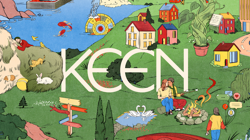
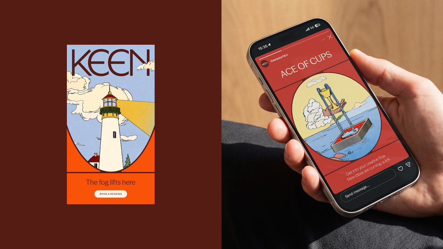
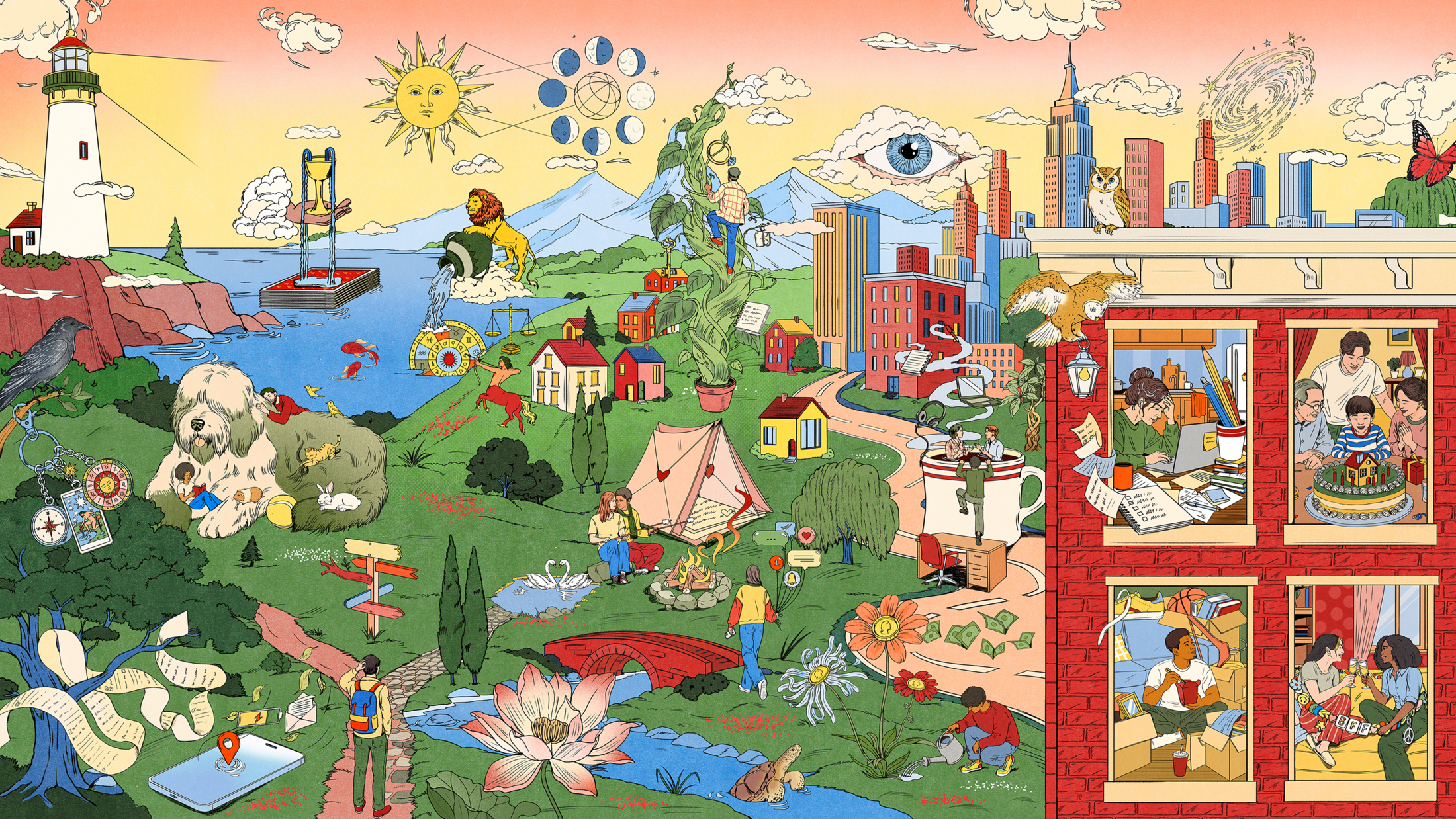
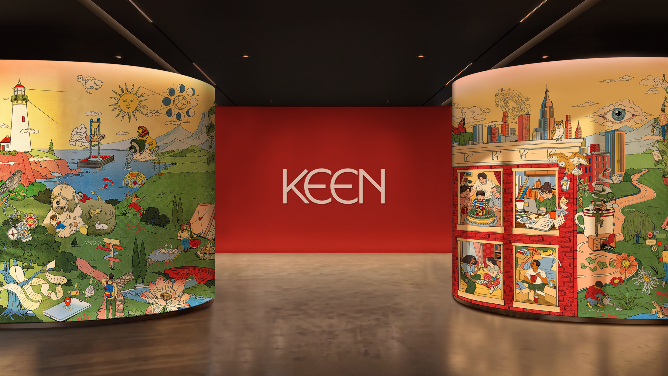
Recognising that opportunity led Mother Design to create an illustrated world that captures the richness of life in all its wonder and familiarity. Created with illustrator María Jesús Contreras, the illustration system draws on traditions of folk art to blend cityscapes, countryside, spiritual symbolism and everyday life into a single interconnected tapestry. Rather than a collection of assets, it functions as a living brand world, with scenes and symbols extracted across the website, app and communications.
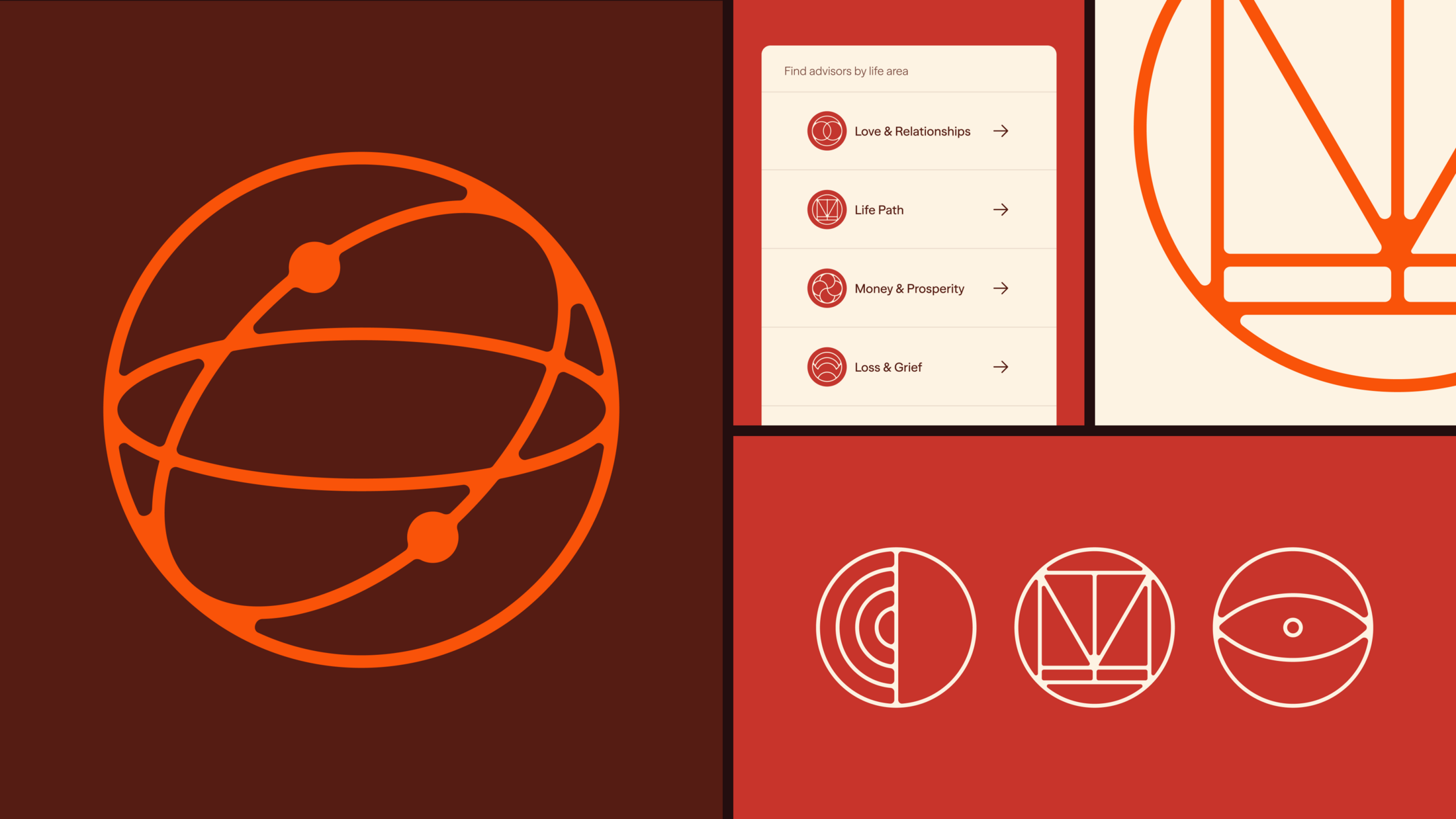
To stop this rich world from becoming overwhelming, Mother Design used perspective and a sense of containment as central themes for the identity. Circular forms and shifting viewpoints, set against an illustrated tapestry of intimate moments, became the foundation of a brand language designed to help users find clarity amid the richness of everyday life.
The remaining visual elements, from colour and typography to iconography, balance ancient influences with a contemporary sensibility. A colour palette inspired by some of the earliest pigments used in human art combines grounding tones with warm neutrals and optimistic accents, while the typographic system, pairing an expressive serif with a functional humanist sans serif, balances ancient wisdom with contemporary accessibility.
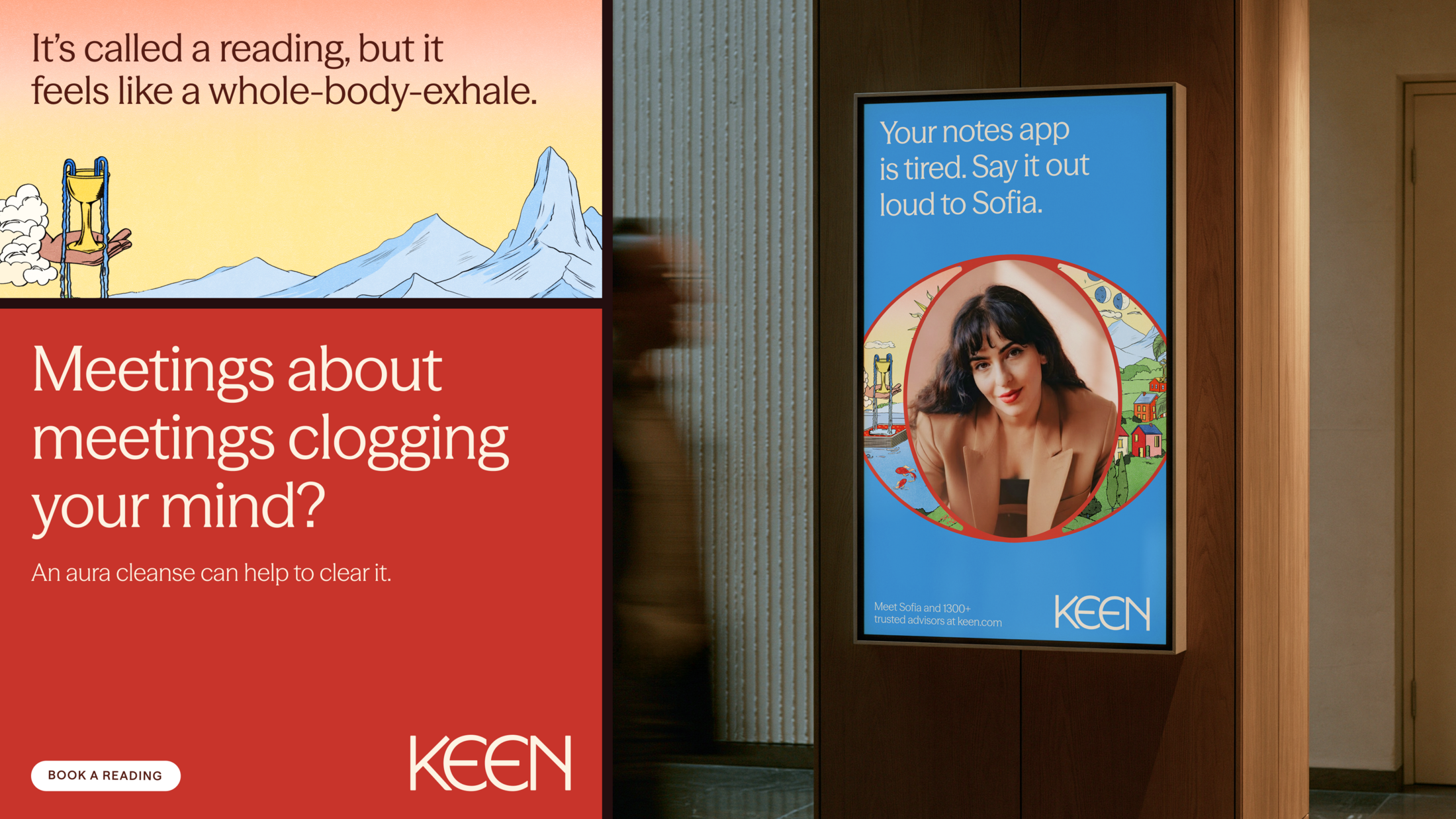
Photography highlights the real advisors behind the platform, reinforcing the human connection that distinguishes Keen from AI-powered alternatives. The verbal identity follows the same principle, with a voice that is warm, reassuring, knowing and conversational, making the world of spiritual guidance feel relevant to the questions and experiences of everyday life.
All of this culminates in a joyous brand world: rooted in ancient principles, yet personal and familiar. Expansive yet contained, it allows users to step back and see the bigger picture while still exploring the richness of everyday life up close.
The digital experience, which offers a maximalist gasp in a world of minimalist wellness design, reinforces this idea through movement and discovery. Users navigate by zooming through the illustration world rather than simply scrolling, encouraging exploration and reflecting the brand's belief that perspective comes from seeing both the bigger picture and the finer detail.
This professional campaign titled 'Brand identity' was published in United States in September, 2026. It was created for the brand: KEEN, by ad agency: Mother Design. This Design medium campaign is related to the Electronics, Technology, Health, and Other industries and contains 7 media assets. It was submitted about 2 months ago by Owner: Julia Conroy of Julia Conroy Limited.
Credits
Agency: Mother Design